Feature Wiki
Tabs
Workflow for Personal Profile
Page Overview
[Hide]1 Initial Problem
- In 5.3 entering of data and publishing of the Profile are spread over several tabs this is not user-friendly.
2 Conceptual Summary
The first thre tabs get a new Checklist eleement as known from the learning objective-driven cours and the set-up.
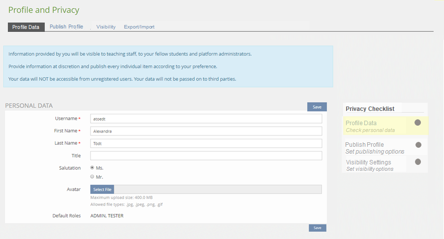
The Privacy Checklists compriese three entries with optional by-lines:
- Personal Data
- Never touched:
- grey dot
- By-line 1: Check personal data
- Form was saved with or without changes but all required fields are completed:
- green dot
- By-line 2: Personal data checked
- Form was saved with or without changes but at least one required fields is not completed:
- Normal "force-to-complete" workflow
- Never touched:
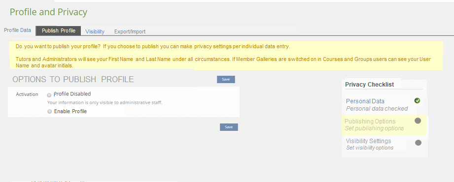
- Publishing Options
- Never touched:
- grey dot
- By-line 1: Set publishing options
- Form was saved with or without changes but all required fields are completed:
- green dot
- By-line 2:
- Profile disabled OR
- Profile enabled for logged in users OR
- Profile enabled on the internet (www)
- Never touched:
- Visibility Settings
- Never touched:
- grey dot
- By-line 1: Set visibility options
- Form was saved with or without changes
- green dot
- By-line 2:
- Show in Who-is-online? and Allow contact requests OR
- Show in Who-is-online? and No contact requests OR
- Hide from Who-is-online? and Allow contact requests OR
- Hide from Who-is-online? and No contact requests
- The tab is re-labled to "Profile"
- The tab gets the Checklist mentioned above.
- Saving the form will automatically carry over the user to the next tab "Publish Profile".
- Saving the form will change the Checklist status of the first entry.
- The tab is re-labled to "Publish Profile"
- The tab gets the Checklist mentioned above.
- Selecting one of the two Enable-profile options opens a sub-set of options: The subset is comprised of all those data entries made in the Profile Data -tab. Options left empty in the Profile Data-tab will not be displayed. This will make the form less overwhleming. For the Avatar the title of the picture could be displayed instead of the picture itself.
- Selecting one of the two Enable-profile options calls for a preview underneath the form.
- The preview will adapt to any entries made in the sub-form without the need to save the form.
- The preview will auto-update to any box checked in the sub-form.
- Saving the form will automatically carry over the user to the next tab "Visibility".
- Saving the form will change the Checklist status of the second entry.
The two settings are to be moved from General Settings to Personal Data and Profile , thus all settings relevant to the visiblity of users are located in one place:
- Hide Me From ‘Who is online?’-Tool
- Allow to contact me
The "Preview" tab is abandonned, the preview becomes a part of the tab.
3 User Interface Modifications
3.1 List of Affected Views
- Personal Data and Profile > Personal Data
- Personal Data and Profile > Profile
- Personal Data and Profile > Visibility (new)
3.2 User Interface Details
We suggest the following re-labeling of tabs:
IS en | IS de | SHOULD en | SHOULD de |
|---|---|---|---|
Personal Data and Profile | Persönliche Daten und Profil | Profile and Privacy | Profil und Datenschutz |
Personal Profile > Personal Data | Persönliche Daten | Profile Data | Profildaten |
Personal Profile > Profile | Profil | Publish Profile | Veröffentlichung |
- | Visibility | Sichtbarkeit |
3.3 New User Interface Concepts
Border Case: The Checklist does already exist. But making a Kitchensink element from it would be nice. While doing a Kichtensink element, it would be nice to visually face-lift that control, too.
4 Technical Information
No technical issues.
5 Contact
- Author of the Request: Tödt, Alexandra [atoedt]
- Maintainer: Killing, Alexander [alex]
- Implementation of the feature is done by: {The maintainer must add the name of the implementing developer.}
6 Funding
7 Discussion
Killing, Alexander [alex], 3 April 2018: I fully support this request.
Amstutz, Timon [amstutz], 22. April 2018: I support this request as well. I also agree that this is a border case for a KS-Entry. However I would really recommend the JF to ask for such an entry since the control seems to be extended. Further this control is of great value if specified well, for several other components. In my appart from the layout this should not be too complex. Each line has three possible states ("completed", "ready to be tackled" and "not possible to start yet"). Each of this state should be visually indicated (e.g. as currently done with green, grey and red dots). One line can be active, this should be indicated as well (e.g. by the yellow overlay as in the screens above) and each line has a title and byline.
If necessary, we would help funding the KS-Part of this.
JourFixe, ILIAS [jourfixe], 23 APR 2018 : We highly appreciate this suggestion and schedule it for 5.4. We would like to have a "Save and Continue" button on those tabs where the user is re-directed to the next tab after submitting inputs. Adding the 'Check List' as a new KS element would be highly appreciated but is no requirement by JF as it is an already implemented UI element. A decision about using the KS form depends on implementing missing UI elements (e.g. radio boxes, file input, image map, multi-select). We will discuss this separately after Timon's return from vacation.
Samoila, Oliver [oliver.samoila], 16 Nov. 2018: The UI Workflow should be used.
JourFixe, ILIAS [jourfixe], 17 DEC 2018 : We highly appreciate this suggestion and re-schedule the feature for 6.0. The new Workflow UI should be used to visualise the status of each of the described steps.
Killing, Alexander [alex], 12 Nov 2019: See also https://mantis.ilias.de/view.php?id=26076
8 Implementation
Test Cases
Approval
Approved at 2019-11-04 by Samoila, Oliver [oliver.samoila] (Technische Hochschule OWL) as agreed with DHBW Karlsruhe.
9 Former Requirements

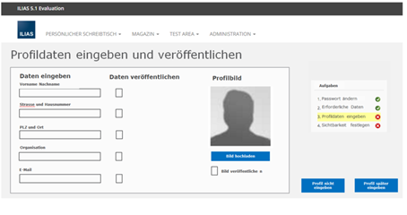
In addition to the suggestions of Usability Improvements of Personal Profile and Prompting to Personal Profile in First Access the entering of the data for the Personal Profile should be revamped. In 5.1 entering and publishing are spread over two tabs this is not user-friendly.
The changes could be made within the confines of the ILIAS standard form or by preparing a new form dedicated to this purpose.
New Dedicated Form
The deditcated form should look like a profile visiting card from the beginning, not the key-value form.
Last edited: 12. Nov 2019, 08:49, Killing, Alexander [alex]


