



















































Feature Wiki
Tabs
Improve Visual Guidance and Action Grouping in the Page Editor Slate
Page Overview
[Hide]- 1 Summary
- 2 Problem Statement
- 3 Concept
- 4 User Interface Modifications
- 5 Non-Functional Implications
- 5.1 Security
- 5.2 Privacy
- 5.3 Accessibility Implications
- 6 Process Information
- 6.1 Involved Authorities
- 6.2 Contact
- 6.3 Funding
- 7 Discussion
- 8 Implementation
- 8.1 Description and Screenshots
- 8.2 Test Cases
- 8.3 Privacy
- 8.4 Approval
1 Summary
Improve the visibility and structure of the guidance displayed in the Page Editor slate under “Edit” and “Select”. Visually distinct sections combining icons, headings and short instructions help users recognise the guidance and understand the available actions. In “Select”, related buttons are grouped according to their purpose.
2 Problem Statement
The current guidance is not visually prominent enough to be readily recognised as help. Users may overlook instructions explaining how to interact with page elements.
In “Select”, buttons serving different purposes are not clearly distinguished. Selecting elements, performing clipboard operations and changing element properties would profit from a clearer visual hierarchy.
A corresponding mantis issue exists, because this is a current usability issue.
3 Concept
The slate uses grouping to distinguish instructions and actions without changing the underlying editing workflows.
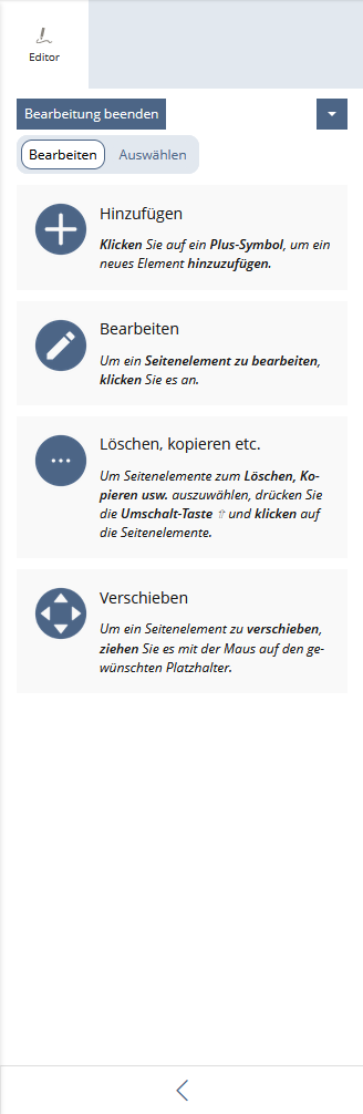
In “Edit”, four visually distinct sections explain the main interactions: adding, editing, selecting for further actions and moving page elements. Each section combines a prominent icon, a heading and a short instruction, as illustrated in the mockup.
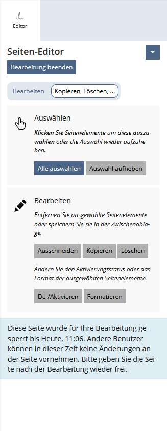
In “Select”, separate sections distinguish selection controls from actions applied to selected elements. Within the actions section, short explanatory texts further distinguish clipboard and deletion actions from activation and formatting actions.The proposal changes presentation and instructional text only. Existing functionality, permissions and page content remain unchanged.
4 User Interface Modifications
4.1 List of Affected Views
- Page Editor → Slate → “Edit”
- Page Editor → Slate → “Select”
4.2 User Interface Details
4.2.1 Edit
Display four vertically stacked sections with a prominent icon, heading and instruction.
Use visually separated backgrounds and consistent spacing. The icons illustrate the instructions; they are not additional controls.
4.2.2 Select
Display two visually distinct sections:
- “Select”: an icon and instructions explaining how to select or deselect page elements, followed by “Select All” and “Clear Selection”.
- “Edit”: an icon and two clearly separated action groups:
- “Remove selected page elements or copy them to the clipboard.” - “Cut”, “Copy”, “Delete”.
- “Change the activation status or formatting of selected page elements.” - “(De-)Activae Elements”, “Assign Characteristic”.
Preserve existing button behaviour and availability rules. The attached mockup defines the intended visual grouping.
4.3 New User Interface Concepts
No new interaction concept is proposed. Use existing UI components and styling conventions for icons, headings, buttons and visually grouped content.
4.4 Technical Aspects
Changes are limited to the shared Page Editor slate’s presentation and language entries. No changes to page data or editing logic.
5 Non-Functional Implications
5.1 Security
No security-relevant changes are proposed. Existing actions and permission checks remain unchanged.
5.2 Privacy
No additional personal data is stored or processed. Existing data processing remains unchanged.
5.3 Accessibility Implications
Use semantic headings and a logical reading order. Icons must not be the sole means of conveying meaning; decorative icons should be hidden from assistive technologies.
Ensure sufficient contrast, readable text and a layout that remains usable at increased zoom and narrow slate widths. Existing keyboard interaction and button labels must remain available.
6 Process Information
6.1 Involved Authorities
- Authority to Sign off on Conceptual Changes: Killing, Alexander [alex]
- Authority to Sign off Code Changes: Killing, Alexander [alex]
6.2 Contact
Person to be contacted in case of questions about the feature or for funding offers: Becker, Matthias [matthias.becker]
6.3 Funding
Funding status and funding parties are listed in the block 'Status of Feature' in the right column of this page.
If you are interested to give funding for this feature, please get into contact with the person mentioned above as 'Contact'.
7 Discussion
Killing, Alexander [alex], 6 Nov 2026: Currently the UI section says "No new interaction concept is proposed. Use existing UI components and styling conventions for icons, headings, buttons and visually grouped content.". Not sure what "styling conventions ... visually grouped content." is meaning here. The layout of these blocks (icon + descriptive text) must be implemented by either a KS element or a page editor component based UI element / template.
Kunkel, Matthias [mkunkel], 11 NOV 2026: Thanks for this suggestion. I think it is really helpful and improves usability. But why has the 'Select' slate a headline ('Seiten-Editor') and the 'Edit' slate not? Could we streamline this? And is a (visual) headline really necessary?
Becker, Matthias [matthias.becker], 16 NOV 2026: @Alex, sorry for the obscure description. What I tried to say was that I only used KS Elements, if I remember correctly. I think I used Shy Items for visualisation.
@Matthias, I'm really sorry, I'm stumped about the headline. I played around with a few ideas together with Alexandra a while back and this is probably a left-over idea that was not supposed to be there for this FR. Please ignore this.
JourFixe, ILIAS [jourfixe], 16 NOV 2026: We highly appreciate this suggestion and accept the feature for trunk. We assume that both screens can be implemented using UI KS elements. If problems arise with this, please pick-up the topic again (probably together with the UI experts).
8 Implementation
Feature has been implemented by {Please add related profile link of this person}
8.1 Description and Screenshots
{ Description of the final implementation and the changed behaviour in the related components. Please add screenshots to visualise the changes if possible. }
8.2 Test Cases
Test cases completed at {date} by {user}
- {Test case number linked to Testrail} : {test case title}
8.3 Privacy
Information in privacy.md of component: updated at {date} by {user} | no change required
8.4 Approval
Approved at {date} by {user}.
Last edited: Yesterday, 15:31, Kunkel, Matthias [mkunkel]