


Feature Wiki
Tabs
Modernizing ILIAS Breadcrumbs for Usability and Accessibility
Page Overview
[Hide]- 1 Initial Problem
- 2 Conceptual Summary
- 3 User Interface Modifications
- 4 Additional Information
- 4.1 Involved Authorities
- 4.2 Technical Aspects
- 4.3 Privacy
- 4.4 Security
- 4.5 Contact
- 4.6 Funding
- 5 Discussion
- 6 Implementation
- 6.1 Description and Screenshots
- 6.2 Test Cases
- 6.3 Privacy
- 6.4 Approval
1 Initial Problem
The current ILIAS breadcrumb implementation fails to deliver reliable orientation and navigation across modern usage contexts. On small screens, breadcrumbs are hidden in the header, overlap content, or become cluttered with unclear dropdown symbols and truncated titles. Deep hierarchies overwhelm the visible trail without proper overflow handling, while permission logic hides the current page from users with read access, creating misleading location feedback. Object types like forums, wikis, and exercises show inconsistent internal level representation, weakening predictability as secondary navigation. Accessibility is hindered by lacking semantic list structure for screen readers, inconsistent focus order, insufficient touch target sizes, varying mobile/desktop presentation, and unclear marking of the current position.
Related Mantis Issues:
Related Feature Requests:
Related Documents:
2 Conceptual Summary
This FR proposes a comprehensive redesign and modernization of ILIAS breadcrumbs to improve orientation, responsiveness, accessibility, and consistency across hierarchies and object types. Key changes and improvements include:
- Visual & Responsive Layout
- Semantic HTML markup
- Accessibility
- Permissions & Visibility
- Current Page Handling
These changes align with ILIAS SCSS guidelines, reduce visual clutter, enhance scanability, and make breadcrumbs reliable secondary navigation.
3 User Interface Modifications
3.1 List of Affected Views
- Breadcrumbs
3.2 User Interface Details
Visual & Responsive Layout
The proposed ILIAS breadcrumb designs use a unified model with page links for parent navigation, clear separators for hierarchy, and an emphasized current page for orientation (see Mantis Bug #45836).
To strengthen visual orientation, the breadcrumb font size should be increased to 0.825rem so the trail receives slightly more visual attention without becoming overly dominant in the interface. Parent items should use font-weight 400, while the current page should keep font-weight 600 and use the standard text color, creating a clearer visual distinction between navigable parent levels and the current location.
For usability and accessibility, each breadcrumb link should provide a target area of at least 24 by 24 CSS pixels, in line with WCAG 2.2 target-size guidance. If the text itself is smaller than that minimum, the clickable area should be expanded by adding spacing around the label so that the surrounding padding, not just the text, is clickable.
Default Breadcrumbs
- Page link: Links to a higher-level page in the hierarchy and enables quick navigation back to parent sections.
- Separator: Visually separates breadcrumb items and clarifies the hierarchical relationship between pages.
- Current page: Indicates the user’s current location in the hierarchy and is visually emphasized to distinguish it from navigable parent links.

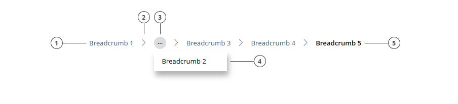
Breadcrumbs with Overflow-Button
- Page link: Links to a higher-level page in the hierarchy and enables quick navigation back to parent sections.
- Separator: Visually separates breadcrumb items and clarifies the hierarchical relationship between pages.
- Overflow button: Collapses intermediate breadcrumb items into a menu when more than four (upper example) or five (lower example) items would otherwise be shown, helping to avoid unnecessary truncation, offscreen overflow, and visual clutter while preserving access to hidden levels.
- Overflow dropdown: Displays the collapsed intermediate breadcrumb items in a compact menu, so hidden hierarchy levels remain available without overloading the main breadcrumb trail.
- Current page: Indicates the user’s current location in the hierarchy and is visually emphasized to distinguish it from navigable parent links.

Default Mobile Breadcrumbs
- Page link: Links to a higher-level page in the hierarchy and enables quick navigation back to parent sections.
- Separator: Visually separates breadcrumb items and clarifies the hierarchical relationship between pages.
- Overflow button: Collapses intermediate breadcrumb items when the trail contains more than two items, so that only the root breadcrumb and the current page remain visible, reducing clutter and preserving space on narrow viewports.
- Overflow dropdown: Displays the intermediate hierarchy levels hidden by the overflow button, ensuring that the full breadcrumb path remains accessible without crowding the mobile layout.
- Current page: Indicates the user’s current location in the hierarchy and is visually emphasized to distinguish it from navigable parent links.

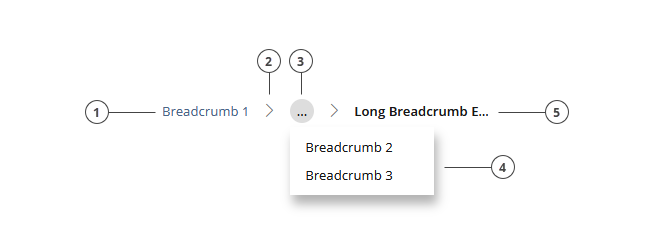
Mobile Breadcrumbs with Long Current Breadcrumb-Name:
- Page link: Links to a higher-level page in the hierarchy and enables quick navigation back to parent sections.
- Separator: Visually separates breadcrumb items and clarifies the hierarchical relationship between pages.
- Overflow button: Collapses intermediate breadcrumb items when the trail contains more than two items, so that only the root breadcrumb and the current page remain visible, reducing clutter and preserving space on narrow viewports.
- Overflow dropdown: Displays the intermediate hierarchy levels hidden by the overflow button, ensuring that the full breadcrumb path remains accessible without crowding the mobile layout.
- Current page: Indicates the user’s current location in the hierarchy and remains visible, but its label is truncated when the available viewport width is reached in order to keep the breadcrumb on a single line.
Alternative Icon usage for root item:

The previously used overflow button only works to a limited extent for learning modules. Since learning modules have at least three inherent levels in their standard structure (learning module, chapter, current page [only in edit mode]), a minimum of a fourth level would be required after the overflow button in the breadcrumb to allow navigation from the current object to its parent object. As learning modules (as in the example) often have additional subchapters and are not restricted to just one subchapter level, the number of levels that would need to be shown in order to navigate back out of the learning module can quickly grow to five, six, or even more.
Because the learning module is one of the few objects with its own navigation, one might argue that the breadcrumb could be simplified in this particular case, but this is not advisable for usability and accessibility reasons.
Another confusing aspect of the breadcrumb implementation in learning modules is that the current page is not displayed in the breadcrumb bar in presentation mode. It only appears when the page is in edit mode. Since standard users are more likely to consume than to edit, the current position is missing for them when viewing the learning module: they know which chapter or subchapter they are in, but not which page they are currently on.
One could argue that in a traditional book you also only see the chapter titles and individual pages do not have their own navigation markers. However, pages in learning modules are, in most cases, inherently different and cover a specific function or behavior that is useful to communicate to users by displaying the title. The learning module is a particularly complex case because its settings allow configuration so that only chapter titles are displayed in both the navigation and the page titles. This would lead to unnecessary confusion if the result were that the breadcrumb shows the current page with the chapter title while the chapter itself also has the same title.
The most usability-friendly approach would be to define a dedicated logic for learning modules in which the breadcrumb consistently displays Root > Overflow button > Parent object, regardless of how many subchapters follow. However, the advantage of the overflow button is that it allows users to access nodes that are not permanently visible in the breadcrumb. While this would be a slightly limited solution from a usability perspective, since the parent object cannot be identified as easily in the overflow menu, the previously described logic could still be applied to learning modules with almost no reservations.

Why truncate the current page label?
The current page label carries the most immediate orientation value and is the item users need to recognize most clearly, so it should always be visible and never hidden. However, truncating the root breadcrumb is worse because the root (like “Home, Repo, Magazin”) is usually short and recognizable anyway, and hiding or truncating it reduces the sense of “how far from home” the user is. Further, Omitting the overflow button removes access to hidden intermediate levels, which weakens the breadcrumb’s role as hierarchical navigation rather than just a compact visual hint.
Semantic list markup for breadcrumbs
The ILIAS breadcrumb markup should be improved by using a semantic ordered list with list items and marking the current page with an aria-label (see Mantis bug #47573), addressing the BITV test finding for ILIAS 9 (see Mantis bug #44581) that noted better list markup is needed for screen reader navigation and comprehension. At the same time, the CSS classes should be renamed to align with the current ILIAS SCSS BEMIT naming conventions for components.
These following markup mockups are suggestions for what a possible breadcrumb structure could look like. They can be quickly pasted into an HTML editor to get an additional visual impression of the proposed setup. They are not a strict specification of what must be implemented in the final code.
Short Breadcrumb Trail:
| |
| |
Changes:
Classes should be renamed to c-breadcrumbs, c-breadcrumbs__list, and c-breadcrumbs__item, because the current ILIAS SCSS guidelines recommend BEMIT naming with the c- prefix for components, which makes the breadcrumb structure clearer and more consistent with the current styling architecture.
- <div class="breadcrumb">
+ <ol class="c-breadcrumbs__list">
The generic div should be replaced with an ordered list because breadcrumbs represent a hierarchical sequence of locations. This is the recommended semantic structure in common breadcrumb accessibility guidance.
- <span class="crumb">
+ <li class="c-breadcrumbs__item">
Each breadcrumb item should be changed from span to li so the individual steps are represented as real list items.
- <a href="link">Campusführung und Einführung in die Bibliothek</a>
+ <a href="link" aria-current="page">Campusführung und Einführung in die Bibliothek</a>
The last breadcrumb link is marked with aria-current="page" so assistive technologies can identify it as the current location in the breadcrumb trail and an explicit c-breadcrumbs__item--current modifier-class is added to enable precise CSS and JavaScript targeting without descendant selectors. Only one item in the breadcrumb should be marked as current.
Long Breadcrumb Trail:
| |
| |
Overflow-Button Integration:
An overflow breadcrumb variant should be proposed for ILIAS to handle deep hierarchies with possible long labels, keeping the first breadcrumb item and most recent items visible while collapsing intermediate levels into an overflow menu. It should use a nav landmark, an ordered list for the breadcrumb structure, semantic list items, a real button for the overflow control, and aria-current="page" on the current item. As a possible approach, items could either be collapsed once more than four or five items are visible and when the available viewport width is exceeded, or they could be collapsed into an overflow button only when the available viewport width is no longer sufficient. This would improve readability, reduce visual clutter, and preserve accessibility at the same time.
Changes:
| |
A dedicated overflow element was added to collapse several intermediate breadcrumb steps into a menu. This keeps the breadcrumb readable in deep hierarchies while still exposing the hidden levels through an interactive control.
- multiple long middle breadcrumb items shown inline
+ middle breadcrumb items moved into the overflow menu
The middle items were moved into the overflow menu because they create visual clutter and reduce scanability when the hierarchy becomes very long. Keeping the first item and the last few items visible gives users both orientation and local context.
Food for thought:
An explicit c-breadcrumbs__link class would enable precise CSS and JavaScript targeting without descendant selectors, but it could be argued that it doesn't match ILIAS's current pattern of keeping simple elements unclassed. For the breadcrumb, the simpler descendant selector approach is probably sufficient unless link-specific styling or JS targeting becomes necessary later.
Mobile Breadcrumb Trail:
| |
| |
As shown in the design mock-ups above, the new mobile breadcrumb collapses intermediate breadcrumb items when the trail contains more than two items, so that only the root breadcrumb and the current page remain visible, reducing clutter and preserving space on narrow viewports.
Permissions
The current breadcrumb implementation should be changed to always show the current item, even when users lack "view" permissions but have "read" permissions. This addresses Mantis bug #45844, where users accessing objects via direct links do not see the current node in the breadcrumb trail and thus cannot orient themselves properly or understand permission-related gaps.
Users with read but no view permissions can still access objects via links (e.g., from entry pages or custom buttons), but the breadcrumb misleadingly shows a parent node instead of the actual current location. This creates confusion, especially since screen readers announce the wrong item (e.g., NVDA announces a parent category instead of the actual object). As mentioned above, the current page label carries the most immediate orientation value and is the item users need to recognize most clearly, so it should always be visible and never hidden.
Objects for which users lack view permissions should continue to remain hidden from the parent item's content page, but there is no sensible reason to exclude them from the breadcrumb trail when users are actually located within that item. It is entirely reasonable to hide parent items without view permissions from the breadcrumb trail to protect the hierarchy path, but since users are already within the current object, displaying it in the breadcrumb provides essential orientation without compromising security or privacy.
Handling Permissions:
- Display the current item regardless of view permissions.
- Keep intermediate/parent items hidden if users lack view permissions, to respect existing scenarios like public surveys (see Mantis bug comment #45844#c120644).
Current Page Handling
Industry standards, accessibility guidance, and best-practice recommendations (such as NN/g, W3C WAI-ARIA and the Carbon Design System) indicate that the current page in a breadcrumb trail should ideally be rendered as static text rather than as a link. The purpose of the current breadcrumb item is orientation, not navigation. A self-referential link suggests an action although no meaningful navigation takes place, which can confuse users and create unnecessary cognitive effort. A static current item, combined with aria-current="page", communicates the current location clearly and unambiguously to assistive technologies and avoids the ambiguity of a non-functional link.
In ILIAS, however, the situation is more complex (see Mantis bug #47574). Some object types, such as wikis, exercises, and forums, do not expose their deeper internal structure in the breadcrumb trail. In addition, when working in the page editor, there is currently no preview mechanism that allows users to inspect the content level in a separate tab or view without leaving editing mode. The same limitation applies to local style adjustments, where there is no straightforward way to inspect the resulting content presentation directly on the local content level while continuing to edit. In these contexts, the current breadcrumb item, which often points to the topmost accessible content level of the object, can effectively be used as a shortcut to return to that level.
Strictly speaking, however, this is not what breadcrumbs are meant for. In ILIAS, the breadcrumb should function as secondary navigation, which is also consistent with best practices and the KS documentation, whereas primary navigation should be provided by dedicated navigation elements within the object itself. In fact, such primary navigation already exists in several of the affected object types: exercises provide the “< Assignment List” tab navigation, forums provide the “< All Threads” tab navigation, and wikis provide navigation through the secondary panel. These controls are the proper mechanisms for returning to an object’s main level, not the breadcrumb.
At the same time, the current implementation reveals a structural inconsistency. Forum posts, exercise units, learning module pages and wiki pages represent meaningful user locations with their own permalinks, yet they do not consistently appear as dedicated breadcrumb items. This weakens orientation and also contributes to inconsistent navigation behavior across object types, since deeper levels are shown in some contexts, such as tests or learning modules (partly), but not in others. From a usability perspective, this inconsistency is the larger issue. If these deeper levels were represented consistently in the breadcrumb trail, users would receive a clearer and more reliable indication of where they are in the system.
For that reason, the long-term solution should not be to preserve the current page as a link indefinitely, but rather to improve the breadcrumb model for those object types that currently omit internal levels. These levels should be represented consistently in the breadcrumb trail so that users can orient themselves and move through the system in a simple, predictable, and coherent way. In parallel, the page editor should offer a preview option that allows the editing view to remain open while the content level can be inspected in another tab or window.
Since these broader improvements will likely require additional feature requests and pull requests, it is proposed to keep the current page rendered as a link for the time being, but with clear visual emphasis and differentiation, until the affected special cases have been addressed properly and a more consistent overall navigation and orientation model has been established in ILIAS.
Separators (Food for Thought)
Inline SVG separators outperform pure CSS icons for ILIAS breadcrumbs in accessibility and flexibility, while pure CSS excels in performance and simplicity.
Accessibility and Flexibility Benefits of Inline SVG
Inline SVG with aria-hidden="true" and role="presentation" remains silent to screen readers, preventing verbose announcements of slashes or arrows in ILIAS's deep repository trails—unlike CSS ::after { content: '>' } which exposes text. This aligns with ILIAS's BITV/WCAG focus, where aria-labels on nav suffice for context without separator clutter. Users in education (e.g., visually impaired students) benefit from cleaner navigation audio.
SVG enables scalable, multi-color chevrons or custom arrows inheriting ILIAS Delos theme colors via currentColor, ideal for skin customizations in src/scss/_components/breadcrumbs.scss. Animations (e.g., hover morphs) and gradients work natively, surpassing CSS Unicode limits or clip-path hacks for triangular ribbons. In ILIAS, override vars like $breadcrumb-separator with inline SVG for client-specific repos without extra assets.
Performance and Simplicity of Pure CSS
Pure CSS pseudo-elements load faster with zero DOM impact or file requests, crucial for ILIAS's high-traffic LMS with many simultaneous users. Simpler maintenance in SCSS compilation (no SVG optimization needed) and consistent rendering across browsers without SVG support quirks. Smaller bundle size suits mobile learning in bandwidth-limited settings.
For basic slashes ("/" or ">"), CSS suffices without overkill; ILIAS defaults favor this for lightweight defaults before custom skins. Avoids potential SVG security parsing overhead in strict CSP policies common in edu environments.
3.3 New User Interface Concepts
The overflow button is expected to introduce a new interface concept, and the same may apply to the overflow menu, which, howeber, will likely be represented using the standard dropdown component.
3.4 Accessibility Implications
The changes proposed in this PR resolve or improve several accessibility issues in the current breadcrumb implementation.
WCAG Issues
WCAG 1.3.1 – Info and Relationships (Level A)
Current Issue: Using div and span instead of an ordered list (ol) prevents screen readers from understanding the hierarchical structure.
This issue is resolved by replacing the current non-semantic structure with an ordered list. Using ol and li makes the breadcrumb hierarchy programmatically determinable and understandable for assistive technologies.
WCAG 2.4.3 – Focus Order (Level A, ILIAS 10)
Current Issue: Using dir="rtl" reverses the visual order while the DOM remains left-to-right, so the keyboard focus order no longer matches the perceived breadcrumb path.
This issue should still be addressed explicitly for ILIAS 10. With the revised breadcrumb layout, the visual order should no longer rely on CSS-based reversal and should instead follow the DOM order, so that keyboard focus remains logical and consistent with the perceived breadcrumb path.
WCAG 2.5.8 – Target Size (Minimum) (Level AA)
Current Issue: In the current implementation, breadcrumb items (clickable) have a height of only 17 CSS pixels, which is too small for comfortable interaction. Interactive targets should be at least 24 by 24 CSS pixels.
This proposal increases the font size to 0.825rem and should further ensure sufficient clickable spacing so that interactive breadcrumb targets reach the required minimum target size of 24 CSS pixels.
WCAG 3.2.3 – Consistent Navigation (Level AA)
Current Issue: Breadcrumbs are presented differently depending on the device, so users cannot reliably know where to find them.
This issue is addressed by removing the separate mobile breadcrumb from the header and placing the breadcrumb consistently beneath the header and above the object heading, as in the widescreen version. The behavior also becomes more consistent, as intermediate breadcrumb items are collapsed into an overflow button when the available screen width is no longer sufficient.
WCAG 2.4.8 – Location (Level AAA)
Current Issue: The current breadcrumb item is not marked with aria-current="page", which makes it harder for users to identify their exact location in the hierarchy.
This issue is resolved by adding aria-current="page" to the current breadcrumb item and visually highlighting it, so that the user’s current location is conveyed both programmatically and visually. It is also essential that the current page always remains visible in the breadcrumb trail, regardless of view permissions, to ensure that the user’s location within the hierarchy can always be identified.
Keyboard Navigation
The TAB key moves focus sequentially through all breadcrumb items from left to right, beginning with the first clickable breadcrumb link. Separator symbols between items must not be keyboard focusable.
Overflow menus follow the standard tab order and activate when users press Space or Enter on the trigger button. When an overflow menu opens, focus automatically moves to the first item in the menu. Users can navigate between menu items using the Up and Down arrow keys. Pressing Space or Enter on a focused menu item selects it. The Escape key collapses the menu and returns focus to the original trigger button.
Future Consideration: Once inconsistencies in object-type breadcrumb representation are resolved, the final current page breadcrumb - rendered as static text without an href - will be omitted from the tab order.
Screen Reader Accessibility
The breadcrumb announces as a labeled navigation landmark <nav aria-label="Breadcrumb"> containing an ordered list of hierarchical locations. Each breadcrumb announces as "link, [link text]", with parent links identifiable by destination and the current page marked via aria-current="page" ("current page: [title]").
Overflow menus expand inline within the list structure, maintaining semantic order—users hear intermediates as additional list items when opened. Separators remain purely decorative (no announcement). The current page is always announced last and never hidden, ensuring location awareness even with permission restrictions or truncation.
Should not do: Announce separators as items, use div/span wrappers (non-semantic), hide current page, or reverse DOM order (breaks hierarchy comprehension).
4 Additional Information
4.1 Involved Authorities
- Authority to Sign off on Conceptual Changes: UICore: Fuhrer, Thibeau [tfuhrer]; CSS: Solzbacher, Bettina [BettinaSolzbacher]
- Authority to Sign off Code Changes: UICore: Fuhrer, Thibeau [tfuhrer], Schmid, Fabian [fschmid]; CSS: Solzbacher, Bettina [BettinaSolzbacher], Padula, Vincenzo [vincenzo], Ortega, Javier [javier.ortega]
4.2 Technical Aspects
Development Considerations:
- The breadcrumb trail should be wrapped in a
navlandmark with an accessible name such asaria-label="Breadcrumb"so assistive technologies can identify it as navigation. - The breadcrumb structure should use an ordered list
olfor the trail itself; overflow menu items may use a separate list structure, but they should not break the semantic hierarchy of the main breadcrumb trail. - Only one breadcrumb item should carry
aria-current="page"and that state should always identify the actual current location. - The overflow trigger should reflect its open/closed state with
aria-expanded="true"andaria-expanded="false". - The overflow trigger should reference the controlled menu with
aria-controlsif a dedicated menu container ID is used; this is optional, but helpful when the relationship should be explicit. - The overflow trigger must be a real
<button>element, not a styled link or span, so keyboard and assistive technology behavior remains native and predictable. - Focus handling must be implemented consistently when the menu opens and closes, including returning focus to the trigger after Escape or dismissal without selection.
- The DOM order of breadcrumb items must match the visual order; CSS-based reversal should not be used, because it can create a mismatch between visual reading order and keyboard focus order.
- Hidden breadcrumb items moved into the overflow menu should remain fully reachable and understandable to screen reader users, including their original link text and hierarchy meaning.
- Separator characters should be decorative only and should not be exposed as separate interactive elements.
- The implementation should define a clear truncation strategy for very long labels, including whether truncation is purely visual and whether the full label remains available via accessible name or tooltip.
- The implementation should define when overflow is triggered: by fixed item count, by available width, or by a hybrid rule, so behavior stays predictable across responsive breakpoints.
- The component should be tested across object types that currently expose hierarchy inconsistently, especially forums, wikis, exercises, tests, and learning modules, to avoid introducing another layer of inconsistent breadcrumb behavior.
- Permission-based filtering must be tested separately for current, parent, and intermediate items to ensure the current location is always shown while restricted hierarchy levels remain hidden where required.
- The mobile and desktop variants should use the same interaction logic as far as possible, so only the collapse threshold changes, not the conceptual behavior of the component.
- CSS naming should consistently follow the proposed BEMIT component pattern, including any modifier classes for current, overflow, expanded, or truncated states, so future styling and scripting remain maintainable.
It is important that, during the redesign, we ensure that the changes do not affect the breadcrumbs of the data table, or that any changes are made in a way that also makes sense for the data table.
4.3 Privacy
Expected to be not relevant.
4.4 Security
Expected to be not relevant.
4.5 Contact
Person to be contacted in case of questions about the feature or for funding offers: Becker, Matthias [matthias.becker]
4.6 Funding
Funding status and funding parties are listed in the block 'Status of Feature' in the right column of this page.
If you are interested to give funding for this feature, please get into contact with the person mentioned above as 'Contact'.
5 Discussion
6 Implementation
Feature has been implemented by {Please add related profile link of this person}
6.1 Description and Screenshots
{ Description of the final implementation and screenshots if possible. }
6.2 Test Cases
Test cases completed at {date} by {user}
- {Test case number linked to Testrail} : {test case title}
6.3 Privacy
Information in privacy.md of component: updated at {date} by {user} | no change required
6.4 Approval
Approved at {date} by {user}.
Last edited: 4. May 2026, 15:19, Becker, Matthias [matthias.becker]