Feature Wiki
Tabs
Streamlining and Improvement Authentications Login Page
Page Overview
[Hide]1 Initial Problem
The Login Page is the first impression of ILIAS. The page has to be welcoming, nice and consistent.
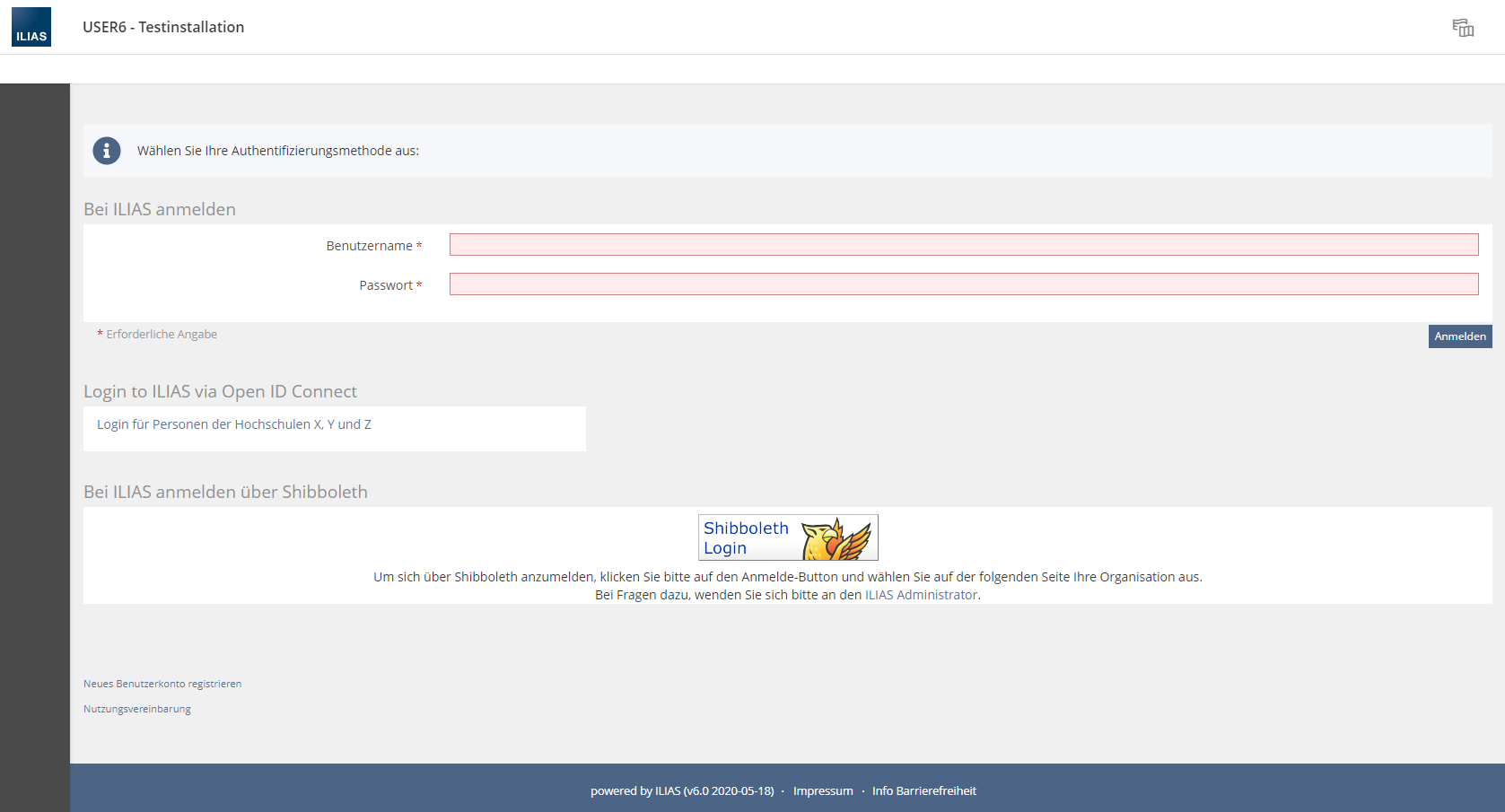
Especially when using different authentication methods, it's currently not. The presentation of the forms, links and buttons are handled very differently and being on the same screen they aren't «weight equally». The ILIAS Login form with its input fields is an eye catcher. Links and buttons of other authentication methods often are overseen – even with additional editing of the page.
It's not possible to get a nice, equal and consistent-looking result without touching CSS and code.
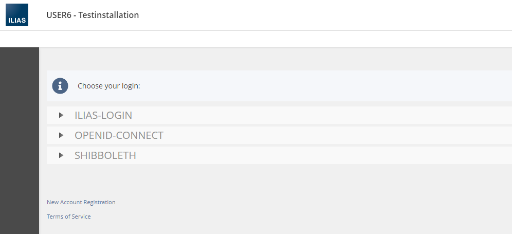
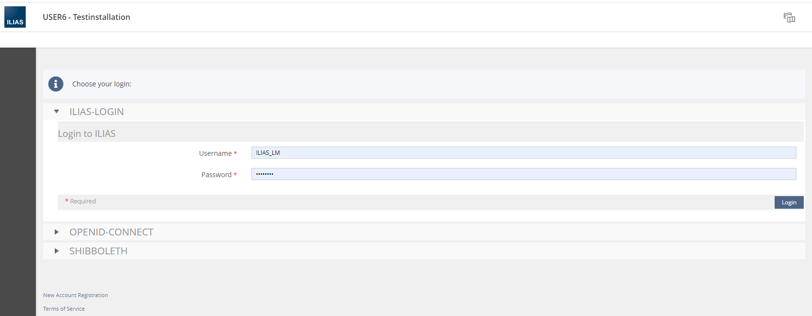
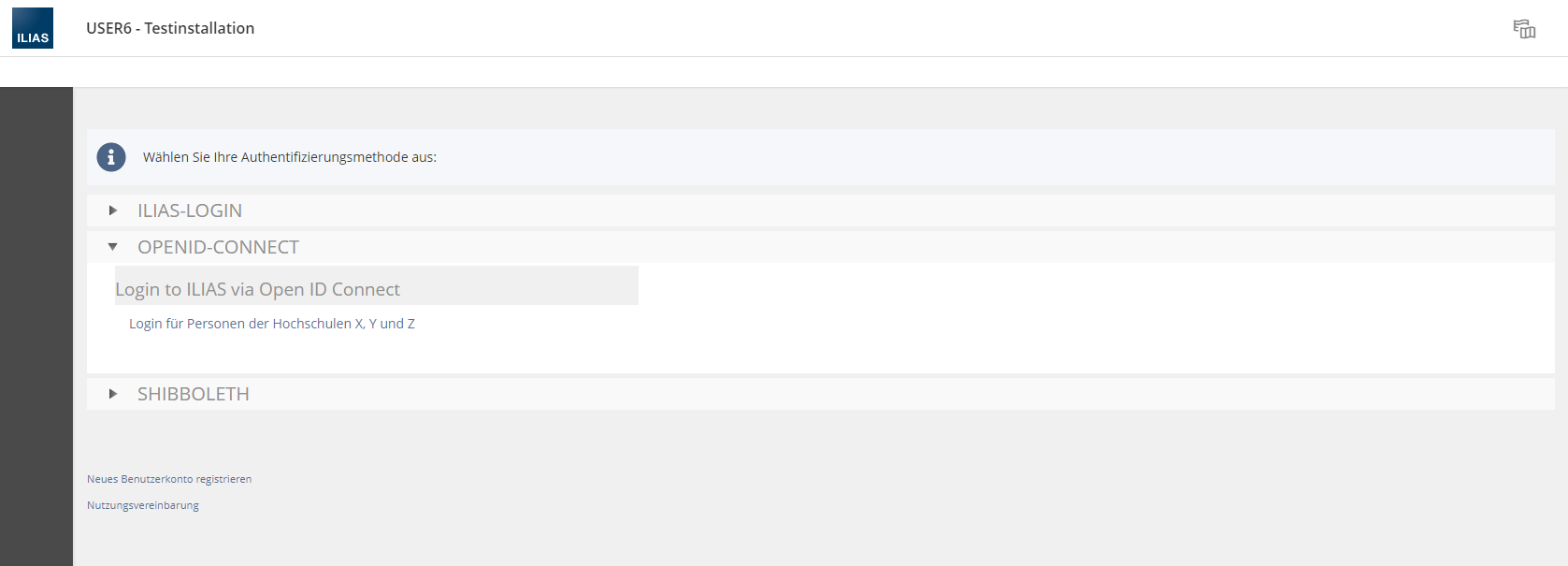
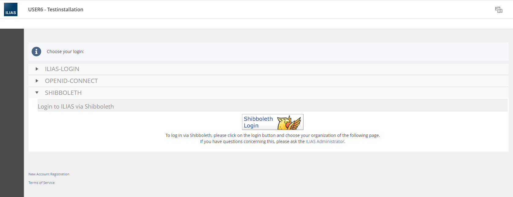
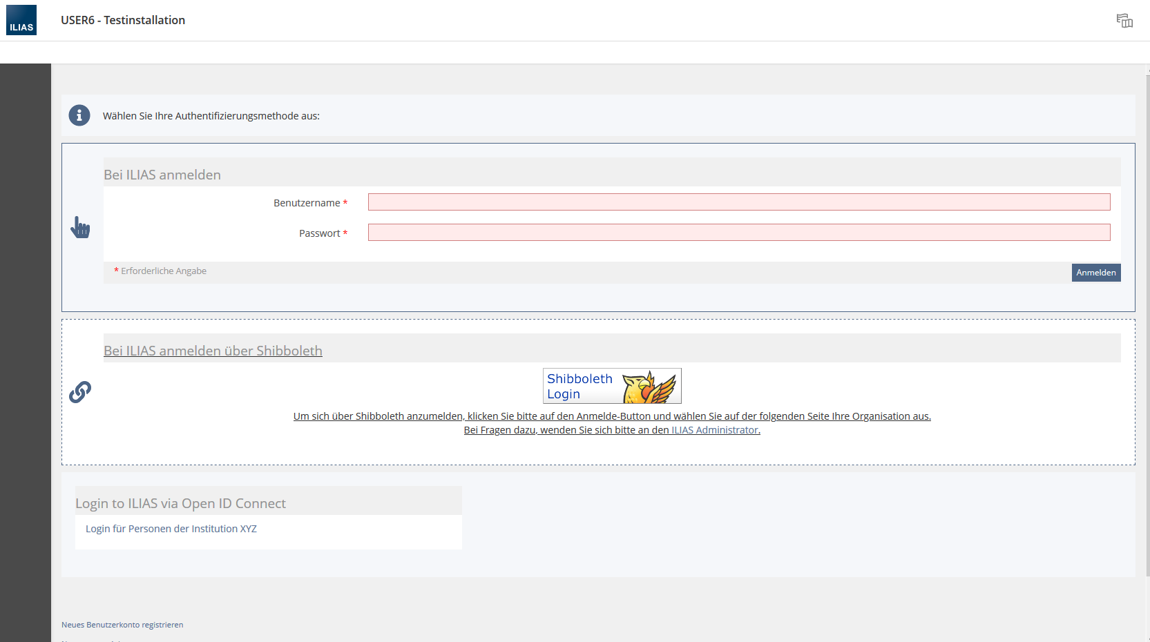
The screenshots in the following accordions show, how the different authentication methodes look like combined (plain) and how the forms or the form's design interfere with the section-block's or the accordion's design:
- Accordion: Accordion title and form header -> it's «too much»
- Block:
- colors of form and block get in conflict
- form header may be too much
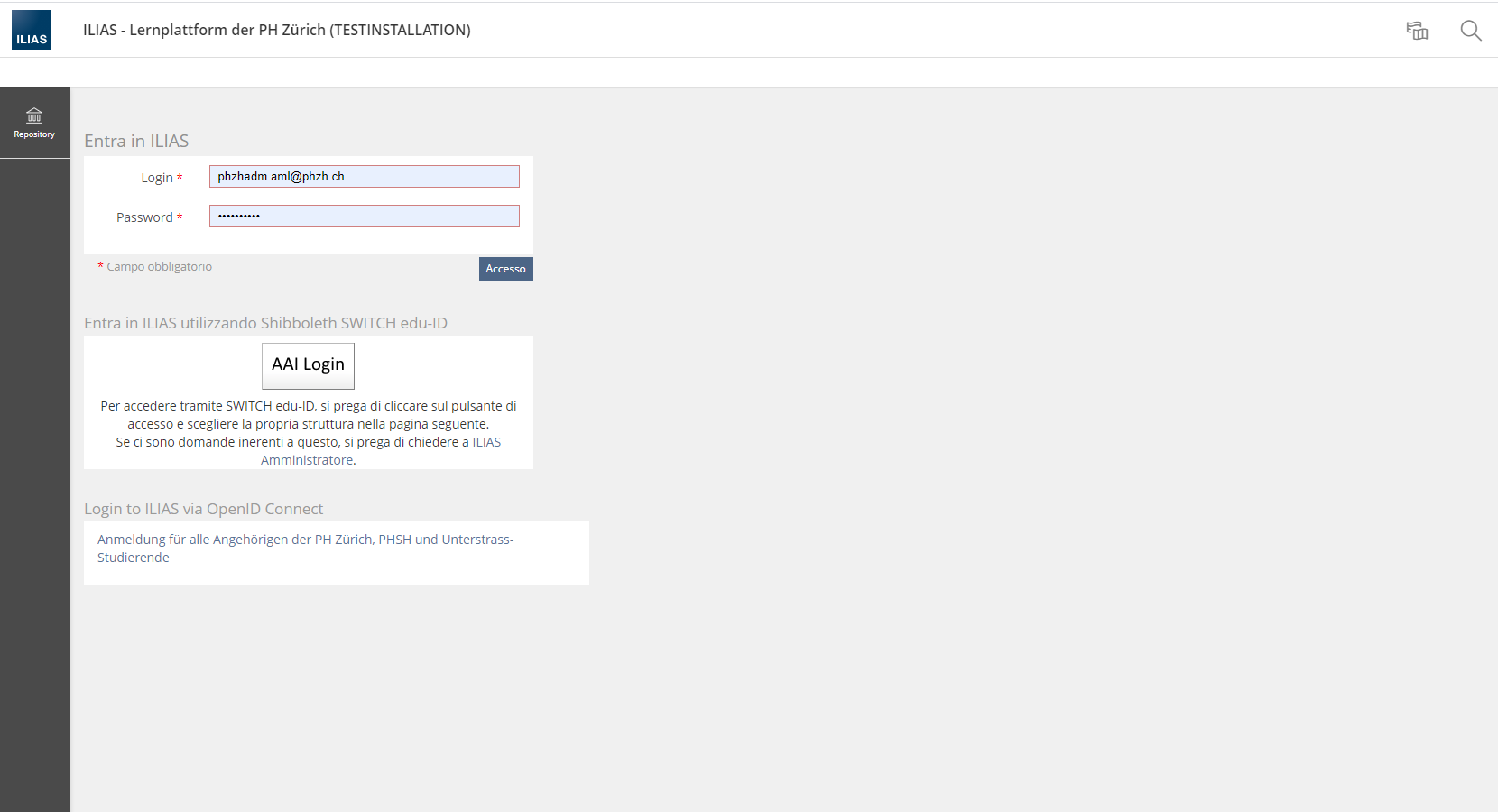
The second problem is: There is no workaround-possibility like using e.g. accordions and self created links, because the original forms will automatically be displayed below on the login page. A security measure so no-one can lock themselves out accidentally. And the self-created link wouldn't work with Permanent links: One always lands on the Dashboard instead of the original goal.
The form of the authentication methodes (especially the forced header) and the different widths of the forms prevent a nice customisations. The CSS is based on the System Style and has not a costumizable style of its own.
Some of the elements are grouped or displayed automatically when activated in administration. They don't have a placeholder/element. E.g. the «Password forgotten?»-Link, as mkunkel mentions in the discussion below. They can't be placed separately or styled differently.
2 Conceptual Summary
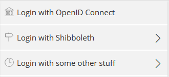

- There must be a Guideline for the standard. (appearance and functions out of the box)
- E.g. same width of forms, so columns can be used
- The Login Page gets a better costumizable Content-Style.[1]
- There are no headers on forms.
- Display options of authentication methodes:
- With Form: 1 single form used by all the form based authentications
- ILIAS Login
- LDAP
- Others...?
- Without form: Link-Button[2]
- Shibboleth
- OpenID Connect
- Others...?
- With Form: 1 single form used by all the form based authentications
- Every feature/link/element on the Login Page is an independant Login Page Element and can be styled and placed individually:
- When used different authentication methods (form/without form mixed or several without form), the design is harmonized.
- If the Login Page Element of an activated authentication method has been deleted, ILIAS won't display it automatically on the page (like currently), but show an Emergency Login Link in the footer. [I am aware that it would be visible for everyone, but as it is ment as an emergency login it wouldn't last long. If there is a better solution, feel free.]
Regardless of which kind of display option is used: Permanent links to an object must work!
3 User Interface Modifications
3.1 List of Affected Views
- Login page
- Administration > Users and Roles > Authentication and Registration
- Administration > Users and Roles > Authentication and Registration > Loginscreen Editor > Language > Edit
- Administration > Users and Roles > Authentication and Registration > Shibboleth
- Administration > Users and Roles > Authentication and Registration > CAS
- Administration > Users and Roles > Authentication and Registration > OpenID Connect
- Administration > Users and Roles > Authentication and Registration > SAML
- Administration > Users and Roles > Authentication and Registration > ...every other visible existing or future authentication method
- ?Administration > Layout > ?
3.2 User Interface Details
3.3 New User Interface Concepts
4 Technical Information
5 Privacy Information
6 Security Implications
7 Contact
- Author of the Request: Mela, Alix [ILIAS_LM]
- Maintainer: {Please add your name before applying for an initial workshop or a Jour Fixe meeting.}
- Implementation of the feature is done by: {The maintainer must add the name of the implementing developer.}
8 Funding
9 Discussion
Schmitt, Pascal [pascal.schmitt] I highly appreciate this idea. After looking at a lot of login solutions for an internal project I found the way padlet.com offer the most clear and attractive one.
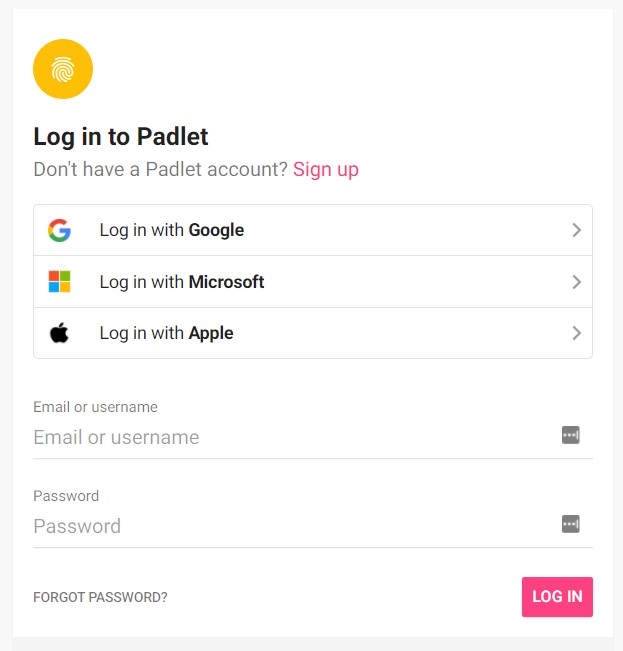
Every Login Page Element should be separated and individually handled by style, not only the authentication elements. This includes also the following elements:
- New Registration Link
- User Agreement Link (Terms of Service)
- Public Area*
- Forgot your password?*
- Forgot your username?*
- Language Selection
2021-05 Mela, Alix [ILIAS_LM] (zu Dokumentationszwecken)
Zur Debatte (pschmitt, ezenzen, ILIAS_LM) stand die Variante, wie bei neueren Loginverfahren auf dem ersten Loginscreen nur ein Eingabefeld für den Benutzungsnamen zu präsentieren und erst auf dem zweiten Screen das Passwort abzufragen (Bsp. Microsoft). Wenn der Benutzungsname eindeutig ist, würde ILIAS "von sich aus" die Auth-Methode anwenden. Wenn der Benutzungsname nicht eindeutig wäre, würde ILIAS nachfragen, welche Methode man wünscht.
Einschätzung des damaligen Maintainers (Stefan Meyer): Diese Variante ist technisch schwierig umsetzbar, da der Benutzername nicht eindeutig genug ist. Benutzer. bzw. Loginnamen können mehrfach verwendet werden, sodass eine eindeutige Zuweisung nicht möglich ist.
Zenzen, Enrico [ezenzen] 2021-06-14 (added by Mela, Alix [ILIAS_LM] )
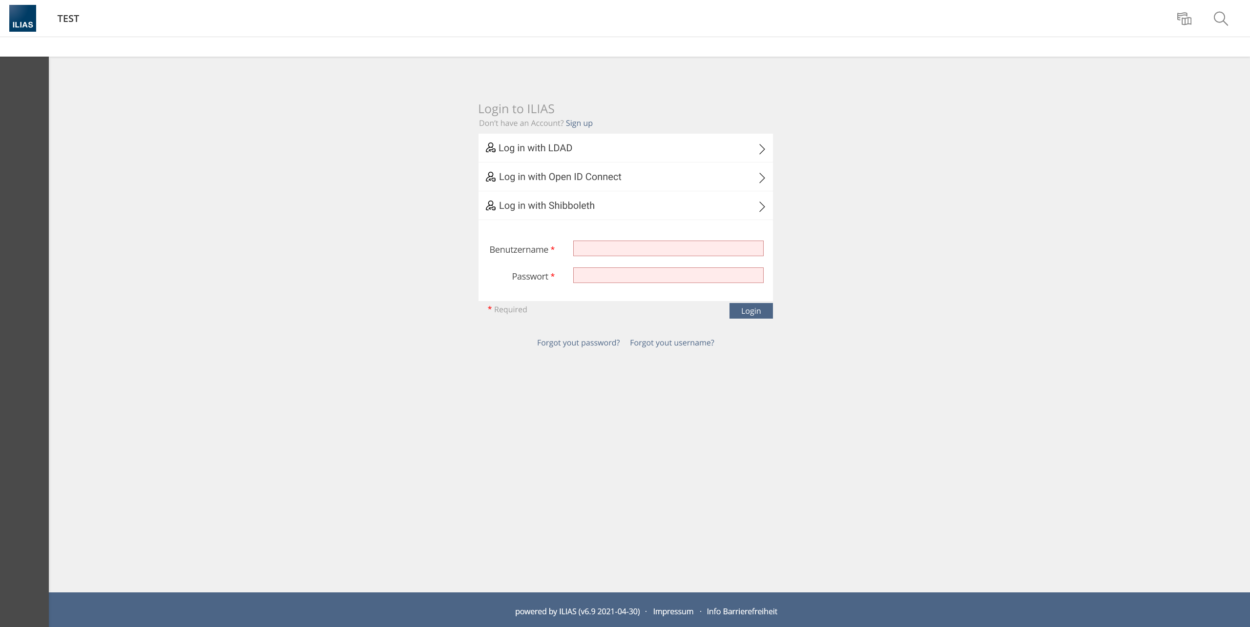
Meine (Paddlet-)Darstellung würde wohl so aussehen ;). Die UI Komponenten gibt es schon. Die einzelnen Loginmethoden werden mithilfe von Bulky Buttons angezeigt. Darunter befindet sich ein Form. Ob diese Kombination so möglich ist, würde ich den Jour Fixe entscheiden lassen.
10 Implementation
Test Cases
Approval
Last edited: 15. Apr 2024, 13:49, Kunkel, Matthias [mkunkel]
