Feature Wiki
Tabs
Beautification of Matching Question
Page Overview
[Hide]1 Initial Problem
- The matching question provide very little visual clue, what to do.
- The items in a Matching Questions are partucularly ugly.
- Plus: They cannot bey styled via the style editor.
2 Conceptual Summary
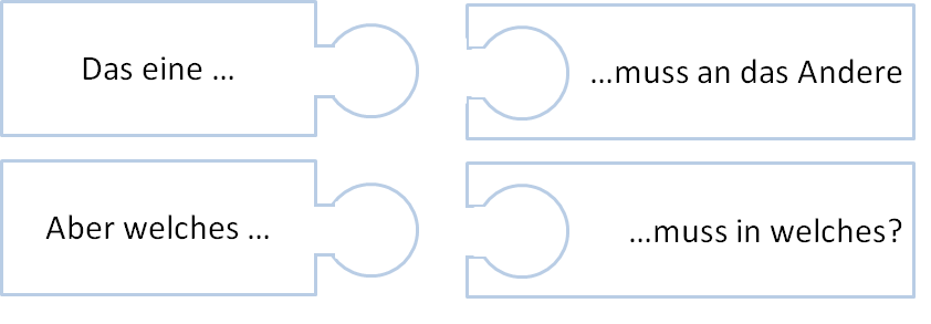
- The outlines of the Matching Question should be visually re-done and feature a well known visual pattern of "please connect" known from puzzling.
- The items should be styleable by the style editor.
3 User Interface Modifications
3.1 List of Affected Views
Test Player
3.2 User Interface Details
3.3 New User Interface Concepts
{If the proposal introduces any completely new user interface elements, you might consult UI Kitchen Sink in order to find the necessary information to propose new UI-Concepts. Note that any maintainer might gladly assist you with this.}
4 Technical Information
{The maintainer has to provide necessary technical information, e.g. dependencies on other ILIAS components, necessary modifications in general services/architecture, potential security or performance issues.}
5 Contact
- Author of the Request: {Please add your name.}
- Maintainer: {Please add your name before applying for an initial workshop or a Jour Fixe meeting.}
- Implementation of the feature is done by: {The maintainer must add the name of the implementing developer.}
6 Funding
- …
7 Discussion
Kergomard, Stephan [skergomard], 2022 Mar 9: We close this as part of the cleaning up effort undertaken in the Splitting-Up Test & Assessment Workinggroup.
8 Implementation
{The maintainer has to give a description of the final implementation and add screenshots if possible.}
Test Cases
- {Test case number linked to Testrail} : {test case title}
Approval
Approved at {date} by {user}.
Last edited: 9. Mar 2022, 13:43, Kergomard, Stephan [skergomard]

