Feature Wiki
Tabs
Improved navigation at end of initial test in course with learning objectives
Page Overview
[Hide]1 Initial Problem
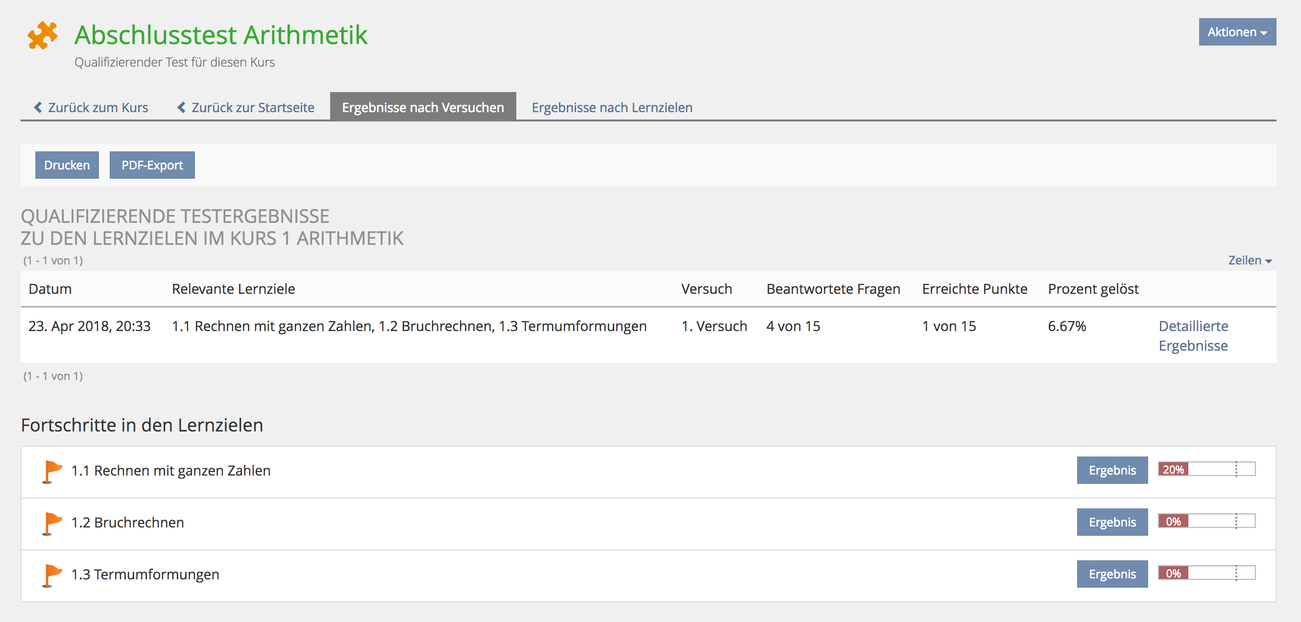
Users are often spacy when finishing an inital test. They would prefer a clearly indicated way to return to the course where they started the test. They miss the links "Back to Course" and "Back to Start Page" in the tab bar due to the presence of the Print and Export button.

2 Conceptual Summary
- For initial tests the button should be labeled with ...
- Continue Course
- Weiter zum Kurs
- For final tests the button should be labeled with ...
- Back to Course
- Zurück zum Kurs
3 User Interface Modifications
3.1 List of Affected Views
Test » Results by Attempts / Results by Learning Objectives
3.2 User Interface Details

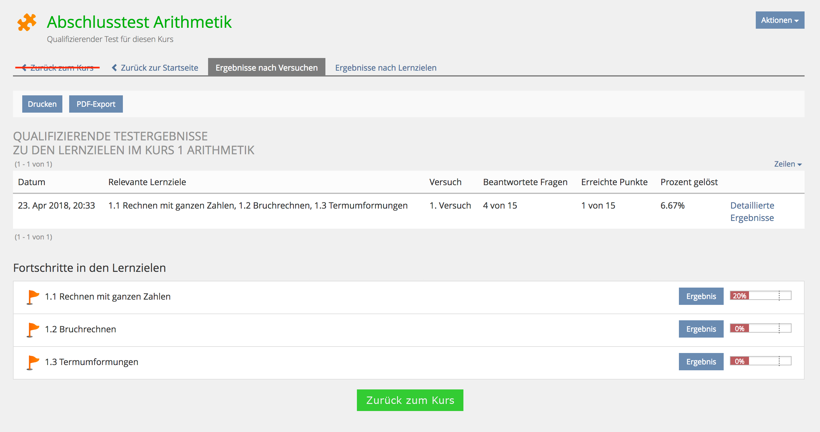
A new 'Big Button' is introduced on the screen to give a simple and obvious option to go back to the course content page where a learner should go next after having completed the initial test in a LoC. The current link 'Back to course' in the tab row will be removed.
3.3 New User Interface Concepts
The new KS element 'Big Button' will be used for this 'Back to Course' button.
4 Technical Information
{The maintainer has to provide necessary technical information, e.g. dependencies on other ILIAS components, necessary modifications in general services/architecture, potential security or performance issues.}
5 Contact
- Author of the Request: Kunkel, Matthias [mkunkel]
- Maintainer: Heyser, Björn [bheyser]
- Implementation of the feature is done by: {The maintainer must add the name of the implementing developer.}
6 Funding
- DHBW Mannheim
7 Discussion
Heyser, Björn [bheyser], 03 April 2017: All screens of tests used in a LoC scenario that does have a tabbar offers a back link called back to course by concept. With test screens that offers any back link in general, this one becomes the second back link for the just described LoC situation. When there is no back link this should be considered as bug imho.
Kunkel, Matthias [mkunkel], 22 JUN 2018 : This feature request is based on user feedback from the optes project (mostly ILIAS newbies) that have serious problems to know what to do next when finishing the initial test in an LoC. The big green button at the bottom of the form is much more obvious than the little link on the upper left side. This request suggests to remove this 'Back to course' link from the tab bar and make a proper big button out of it.
- The button "Back to Course" is used for navigation only. But buttons should not be used for navigation.
- The button is not well embedded in the page layout. A kind of tool bar might be better.
- What is the rule for the KS that distinguishs in which cases such a button can be used instead of double back links?
- We consider it as a problem of learnability when back buttons are presented in different versions (button vs. link). A general solution for this problem would be highly appreciated.
Kunkel, Matthias [mkunkel], 18 JAN 2022 : The problem still exists. But at the time being there are more important issues to solve for the test and the course. This is why I take this request out of the list of actual requirements. One day it might appear there again ...
8 Implementation
{The maintainer has to give a description of the final implementation and add screenshots if possible.}
Test Cases
- {Test case number linked to Testrail} : {test case title}
Approval
Approved at {date} by {user}.
Last edited: 18. Jan 2022, 14:11, Kunkel, Matthias [mkunkel]