Feature Wiki
Tabs
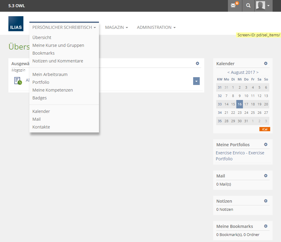
resorted and shortened menu of Personal Desktop
Page Overview
[Hide]1 Initial Problem
The personal desktop drop-down is overcrowded. The menu contains sections which can be reached in other ways.
Current implementation:
PERSONAL DESKTOP
Overview
My Courses and Groups
Bookmarks
Notes and Comments
News
————————————
My Workspace
Portfolio
My Competences
Learning Progress
————————————
Calendar
Mail
Contacts
————————————
Badges
————————————
Personal Profile
Settings
2 Conceptual Summary
- "Badges" should be included in group of „My Workspace" and "Portfolio" as a fourth point. (Between „My Competences“ and „Learning Progress“.)
- "Personal Profile" and "Settings" should be removed from the menu. Both sections are available on the profile image / avatar.
PERSONAL DESKTOP
Overview
My Courses and Groups
Bookmarks
Notes and Comments
News
————————————
My Workspace
Portfolio
My Competences
Badges
Learning Progress
————————————
Calendar
Mail
Contacts
3 User Interface Modifications
3.1 List of Affected Views
Screens with shown Mainmenu.
3.2 User Interface Details
New user interface elements: No
Other textual appearance of the UI elements: No
New behaviour of the UI elements: No
3.3 New User Interface Concepts
No
4 Technical Information
No technical issues.
5 Contact
- Author of the Request: Samoila, Oliver [oliver.samoila]
- Maintainer: {Please add your name before applying for an initial workshop or a Jour Fixe meeting.}
- Implementation of the feature is done by: {The maintainer must add the name of the implementing developer.}
6 Funding
- possibly Technische Hochschule OWL
7 Discussion
Killing, Alexander [alex], 20 Mar 2017: Would be ok for me.
Kunkel, Matthias [mkunkel], April 04, 2017: I support this request. But we should think about the labeling of those entries. Sometimes they are called "My ...", sometimes not.
Samoila, Oliver [oliver.samoila], April 05, 2017: Basically, all elements are personal elements, so they can be labeled with "My".
This damages the readability clearly.
If something is to be changed on the labels, I would remove the existing "My".
Samoila, Oliver [oliver.samoila], April 10, 2017: Dear JourFixe, please consider whether the arrangement of the element badges could become a usability fix for 5.2.
JourFixe, ILIAS [jourfixe], April 10, 2017: We highly appreciate this suggestion and schedule it for 5.3. We would like to get rid of the "My" prefix in all entries.
8 Implementation
Test Cases
- C18651: Das Menü 'Persönlicher Schreibtisch'
Approval
Approved on 2017-08-16 by Samoila, Oliver [oliver.samoila].
Last edited: 2. Apr 2019, 20:30, Samoila, Oliver [oliver.samoila]

