


Feature Wiki
Tabs
Bulletin presentation for Survey Results
1 Requirements
- Stacked bar chart: One rectangular shape stretching horizontally. Only one rectangle per question covering all answer options, full form represents 100%. Needs very little screen estate.
- Column chart: For each answer option there is one rectangular shape stretching vertically. Needs a lot of screen estate.
- Pie Chart: For each answer option that was selected at least once, there is one piece of pie. All pieces of pie forming a circle. Needs a lot of screen estate.
- Line charts are ruled out since they require a lot of data of a high type of scale which is typically not to be expected.
The following table lists what chart would be suitable for what question type in general
Question Type | Options for charts |
|---|---|
Multiple Choice (Single Response) | Stacked bar chart, column chart, pie chart |
Multiple Choice (Multiple Response) | Stacked bar chart, column chart, pie chart |
Matrix Question | Stacked bar chart |
Metric Question | Column Chart or no chart |
Essay | No chart |
1.1 Status and Mock-Ups per Questions Type
The concept of Bulletings in Surveys is based on the KS-Entry: Bulletin.
1.1.1 Essay Question
The essay question has no chart. This should stay this way.


1.1.2 Matrix Question
In ILIAS 5.1 the matrix report comes with one entry per row which is quiet disturbing. All rows of a matrix should be reported within one single Bulletin, there should be no longer be one Bulletin per row.
Since multiple rows of a matrix are to be displayed in one single report it has to be a Stacked bar chart, since this allows displaying data with little space. Pie charts would eat up way to much space as would columns, too.


1.1.3 Multiple Choice Question (Multiple Response)
- Stacked bar charts are most economical concerning the space they cover but they are not as intuitive to read and compare the relative sizes of their individual segments to each other.
- Columns charts are the dullest but most intellgible option.
- The pie chart consumes the most space of these options.


1.1.4 Multiple Choice Question (Single Response)
Same as Multiple Response


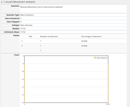
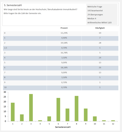
1.1.5 Metric Question
This has to be a column chart or no chart.
1.2 The Sub-Tab "Details" in the Results-Tab
The screenshot shows the “Details” sub-tab of the “Results”-tab of the standard survey. It shows a toolbar, a kind of summary table and reports for individual questions.
The “Details” sub-tab of the “Results”-tab of the 360° feedback survey is the same as for the standard survey except for the toolbar: It contains an additional control for selecting appraisees.
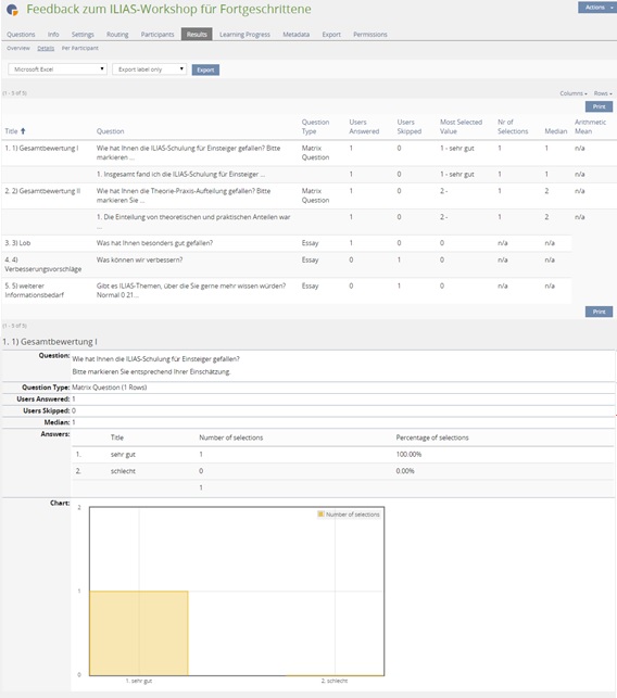
Toolbar
Another part of the toolbar should allow for configuring the reports. One can select the figures to be included and the type of presentation.

...
2 Additional Information
- Idea / concept: Alexandra Tödt
- Interest in funding: (please indicate if you are interested/able to fund this feature)
- Maintainer: (will be set by Jour Fixe / maintainer)
- Implementation of the feature is done by (will be set by Jour Fixe / maintainer)
- Testcases by: (please add your name if you want to create the testcases for this feature)
3 Discussion
Our thoughts about some aspects from above:
- 1.2 The Sub-Tab "Details" in the Results-Tab > Toolbar: We would prefer another order for the "Presentation" dropdown: Both | Table | Chart (Both = default). Because at the moment charts are visible per default and mostly they are easier to scan the results than a table.
- Report Card: We like the report card and block version. Please consider also the PDF-Export version of this new survey result views.
- Charts: Have you already thought about accessibility? In the version ILIAS 5.0 you have numbers to merge the stacks with the answers (f.e. 1, 2,...). Now you only would have colors which would be a problem for color blind people or if you made a black-and-white print. Would there be a hint for such handicapes?
- I know this problem also appears at the "poll" tool....
- Spider Chart: update 23.05.2016 yvseiler: Discussion with Alexandra Tödt changed my mind about spider charts. Because they aren't easy to interprete I would change my comment below: Matrix questions doesn't need a spider chart. In 360° Feedback you have a Spider Chart for the matrix question. Did you already thought about it, if spider chart would be interesting for the Matrix Question (SC)? => because it's already a feature in survey. But I do not know if this would be really a good idea - just a train of thought.
JourFixe, ILIAS [jourfixe], June 20, 2016: We highly appreciate this suggestion and schedule the feature for 5.2.
4 Implementation
, 23 Aug 2016: This feature has been implemented as described above.


Test Cases
Approval
Approved at 2016-08-18 by alenich.
Last edited: 23. Aug 2016, 10:16, The user has been deleted