


Feature Wiki
Tabs
Set Containers to Deck of Card Listing
Page Overview
[Hide]1 Initial Problem
- Tutors create a responsive grid.
- Tutors upload images and use the fancily layouted media caption as "title replacement".
- Tutors link images to objects.
- Tutors hide the list of objects by cramming them in a folder, which is not visible but readble to ther target audience.
2 Conceptual Summary
- Tutors configure the presentation of their list of objects:
- presented as Deck of Cards
- presented as List of Items.
- In case Deck of Cards is set all objects in that container are presented in the Content-tab as a grid with Cards as representation.
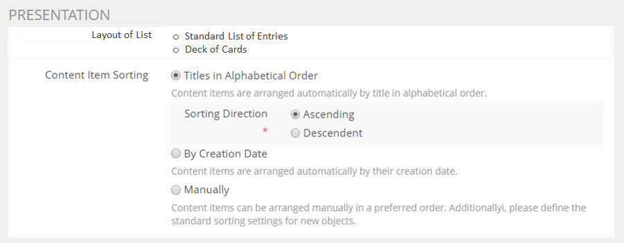
2.1 Location of Setting in Settings-Form
- Setting the way Listings are presented is done in the Settings tab before the Content Item Sorting Setting.
- IF Content Item Sorting and the Layout of List do not work together, the form should fight back against being saved and present an error message on the top of the form.
- This is envisaged to happen when a Course is set to Learning Objective-Driven Course and Cards. However this could be avoided by Making Learning Objectives-Driven Course a Type of Course instead of a Setting
2.2 Decision: Visualisation of Object-Type
- Cards feature an KS: Outlined Icon to visually indicate the type of object.
- pros: This option is very beautiful
- cons: Preparing Outlined Icons is a lot of work and may not be feasible in all cases
- Cards do TEXTUALLY indicate the type of object. Object-type is written in front of the title.
- pros: No Outlined Icons need to be prepared
- cons: Less beautiful and pushes titles to have two lines or more
- Cards do NOT indicate the type of object.
- pros: No effort spent
- cons: Users cannot understand what they are up against

 Options for Visualisation of Object-Type
2.3 Display of Object Properies
Things that could be displayed | Deck of Cards |
|---|---|
Icon | if Option 1 is chosen then outlined Icon is used in the left corner |
Image | Background |
Title | displayed, of Option 2 is chosen, then it is preceded by textual statement of Object Type |
Description | the first 120 characters are isplayed, the rest is abbreviated. |
Learning Progress | the learning progress status representation could be displayed |
Certifiacte | a certificate representation could be displayed |
Properties / Metadata | are displayed underneath titele and description |
Actions | Actions are displayed |
Availability / Preconditions | are displayed, the image is ddisabled, the textual representation textually remains as in normal list |
Rating | is not displayed |
Tagging | is available via Actions and the respective modal, but are not displayed directly |
3 User Interface Modifications
3.1 List of Affected Views
- Category > Settings
- Category > Content
- Folder > Settings
- Folder > Content
- Group > Settings
- Group > Content
- Course > Settings
- Course > Content
- All objects
3.2 User Interface Details
Category
 Category_Settings
 Category set to "Cards"
Folder
 Folder > Settings
  Folder with Content set to "Cards"
Group
 Group > Settings
 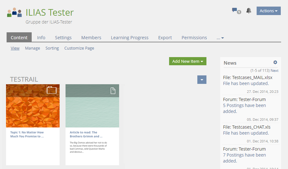 Group set to "Cards" in which an Item Group titled "Testrail" is used
 Course > Settings
 Course set to "Cards" and "Timings View"
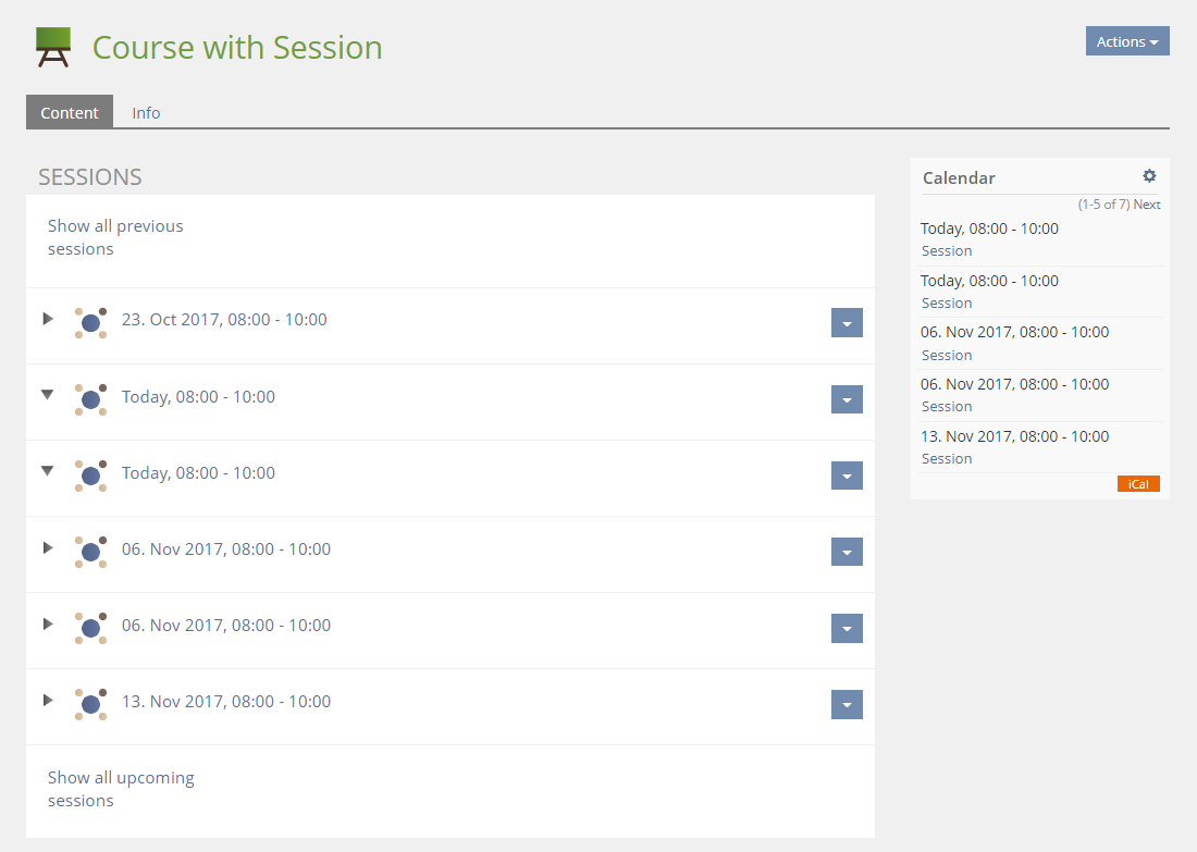 How it is in 5.3
 Sessions set to "Cards"
- Simple View and Grouped by Type were not drawn since they very closely resemble what was drawn i.e. in Folders.
3.3 New User Interface Concepts
- Deck of Cards
- KS: Outlined Icon
4 Technical Information
{The maintainer has to provide necessary technical information, e.g. dependencies on other ILIAS components, necessary modifications in general services/architecture, potential security or performance issues.}
5 Contact
- Author of the Request: Tödt, Alexandra [atoedt]
- Maintainer: Killing, Alexander [alex]
- Implementation of the feature is done by: Killing, Alexander [alex]
6 Funding
7 Discussion
Klees, Richard [rklees], 2017-11-06: I really like the feature in general, but I'm not happy with how this request is made. From my POV there are about 90% visual problems problems to be solved here. E.g. there is the question on how icons of objects could be presented on a card ("Outlined Icon"). We agreed on a process ("KS-process") to discuss these questions. For the other part I'm not happy with the card and the deck of cards for this feature. This isn't a problem of this feature but of the KS, but this request shows it. To me, we would be better modeling the "cards" as "items" and then introduce a new type of listing for these items. After all, that's what these cards are. I also wonder, where the images for the cards come from and how a default could look like. Did I miss something?
JourFixe, ILIAS [jourfixe], NOV 06, 2017: We highly appreciate this suggestion and like it very much. We prefer the 'Outlined Icon' for visualising the object types but would accept also 'Textual Indication' as fallback if we cannot generate outline icons from our new icon set for all existing repository object types. Therefore, we involve our icon designer in this discussion. Before scheduling it for 5.4, this investigation should be made. Additionally, we would like to know how the 'Actions' dropdown is presented for an item on such a deck of cards. And please give us a short outlook on how other object properties could be presented on the top bar of such a deck. This will also influence the decision on the position of the object type icon.
Tödt, Alexandra [atoedt] 2017-11-15: @ RK I totally agree and made a request to that effect with Timon. Please give your opinion in the respective bug report / JF discussion.
Concerning the process, I will try to create Pull Requests. However as a subsitute I ddid create Featurewiki entries with sggested rules and linked them in the article.
Kunkel, Matthias [mkunkel], 16 NOV 2017: CaT will offer us an outlined version of the Milos icon set as a donation. So the version with 'Outlined Icons' could be realised for 5.4.
Kunkel, Matthias [mkunkel], 16 NOV 2017: I have thought about the icon positioning on the new desk of cards presentation and where to place what. I laid a grid over the current card and would like to make some suggestions for the next steps.

A1-B4 : Object image
A1-A4 : Darkened layer over object image
A1 : Object icon (outlined form)
A2 : Reserved space for Learning Progress (outlined form)
A3 : Reserved space for Certificate (outlined form)
A4 : Actions dropdown (outlined form)
C1-C4 : Object title
D1-D4 : Object description
E1-E4 : Additional information
- Laying a grid over a card shows the need of a clear height and width ratio. I am not sure if the current mock-ups above do have such a ratio already. Based on my grid above I would suggest to implement a 4x6 ratio (therefore row B is two grid rows high).
- I also thought about placing the Actions dropdown into cell C4. But this reduces space for the object title. And I am bit afraid that the space becomes to narrow to display the title. Additionally, placing the Actions in row A has more conceptual strenght (all icons/glyphs in one row).
- I know that several customers would like to have a clear visual presentation of existing certificates and the current learning progress. This is why I offer such cells in my suggestion. But the simple ListGUI (suggested name to distinguish it from the desk of cards) already shows additional visual information for which we might need some space to display it in the DoC:
- Rating: currenlty only supported by some objects and displayed as five stars in a row. Alternative presentatin for DoC could be in a ring of stars and placed in A3
- Tags: should be placed in row E but could get into conflict with another additional information like timings (needs either priorisation what is shown or decision not to display it in the DoC)
- Offline: it is just text but highlighted and presented in a separate row at the time being. How about adding (Offline) after the object's title?
- Anything forgotten?
- Last but not least: I would like to introduce an additional look for the DoC that might be an attractive alternative to the one presented above. It is a 4x4 grid that hides rows D and E and extends the background image to row C including a darkened background and with a title in white. In this case the cards would be squarred and completely filled with the background image. This is a bit like the button-like look on the start page of ilias.de. I think this would look quite good and save also height. But it is only useful in specific scenarios and should therefore be an option.
- All icons should be linked: F.e. object-type-icon = link to content, learning progress icon = link to learning progress tab, certificate = download certificate, actions = actions dropdown
- Cell A2 (learning progress) and A3 (certificate) perhaps could be merged in one - I do not really know if it's possible to get them both on one screen?
- Perhaps row E could be "expandable", depends on how many "feature" would be visible for this card (preconditions, tags,...). We should consider that all cards have the same height, so we don't have an aliasing. Or we decide which features are available in this deck of cards view (global setting, manual setting for each deck of cards or non-customizable default).
- Last but not least: I draw a 4x4 example with the divisions above, how it could looks like (no visualisiation for action menu at the moment).
 4x4
4x4Tödt, Alexandra [atoedt], 20 NOV 2017: Latest mock-up suggestion, incl. Actions menu.

- A1 : object icon
- A2 : learning progress status or certificate
- A3 : left empty
- A4 : Actions dropdown
- Limit the setting to categories for 5.4 (which groups "by type")
- Add a info text that only types that support the image upload (most important courses) are listed as tiles, all others fall back to the standard list presentation.
Kunkel, Matthias [mkunkel], 24 FEB 2019: When creating a new container and changing to tile view, no default background is defined for the tile. It is just white. It would be highly appreciated if ILIAS comes already with a predefined background other than white. With the white background it looks as if this view is broken because white = nothing. How about deliver this feature with a png image in 'brand-primary' = #4c6586?
- use images per object type to define the background of a tile. Alexander will check if it is possible to include less information into svg images to re-use the defined colour scheme of the ILIAS system style. Otherwise, he will use 1 pixel PNGs.
- This solution will handle all plugin objects as one type.
- This solution allows to substitute the default images by customised ones in the system skin.
8 Implementation


Test Cases
- 24852 : Kategorie mit Kachelbild versehen
- 24853 : Kategorie auf Kachel-Anzeige umstellen
- 24854 : Ordner mit Kachelbild versehen
- 24855 : Ordner auf Kachel-Anzeige umstellen
- 24856 : Gruppe mit Kachelbild versehen
- 24857 : Gruppe auf Kachel-Anzeige umstellen
- 24858 : Kurs mit Kachelbild versehen
- 24859 : Kurs auf Kachel-Anzeige umstellen
Approval
Approved at 23.10.2018 by Lenich, André [andre.lenich].
Last edited: 25. Feb 2019, 15:53, Kunkel, Matthias [mkunkel]