Feature Wiki
Tabs
Test Results: Show right answers in Show users detailed results (marked passed)
Page Overview
[Hide]1 Description
For tutors which have to look the test results of participants, it could be helpful if the right solution would also be on the bottom of an answer.
In the participants view there a test participants can click on a question (in the menu Show test results > Pass details) and see his answer and the right one beneath (see screenshot). The possibility of showing the participants answer and the right answer beneath it, could be helpful in analysing the problems a participant had with this question (not everyone knows all the right answers of a test by heart).
The solution could look like the view of the participants (the right answer is beneath the participants answer), or the right answer could be fold-out (like in the menu "manual scoring" where you can set manual feedback).

See also: Test Results: Link the question with an anchor
2 Status
- Scheduled for Release: ILIAS 5.0
- Funding: Universität Bern
- Development: Feature is to be developed by Databay AG
- Contract settled: Yes
- Tested by / status: Yvonne Seiler iLUB, tested on 4.5
3 Additional Information
- If you want to know more about this feature, its implementation or funding, please contact: Yvonne Seiler Universität Bern / yvonne.seiler@ilub.unibe.ch
4 Discussion
JF 15 Nov 2010: We highly appreciate the idea. Maybe this could be toggled on/off. But if only one answer is shown, it should be ok to show the correct solution additionally below in general.
These are the problems of the starting position
- The view of test results of participants and administrator are different and should be adapted.
- It takes a few steps until you get the "correct/wrong" view of your answers, it should be possible to get this access easier.
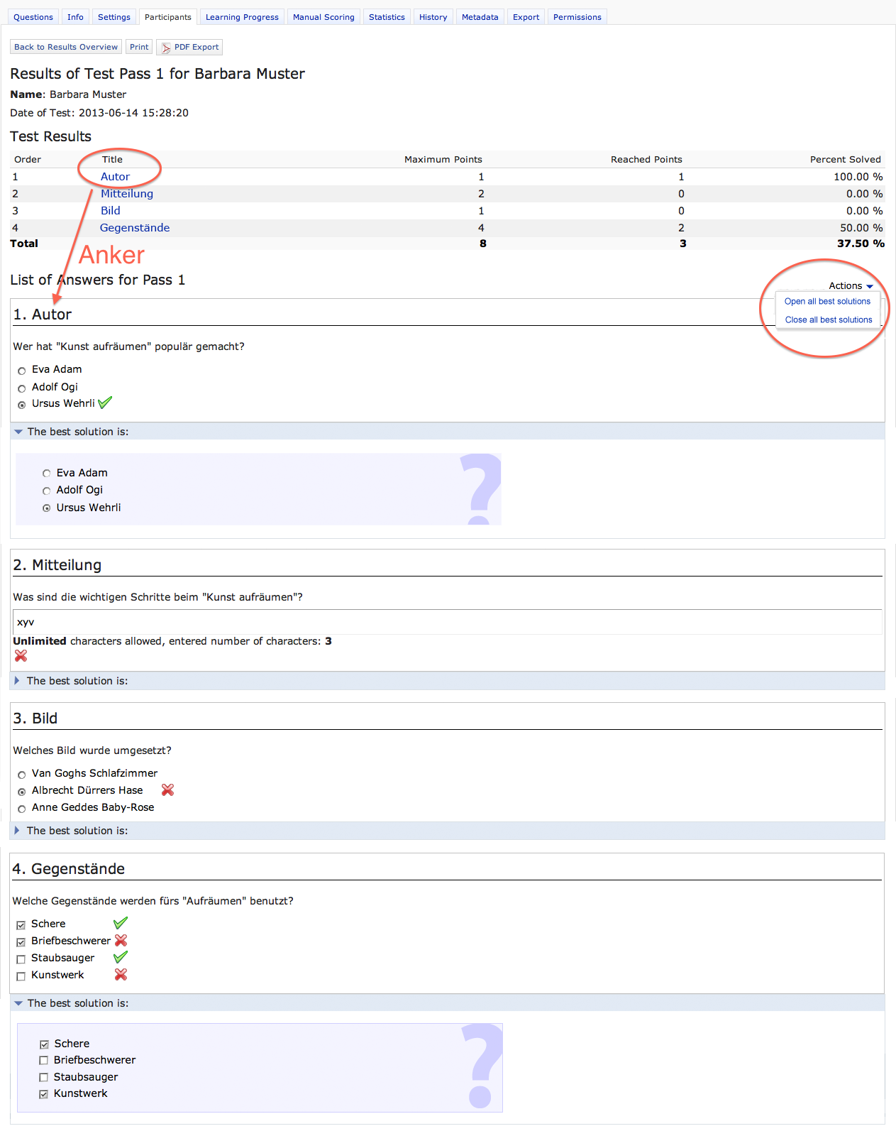
We think about a three-step format of the test results (see mockup):
- Test results with own answers in a list (List of Answers)
- Test results with own answers (List of Answers) enhanced with corrections (correct or wrong, icon green-checking or red-cross)
- Test results with own answers (List of Answers) enhanced with best solutions as an accordeon/register beneath each question
(1) participant view of test results (Test > Info > Show Test Results > Actions > Pass Details):
- If test setting "Show Pass Details for Running Test" is activated, the participant gets access to his test results. => familiar behaviour and design
- If test setting "Show List of Answer" ist activated, the list of answer is shown. => familiar behaviour and design
- If test setting "Show Solutions in Test Results" is activated, the correct/wrong answers are marked with a green checking-icon or a red cross-icon. => This view is familiar to the actual admin view (Participants > Show Test Results > Actions > Pass Details). Participants haven't to click on the title of a question to see, which answers are correct or wrong (as they have to do now). Everything will be shown on the same site. Not like now, where you get redirected to a new site. => bevahiour and design have to be adapted (see mockup)
- If test setting "Best Solution in Test Results" is activated, the best solution will be shown. => Participants haven't to click on the title of a question to see, which were the best solution of a question. Best solution will be shown in a accordeon/register beneath the answer of the participant. => bevahiour and design have to be adapted (see mockup). With an action-menu you can expand or collapse all best solution. This setting has an impact to the print-version.
- "Reached Points" should be shown beneath each answer, so participants don't see only the reached points in the overview above, but also beside every answer. This option should be show if you activated "Show Pass Details for Running Test". => actually you see this option in the test admin view (Participants > Show User's Detailed Results (marked pass)), this informations should be shown for participants too. => design has to be adapted
- Question title in overview table will be linked with an anchor to the answer of each question. => Until now the title were linked with an other site (correct answer and best solution). This site is dispensable, because the correct answer and best solution will be shown in list of answer. => behaviour has to be adapted
- Admin of a test gets access to all tree steps of test results, means "List of Answer", "correct solutions" (Show Solutions in Test Results) and "best solutions" (Best Solutions in Test Results). He will see all these three steps everytime. => current view of "Show Test Results" will be added with the accordeon solution of "best solution".
- "Reached Points" should be shown beneath each answer, so admins don't see only the reached points in the overview above, but also beside every answer. => actually you see this option in the test admin view (Participants > Show User's Detailed Results (marked pass)), this informations should be available for Participants > Show Test Results > Actions > Pass Details too. => behaviour has to be expanded
- Question title in overview table will be linked with an anchor to the answer of each question. => Same behaviour like new participants view (see (1))
Perhaps the order of these options in test Settings > Scoring and Results should be discussed and reordered. Our proposal (checkboxes):
- Show Pass Details for Running Tests
- Show List of Answers
- Show Solutions in Test Results
- Best Solution in Test Results
- ...
- Show Pass Details for Running Tests
- Show List of Answers
- Show Solutions in Test Results
- Best Solutions in Test Results
- ...
JF 8 Jul 2013: We schedule the original proposal for 4.5 again, Björn Heyser will work through the comment and simiar requests and add additional feedback.
The new presentation of best solution in the detailed answer list (Erweiterung Präsentation Testergebnisse) should be configurable:
- The best solution can either be displayed next to or below the students answer.
- If the best solution is to be displayed below the students answer, it should be contained in an accordion.
JF Sep 16 2013:
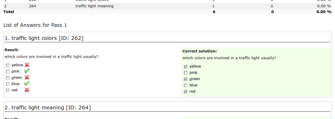
Screenshot of current implementation (4.4 alpha) coming from the EA branch:

We think the presentation side-by-side is more readable. We currently do not support the implementation of two different ways to present the correct solution, so the accordion implementation can be skipped. The activation of the presentation for learners must be configurable. The options should not affect the presentation for tutors. For tutors a "toggle" on top of the page "Display Correct Solutions On/Off" would be ok.
- "Result" should be named "Your Answer"
- "Correct Answer" should be named "Best Solution"
- The option should be renamed to "Show Best Solution in List of Answers"
- The option should be a suboption of "Show List of Answers"
5 Implementation
MJ 08 May 2014: Implemented and integrated into v4.5.0 Alpha by Björn Heyser
- "Result" is now named "Your Answer"
- "Correct Answer" is now named "Best Solution"
- The option was renamed to "Show Best Solution in List of Answers"
- The option is now a suboption of "Show List of Answers"
BH 19 Jan 2015: Implementation Description
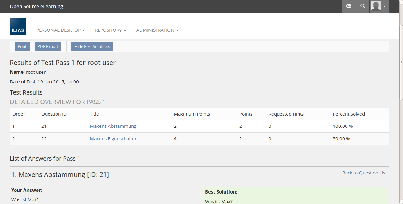
This feature added/streamlined the presentation of best solutions beside the user solution within the list of answers for a single pass in the context of user results (the user view) as well as participants results (the tutors view) as shown in the next two screenshots.
The presentation of best solutions for users is enabled by the setting "Show Best Solution in List of Answers" within the Scoring&Results settings.
Within the tutors view the presentation can be toggled by a toobar button.


6 Test Cases
YS, 21 July 2014: Test cases for this feature are collected by iLUB from Universität Bern on the authority of Databay.
initial = must be tested in first testing only
wk = (dt. wiederkehrend) must be tested for every new ILIAS-version
Last edited: 17. Apr 2025, 14:47, Kunkel, Matthias [mkunkel]

