Feature Wiki
Tabs
Accordeon behavior
1 Description
Suggestion 1: New icons/behaviour of vertical accordeon (icons): see accordeons at Adobe: http://www.adobe.com/de/products/elearningsuite/features/
- Default icon of the vertical accordeon: points to the right
- If you click the accordeon: the accordeon opens, ant the icon then points to the bottom
And the second suggestion for the horizon accordeon
- Default icon of the horizonal accordeon: Use a small "vertical rectangle" for the default icon. (see http://www.photoshopnerds.com/images2/xp_icon_01.jpg)
- If you click the accordeon, the rectangle grows to a square
2 Status
- Scheduled for: ILIAS 5.0 (first version was 4.2)
- Funding: Funded by Universität Bern
- Maintainer: Alex Killing
- Implementation of the feature is done by Leifos
- Contract settled: Yes
- Tested by / status: (name, e-mail), (status information set after implementation)
3 Additional Information
- If you want to know more about this feature, its implementation or funding, please contact: HJ Lauener Universität Bern / lauener [at] ilub.unibe.ch
4 Discussion
JF 26 July 2010: We agree that this can be improved. However the implementations, especially in the content editor, are already quite complex (also wrt the style editor). We should work out a guideline for 4.2.
M. Kunkel, A. Killing, 1 Apr 2011: We confirm the feature for 4.2. We will go on with the guideline discussion during the development.
JF 9 May 2011: We will continue the discussion on the Expandable Areas Guideline page.
- Accordion (Vertical): close = arrow down; open = arrow up
- Accordion (Horizontal): close = arrow right; open = arrow left
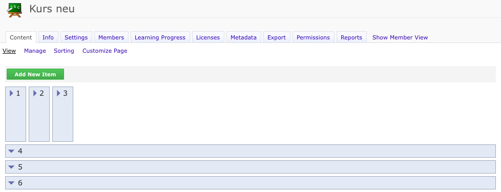
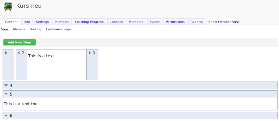
Alex Killing, 4 Apr 2014: I support this feature request. I support also to change the guideline for accordions as outlined in Yvonnes comment above. We will need two new style classes in the ILIAS style editor for the expanded states.
- Arrow to the right: The area is collapsed and can be expanded.
- Arrow downwards: The area is expanded and can be collapsed.
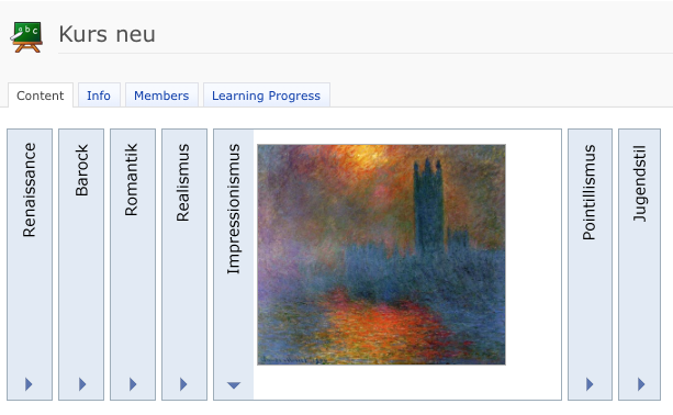
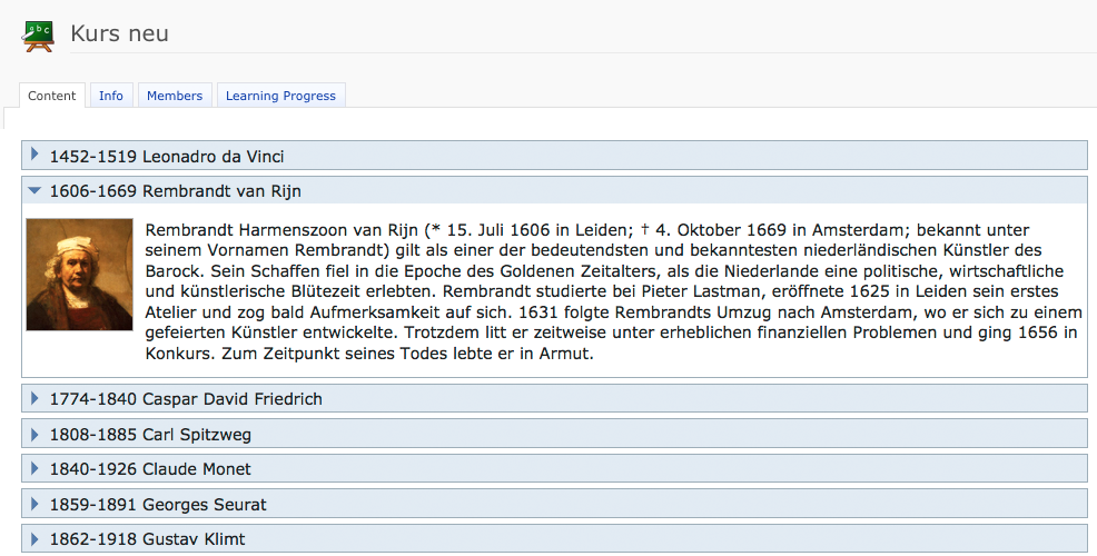
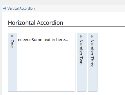
YS, 13 May 2014: We've elaborated a new version for horizontal and vertical accordeons with collapsed and expanded view. We accept our decision to use always the same arrows (see JF 28 Apr 2014), but we'd like to adapt the horizontal accordeon with rotaded lettering (see Mockups). This is a common use for horizontal accordeons (f.e. http://webdesignandsuch.com/top-20-horizontal-jquery-accordion-plugins-for-websites/). A further benefit is, that the horizontal accordeons don't need so much space anymore.
JF 26 May 2014: We agree with YS suggestion but would prefer to place the icons on top in the case of horizontal accordions.
Matthias Kunkel, 02 Feb 2015: It's a pity that existing content styles cannot use the new accordion behaviour. Now I need to rebuild my entire content style only for using this much better accordion design.
Seiler, Yvonne [yvseiler], 28 July 2015: If you would like to adjust your style, you have to change following parameters in your style: Go to your style to "Style Classes" > "Accordions and Panels".
HAccordIHeadCap
Positioning:
- Position: relative
- Top: 20px
- Left: 5 px
- Width: 1 px
Special:
- Transform: rotate(90deg)
- Transform-Origin: Horizontal 0px / Vertical 0px
HAccordIHead
Margin and Padding:
- Padding: Top 3px / Bottom 3px / Left 20px / Right 10px
Background:
- Background Image: tree_exp.png
- Background Repeat: no-repeat
- Background Position: Horizontal 6px / Vertical 4px
HAccordIHeadActive
Background:
- Background Image: tree_col.png
Please note that height of the horizontal accordeon has to be specified in the settings of the accordeon manually (see "5 Implementation" below).
5 Implementation
See screenshots for the new presentation. The CSS is already quite complex. For horizontal accordeons and adequate height must be specified, otherwise text will be cut.
Please note that existing custom content styles are not changed, since this may be unintended by the author and even mess up existing content.
The new presentation is used in the default fallback content style (when no custom style is used) and for newly created content styles.

Last edited: 17. Apr 2025, 14:47, Kunkel, Matthias [mkunkel]
