Feature Wiki
Tabs
Revamp of glossary presentation
Page Overview
[Hide]- 1 Initial Problem
- 2 Conceptual Summary
- 2.1 Current Implementation
- 2.2 Layered Information Architecture
- 2.3 Proposed Implementation
- 2.3.1 Fullscreen PC view
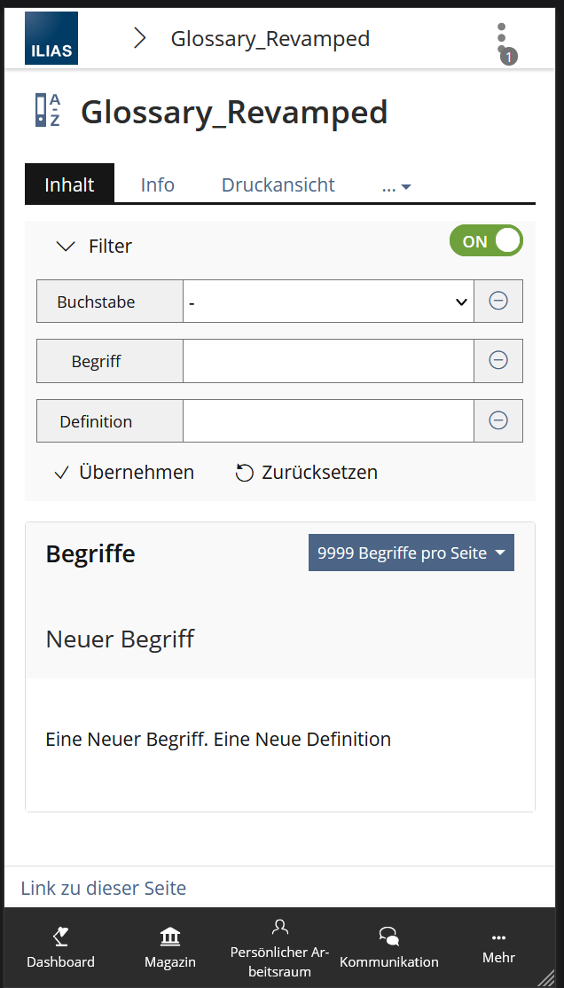
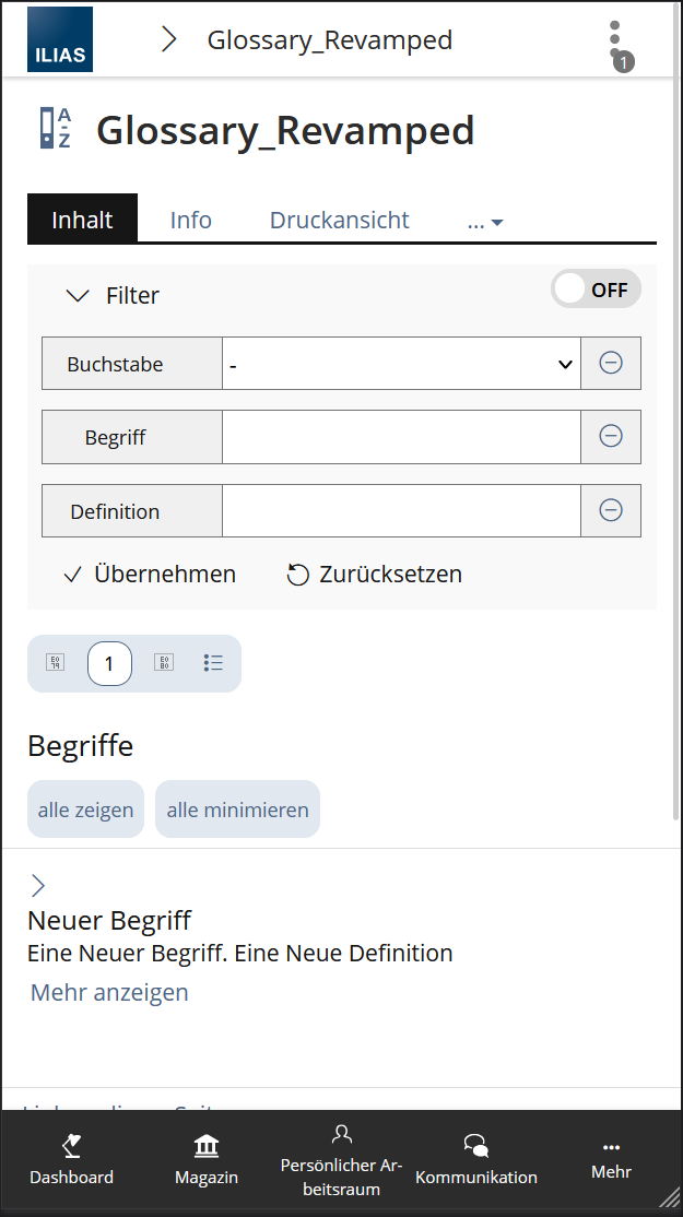
- 2.3.2 Mobile View
- 2.3.3 Change in Definitions:
- 3 User Interface Modifications
- 4 Technical Information
- 5 Privacy
- 6 Security
- 7 Contact
- 8 Funding
- 9 Discussion
- 10 Implementation
1 Initial Problem
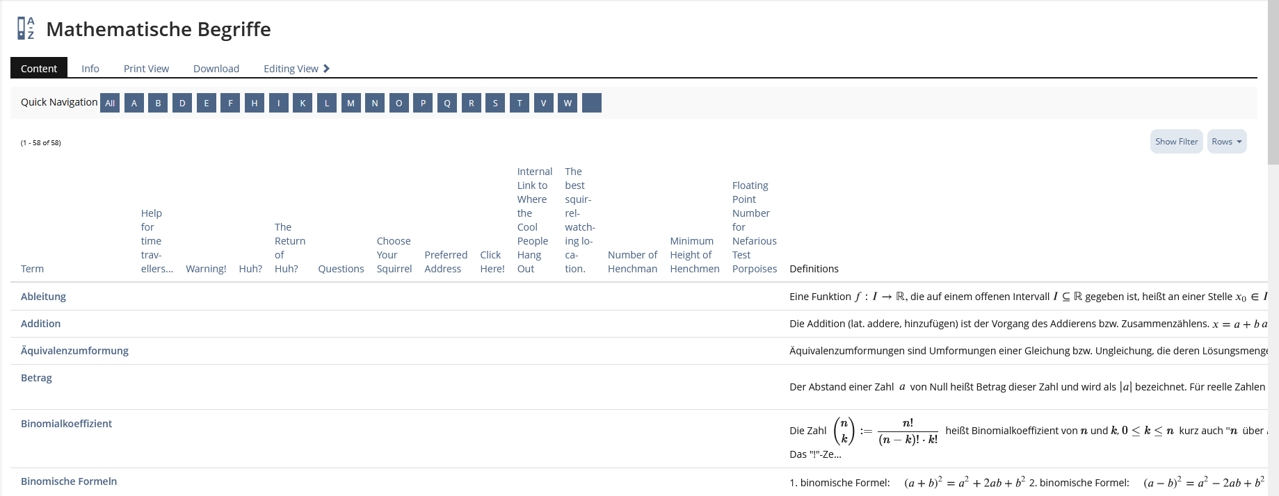
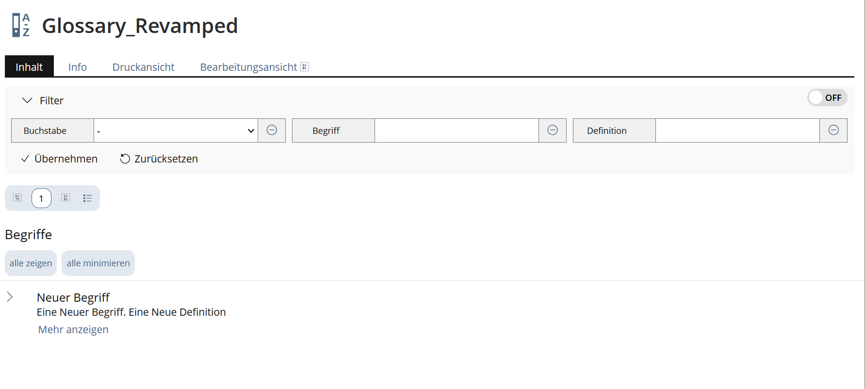
The current presentation of the glossary offers two different modes – Full Definitions and Table Form. The Table Form should be revamped because
- Even on large screens, the view is cluttered and confusing.
- It is partly rendered with deprecated legacy UI instead of using KitchenSink elements
2 Conceptual Summary
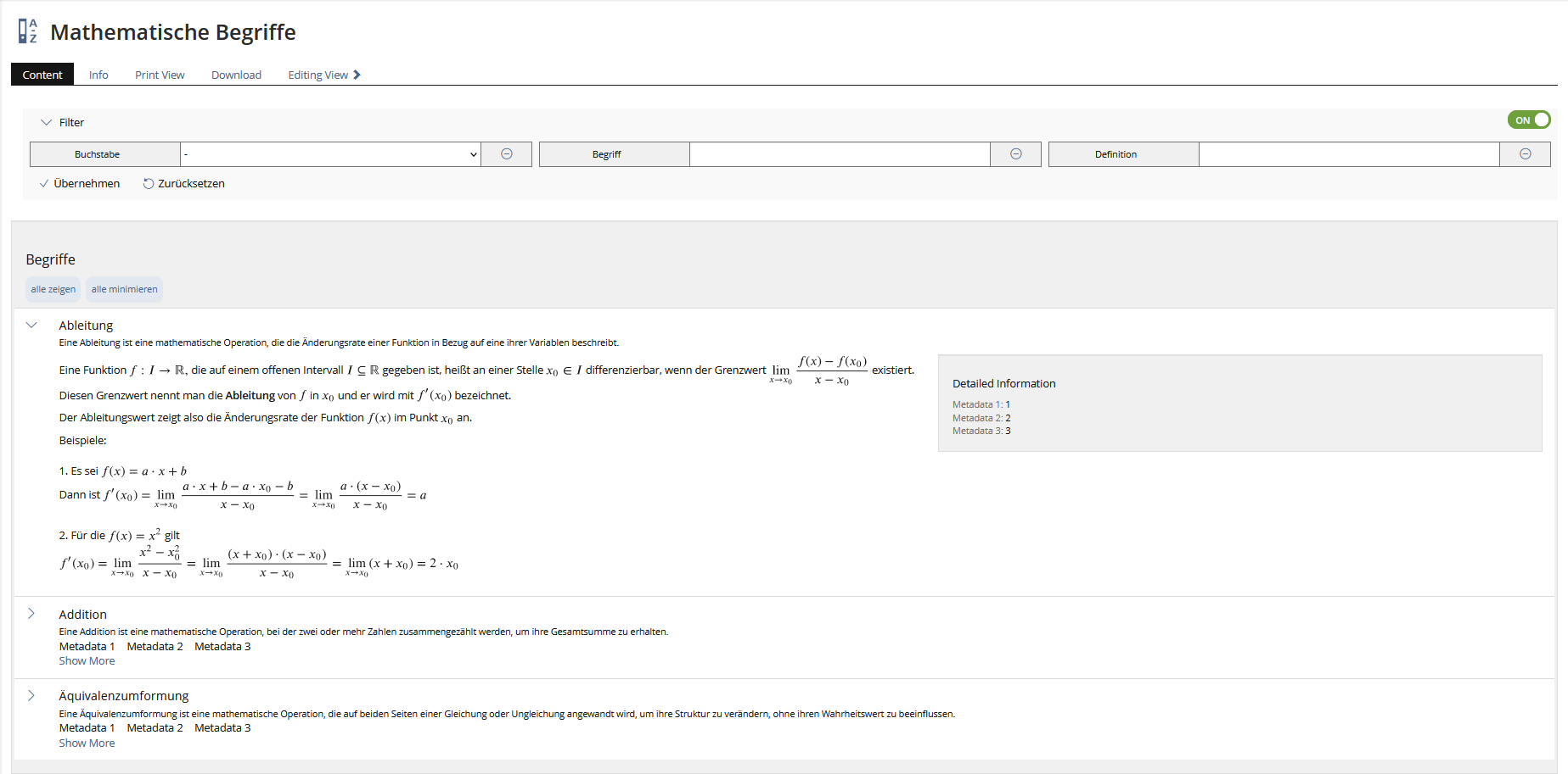
We propose a new detailed Glossary presentation that transfers the Table Form into a UI Presentation table and thus
- minimises confusion for users when using and maintaining a glossary
- enables users to intuitively navigate to the information they seek using flexible UI components
- makes maintenance easier by using UI KitchenSink elements
2.1 Current Implementation
2.2 Layered Information Architecture
The Table Form shows columns for the titles of the metadata fields and a short extract of the first 200 characters of the definition. The full definition is only accessible by clicking on a term and presenting it in a new tab/window. A Presentation Table will hold these two levels of information intuitively in the same spot:
- Level 1: The collapsed rows of the Presentation Table will provide an uncluttered overview by showing only the most relevant information for the average user: the Term title and e.g. a brief synopsis.
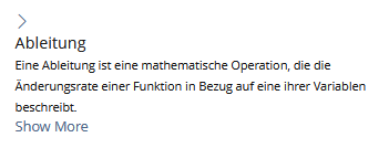
- Level 2: On click, a row expands in place and reveals the content area with the Definition text and the titles and content of the metadata fields.
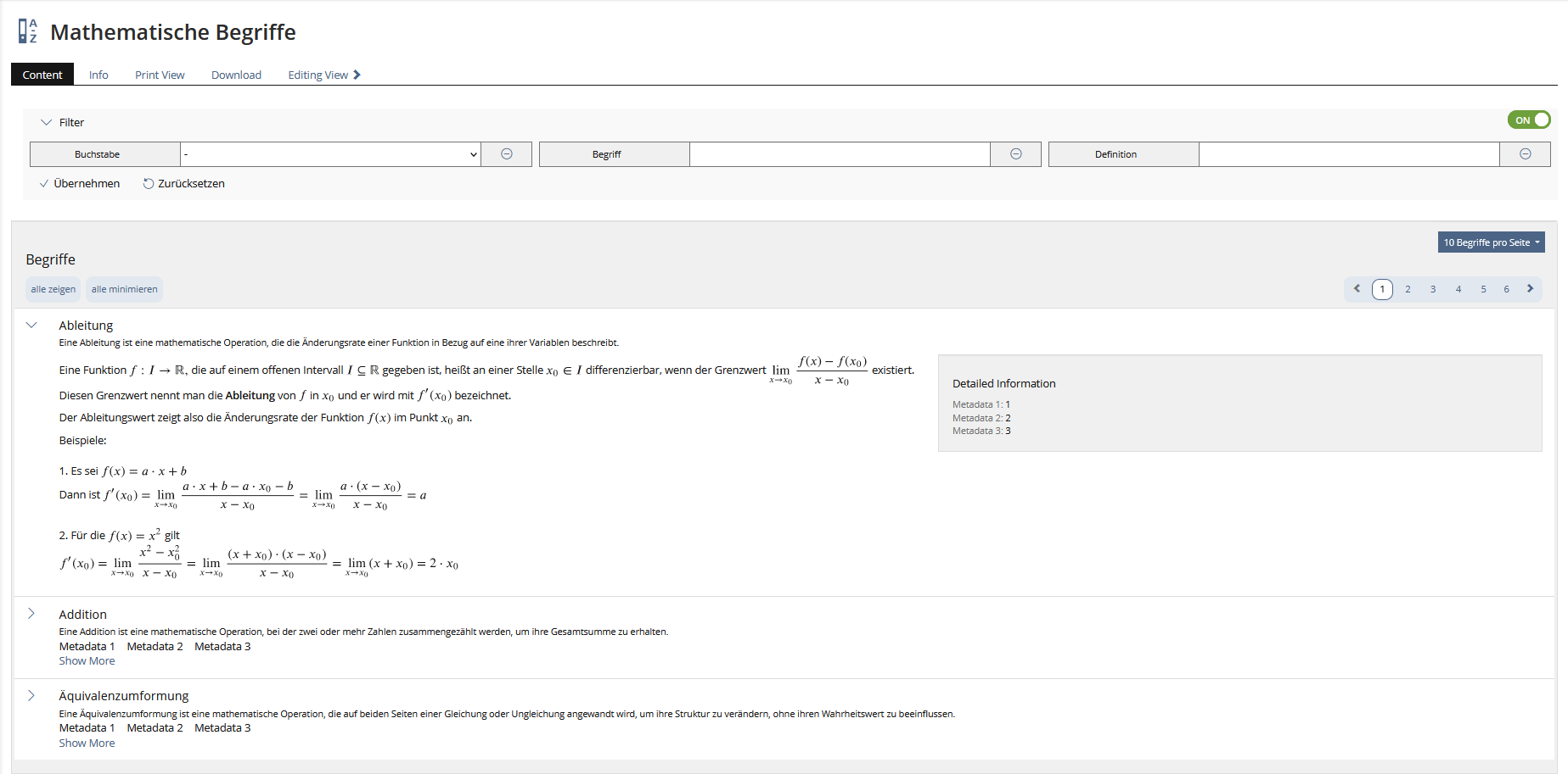
ViewControls and Filters will help the user to navigate through the content.
2.3 Proposed Implementation
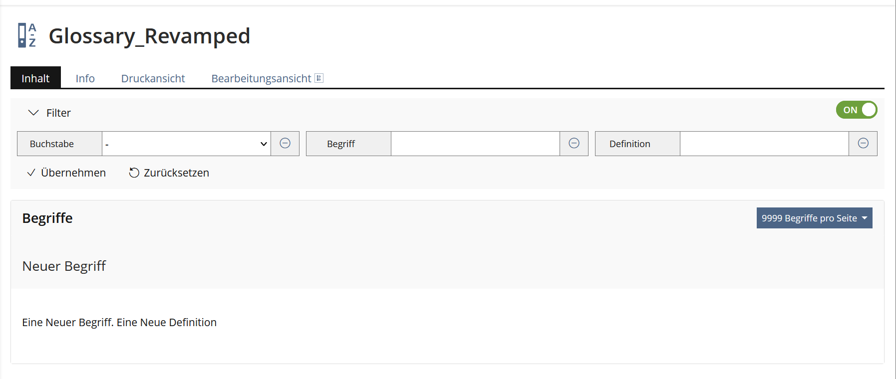
2.3.1 Fullscreen PC view
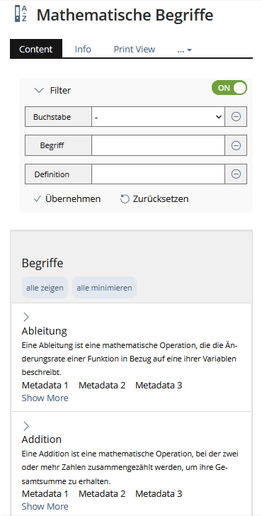
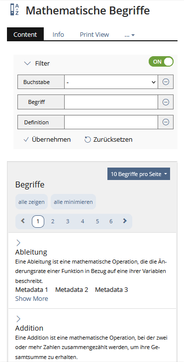
2.3.2 Mobile View
2.3.3 Change in Definitions:
The current implementation of the definitions in the Table View shows the first characters of the Definition of a Term. This is quite confusing because most sentences are cropped and no usable information is transfered. Looking at the Presentation Table in the KS, each entry has an additional byline. We propose to use this byline for a short synopsis for each term that is displayed in the presentation table.
Current Definitions View
3 User Interface Modifications
3.1 List of Affected Views
- Glossary presentation mode Table Form
- View Control (optional with implementation of Pagination)
- UI component Presentation Table
3.2 User Interface Details
3.2.1 Glossary presentation modes / Presentation Table
The current presentation mode Table Form is cluttered and confusing even on large screens, and the single view an unnessecary additional step.
Transfering the Table Form to a Presentation table creats a better overview and handling for creators and users of glossarys.
The collapsed rows of a Presentation table, with very limited information, help users to skim through the list of Terms without being distracted by too much content. By clicking on a collapsed row the term-definition and the metadata will be displayed.
- Metadata should only be displayed if metadata for a term is given.
3.2.2 View Controls / Filters
The current use of filters is very click-intensive and confusing. Because there is currently no search function component in the KitchenSink, we propose to introduce a new View Control that simplifies the navigation and handling in a glossary.
An other option, perhaps an even better one, would be to implement a new search function component in the KitchenSink which allows the search through the definitions and terms in a glossary.
3.3 New User Interface Concepts
None
3.4 Accessibility Implications
No additional accessibility implications, using KS elements.
4 Technical Information
No technical issues.
5 Privacy
Current state: https://github.com/ILIAS-eLearning/ILIAS/blob/trunk/components/ILIAS/Glossary/PRIVACY.md
This feature will not implement any privacy related changes.
6 Security
No security issues.
7 Contact
- Author of the Request: Becker, Matthias [matthias.becker]
- Maintainer: Killing, Alexander [alex]
- Implementation of the feature is done by: {The maintainer must add the name of the implementing developer.}
8 Funding
- …
9 Discussion
For this request there were selected questions that were discussed in the UI Clinic of 09.04.2024 (see minutes).
JourFixe, ILIAS [jourfixe], 05 AUG 2024: We highly appreciate this suggestion and schedule the feature for ILIAS 10.
10 Implementation
Implemented as described above
{ The maintainer has to give a description of the final implementation and add screenshots if possible. }
Test Cases
Test cases completed at 23.10.2024 by Elagamy, Ahmed [Ahmed]
Privacy
Information in privacy.md of component: updated on {date} by {user} | no change required
Approval
Approved at 24th October 2024 by Becker, Matthias [matthias.becker].
Last edited: 6. Nov 2024, 17:53, Elagamy, Ahmed [Ahmed]
