


Feature Wiki
Tabs
Introducing View Control Selection
Page Overview
[Hide]1 Initial Problem
There is currently no KS View Control Element that allows for the selection of jump controls to specific anchor points.
2 Conceptual Summary
We propose introducing a new KS View Control Selection element that allows navigation to and through specific information in tables and/or lists. This View Control could e.g. be implemented in a Glossary o. It can be displayed as a short string of characters, e.g. in the specific case of the Glossary as a single character (A,B,C [...] see screenshots below in 3.2). Purpose of the introduction of this new element is a quicker navigation to a certain content point. It can further transfer the legacy-UI quick navigation that is still used in the Glossary into the KS.
Description
Purpose
Selection enables jumping to different aspects, i.e. to the selected data indicated by a specific character(-string) (e.g. terms starting with a specific letter in a glossary [see screenshot 3.2.2]) .
Composition
Selection is a collection of shy-buttons to jump to distinct points of data. The displayed shy-buttons are limited by a certain number of characters. On smaller displays or lower resolution displays, the shy-buttons should aggregate in a dropdown (e.g. 768px)
Seleciton View Control is composed of shy buttons buttons or a dropdown containing a grid that displays the characters.
Effect
A click on a button will jump to a specific anchor point of the displayed data-list, thus displaying the respective part of the data-list.
Rivals
Dropdown
Dropdowns reveal a list of interactions that change the system’s status or navigate to a different view. This is e.g. not feasible in a Glossary as the navigation via View Control Selection is also supposed to function on a single page.
Pagination
Pagination allows structured data being displayed in chunks by limiting the number of entries shown. It provides the user with controls to leaf through the chunks of entries. This is e.g. not feasible in a Glossary as a user cannot know on which page which a certain jump point (e.g. the terms with character L) is displayed.
Filter
Filters are used to let the user limit content within a table, list or any other collection of items presented on the screen. A Filter limits data whereas the purpose of View Control Selection is to jump to certain index points and not limit the content displayed.
Rules
Usage
- A Selection MUST only be used for structured data, like tables, lists or indexed objects.
- A Selection MAY be used standalone.
- Selections MUST be visually close to the list or table their operation will have effect upon. They SHOULD be placed directly above but MAY be placed directly below the list.
3 User Interface Modifications
3.1 List of Affected Views
- Possibly every list or table where the use of the View Control Selection is sensible.
3.2 User Interface Details
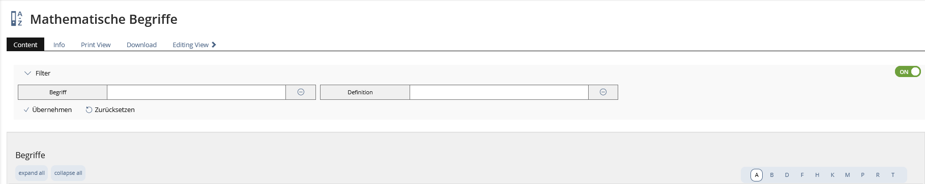
Current solution: The current visualisation of the character selection as seen in the Glossary in the Table View

 3.2.1 Current Selection option as found in the Table View of the Glossary
The current navigation bar acts as a filter and displays the content entries starting with the selected character.
Proposed Solution: Possibly in the Glossary and also in other objects where it is sensible.
 3.2.2 New Selection View Control
 3.2.3 Selection shy-buttons are aggregated under certain circumstances
Mobile View
In mobile view, the charcters used for the View Control Selection are aggregated in a dropdown menu.
Prefered view for Glossary:
 3.2.4 Selection shy-buttons aggregate in mobile view in compact dropdown
Prefered but only optional solution, where, if only a small amount of characters is used, no dropdown is necessary:
 3.2.6 Option with 5 characters with all view controls in one row on standard modern mobile devices
Prefered but only optional solution, where, if only a small amount of characters is used, no dropdown is necessary:
 3.2.7 Option with 11 characters with view controls in two rows on standard modern mobile devices
Full Screen on PC:
3.3 New User Interface Concepts
A new KS Element View Control Selection
3.4 Accessibility Implications
{ If the proposal contains potential accessibility issues that are neither covered by existing UI components nor clarified by guidelines, please list them here. For every potential issue please either propose a solution or write down a short risk assessment about potential fallout if there would be no solution for the issue. }
4 Technical Information
{ The maintainer has to provide necessary technical information, e.g. dependencies on other ILIAS components, necessary modifications in general services/architecture, potential security or performance issues. }
5 Privacy
{ Please list all personal data that will need to be stored or processed to implement this feature. For each date give a short explanation why it is necessary to use that date. }
6 Security
{ Does the feature include any special security relevant changes, e.g. the introducion of new endpoints or other new possible attack vectors. If yes, please explain these implications and include a commitment to deliver a written security concept as part of the feature development. This concept will need an additional approvement by the JourFixe. }
7 Contact
- Author of the Request: Becker, Matthias [matthias.becker]
- Maintainer: Amstutz, Timon [amstutz]
- Implementation of the feature is done by: {The maintainer must add the name of the implementing developer.}
8 Funding
- …
9 Discussion
UI Clinic, 23th APRIL 2024: For this request there were selected questions that were discussed in the UI Clinic of 23.04.2024 (see minutes):
- Consider "List Jump" separately from "navigation" in chapters (learning module). Do not speak of "navigation" for jump labels (also not for labels).
- If space is available, the entries are listed next to each other (directly visible and clickable), should not be double-lined if possible, but we are aware that there may be edge cases that can be double-lined. If there is no space to display the ViewControl in a single line with all entries, a dropdown is displayed which, when clicked, displays all possible jump labels as a list (nice-to-have as a grid display, useful for 1 character such as A, B, C,...).
- There is no pagination/navigation/forward/back in this ViewControl. The ViewControl serves as a jump marker to the first entry in a list with this criterion.
- "Chapters" like A, B, C, ... could also be usefull for User Management, for other lists or tables we could imagine chapters like prices (10€, 50€, 100€, 150€,...). The aim is to jump to a specific position in the list as quickly as possible, it is not a matter of filtering, the list still contains all the entries shown so far.
10 Implementation
{ The maintainer has to give a description of the final implementation and add screenshots if possible. }
Test Cases
- {Test case number linked to Testrail} : {test case title}
Privacy
Information in privacy.md of component: updated on {date} by {user} | no change required
Approval
Approved at {date} by {user}.
Last edited: 23. Apr 2024, 15:52, Seiler, Yvonne [yvseiler]