Feature Wiki
Tabs
Outdated Table
Page Overview
[Hide]1 Initial Problem
- Participants of exercises cannot see clearly the next steps of submission or peer feedback. While a deadline is communicated, the process in its entirety remains opaque.
- The status of a given asigment is not always easily determined.
2 Conceptual Summary
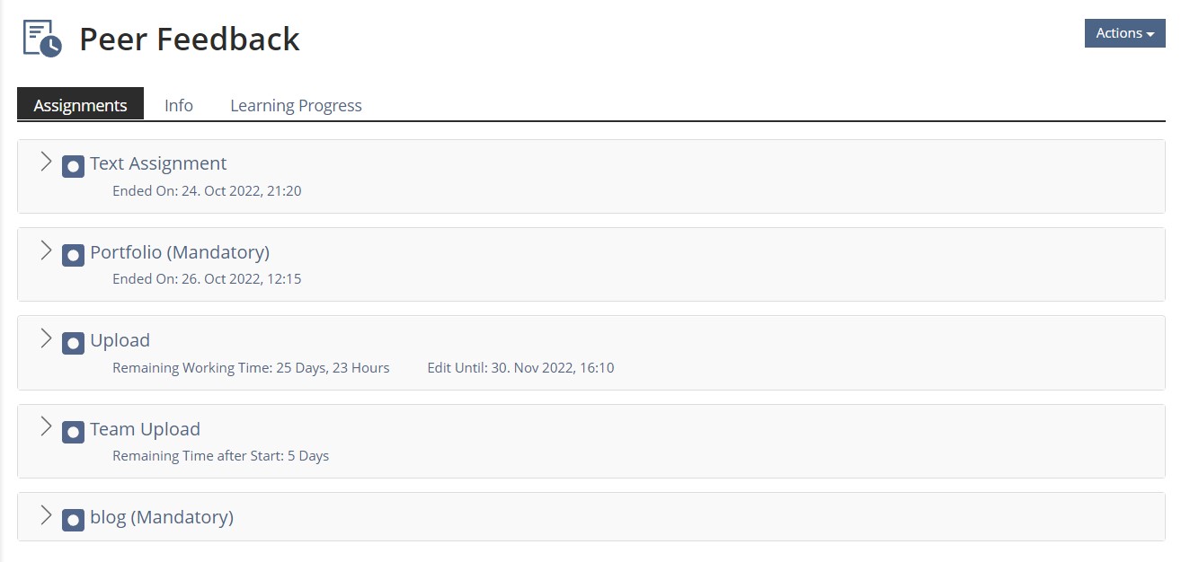
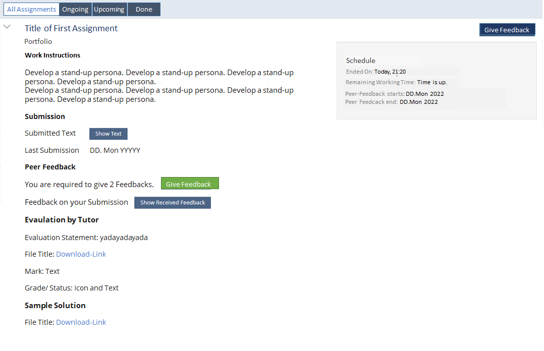
- The Assignment Overview is implemented as a presentation table.
- The overview of Peer Feedbacks to be provided is to be moved to a presentation table.
View Control
The presentation table has a view control allowing to filter the assignments:
- "All Assignments" / "Alle Einheiten" will present all assignments in the order the tutor gave them or the settings gave them.
- (DEFAULT) "Ongoing" / "Aktuell" will present assignments that either
- have no deadline
- or Submission or Peer Feedback deadline are not past
- eventual individual deadlines and grace periods are not past
- still require Peer Feedback to be provided.
- "Done" / "Abgeschlossen" will present assignments that were submitted or the deadline is passed and eventual all feedback requirements were met / feed back was
- "Upcoming" / "Bevorstehend" start date not yet reached
Data Presented in Closed Row
- Title of Assignment (Failed | Passed | Not Attempted)
- Type of Assignment
- Edit Unitil: DD. Mon YYY, HH:MM / Ended On: DD. Mon YYY, HH:MM / No Deadline
- Mandatory / Optional
- Peer Feedback: Nr. / no respectivly Team Member: yes / not yet
- Most important action
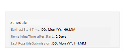
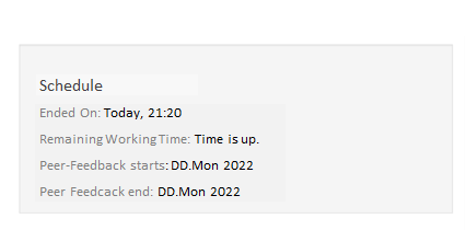
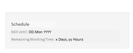
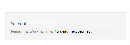
Schedule
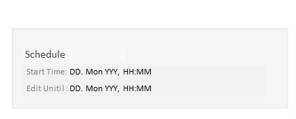
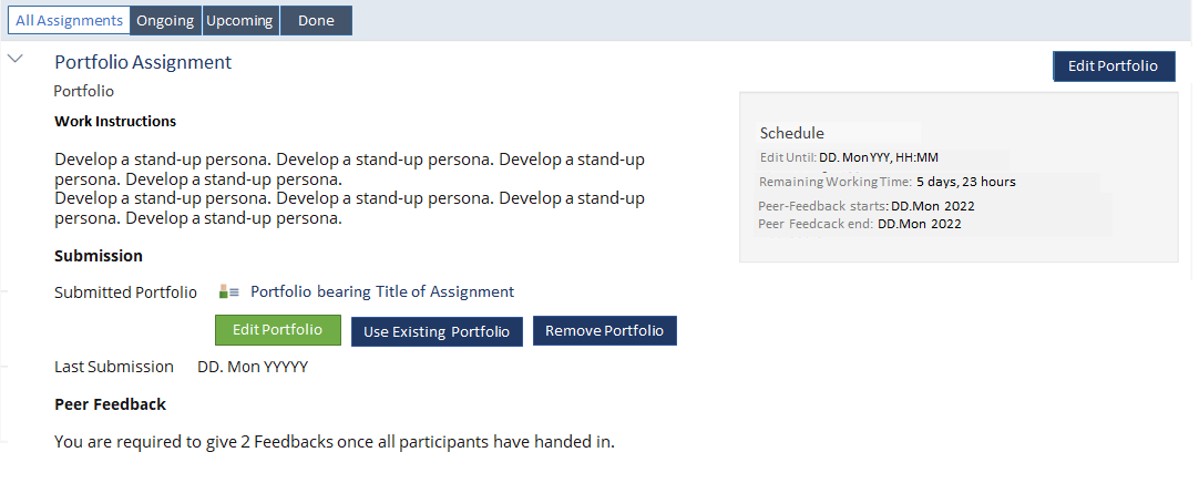
The top right metadata-box is titled "Schedule" and comprises the following data:
- Start Time: DD. Mon YYYY, HH:MM (depends on settings)
- Edit Until: DD. Mon YYYY, HH:MM / Ended On: DD. Mon YYYY, HH:MM (depends on settings)
- Remaining Working Time: No deadline specified. | Time is up. | x Days, yy Hours (always shown)
- Peer-Feedback starts: DD.Mon 2022 (depends on settings, new)
- Peer Feedcack end: DD.Mon 2022 (depends on settings, new)
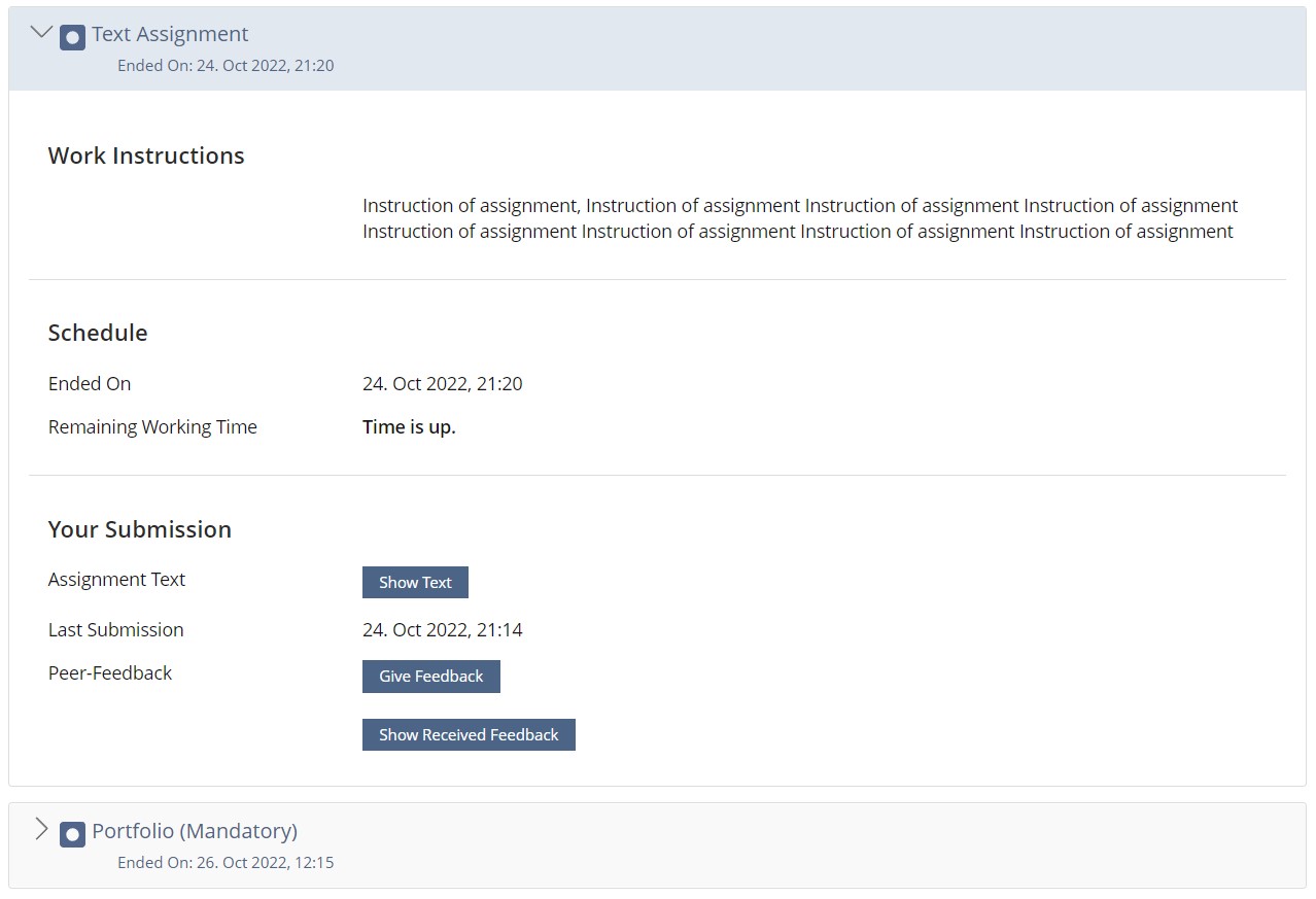
Content of Opened Row
- Title of Assignment (h2)
- Type of Assignment
- Work Instructions (h3)
- Text and links to files and inline pictures of Work Instruction
- Submission (h3)
- Glyph Assignment text: Button
- Last Submission: Today, HH:MM
- Peer Feedback (new) (h3)
- Glyph You are required to give y Feedbacks. |Glyph You gave x of y required Feedbacks | Glyph You gave all required feedbacks Button
- Feedback on your Submission: Button "Show Received Feedback"
- Evaluation by Tutor (h3)
- Evaluation Statement: yadayadayada
- Headline "Evaluation Files" is removed: Its content "File Title: Download-Link" goes under Evaluation by Tutor
- Mark: Text
- Grade/ Status: Icon and Text
- Sample Solution (h3)
- File Title: Download-Link
- The most important action is shown as only button when the row is closed.
- The most important button is shown twice when the row is opened: as standard top right action and as primary button in the line of reading.
Dear UI clinic,
can we double the button (top right button and left)
If not, please advise an alternative approach.
Possibly most-important-action-button
The following actions could be
- Edit Text (Text before deadline)
- Hand-In (Upload before deadline)
- Create Team
- Create Portfolio or Blog
- Request Deadline
- Give Feedback
- If there is not most-important-action left, then no most-important-button is presented
Never the most-important-action-button
Always standard buttons / in the line-of-reading buttons are actions
- Show Text (Text after deadline)
- Show Submitted Files (Upload after deadline)
- Edit Submission
- Use existing Portfolio or Blog
- Edit or Remove
- Show received Feedback
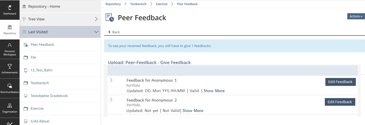
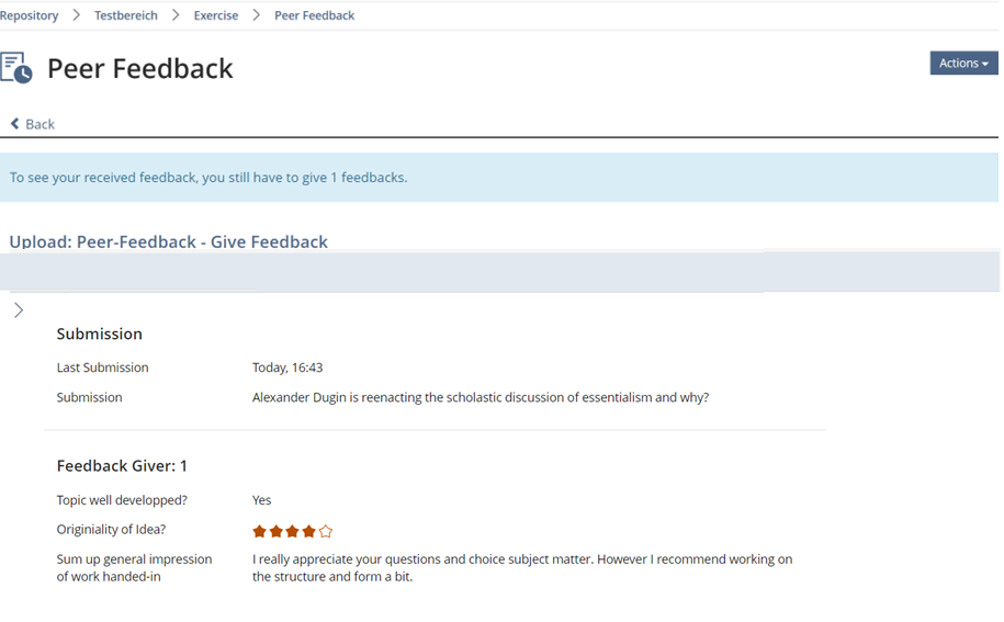
The overview of Peer Feedbacks to be provded
The presentation table has no View Control.
- Title is always "Feedback for Anonymous x"
- Type of Assignment
- Updated: Not yet/ DD. Mon YYYY
- Valid / Not Valid
- Most-important-action-button is always "Edit Feedback"
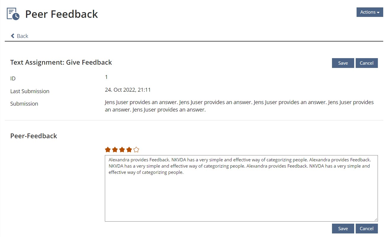
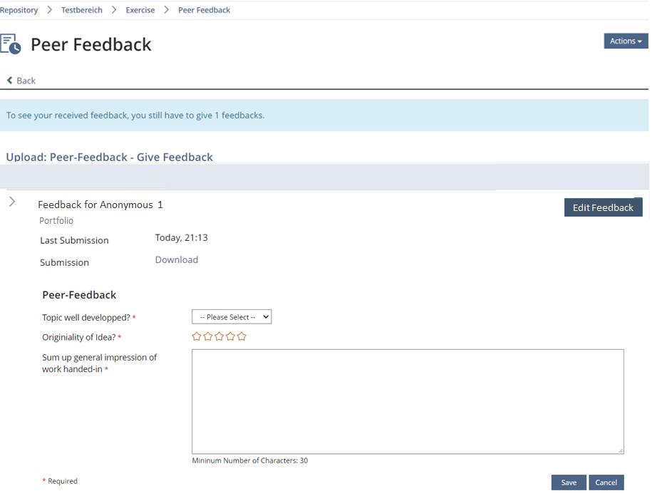
If the row is opened
- participants can view / download the submission
- participants can provide their feedback using drop downs, rating and input fields and similar
Participants that have received Peer Feedback are presented with it in a presentation table, as well.
3 User Interface Modifications
3.1 List of Affected Views
- Exercise > Assignment > View
- Exercise > Assignment > Peer Feedback
3.2 User Interface Details
See above
3.3 New User Interface Concepts
None
3.4 Accessibility Implications
We do not foresee any accessibility issues.
4 Technical Information
{ The maintainer has to provide necessary technical information, e.g. dependencies on other ILIAS components, necessary modifications in general services/architecture, potential security or performance issues. }
5 Privacy
This does not change any personal data saving at all. This is merely about new presentation vehicles not about additional data being presented.
6 Security
There is no foreseeable security issue.
7 Contact
- Author of the Request: Marko Glaubitz, Barbara Müller
- Maintainer: Killing, Alexander [alex]
- Implementation of the feature is done by: Killing, Alexander [alex]
8 Funding
- …
9 Discussion
Notizen aus Workshop
- Akkordeon ist nicht in Kitchensink und Accessibility-mäßig ist das ein Button
- Curriculum ist schwer einer Übungseinheit zuordnen
- Option: Listing Panel und Unterwelt für einzelne Übungseinheit dann gerne auch mit Workflow
- Option: Presentation Table
Killing, Alexander [alex], 25. May 2023: We should split up this page into two feature requests, the Peer Review screen revision should be handled in a separate FW article.
10 Implementation
{ The maintainer has to give a description of the final implementation and add screenshots if possible. }
Test Cases
- {Test case number linked to Testrail} : {test case title}
Approval
Approved at {date} by {user}.
Last edited: 25. May 2023, 14:34, Tödt, Alexandra [atoedt]
