


Feature Wiki
Tabs
Revamping Footer with Link-Groups
Page Overview
[Hide]- 1 Initial Problem
- 2 Conceptual Summary
- 2.1 Semantic Sections of the Footer
- 2.1.1 Sharing
- 2.1.2 Utility Links
- 2.1.3 Meta Information
- 2.2 Grid Template
- 2.3 Global Screen
- 2.1 Semantic Sections of the Footer
- 3 User Interface Modifications
- 4 Technical Information
- 5 Privacy
- 6 Security
- 7 Contact
- 8 Funding
- 9 Discussion
- 10 Implementation
1 Initial Problem
This Feature Request results from a discussion in compact access to the »Legal Regulations« for users and an UI-Clinic discussion.
The footer in ILIAS was changed as part of the page layout revision and currently contains the following elements:
- Permanent link
- Technical information on the ILIAS version used
- A list of links that lead to different functions in ILIAS, e.g. the imprint.
The footer currently only scales horizontally, i.e. the more links are added, the narrower the space becomes. Furthermore, the links currently do not follow a specific pattern, but are listed in the order in which they were implemented in Services/UICore/classes/Screen/PageContentProvider.php.
This implementation is very inflexible and does not take into account that components should manage their own contributions to a page. For example, the MainMenu was modified so that components can and should provide their own entries. This ensures that the code for this is in the right place and that there are no overlapping implementations of components (as is currently the case with the footer in PageContentProvider). The same principle is now to be implemented for the contents of the footer.
As part of this feature request, we would like to address the following issues:
- The footer is divided into sections that make a semantic distinction about what the content is.
- One of these units are new so-called link groups. The "links" that are currently displayed in the footer will be grouped tehmatically and displayed as such groups.
- The UI component "Footer" will be extended so that it offers the semantic areas and can display them. The footer will be rescaled vertically to provide enough space for the current information, but also for future information (additional links to functions offered by the components in the core or user-defined links, see Customizable Link-Groups in Footer).
- The GlobalScreen service receives a new dedicated scope that offers the semantic areas of the footer. all previous information and links are transferred to the components that provide them (provider). A collector collects them and merges them into a final footer (UI component).
2 Conceptual Summary
2.1 Semantic Sections of the Footer
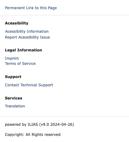
The footer should now be divided into three sections:
- Sharing
- Utility Links
- Meta Information

2.1.1 Sharing
The "Sharing" section contains links and actions that relate to the current page, such as the permanent link. For ILIAS Core, the permanent link would currently be the only sharing option.
This part shall technically be allowed to accept two things:
- \ILIAS\Component\Link\Standard
- \ILIAS\UI\Component\Button\Shy
In the case of standard links, the corresponding URL is called up internally or externally (more on this later in the topic "GlobalScreen Footer-Items"). In the case of Shy buttons, a Modal dialogue is opened accordingly.
The "Sharing" section is delivered with a 1-column grid by default, this can be adapted via SCSS.
2.1.2 Utility Links
The section "Utility Links" shows thematic groups of links, which are provided by the ILIAS Core, plugins and later by manually added groups and links.
This part shall technically be allowed to accept arrays of the folloing two things (together with a title for the respective group):
- \ILIAS\Component\Link\Standard
- \ILIAS\UI\Component\Button\Shy
In the case of standard links, the corresponding URL is called up internally or externally (more on this later in the topic "GlobalScreen Footer-Items"). In the case of Shy buttons, a Modal dialogue is opened accordingly.
The "Utility Links" section is delivered with a 4-column grid by default, this can be adapted via SCSS.
2.1.3 Meta Information
The section "Meta Information" currently contains the ILIAS version used in the ILIAS core and, as a second piece of information, the copy-right information of the page can be displayed here if necessary. Other components or plugins could, for example, display information about the web server here (in the case of load balancing) or, if DEVMODE is activated, information about the ilCtrl control flow could be displayed here, which was the case up to ILIAS 5.4, for example.
This part shall technically be allowed to accept Legacy-Components (since we do not have a component for Text-Only).
The "Meta Information" section is delivered with a 2-column grid by default, this can be adapted via SCSS.
2.2 Grid Template
The footer is therefore composed of three grids and would look as follows by default.

On devices with a small screen, all grids are limited to one element per line:

2.3 Global Screen
A new scope is introduced in the global screen, which works according to the provider/collector pattern (such as the MainMenu scope).
Components can therefore implement a FooterProvider, which offers the following methods in a first version:
| |
Groups would be link groups in this case, the standard ones are offered in the core via a standardFooterGroups provider (analogous to the MainMenu).
isItem are then Footer-Items, in the first version the following types would be provided:
- InternalLink: Are rendered UI standardLink and are called in the same tab.
- ExternalLink: Are rendered as UI standard links and are called up in a new tab.
- AsyncModal: These are rendered as Shy buttons with linked modal, the modal obtains the content asynchronously from the URL specified in each case.
As mentioned at the beginning, the UI/UX experts can transfer all existing links in the core into one of these categories. The implementation is then according to the recommendation of the UI Clinic.
3 User Interface Modifications
3.1 List of Affected Views
- Every Page wich has a Footer in ILIAS
3.2 User Interface Details
3.3 New User Interface Concepts
The UI component will be modified accordingly to cover the new requirements. this will be done via the regular path of the UI components.
A possible implementation could look as follows:

The number of grid-columns per section will be customisable via SCSS variables. Empty link groups (should there be any at a later point in time through configuration) are not displayed.
Side note: With ILIAS 9, the permanent link is a simple link that has to be copied manually, e.g. with a right click. With the implementation of this feature, it will be easier for institutions to implement alternative ways of doing this (e.g. with direct copying to the clipboard).
3.4 Accessibility Implications
The individual links in the footer (which are provided by the core) are divided by the UI experts into links that require a modal dialogue and those that trigger a corresponding redirect. For the implementation of links and shy buttons, the existing UI components are used in the rendering.
4 Technical Information
The details of the global screen part and the adjustments of the UI component are made as PR in Github.
5 Privacy
The new scope does not collect, process or store any user-related data.
6 Security
The individual links are displayed or not via the same visibility/availability principle as the MainMenu items. Visibility is therefore the task of the respective components. no new attack vectors are thus introduced.
7 Contact
- Author of the Request: Schmid, Fabian [fschmid]
- Maintainer: Schmid, Fabian [fschmid]
- Implementation of the feature is done by: Schmid, Fabian [fschmid]
8 Funding
- …
9 Discussion
Schmidt-Sielex, Wolfgang [WSS], 19th July 2023:
Recommendation by SIG Accessibility (AG Feature List Check):
- Please make sure that the Elements within the footer stay list elements within a ul-list.
- Please add the permalink to the list.
JourFixe, ILIAS [jourfixe], 24 JUL 2023: We highly appreciate this suggestion and schedule the feature for ILIAS 9. When specifying the UI component(s) for the footer, please consider Wolfgang's request to present all footer elements as list and make sure that the headline hierarchy is respected (in case of headlines) for the link group titles or check HTML in case these are labels.
10 Implementation
The “feature” was implemented as part of the Kitchen-Skink process as an adaptation of the “Footer” component. The feature request here is merely the initial pitch for the theme. Further information can be found in FEATURE UI: Introduce Footer sections #7907
Test Cases
No direct Testcases for this Request, tested using Kitchen-Sink processes
Privacy
no change required
Approval
See Pull Request #7907
Last edited: 7. Nov 2024, 08:13, Schmid, Fabian [fschmid]