Feature Wiki
Tabs
Improve Display of Tiles
Page Overview
[Hide]1 Initial Problem
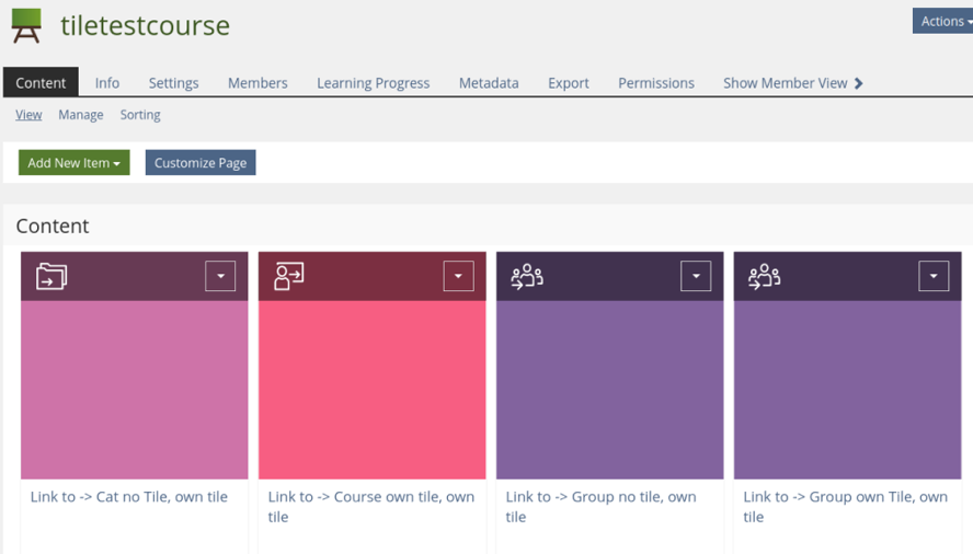
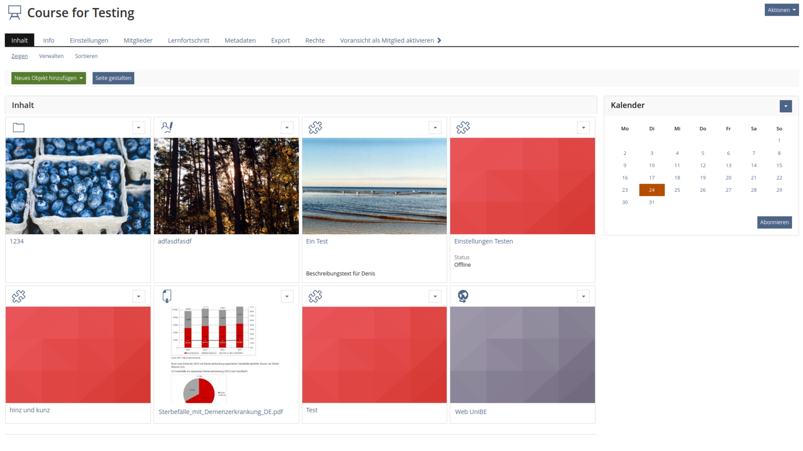
When using tile formats for containers, every object in the container needs a tile image. If the image is not provided, a plain colored tile is displayed
The look of those containers seems a bit inconvenient.
2 Conceptual Summary
The basic idea is to use the icons of the respective objects as a default for the tile image. This may not be a perfect solution, but it eases the effort to ceate content (like e.g. courses) with a decent optic.
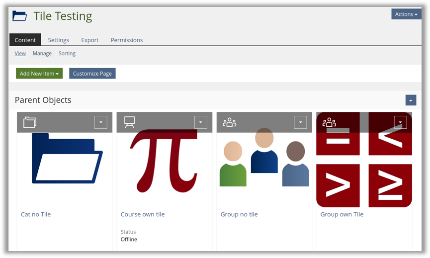
In this illustration, the first and third tile use an icon, while the second and forth tile use an individual image
3 User Interface Modifications
3.1 List of Affected Views
All views that display tiles
3.2 User Interface Details
No change of behavior, only the display of objects with no own tileimage ist affected
3.3 New User Interface Concepts
no new concepts
3.4 Accessibility Implications
accessibility is not affected, since tileimages are considered decorative
4 Technical Information
- A new DefaultMachine "CropRectangle" has been introduced into the ILIAS Resource Storage Service to generate the tiles.
- The Generation of Preview Images for Files has been adapted to generate tiles in different sizes in a ration of 3/2.
5 Privacy
no privacy issues
6 Security
should not be affected
7 Contact
- Author of the Request: Jackisch, Ingo [jackisch]
- Maintainer: Kergomard, Stephan [skergomard]
- Implementation of the feature is done by: Kergomard, Stephan [skergomard]
8 Funding
- If you are interest in funding this feature, please add your name and institution to this list.
DHBW
9 Discussion
Jackisch, Ingo [jackisch] Idea was presented and demonstrated on devconf march 2023. Any better idea is welcome.
Jackisch, Ingo [jackisch] 2023-07-06: The Topic was discussed in the UI-Clinic. A better solution für standard images woud be appreciated, but we agreed that icons are not teh best way to accomplish this.
The main reason is, that tili images should represent the content of the object and that the icon cannot achieve this. Additionally icons would be doubled, since they appear on the top of the tile. We all agreed, that the top bar of the tile should be placed above the image to avoid problems with ovelapping and contrast.
We keep this FR as a basis for further discussions.
Kunkel, Matthias [mkunkel], 09 OCT 2023: The icons would look much better as tiles when there is some padding-top to prevent that parts of the icon are covered by the 'snowboard'.
Seiler, Yvonne [yvseiler], 12 OCT 2023:
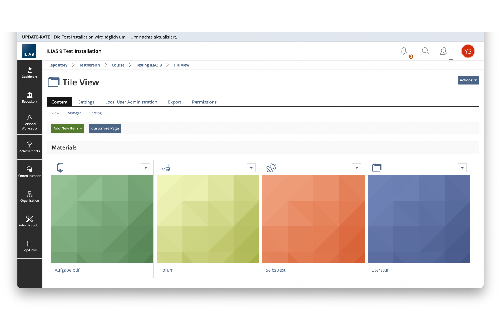
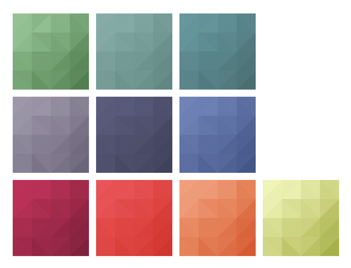
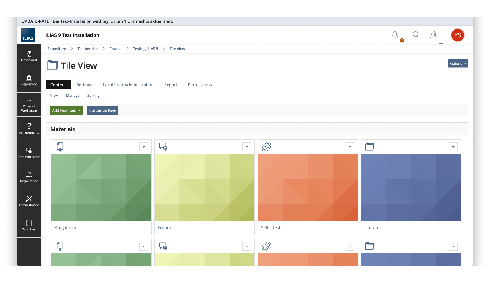
As Ingo Jackisch described in the comment of 6 July (for further information see notes from the UI Clinic Meeting), displaying the icon as a tile image has disadvantages, which is why I would recommend against using the icon as the default tile image. There have already been discussions about using a slightly more dynamic standard tile instead of the monochrome tile images (thanks Samoila, Oliver [oliver.samoila] for the tip with https://trianglify.io/). At the University of Bern, we are currently working on a new variant for the standard tile images based on this, which we will be happy to make available to the community.
The goal of the "snowboard" (header bar of a repository object card) so far has been to create a sufficient contrast for the display of the icons/glyphs/actions on the snowboard, independent of the tile image. Here we could make a visual/structural adjustment. Proposal from the discussion of 6.7. was:
- The tile image is only displayed below the snowboard ("below" is not meant here with behind as now, but "after").
- The snowboard then no longer needs transparency and can be styled via the system style if desired.
- For the Delos style, it still needs a suggestion of how the contents of the snowboard would look (background snowboard, depending on the filter icon, glyph (learning progress), contour/background colour action menu). For a first step, of course, the snowboard could continue to look the same.
JourFixe, ILIAS [jourfixe], 16 OCT 2023: We highly appreciate Yvonne's suggestion for an improved presentation of the tiles view. There will be a final decision made by Yvonne and Matthias about the future size of the tiles (square or rectangular). This has to be made before the related feature request 6388 for the IRSS generated flavours is merged to trunk.
Seiler, Yvonne [yvseiler], 18 OCT 2023: Kunkel, Matthias [mkunkel], Samoila, Oliver [oliver.samoila] and I compared several common aspect ratios for digital space and decided to use a 3:2 ratio for the tile view. Here the ratio of header (snowboard) to image to title is balanced and the lower height creates more space in the vertical space to display the tiles.
Killing, Alexander [alex], 30 Jan 2024: Please add some information in the implementation part about how existing tile images will be handled / migrated when switching from ILIAS 8 to ILIAS 9. Will they get the new format automatically? Will all different sizes be created automatically? Will the images be cropped on top or both on top and on the bottom?
10 Implementation
For ILIAS 9 a migration of existing tiles is provided, in the context of the move of the tile images to IRSS. Tile Images will be cropped accordingly ONCE THE MIGRATION IS RUN. The original is kept. Cropping maximizes the area of the source image visible in the actual tile and it always centers the cutout.
Test Cases
Test cases completed at 23 OCT 2023 by Kergomard, Stephan [skergomard]
- C63550 : Add Tile Image and Check Correct Display
Privacy
No change required
Approval
Approved at 24. OCT 2023 by Seiler, Yvonne [yvseiler].
Last edited: 30. Jan 2024, 15:43, Kergomard, Stephan [skergomard]

