


Feature Wiki
Tabs
Improve Presentation of T&A-Results
Page Overview
[Hide]- 1 Initial Problem
- 2 Conceptual Summary
- 3 User Interface Modifications
- 3.1 List of Affected Views
- 3.2 User Interface Details
- 3.3 New User Interface Concepts
- 3.3.1 New Presentation Table Feature: Alternative to Further Fields Box
- 3.3.2 New Presentation Table Feature: Expand-Collapse-Toggle View Control
- 3.3.3 New Presentation Table Feature: Optimize Print Styling
- 3.3.4 New Presentation Table Feature: Leading Icon
- 3.3.5 New Column Panel, Column Listing or Column Layout
- 3.4 Accessibility Implications
- 4 Technical Information
- 5 Privacy
- 6 Security
- 7 Contact
- 8 Funding
- 9 Discussion
- 10 Implementation
1 Initial Problem
The current detailed result view of the Test Assessment:
- requires many clicks and much scrolling to navigate,
- renders questions in a design unfamiliar to the user,
- and is optimized for printing, but many users evaluate test results on screens.
This impacts the user experience negatively:
- Users see the questions in an unstyled look causing them to wonder why the view "looks broken".
- The lack of filters and sorting can makes evaluating tests with many questions difficult and time consuming.
For developers there are drawbacks to how this view is currently assembled:
- The view is rendered with deprecated legacy methods instead of using kitchen sink elements from the UI framework. Many legacy UI elements will be removed with ILIAS 10 (Project: [[[Project] Removing of Legacy-UIComponents-Service and Table]])
- Some bugs and visual glitches are tricky to fix, because the Content Styles and the print style rendering clash in unexpected ways.
We held two workshops and discussed the problems with the legacy test result presentation. Two suggestions to solve the issues were made by the community. The maintainer wants to progress with this approach:
2 Conceptual Summary
We propose a new detailed result view that is
- using the familiar Content Style appearance for questions to minimize confusion and visual glitches
- enabling the user to intuitively navigate to the information they seek using a flexible and filterable UI Presentation Table,
- making maintenance easier by using modern UI components from the UI framework.
2.1 Layered Information Architecture
The current implementation has an overview table at the top and a long list of question content below. A Presentation Table will hold these two levels of information intuitively in the same spot:
- Level 1: The collapsed rows of the Presentation Table will provide an uncluttered overview by showing only the most relevant information for the average user e.g. which questions were answered (in)correctly.
- Level 2: On click, a row expands in place and reveals the content area with the question text, the answers and more information for in-depth test evaluation use cases.
Filters and View Controls will help the user to narrow down which questions are shown and how they are sorted.
2.2 Current Implementation
2.3 Draft for New Result View
3 User Interface Modifications
3.1 List of Affected Views
- ilRepositoryGUI > ilTestEvaluationGUI > outParticipantsPassDetails
- UI component Presentation Table
3.2 User Interface Details
3.2.1 Level 1: Maximizing overview
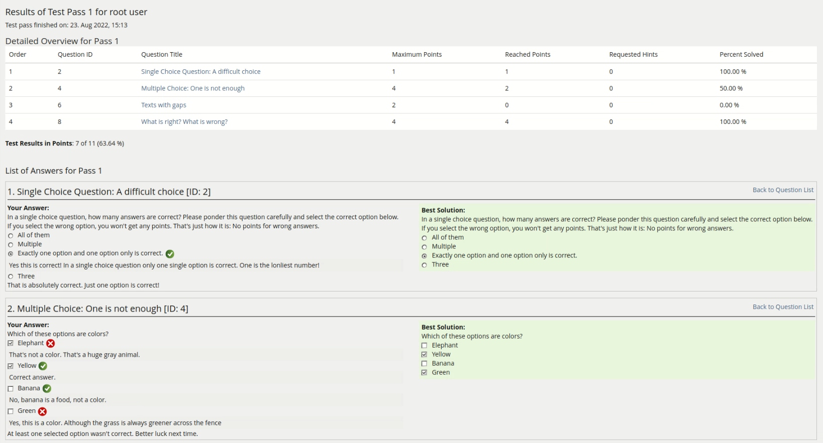
This is how the table of contents at the top of the detailed result page currently looks

The rendering as a legacy table has some disadvantages:
- Some properties are not of immediate interest to the average user, yet they take equal or more space than highly relevant information (e.g. Requested Hints vs Percentage Solved)
- The property most valuable for understanding how well a question was answered is the Percentage Solved column, but because it's far away from the Question Title the eyes need to constantly dart back and forth.
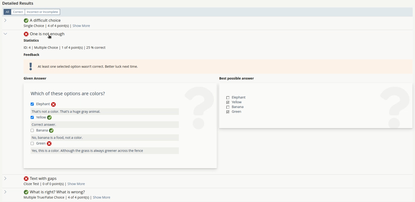
Here is an example of how the new view could look with all questions wrapped within a collapsed Presentation Table:
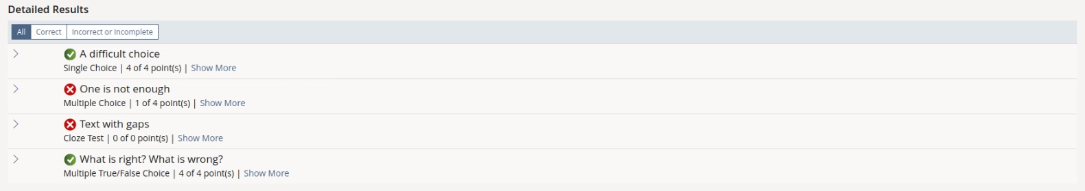
To support quick identification
- correct and incorrect/incomplete answers are more clearly distinguishable by an icon directly in front of the title
- the values for reached and maximum points are pulled closer together instead of being pulled apart by a lot of white space in the legacy table
- the tables view controls allow to quickly filter e.g. for complete and incorrect/incomplete answers
The collapsed rows with very condensed information helps users to
- skim through the list of answers without being distracted by too many properties
- get a rough feeling for the weakest and strongest parts of the test results without even opening a single question
- quickly identify and jump to specific questions that they know about (e.g. a participant could find that one Cloze Test question they had trouble with during the test by focusing on the question title and type)
3.2.2 Level 2: Drilling down for details
If the user is interested in the specifics of one or multiple answers, they can simply click on the row of the Presentation Table to expand the content area and reveal the second level of information, without loosing the position in the table.
In the current implementation the viewport jumps to a question block inside a long list, which is rendered in this way:

This stripped down rendering of questions makes focused work difficult:
- The feedback blends in with the body of the question
- The other question blocks clutter and overwhelm the view even though they might not be of interest
Here is an example for a more familiar and segmented rendering inside the Presentation Table:

Although the user might have many different reasons for looking at this second level of information, the Presentation Table still helps us to improve the user experience:
- users don't loose their position in the table when opening or closing a row entry
- familiar styling makes important areas like the feedback box stand out and helps distinguish e.g. the question text from the rest of the answer.
- more properties can be revealed for more rare use cases without taking up an entire table column (e.g. the question ID)
3.2.3 View Controls for quicker evaluation
Presentation Tables come with a View Control Area attached to them, which provides an excellent opportunity for introducing new ways to process and evaluate test result data.
We propose to start with two view controls:
- A Mode View Control to show all respectively all only incorrect or incomplete answers.
- A sortation view controll that sorts the rows in order of their appearance in the test or by the reached points.
Both view controls will allow educators or learners to quickly understand, where some further learning would be required or advised.
- In the future we could extend the view controls, e.g. with a search bar could quickly hide questions that don't include the entered search term.
3.3 New User Interface Concepts
3.3.1 New Presentation Table Feature: Alternative to Further Fields Box
Currently, a Presentation Table shows a Further Fields box when expanded and cannot be rendered without it. This box takes up space in the expandable area where we would want to show the given answer and the best possible answer side by side across the full width.
We want to implement an alternative Presentation Table layout where further fields are shown in a full width section at the top of the expandable area instead. This opens up more use cases for the content of the Presentation Table while staying true to the concept of having two levels of properties.
3.3.2 New Presentation Table Feature: Expand-Collapse-Toggle View Control
In some cases, users need to expand all table rows at once to see all questions one after the other (e.g. for a printable list).
Therefore, we would like to add
- an optional View Control "Expand/Collapse" toggle, that can open and close all rows of the Presentation Table at once.
- an optional default setting to have the Presentation Table render in an already expanded state (e.g. for a print view)
3.3.3 New Presentation Table Feature: Optimize Print Styling
We would like to optimize the Presentation Table for printing, so that a dedicated print mode of this result screen ideally wouldn't be necessary at all.
3.3.4 New Presentation Table Feature: Leading Icon
An icon next to the title should indicate if an answer has been evaluated as correct or incorrect/incomplete. This helps the average user to find the entries relevant to them more quickly. Therefore we suggest a Leading Icons feature (comparable to the Leading Icon of the UI Item).
3.3.5 New Column Panel, Column Listing or Column Layout
At the moment, the Presentation Table only accepts Descriptive Listings in the content area. If we want to show the Given Answer and Best Possible Answer side by side, we do not currently have an UI component that supports this.
Possible options would be
- adding a column feature to the UI Panel
- adding a column feature to the UI Listing
- adding a general UI column as a layout UI component
3.4 Accessibility Implications
These plans should have a positive impact on accessibility:
- The view will be mostly rendered with UI components that have been built with accessibility in mind.
- Should accessibility concerns arise, those might have to be addressed as an issue with the respective UI component in general.
- Only the legacy rendering of the questions might not be fully optimized yet. In the worst case, accessibility of the question box will stay the same as it currently is. There are other ongoing pojects to turn the questions into UI components which should address all challenges with regard to accessibility.
4 Technical Information
Dependencies to UI components
- Presentation Table
- View Controls
- Filter (Fields & Buttons)
- possibly Panel, Listing, or a new Column Layout
Dependency to legacy code
- Test & Assessment processing of test results
- Question Rendering
- Content Styles
Setting "Result Filter" is obsolete with this feature request: see https://docu.ilias.de/goto_docu_wiki_wpage_7935_1357.html
5 Privacy
The new view will render the same data as the current implementation.
6 Security
No special relevance.
7 Contact
- Author of the Request: Engländer, Ferdinand [fenglaender], Seiler, Yvonne [yvseiler]
- Maintainer: Strassner, Denis [dstrassner]
- Implementation of the feature is done by: {The maintainer must add the name of the implementing developer.}
8 Funding
- …
9 Discussion
Seiler, Yvonne [yvseiler], 30 JAN 2023: We from University of Bern support the approach proposed here. We consider the transfer of the result list into a presentation to be of great added value, both for self-tests for control purposes and for the inspection of exams by administrators. The enhancements to the Presentation Table that are envisioned by this feature request will also be very helpful in other places where the Presentation Table is used. Thanks a lot for this effort!
JourFixe, ILIAS [jourfixe], 20 MAR 2023: We highly appreciate this suggestion and schedule the feature for ILIAS 9. Thanks for pushing the Presentation Table forward!
Strassner, Denis [dstrassner], 12 MAY 2023: The request to remove the setting "Result Filter" was entered to the JF DC today. If accepted by the JF, this needs to be tackled together with the implementation of this feature.
10 Implementation
Implemented with PR 6147


Test Cases
Test cases completed at 25 OCT 2023 by Strassner, Denis [dstrassner]
- C210 - Bewertete Teilnehmerantworten und bestmögliche Lösung in Ergebnissen anzeigen lassen (edited)
- C523 - Anzeige der Testergebnisse (edited)
- C211 - Detailierte Präsentation der Testergebnisse (edited)
- C2235 - Druckbare Liste der Antworten (edited)
- C5291 - Druckausgabe: Platzhalter für Unterschrift und ILIAS-Prüfungsnummer (edited)
- C50077 - Detaillierte Testergebnisse aktivieren und einsehen
Privacy
no change required
Approval
Approved at 19 OCT 2023 by Strassner, Denis [dstrassner].
Last edited: 18. Oct 2024, 15:40, Kunkel, Matthias [mkunkel]