Feature Wiki
Tabs
Transfer of Mail Presentation into a Standard Item with Lead Image
Page Overview
[Hide]1 Initial Problem
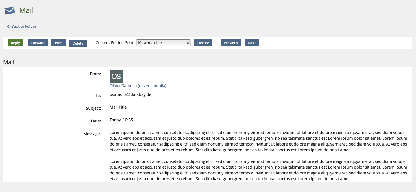
The presentation of mails is a bit outdated.
It is noticeable that a) the information should be more focussed and that b) additional information such as letter avatars are rather squeezed in.
2 Conceptual Summary
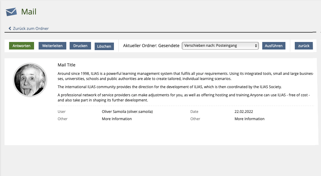
KitchenSink Element "Standard Item with lead avatar" should be used for a clearer presentation of mails.
The current mock-up shows the use of the description for the text body of the mail.
3 User Interface Modifications
3.1 List of Affected Views
- Presentation View of an E-Mail.
3.2 User Interface Details
Using "Standard Item with Lead Image"
3.3 New User Interface Concepts
None
3.4 Accessibility Implications
None
4 Technical Information
None
5 Privacy
No privacy impact.
6 Security
No security impact.
7 Contact
- Author of the Request: Samoila, Oliver [oliver.samoila] & Detemple, Konstanze [kdetemple]
- Maintainer: Jansen, Michael [mjansen]
- Implementation of the feature is done by: {The maintainer must add the name of the implementing developer.}
8 Funding
- …
9 Discussion
Samoila, Oliver [oliver.samoila], JUN 19, 2022: Can we somehow enable a screen reader to read out the sender first? At least before the text of the message. The sender is highly relevant as the context of the message.
Maybe not very elegant, but can the alt text of the image be the sender?
Jansen, Michael [mjansen], JUN 20, 2022: Not that I know of. But you could still include the author in the title, just as an idea. "[Mail Title] by Michael Jansen"
Kunkel, Matthias [mkunkel], 22 JUN 2022 : I am not that happy with the mock-up above. IMHO the lead image (user picture / letter avatar) gets too much space. It should not
Kergomard, Stephan [skergomard], 24 JUN 2022: I think this is a bad idea accessibility wise. And I don't even talk about screen readers. The expected position for the metadata of an email is before the email text. It requires more cognitive effort to parse the information if it is the unexpected way around and we should thus not deviate from the expected order without a very, very good reason. I don't see one. I can see the visual appeal of a bigger user pictures, but only when there is a real picture and not a letter avatar and when we have the screen real estate to really show it. On small screens this will become problematic as far as I can see. So I would also back Kunkel, Matthias [mkunkel]s concern.
Samoila, Oliver [oliver.samoila], 24 JUN 2022 : Thank you very much for the feedback, Matthias and Stephan.
The hint about the image size and the adaptation of the size ratios from the implementation in the comments seems to have been overlooked.
I have therefore adapted the mock-up again to clear up any misunderstandings.
I understand the point about the order of the items I have arranged in the KS Standard Item up to a point.
I don't see a better solution with available options at the moment, but a bad place to start.
For completeness:
The view under discussion is one that is accessed from two points: #1 Mainbar " Communication " Mail or #2 Dashboard " Mail (Secondary Panel).
In #1, I also see the sender directly beforehand in table form. With #2, this information is not offered at all.


Killing, Alexander [alex], 27 June 2022
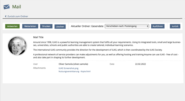
- How do you deal with attachements?
- I would suggest to introduce a new KS Item type for this. The mail text is more something like "Content" and not a "Description" imo. Maybe something like a "Content Item" which has the "Properties" before a "Content" section? This could fix the accessibility issues.
Samoila, Oliver [oliver.samoila], 27 June 2022 : Thank you Alex.
I think the inclusion of attachments should be done in a property section. See the additional image.
Regarding the item, the description gives the following information:
Composition: A list item consists of a title and the following optional elements: description, action drop down, audio player element, properties (name/value), a text, image, icon or avatar lead, a progress meter chart and a color. Property values MAY be interactive by using a Shy Buttons or a Link."
Seiler, Yvonne [yvseiler], 27 JUN 2022: I support the argument of the discussions above (mkunkel, swiniker, alex) that it must be well considered whether a new KS element makes sense here. The aim of KS components is not to use something that does not quite fit, but parts of it do, because there is nothing better. The idea of the KS-Components is that if there is something that fits, then use it, but if this does not achieve the goal, then we need to think about a new component.
In connection with the news and the forum, we had already thought about a KS Personal Item. This has not yet been taken further and is not yet finalised. You could consider whether the mail is a similar type of presentation to a forum post, for example. Could that be something? If so, it makes sense to think further in this direction here and take this KS element forward.
First, of course, it must be clear what you want to achieve with the presentation of the mail (what is the central information that a user has to pick out and display in a mail, does this fit with the idea of a KS personal item, ....). If we transfer elements to the KS (which I very much welcome), we should also take the opportunity to clarify which of them should pursue which goals in the future.
JourFixe, ILIAS [jourfixe], 27 JUN 2022 : We like the feature suggestion in general. But we would like to improve the request by either extending a current KS element or picking up the ideas for a KS Personal Item and find a solution that fits also for forum postings and other communication items. Please get into contact with our UI experts to find an improved solution. The main aspect that should be triggered is a good architecture of information. The sender should not be listed as a property after the message but has to be a "top information".
10 Implementation
{ The maintainer has to give a description of the final implementation and add screenshots if possible. }
Test Cases
- {Test case number linked to Testrail} : {test case title}
Approval
Approved at {date} by {user}.
Last edited: 27. Jun 2022, 17:26, Kunkel, Matthias [mkunkel]


