Feature Wiki
Tabs
Improvement of mail system and mail creation
Page Overview
[Hide]1 Initial Problem
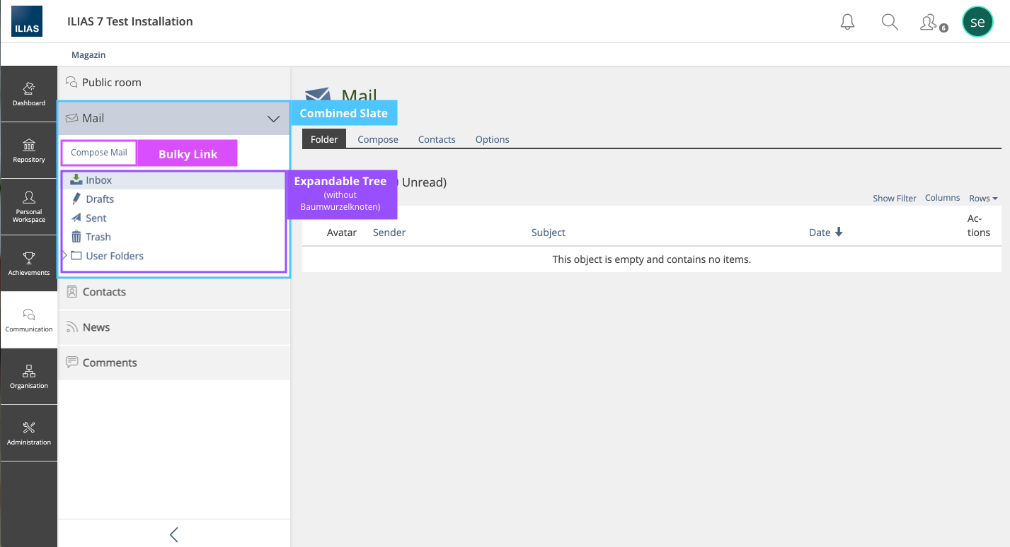
In Request Transfer the mail tree into a Combined Slate, it is proposed that the mail tree be converted to a combined slate. In the context of this request it was decided that a link to the compose-tab will be introduced in the combined slate.
We don't think that's a good idea. Mails should always be created using the same action. This action should always be executed at the same place and be in the focus of the corresponding screen.
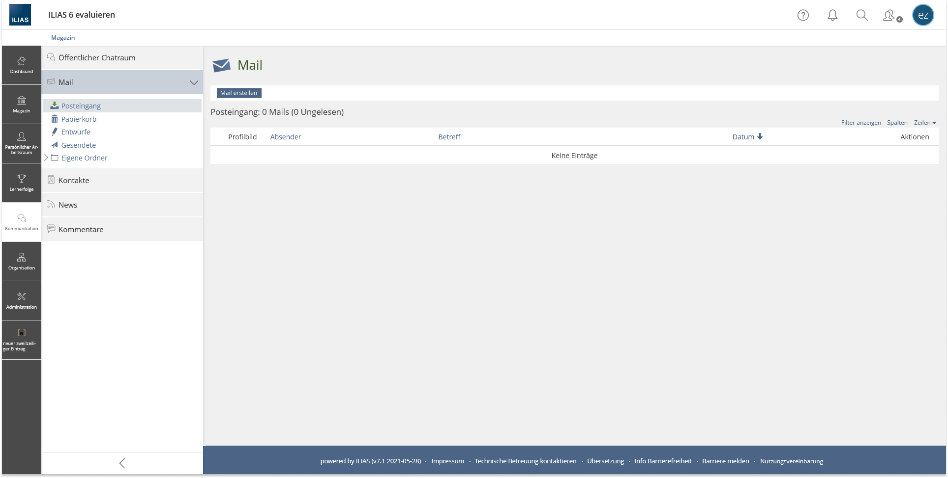
At the moment, the main action "Compose Mail" is difficult to see because it has to share space with other tabs.
2 Conceptual Summary
The creation of a mail is to be revised for the use case "write a mail to someone" as well as "send a mail to members". It's about:
- add a Compose Mail Button
- abandon tab structure
- simplify "Mail to Members" workflow
2.1 Add Compose Button
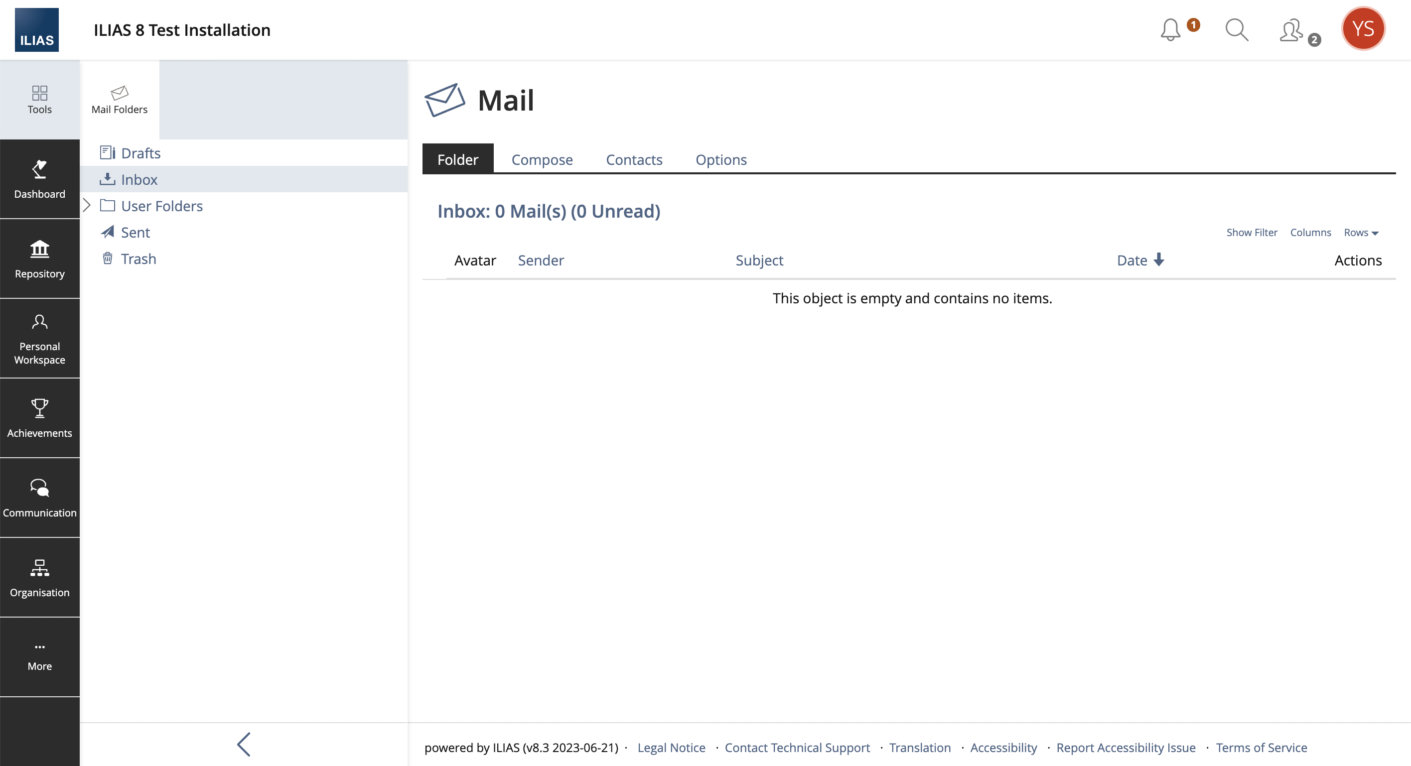
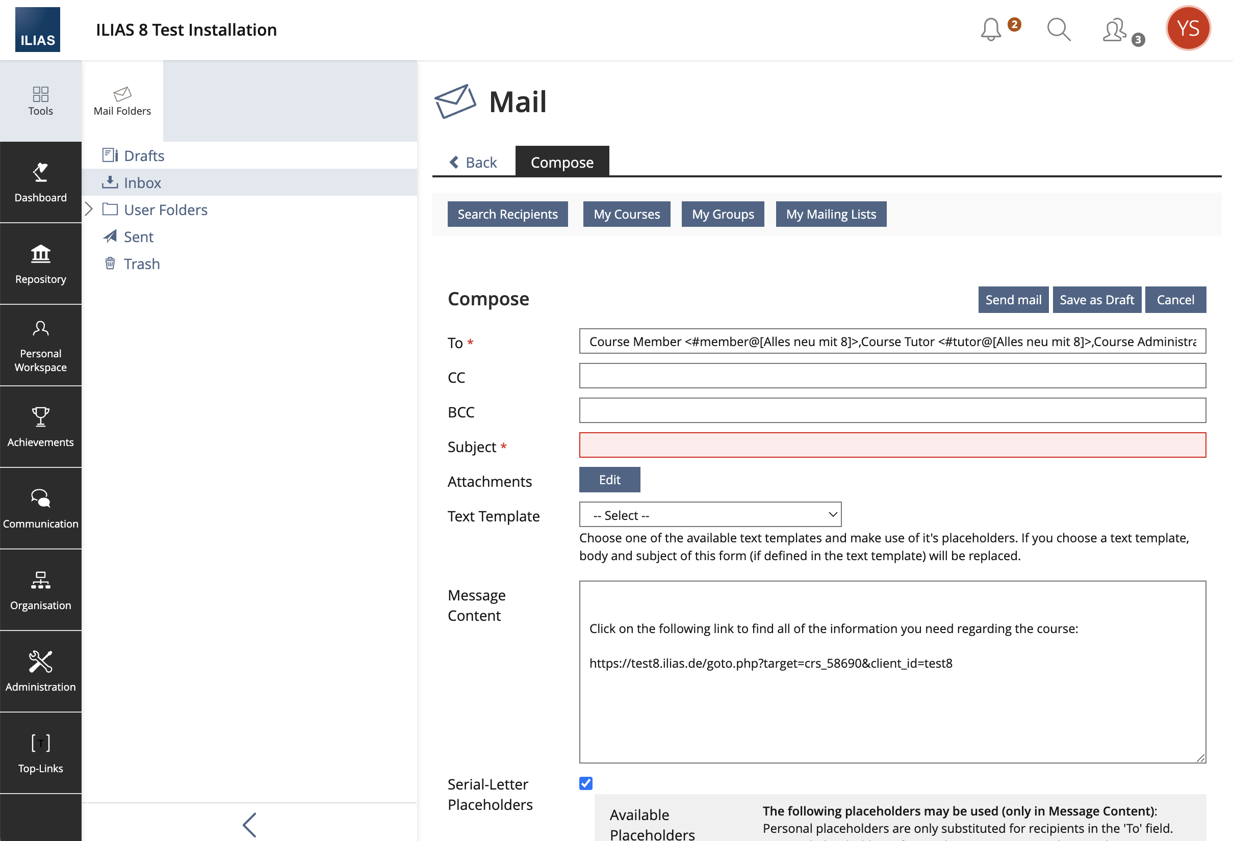
New mails can be created via a "Compose"-button in the toolbar. The "Compose"-action is no longer mapped via a tab. The toolbar is always displayed in the mail system.
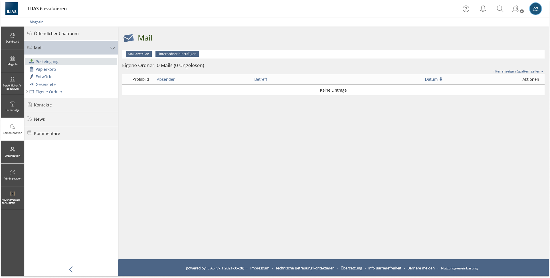
If users switch to the user folders, the "Add Sub-folder"-button is also displayed in the toolbar. However, the "Compose"-button always comes first.
This compose button could be a primary button.
2.2 Abandon Tab Structure
Many of the tabs are duplicates and can be viewed elsewhere in the system. By decoupling the screens from the mail system in this way, the navigation and learnability of the system becomes easier.
Folder
Since no more tabs are to be displayed in the mail system, the Folder tab must also no longer be displayed. Users navigate via the tree within the mail system. The table header shows them which node they are in.
Compose
No longer needed (see chapter "Add Compose Button" above).
Contacts
The tab "Contacts" is no longer displayed in the mail system. Contacts are accessible via a separate menu entry. Because the mail tree is no longer displayed in a tool, the menu item "Contacts" is easy to reach and is displayed directly below the entry "Mail".
- Migrate Subtab "My Contacts" to a new Button on Compose page: The "My Contacts" subtab is the only one that cannot yet be accessed from the Compose page (all others are already present as buttons). This page should be accessible via an additional "My Contacts" button in the toolbar of the Compose page.
Settings
The tab "Mail Settings" is no longer displayed in the mail system. Mail settings can be made in the personal settings. It is not necessary to duplicate the settings in the mail system. All personal settings/profile settings should be made in one central place.
- Remove Administration Option "Show Mail Settings": There is a setting in Administration > Communication > Mail that currently allows the mail settings to be displayed in the Personal Settings in addition to being displayed in the Mail menu node. This would be obsolete and should be removed.
2.3 Mail creation
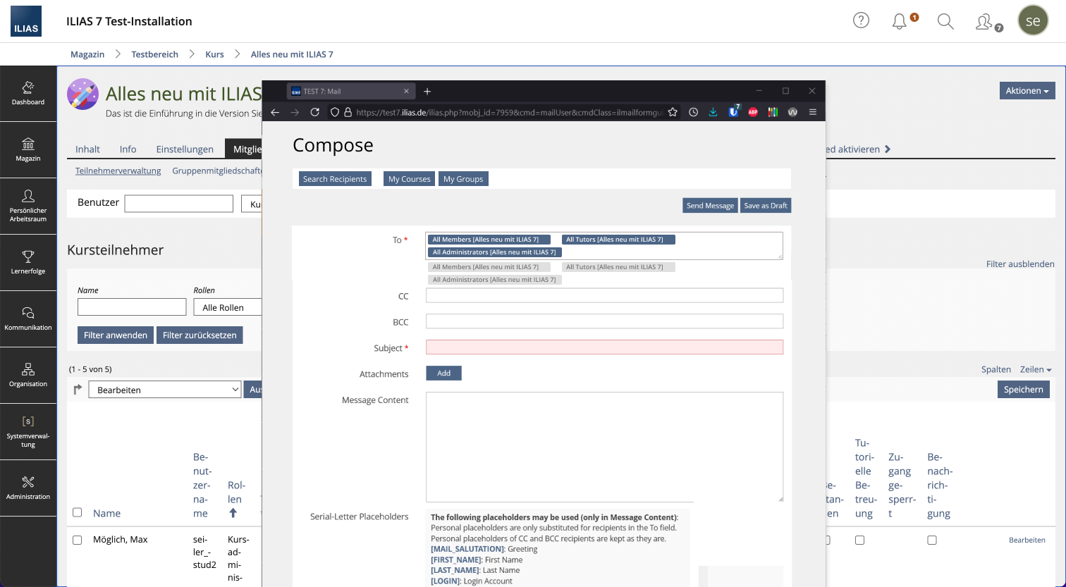
If users click on the "Compose"-button, they can edit the mail form on a new screen ("underworld"). Via the "Back"-tab they can navigate back to the start page of the mail system or course/group/session (if "Mail to members" function was the trigger).
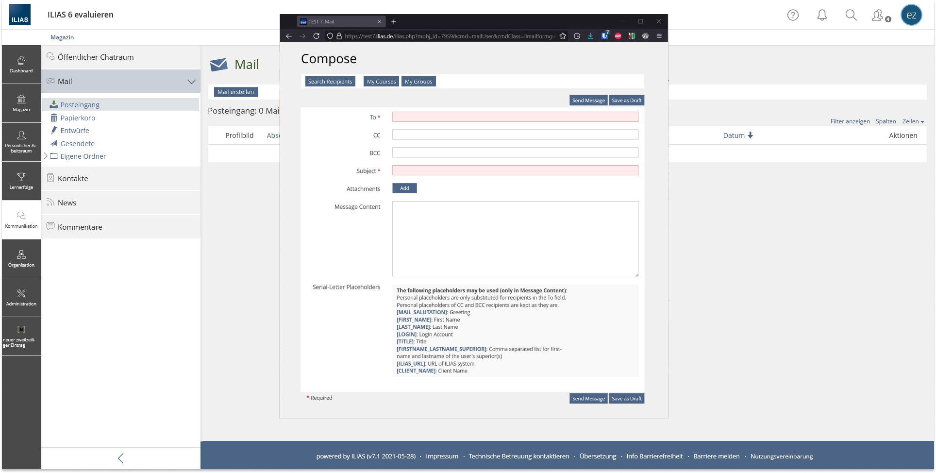
In a first version, the idea of a mail creation in a new window was considered helpful. This was presented at the JF on 18 October 2021. There were various open questions about accessibility, technical implementation and the exact workflow for selecting roles.
In the meantime, the group that drafted the request decided that there were not enough convincing reasons to display the "Compose Mail" in a new window. Therefore, the fallback variant (see above) is used.
Mail window
- Mail form without MainBar and Metabar in new window
- If the trigger element should be a button (standard or primary), it is currently not possible to open an action in a new view port.
- A link on the other hand is able to open an action (URL) in a new view port, but it doesn't look like a button.
- Should buttons be able to open an action in a new view port?
- Or should a new type of link be introduced?
- Or do we need a completely new element?
- It is important that the focus is in the new window (it must be clear that a new window has opened).
- If a field is required, it should be before the input field (already implemented this way).
- If an incorrectly filled field is pointed out when submitting, the hint should be above the field (already implemented this way).
- We had a dedicated meeting/workshop with the UI/A11Y experts to discuss the opening of the new window. As a result, the proposed window will not be openend by the JavaScript API due to A11Y issues. Using the `window.open` API (see: https://developer.mozilla.org/en-US/docs/Web/API/Window/open) of course has advantages like programmatically defined window dimensions and and features, but the workshop participants decided to use a simple `target=_blank` for links and/or forms which target to the new mail screen. This mechanism provides the best A11Y. As a consequence no new UI element will be needed, nor don't we have to modify existing UI elements to make use of the described JavaScript API. The new window cannot automatically be closed by JavaScript if the process of sending a mail has been completed. The window has to be manually closed by the user.
- A `\ILIAS\GlobalScreen\Scope\Layout\Provider\ModificationProvider` will be used to remove all obsolete `GlobalScreen` elements.
2.4 Mail creation in new window
Neither the MainBar nor the MetaBar should be displayed in this window. Only the Footer should be displayed, so that e.g. the link "Report Accessibility Issue" is available.
- The toolbar is extended with a "My Contacts" button (see the section on "Contacts" tab).
- All toolbar actions like Search Recipient etc. will be handled and displayed in this same window.
- Since the activation of the placeholders is often misunderstood, they should be permanently available.
New Workflow "Compose Mail"
- Click "Compose Mail"
- New window opens in the foreground (see chap. Accessibility Implications).
- Add Recipients, write mail content (all in new small window).
- Click "Send Mail".
- Message Box (Success, Failure, Info) is displayed in this window. An another hint informs the user that he can now close this window.
- After closing the windows manually, User see the content page of ILIAS where he/she startet the workflow (f.e. Mail Inbox or Courses and Groups Members List).
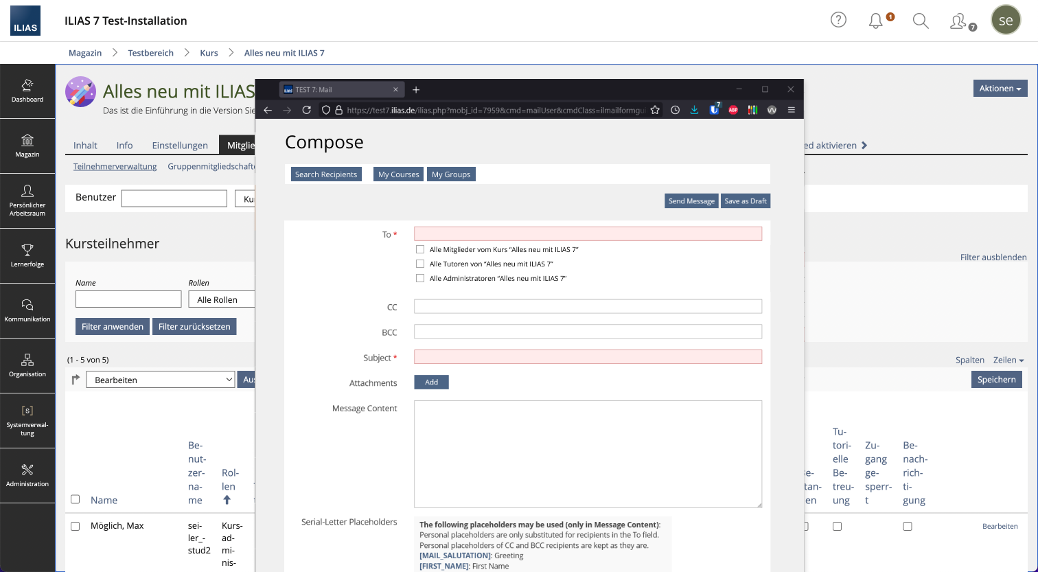
New Workflow "Mail to Member"
- Clicking on "Mail to Members"
- New Window opens (see chapt. 2.2)
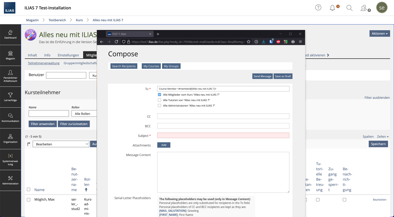
- Below the To-Field all local roles are available as checkboxes.
- By activating a checkbox, the address is transferred to the To field. Deactivating a checkbox deactivates any existing address.
Via Copy&Paste the addresses can be transferred manually from the To field to the CC or BCC field.
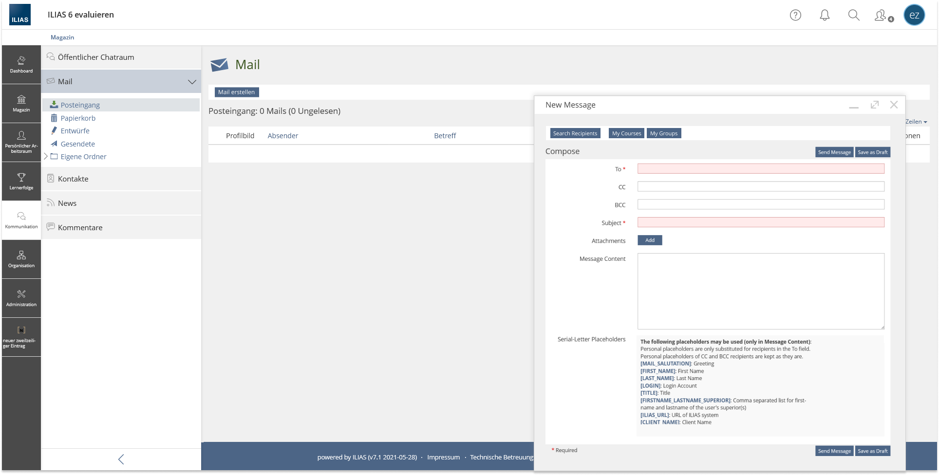
Variant - mail creation in kind of a chat window (the fancy one)
Another conceivable option is to design a similar mechanism for the chat and mail system (see gmail). If users click on the "Compose"-button, a mail window opens in the lower right corner of the screen. Users can edit the mail form, enlarge it (switch to a modal) or close it.
However, we see some conceptual pitfalls here (f.e. competition to the chat window), but still want to provide an outline of this option here.
2.5 Workflow Mail to Members
Course / Group / Learning Sequence / Session
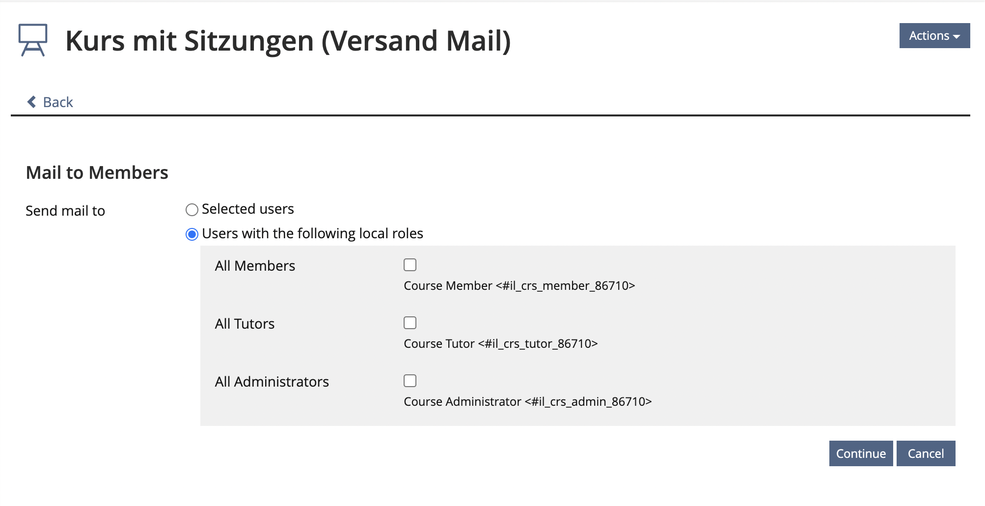
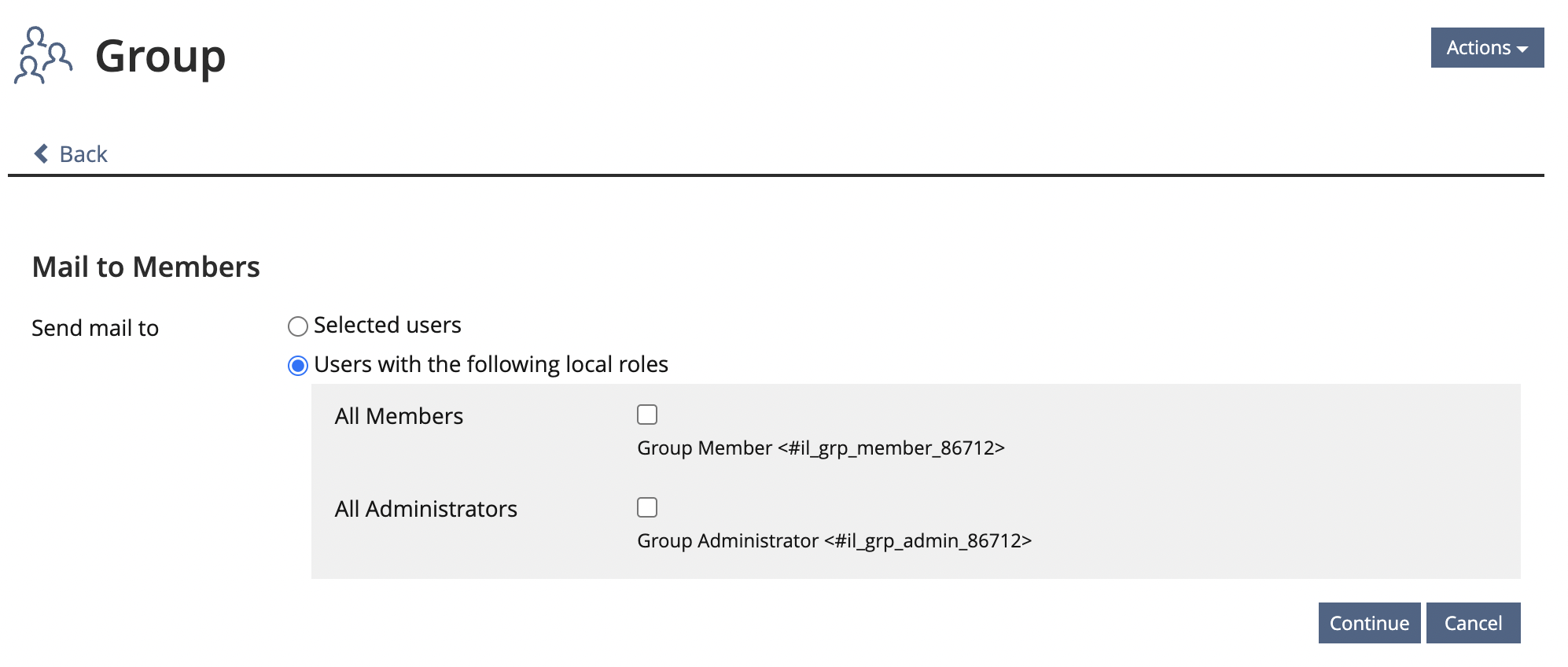
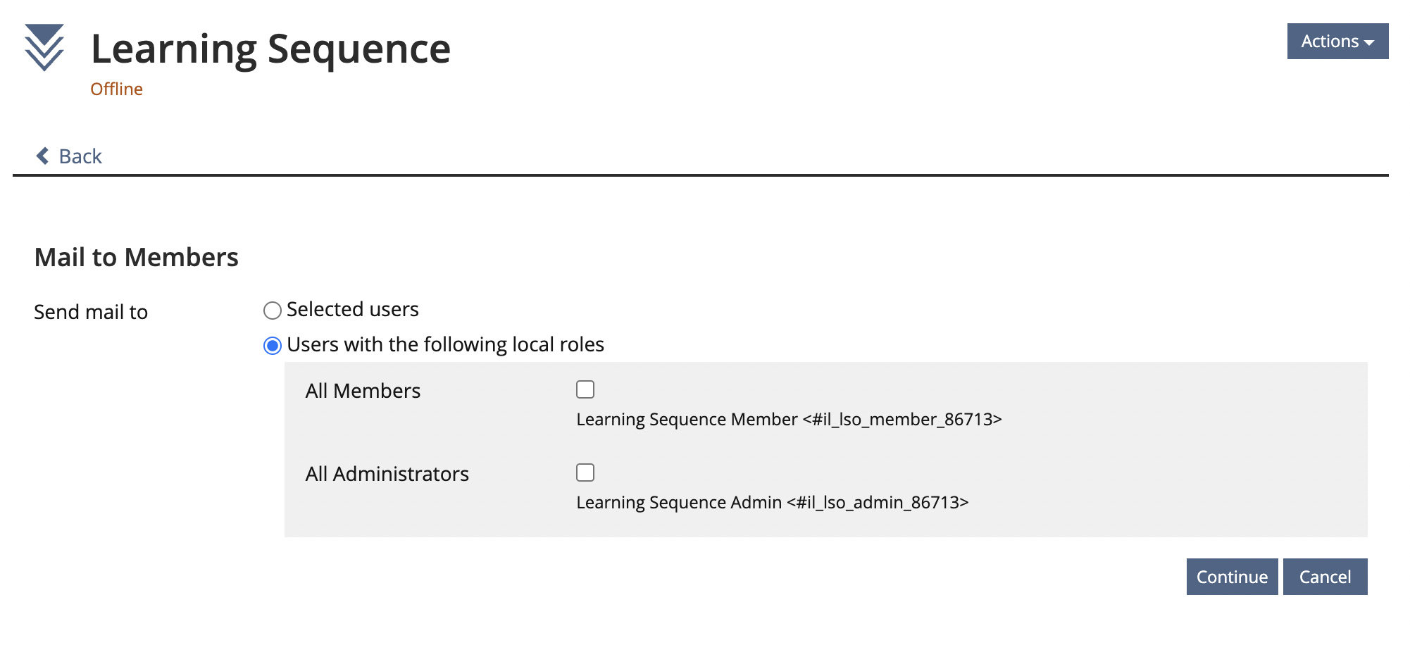
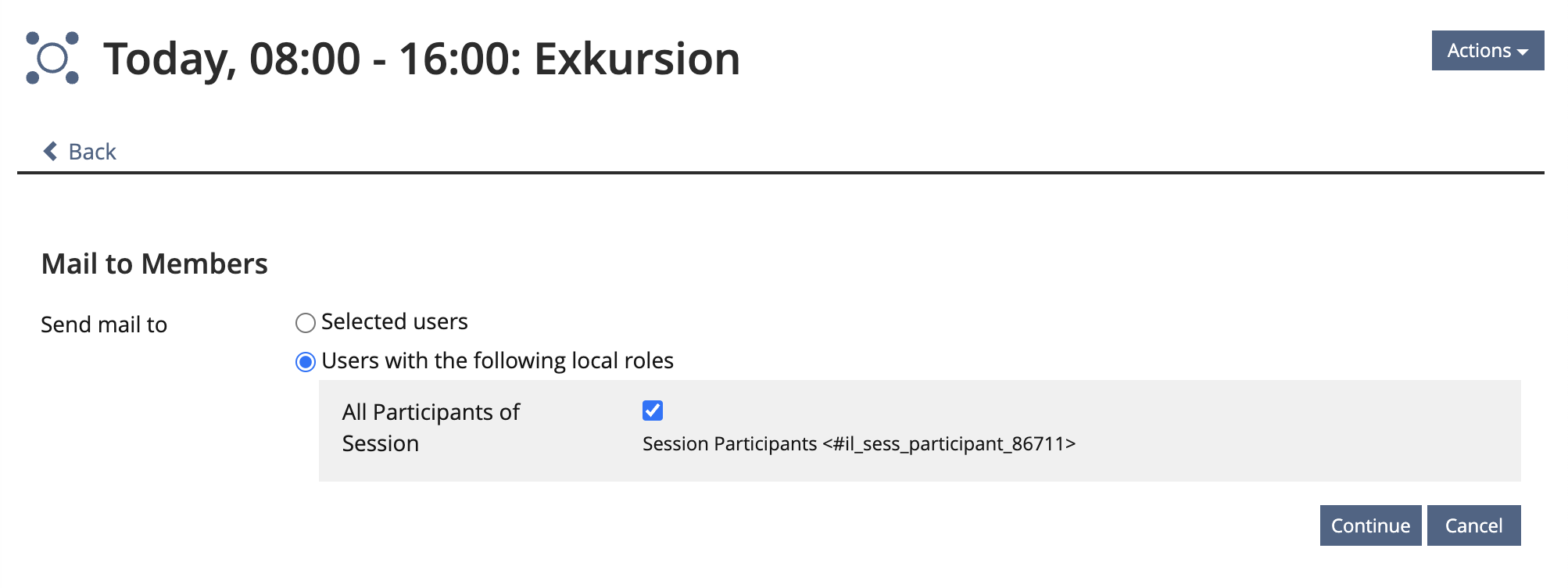
If users clicking on "Mail to Members" the form "Send Mail to" is presented. The form is somewhat simplified so that it is clearer who will get the mail:
- Abandon Option "Send Mail to Selected Users": There are alternative paths to get this option: Members > Members Table OR Mail form "Search Recipients", "My Courses", "My Groups" or just type the name of a user in the input field
- Option "Send Mail to Course Roles": The options are lifted out of the subform. By default, all existing roles should be activated so that the mail can be sent to all participants of the object (f.e. course) with just one click.
Session
It is not entirely clear what is meant by "All Participants of Session", as only registered persons are referred to as "Participants of Session". This is not clear from the previous table. Therefore, we recommend changing the label to "Registered Participants".
There are some concerns, that "All Members" could be interpreted as "All Participants of the course" and not only "All Course Members". Perhaps it would be helpful to look on the issue of "Mail to Members" language variables in the language group.
We hope to accommodate the following request by activating the three roles by default, so that it is easier for users to recognise that the mail is being sent to all course participants (regardless of role). https://docu.ilias.de/goto_docu_wiki_wpage_7677_1357.html
In order not to overload this original feature request, it was decided to formulate a minimal solution (see above) that gets rid of the current intermediate screen as a first step.
If in the future the way for writing mails should continue, it would be important to transfer the mail form into KS elements. This would require new solutions for
- text input
- possibly text input with search results (for tag input multi-line)
- placeholder
- attachment
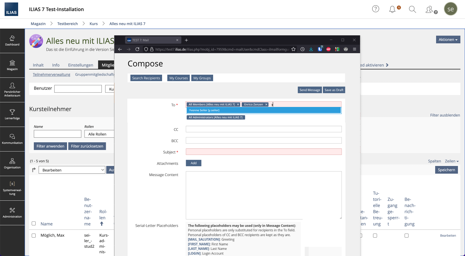
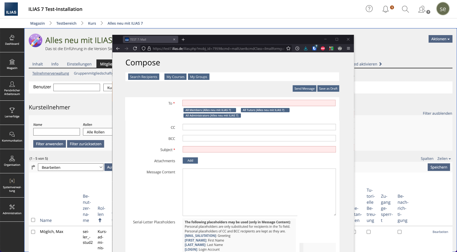
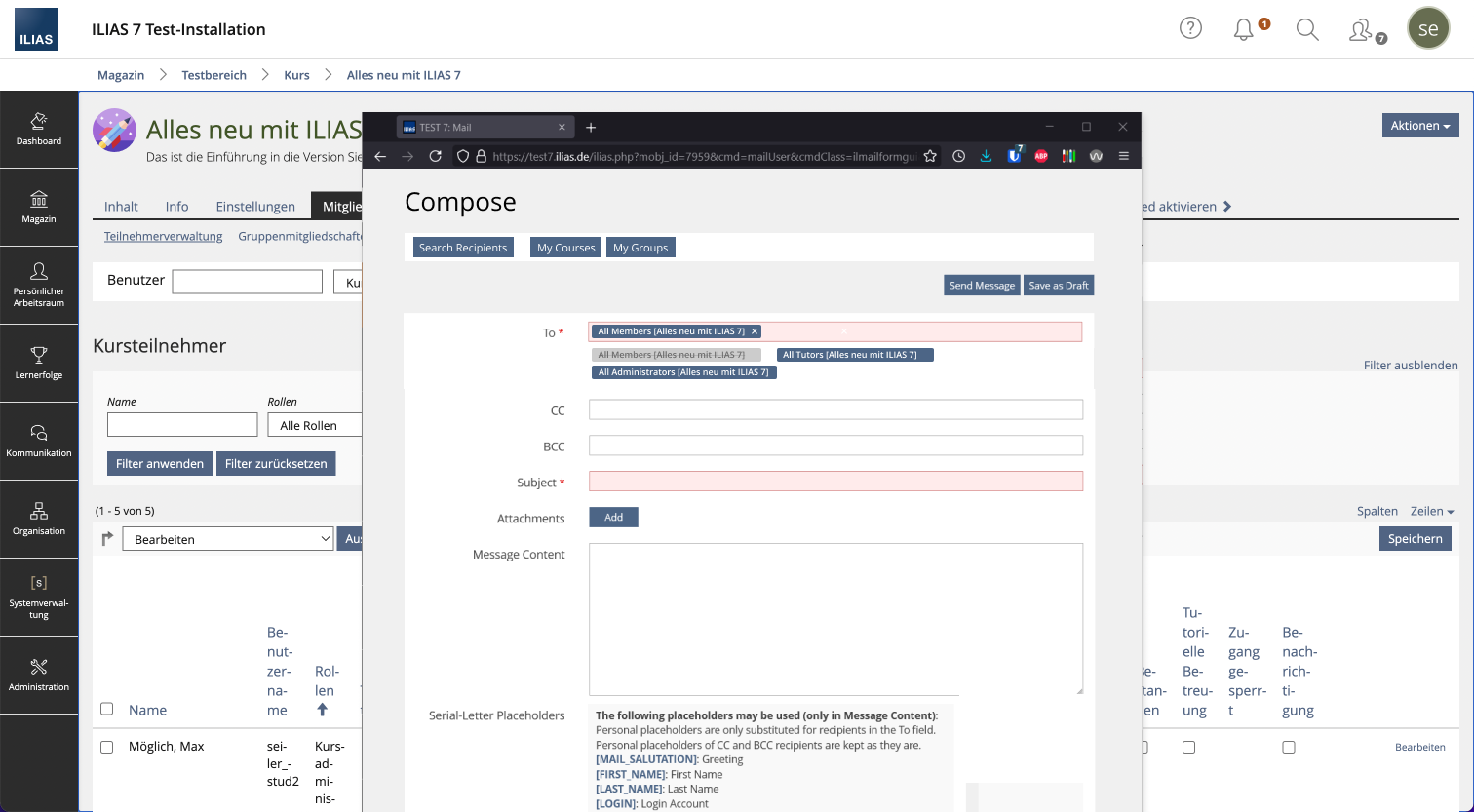
- Tags of all roles of the context (e.g. course) are entered directly into the to-input field. Further recipients can be added in the To field, in the case of e-mail addresses these are taken over as before.
- Variant: If you click on one of the tags, they will be displayed as disabled and transferred to the To input field.
- It must be checked whether the Javascript library currently in the UI component can fulfill the tag requirements (e.g. display directly in the input field or list the unused tags depending on the variant)
- Via the x in the tag, the tags can be deleted from the To input field again. How to get dem back? To be discussed:
- Variant 1: to write to a specific role you have to click into the input field and enter a term (e.g. Members or KursAAA), then the local roles of the current context will be displayed at the top of the search results
- Variant 2: Then the tag below the input field is displayed active and clickable again
- It must be well considered how to handle different language variables in the tag search (when to display correct matches e.g. "members" vs. "member").
- For CC and BCC fields, no additional clickable tags should be displayed (if they are displayed below the To field in variant). Not possible seems that tags can be moved/copied across multiple input fields.
Consequences
- The UI component Tag Field Input needs to be further developed, so that available tags are already visible at the input field without making an input. Up to now, a first character has to be entered into the field in order to get matching tags displayed.
This extension of the UI component can also be valuable for the tags in general. e.g. when tagging objects already show all own tags, from which you can select the matching ones.
3 User Interface Modifications
3.1 List of Affected Views
- Communication > Mail
- Administration > Communication > Mail
- Personal Settings (Profil (Letter Avatar) > Settings)
- Course / Group / Learning Sequence / Session > Members > Mail to Member
3.2 User Interface Details
See descpritions ans mockups above.
3.3 New User Interface Concepts
No new UI-concepts necessary.
3.4 Accessibility Implications
"Compose Mail" Button should get focus.
4 Technical Information
5 Privacy
There will be no additional data stored at all.
6 Security
There will be no security relevant changes.
7 Contact
- Author of the Request: Zenzen, Enrico [ezenzen], Seiler, Yvonne [yvseiler]
- Maintainer: Jansen, Michael [mjansen]
- Implementation of the feature is done by: {The maintainer must add the name of the implementing developer.}
8 Funding
If you are interest in funding this feature, please add your name and institution to this list.
9 Discussion
- What would be the better option for screen readers (option 1 or 2) could be asked in the next SIG (next meeting on 18.8. 14:30 h)
- Option 1: New window has many advantages e.g. no more "new tab" needed to search parallel things.
- Option 2: Similar to option 1 in terms of A11y. More difficult seems to be the placement of the three actions "Back/Cancel" (top left) and "Send mail"/"Save as draft" top right/bottom of the form).
- Option 3: Many different elements competing (tabbing more difficult between background and overlay). Likely most difficult from A11y view.
- Note: Menu item "Contacts" in "Communication" is dependent on an admin setting. Tab "Contacts" in Mail is not affected. Does this make sense? How do we deal with this?
Seiler, Yvonne [yvseiler], 06. OCT 2021: After discussion with the maintainer -> Regarding the last point "Note" in the comments above: Even if the main menu entry "Contacts" in Communication would not be displayed, all functions could be accessed independently (as it is now) as soon as a new mail is created (My Mailinglist, My Contacty, My Groups, My Courses). Therefore, no further action is needed here.
- Is this how the behavior will take place with course/group mail?
- Should "Compose" button be a "Primary button"?
- The Mockup shows a real new browser window. Does this work technically at all, that the browser window closes and then the focus is back in the previous ILIAS browser tab?
- If this works for desktop browsers, what about mobile browsers?
JourFixe, ILIAS [jourfixe], 18 OCT 2021 : We highly appreciate this suggestion and prefer option 1. But we cannot decide upon the request until the open questions (see 3.2) are finally answered. Please discuss the options for buttons / links / pop-up... in the UI clinic and come back with the request in one of the next JF. According to the maintainer, an implementation would not be possible before ILIAS 9 due to missing resources.
Seiler, Yvonne [yvseiler], 05 MAY 2022: We added chapter 2.3 Workflow "Mail to Members" and additionally workflow for the buttons "My Courses", "My Groups", "Search Recipients" and "My Mailing Lists".
Further, the issue of popup and new window was discussed in a UI Clinic session on 11/4/2021. See section "3.4 Accessibility Implications" for guidance on how to proceed.
Seiler, Yvonne [yvseiler], 03 JULY 2023:
Various clarifications regarding the solution proposed on 18 OCT 2021 (new window) have shown that a simpler fallback solution should be used. The feature request was adapted accordingly and the previously proposed solution was moved to the accordion "Other options (not preferred)".
The following points should be discussed at the JF:
- add a Compose Mail Button
- abandon tab structure
- simplify "Mail to Members" workflow
- language variable "Mail to Members" vs. "All Members" vs. "Course Participants
10 Implementation
{ The maintainer has to give a description of the final implementation and add screenshots if possible. }
Test Cases
- {Test case number linked to Testrail} : {test case title}
Approval
Approved at {date} by {user}.
Last edited: 27. Jul 2023, 15:26, Seiler, Yvonne [yvseiler]
