Feature Wiki
Tabs
Improvement of Tag relevance
Page Overview
[Hide]1 Initial Problem
- Kitchen Sink: Although there is a Kitchen Sink componente tag, it is not used for the tags.
- Relevance: The relevance of the tag results from the frequency of use. If more than one tag is used:
- 1 Usage = tag-relevance-verylow
- 2 Usage = tag-relevance-low
- 3 Usage = tag-relevance-middle
- 4 Usage = tag-relevance-high
- 5 Usage = tag-relevance-veryhigh
- Colour scheme: Tags can be displayed in five colour gradations according to their frequency of use. Since all colour compositions must be accessible (contrast), the colour scheme of the highest and lowest relevance falls very far apart.. Tag are displayed with very ILIAS untypical colours.
2 Conceptual Summary
The tags are to be transferred to the Kitchen Sink component Tag. In addition, the Kitchen Sink component is to be adapted. Since the gradations are to be adapted to the relevance, 5 relevances are no longer needed. The KS component tags are given three levels of relevance (see next section).
Relevance
Since the relevance of the tags already changes with further use, the levels do not give a good indication of whether a tag is used 5, 10 or 25 times. The relevance of tags should no longer be based on single uses but on ranges. In this way, the gradations can be reduced so that the relevance levels are more clearly recognisable.
- 0-5 Usage = tag-relevance-low
- 5-10 Usage = tag-relevance-middle
- >10 Usage = tag-relevance-high
If the number of relevance levels is reduced, the colour scheme shall be adjusted. The new tag colours should match the ILIAS colours and comply with the contrast requirements of the WCAG.
Tag Input
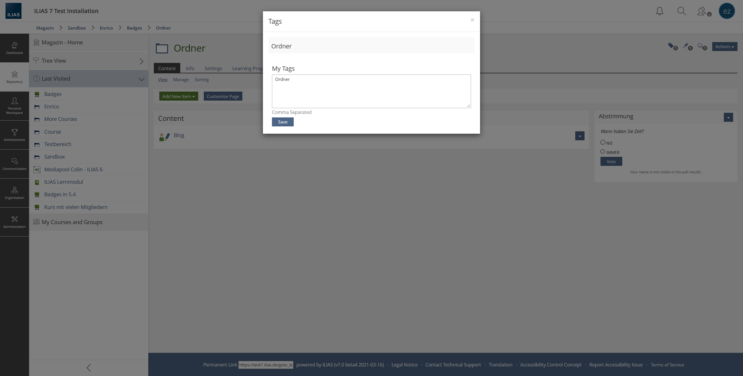
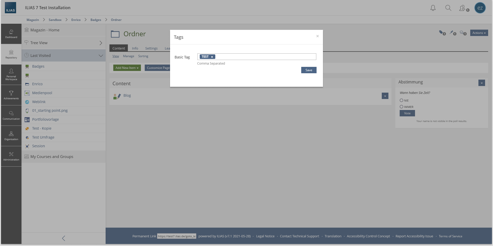
The input are to be transferred to the Kitchen Sink component Tag Input. In addition to the transfer, the modal for setting tags is also to be revised. A strange number of headings are displayed there and the layout looks confused. Since a modal serves to not lose the context, the object title, for example, does not have to be displayed again.
Needs to be clarified
The KS component Tag Input uses its own colour for the tags entered. This colour is independent of the relevance.In the discussion, there were three suggestions for the design of the tag input.
1.) The tags should already be displayed in the tag input in the colour of the corresponding relevance. (Is this technically possible?)
2.) The tags in the input are always displayed in the colour of the first relevance.
3.) The tags in the input are always displayed in their own independent colour.
For some objects, the days can be set from the outside in the repository list view. If you open the object, however, no action menu is displayed in the upper right corner. Accordingly, no tags can be set.
- Individual Assessment (Actions are missing)
- Question Pool for Survey and Tests (Actions are missing)
- Blog (Tags cannot be set via the actions menu.)
- Chat Room (Actions are missing)
3 User Interface Modifications
3.1 List of Affected Views
- Personal Workspace > Tags
- Tag Cloud in several Objects:
- Category
- Category Link
- Course
- Course Link
- Group
- Group Link
- Folder
- Learning Sequenz
- Forum
- Session
- Test
- Survey
- Portfolio Template
- SCORM-, HTML- and ILIAS Learning Modules
- Weblinks
- Glossary
- Mediacast
- Files
- Wiki
- Media Pool
- Exercise
- Data Collection
- Content Page
- Bibliographic List Item
- LTI Consumer
- xAPI/cmi5
- Individual Assessment (Actions are missing)
- Question Pool for Survey and Tests (Actions are missing)
- Blog (Tags cannot be set via the actions menu.)
- Chat Room (Actions are missing)
- Keywords in Blogs
3.2 User Interface Details
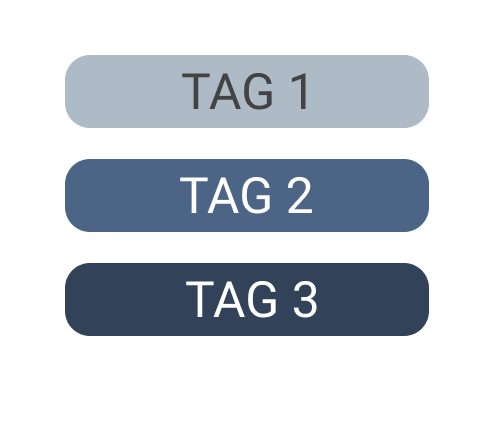
- TAG 1: 0-5 Usage = tag-relevance-low
- TAG 2: 5-10 Usage = tag-relevance-middle
- TAG 3: >10 Usage = tag-relevance-high
3.3 New User Interface Concepts
Kitchen Sink component Tag needs to be revised.
3.4 Accessibility Implications
Need to be adressed during the KS development, especially for the tag input element (keyboard control, contrast, ...).
4 Technical Information
No special technical implications.
5 Privacy
See https://github.com/ILIAS-eLearning/ILIAS/blob/trunk/Services/Tagging/PRIVACY.md
6 Security
No security issues.
7 Contact
- Author of the Request: Zenzen, Enrico [ezenzen]
- Maintainer: Killing, Alexander [alex] (Tag Service)
- Implementation of the feature is done by: {The maintainer must add the name of the implementing developer.}
8 Funding
- …
9 Discussion
Killing, Alexander [alex], 10 June 2021: "A strange number of headings are displayed there and the layout looks confused. Since a modal serves to not lose the context, the object title, for example, does not have to be displayed again." This is not correct. The object title has been added here on purpose (I am not able to refer to a JF decision though). The context may be e.g. a category with a lot of objects. Each object offers the "Set Tag" action in its Dropdown. On larger screens the Dropdown has quite a distance from the object title, so repeating the object title (which is NOT the current context - the parent container is the current context), ensures that the user did no mis-click the desired target object.
- We need to keep the location of the tag in the modal. To improve the modal screen, please add the location to the headline of the form input, e.g. "My Tags in Ordner"
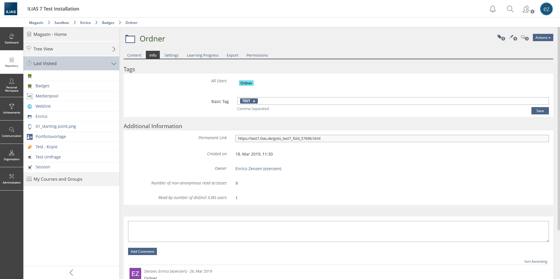
- We prefer to keep the existing colour for tags (see ILIAS main colours: 1EC6D8) that is also used for the weblink icon and some other icons. In case a darken and lighten variation does not look good, please open a dev issue for this.
10 Implementation
{ The maintainer has to give a description of the final implementation and add screenshots if possible. }
Test Cases
- {Test case number linked to Testrail} : {test case title}
Approval
Approved at {date} by {user}.
Last edited: 14. Jun 2021, 15:45, Kunkel, Matthias [mkunkel]


