Feature Wiki
Tabs
Node Specific Tools
Page Overview
[Hide]This is a feature of the project [[[Project] Splitting Up Tools]] that bundles several feature wiki pages which belong to a larger development activity for multiple ILIAS components currently using the space provided by the "Tools-Slate".
1 Initial Problem
Currently we see the following tools falling under this category:
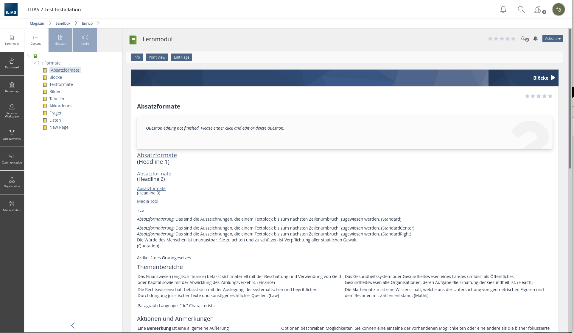
- ToC, Glossar, and Media-Elements in the ILIAS-Learning-Modul
- The Tree of postings in the Forum
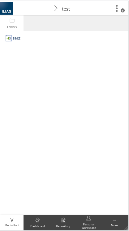
- The Folders in MediaPool
- The Tree of Organisational Units in the Administration
- The Folders of Personal Resources
2 Conceptual Summary
- Show the current content of these components shown under Tools in a new slate at the top level of the Mainbar.
- The Trigger of the Slate will be named with the title of the component controlling the Tool and will show the icon of the component.
- The Trigger of the Slate is shown in a different color than the Main Menu entries of the Mainbar
- There is still the option to show multiple sub slates, thus the triggers for the different subslate remain compulsory and are titled with a heading of the content shown in the slate (as today).
- There is always just one of this Node Specific Tools Slate shown in the Mainbar.
- We propose to change the Glyph for the trigger of the Node Specific Tool slate to a "v" when the slate is open on mobile devices.
3 User Interface Modifications
3.1 List of Affected Views
- ToC, Glossar, and Media-Elements in the ILIAS-Learning-Modul
- The Tree of postings in the Forum
- The Folders in MediaPool
- The Tree of Organisational Units in the Administration
- The Folders of Personal Resources
3.2 User Interface Details
3.3 New User Interface Concepts
The concept of a Node Specific Tool is a new UI concept in itself. The group has been in contact with the coordinators of the Kitchen Sink to ensure a smooth process forward.
3.4 Accessibility Implications
- We believe that this change will improve accessibility of the editor by clarifying the relation between the slate in the Mainbar and the Content Area.
- It will be necessary to ensure that the Node Specific Tool slate are clearly and easily reachable through the keyboard.
4 Technical Information
{ The maintainer has to provide necessary technical information, e.g. dependencies on other ILIAS components, necessary modifications in general services/architecture, potential security or performance issues. }
5 Privacy
Implementing this Feature will not lead to any additional data being collected or shown. Thus it doesn't have any implications for privacy.
6 Security
We don't see that this change has any impact on the security of the system.
7 Contact
- Author of the Request: Kergomard, Stephan [skergomard]
- Maintainer: {Please add your name before applying for an initial workshop or a Jour Fixe meeting.}
- Implementation of the feature is done by: {The maintainer must add the name of the implementing developer.}
8 Funding
- …
9 Discussion
2021 Apr 29, Kergomard, Stephan [skergomard]: Right now I have a feeling that we might be able to also add the Assignment Task under this concept, ...with a little bit of word smithing (and by this I actually mean, working on the concept not finessing the language to work around our concept ;-)).
I understand that currently it is not made visible (especially on mobile devices) that the slate is superimposed on the content. There is no "close" area in the slate on small screens (which is offered on larger screens). I find the suggestion that the icon of the component be replaced with a close arrow somewhat difficult, because then the connection of the slate with the component is lost again.
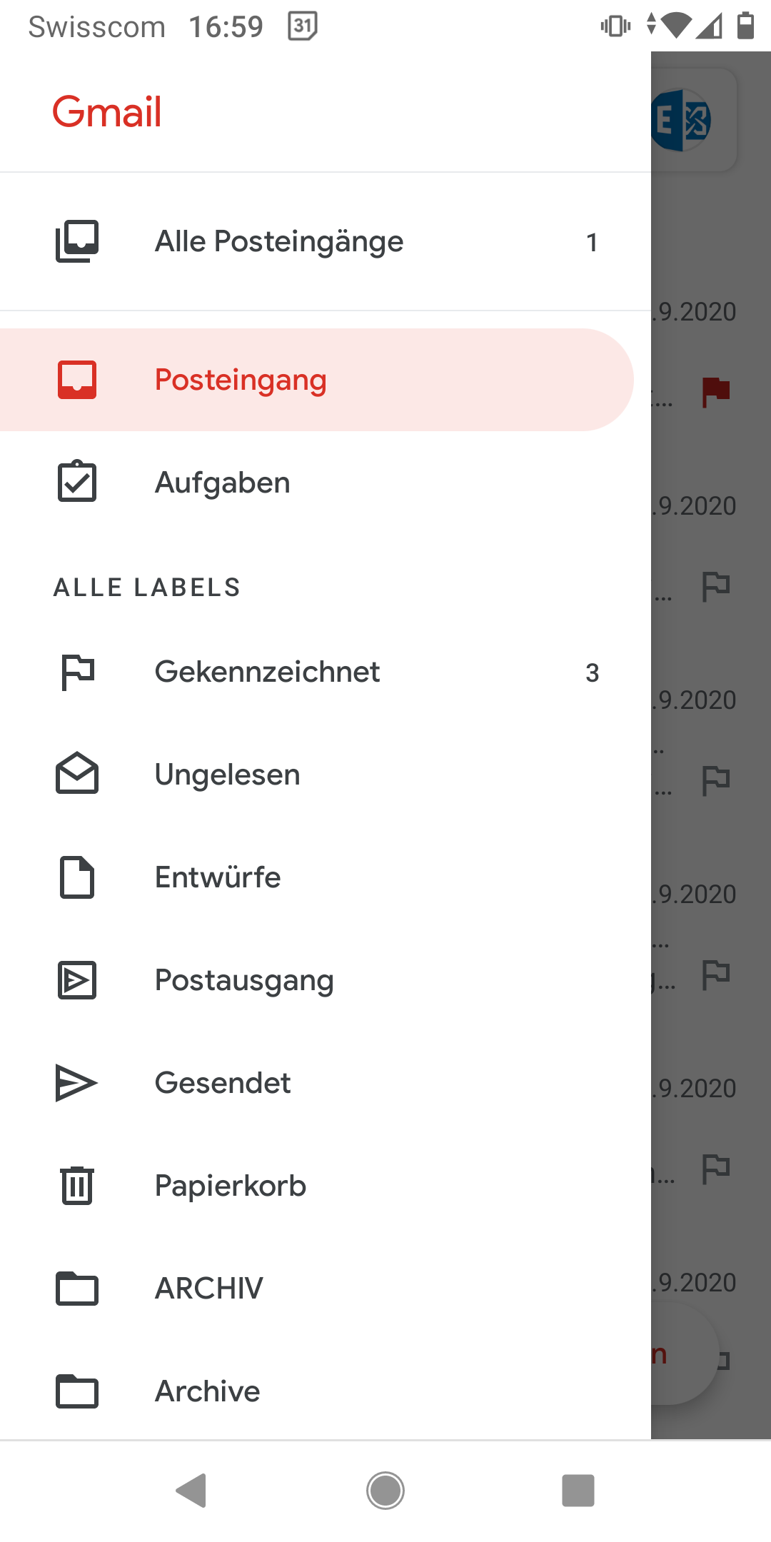
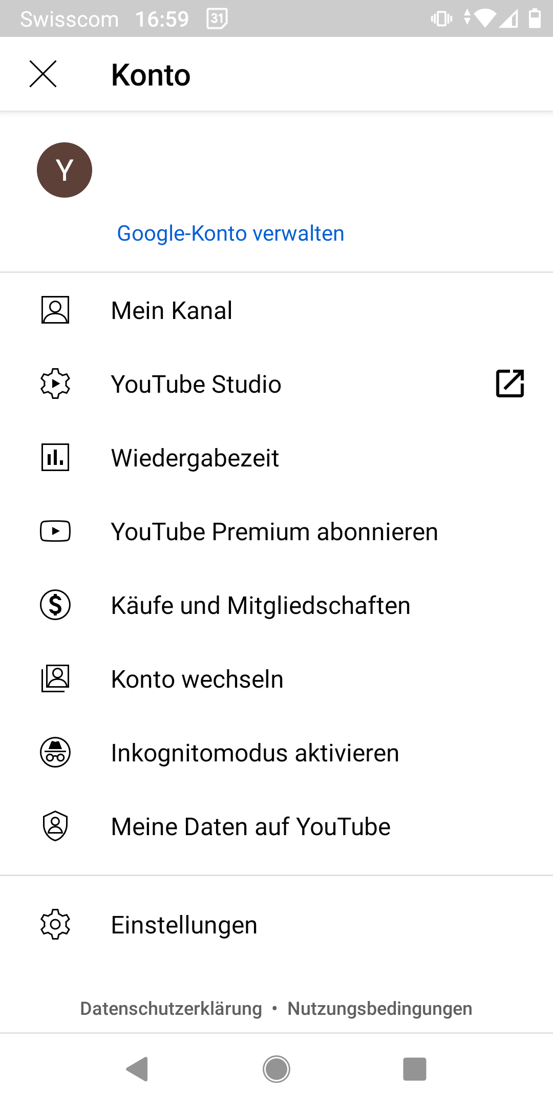
A brief analysis of various websites and apps shows different solution strategies to be able to close a "slate that opens over the content" again (these are partly combined):
- Animation shows how the slate opens and overlays the content.
- Slate overlays only a part of the content - clicking next to it closes it again
- A "Back" arrow or an X-glyph at the top left or a "Done" link at the top right shows how to close the slate. These indicators are always at the top of the screen.
- On apps there are also "draggable handles" via which you can "push" a slate to the side.


10 Implementation
{ The maintainer has to give a description of the final implementation and add screenshots if possible. }
Test Cases
- {Test case number linked to Testrail} : {test case title}
Approval
Approved at {date} by {user}.
Last edited: 18. Oct 2024, 14:53, Kunkel, Matthias [mkunkel]


