Feature Wiki
Tabs
Repository Chat: Message box supports multiple lines
Page Overview
[Hide]1 Initial Problem
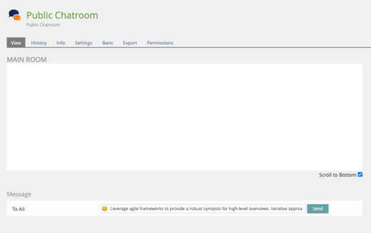
In the repository chat, the text space width for typing a message is very small. If you type the following sentences on the desktop version:
Leverage agile frameworks to provide a robust synopsis for high-level overviews. Iterative approaches to corporate strategy foster collaborative thinking to further the overall value proposition. Organically grow the holistic world view of disruptive innovation via workplace diversity and empowerment.
You only get the following before it starts scrolling to the right.
Leverage agile frameworks to provide a robust synopsis for high-level overviews. Iterative approa
When typing via mobile it is even less and the text kind of jumps around and difficult, if not impossible to scroll back to see what you already typed.
Unlike other apps, this should show at least two lines of text on screen, to give the user the ability to see what they’ve typed and edit, as needed.
Also created related bug: https://mantis.ilias.de/view.php?id=30468
2 Conceptual Summary
We would like to recommend that the 'message' field for repository chat be changed to a textarea instead of a text input field so when a user is typing a longer message they can view all the text instead of having to scroll to the left to see the text.
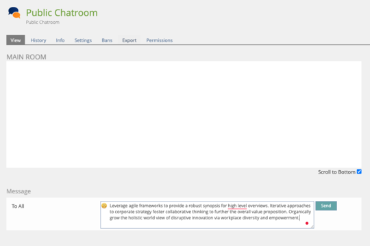
I believe a textarea can also be set up to allow submission on pressing 'Enter' which is common for other chat systems like Slack. It will require updating the JavaScript code to handle the change of the field. Currently, if you use 'Developer Tools' in Chrome and change the field to textarea it works and the UI is not bad. Screenshot below:

The related bug which mentioned the concern about pressing 'Enter' for submitting the text: https://mantis.ilias.de/view.php?id=2421
3 User Interface Modifications
3.1 List of Affected Views
- Repository > Chatroom > View
3.2 User Interface Details
Using 'Public Chatroom' as an example. Below the 'Main Room' chat box is the 'Message' box. To the left is 'To All' (default) and then the input text field with the 'Emoji' button inside the field followed by the 'Send' button.

Change the input text field to textarea. Move the 'Send' button below and either keep the 'Emoji' button as is or copy Slack's button styles.

3.3 New User Interface Concepts
None
4 Technical Information
None
5 Privacy Information
None
6 Security Implications
We would need to ensure that the textarea also sufficiently sanitizes input like the current input text field.
7 Contact
- Author of the Request: Mundra, Daniel [dmundra]
- Maintainer: Jansen, Michael [mjansen]
- Implementation of the feature is done by: To be determined
8 Funding
If you are interested in funding this feature, please add your name and institution to this list.
- CivicActions is interested in implementing this feature for a project of ours that uses Ilias 5.4. We will share a potential solution once we create it.
9 Discussion
DM, 9 Apr 2021: Here is a pull request on GitHub with the suggested changes https://github.com/ILIAS-eLearning/ILIAS/pull/3296
JourFixe, ILIAS [jourfixe]: We highly appreciate this suggestion and accept the PR as usability fix for all maintained versions (5.4 and higher).
10 Implementation
Implemented as PR.
Last edited: 11. Jul 2023, 23:13, Mundra, Daniel [dmundra]