Feature Wiki
Tabs
Section Editing: Multi-selection of style classes
Page Overview
[Hide]1 Initial Problem
To create elaborated page layouts users need a huge variety of content styles for sections.
The initial set of ILIAS section style classes is not sufficient as they are very limited and do not fulfill customers needs. Very often the Content Styles do not provide the specific section style class they are looking for.
Style classes like „Mnemonic“, „Example“ or „Literature“ are suitable for structuring learning content and laying emphasis on special paragraphs like in a book. Styles have been developped under the assumption that there is need for one style for a block only.
But a design of page layouts that are similar to website layouts and thus encourage „discovery learning“ or „discovery of content“ requires an expansion and/or far-reaching adaptions of style classes.
There are to ways to get rid of this problem: By creating more and more section style classes in all possible variations (which will barely cover the endless range of style-requirements) or by nesting sections of different style classes (which leads to very complex structures in editinig mode).
The overall aim of the following feature request is to expand customization possilities for the page element „section“ and thus avoid the need of more and more new style classes.
1.1 Example 1
- Users are asking for sections
- in different colours
- with or without frames
- with shadows
- with or without hover effects
- Different users want to realize different combinations.
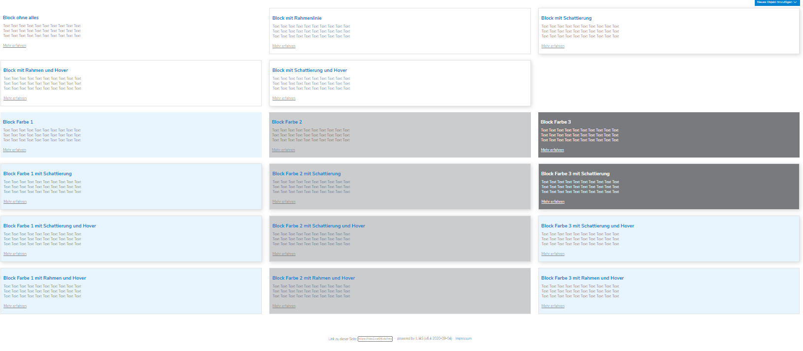
To offer users the complete range of section styles, an enourmous number of styles classes has to be provided (here: 17 styles in total).
If it would be possible to combine different style classes this would lead to a useful reduction - only 8 styles would be needed (3 outline-styles (no outline, frame, shadow), 4 "basic-section" styles (no colour, 3 colours), 1 style for hover effect).
If a fourth colour is requested, only 1 new style class has to be provided.
1.2 Example 2
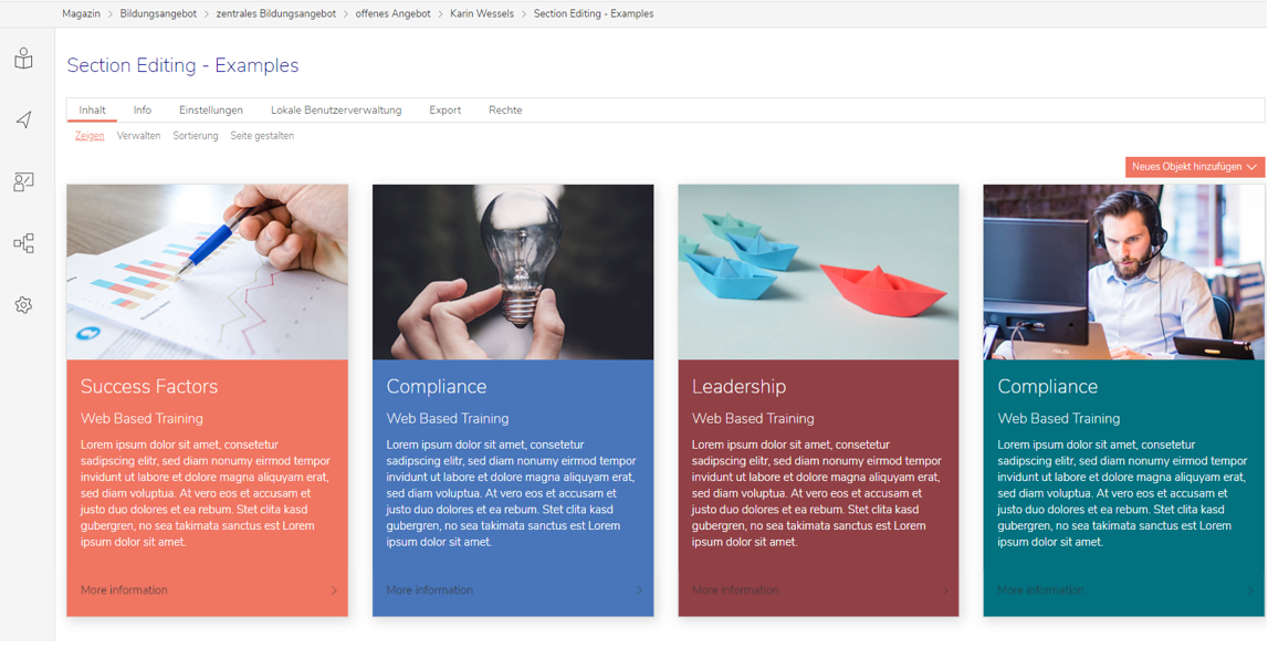
- A user wants to create a column layout with 4 columns.
- In each column there should be a coloured card with a shading all around.
- Each card should have an image, texts and a link on it.
- There should be a defined distance between texts and border of card.
- Only the lower part of the card (with link on it) should hover.
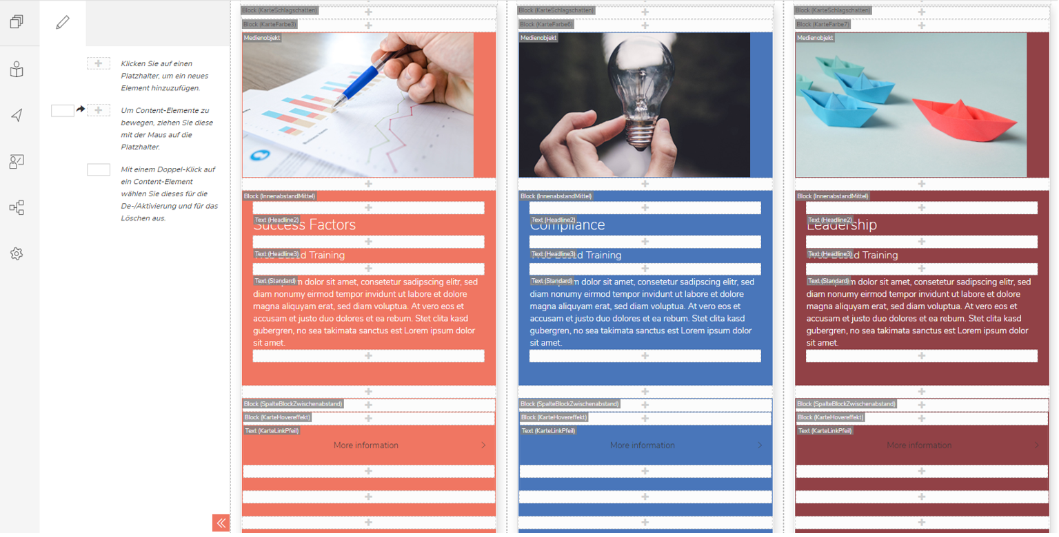
- Card Shading
- Card Colour 1
- Card Colour 2
- Card Colour 3
- Card Colour 4
- Card Internal Spacing (border to text)
- Card Spacing (seperating upper from lower part of block)
- Card Hover Effect
All in all 20 sections have been used within these 4 columns.
As a result the HTML-code of this page is of enormous length.
2 Conceptual Summary
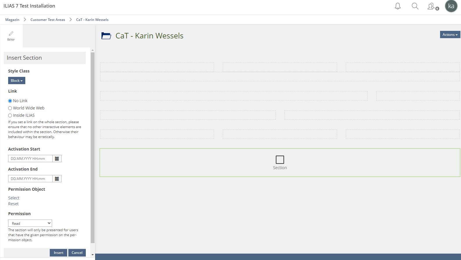
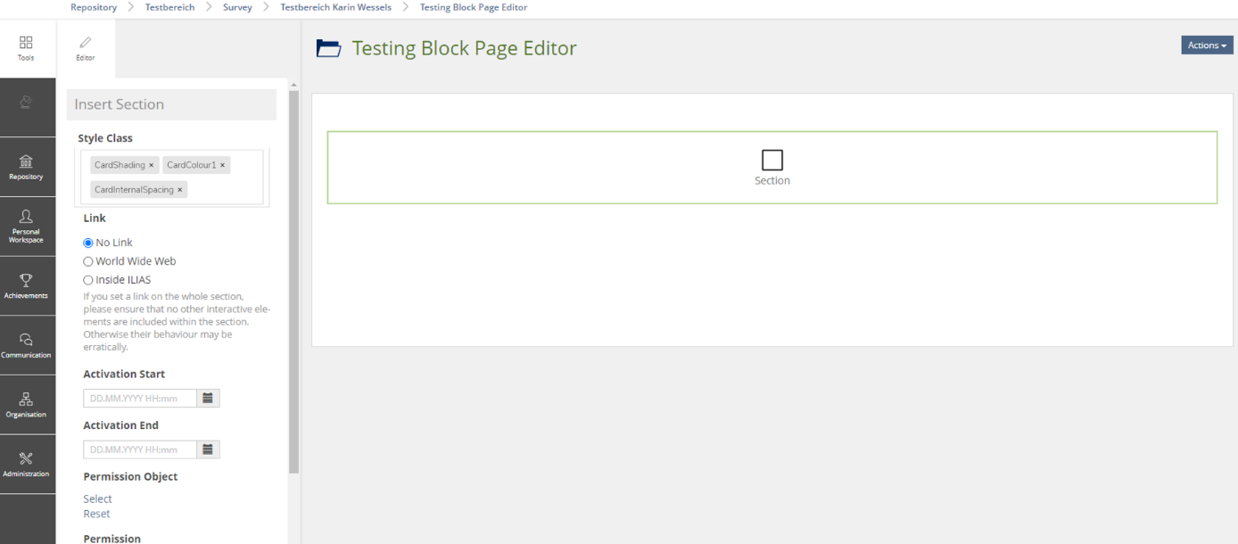
Therefore a tag input field instead of a standard dropdown button will be implemented within the editing mode of a section (slate).
This allows users to combine several section style classes that have been added to the Content Styles.
Advantages:
- The amount of style classes for section can be reduced.
- At the same time the flexibility for users to create attractive content pages are considerably enlarged.
- With special regard on Example 2: Users do not have to add that much sections to a page than before which leads to a tidy look of the editing mode an d instead of adding more and more div-containers to the HTML-code the code gets shorter.
3 User Interface Modifications
3.1 List of Affected Views
Tool Slate >> Insert Section / Update Section
3.2 User Interface Details
New for ILIAS 8: Users who add a section to a page, have to choose the style classes they want to combine by using the input field within the slate.
3.3 New User Interface Concepts
None
4 Technical Information
{The maintainer has to provide necessary technical information, e.g. dependencies on other ILIAS components, necessary modifications in general services/architecture, potential security or performance issues.}
5 Privacy Information
{ Please list all personal data that will need to be stored or processed to implement this feature. For each date give a short explanation why it is necessary to use that date. }
6 Security Implications
{ Does the feature include any special security relevant changes, e.g. the introducion of new endpoints or other new possible attack vectors. If yes, please explain these implications and include a commitment to deliver a written security concept as part of the feature development. This concept will need an additional approvement by the JourFixe. }
7 Contact
- Author of the Request: Wessels, Karin [karin.wessels]
- Maintainer: {Please add your name before applying for an initial workshop or a Jour Fixe meeting.}
- Implementation of the feature is done by: {The maintainer must add the name of the implementing developer.}
8 Funding
- …
9 Discussion
Killing, Alexander [alex], 6 May 2021: With the current implementation you really do not need all these nested blocks. Given the headlines you need one image style class, one card block class per color and one block type for the hover area (if I understand this correctly). I don't think that his can be further reduced by multi style assignment. E.g. define card blocks with padding of 20px; and image class with an additional "width: calc(100% + 40px)" rule (at the bottom of the style class form) and -20px margins for top/left/right. This eliminates the complex structure for the images and the general padding.
Wessels, Karin [karin.wessels], 15 June 2021: I am not quite sure but possibly we do not have the same understanding of the feature yet (or the FR does not make it that clear). I will try to explain it further: Regarding the example (example 2) above, you could of course offer one card block per color with a shading all around which would mean 3 different section style classes. But as soon as users ask for the coloured sections without shading 3 more section style classes without shading have to be offered. The more design options are requested the more style classes are needed and an almost endless range has to be offered (which gets confusing for users also). The page structure is not the only problem in that case but rather the quantity of styles that is caused by creating different page layouts. The option to combine styles would help a lot to solve both problems - structure AND amount of style classes.
Wessels, Karin [karin.wessels], 15 July 2021: To make this feature request more clear, I just added another example here, that is much more simple. Please see example 1 above.
10 Implementation
{The maintainer has to give a description of the final implementation and add screenshots if possible.}
Test Cases
- {Test case number linked to Testrail} : {test case title}
Approval
Approved at {date} by {user}.
Last edited: 29. Jul 2021, 14:10, Wessels, Karin [karin.wessels]
