Feature Wiki
Tabs
Page Editor as Mode
Page Overview
[Hide]- 1 Initial Problem
- 2 Conceptual Summary
- 3 User Interface Modifications
- 3.1 List of Affected Views
- 3.2 User Interface Details
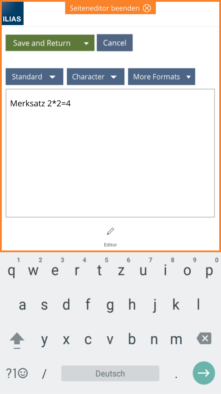
- 3.2.1 Page Editor Mode (Mobile Device)
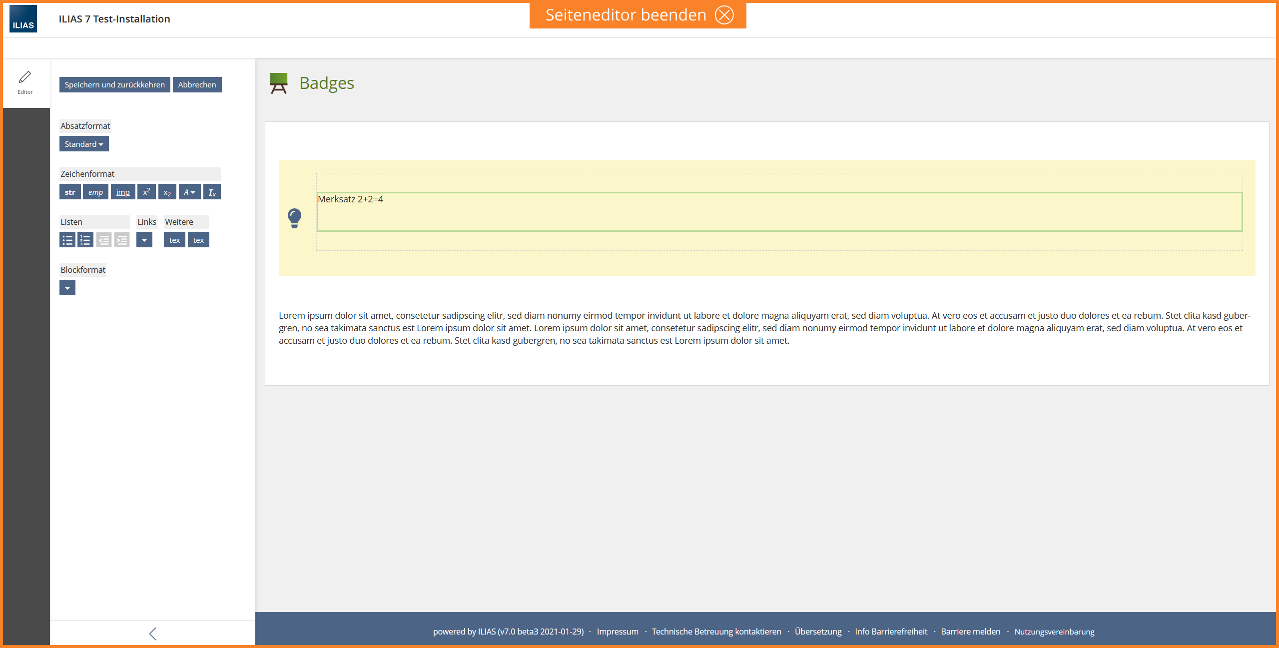
- 3.2.2 Page Editor Mode (Desktop)
- 3.2.3 With other tools
- 3.2.4 Further ideas
- 3.3 New User Interface Concepts
- 3.4 Accessibility Implications
- 4 Technical Information
- 5 Privacy Information
- 6 Security Implications
- 7 Contact
- 8 Funding
- 9 Discussion
- 10 Implementation
This is a feature page belonging to a larger development activity for multiple ILIAS components ([[[Project] Splitting Up Tools]]) currently using the space provided by the "Tools-Slate".
1 Initial Problem
Since the Page Layout Revision, the ILIAS page editor is also displayed in the Tools Slate. The experience of ILIAS 6 shows that this representation is associated with some difficulties.
- The ILIAS Page Editor can be overlaid by other Tools (e.g. TOC-, Glossary- or Media-Tool), especially in ILIAS Learning Modules. If the editor is overlaid, users have difficulty finding it again, they do not know how or where to save their changes and how to exit the editor.
To improve basic usability of the editor, we propose the editor as a mode.
2 Conceptual Summary
A mode has different tools to work within that mode. For a particular work, a unique combination of tools should be offered based on the requirements and goals of that work step. A mode offers users exactly the options that are needed at this point.
If a page is being edited, a user is exactly at such a point where he/she wants to focus on the current work step and the tools that go with it (like add and formatting text, add images and column, change page in a learning module, choose another block format, etc.). The mode approach, for example, is already known from the Learning Sequence.
- Things you don't need are not displayed, they are not distracting (focus, space economy, attention efficiency). The focus is on the work surface, not on everything around. Statement "Focus on this".
- Unintentional navigation away and loss of unsaved content becomes less or no longer possible. Saving is done at the latest when leaving the mode.
- Completing the workflow is made conscious.
- There is now an enormous amount of space in the metabar that can be used for the editor. The pattern mainbar can also be used successfully in the editor.
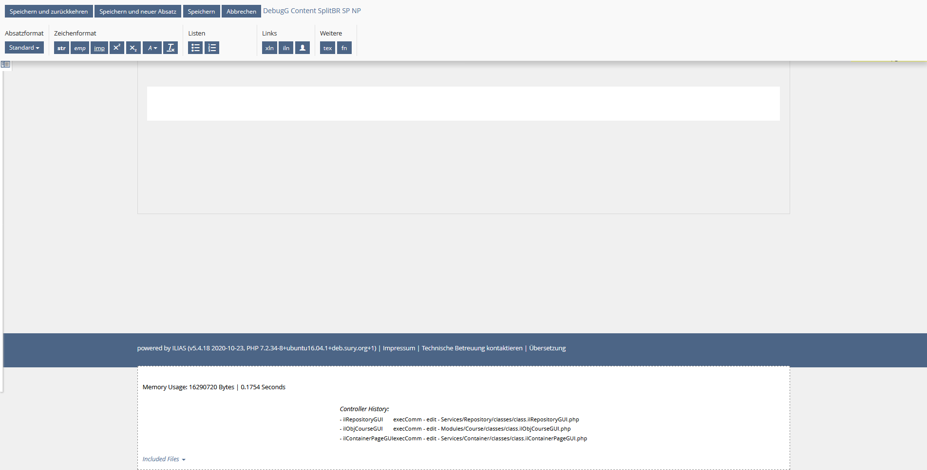
Already in ILIAS 5.4 the page editor was displayed in a kind of mode. The Main Menu and the TopBar were not displayed, so the user's focus was on editing the page.
- The page editor is transferred to a mode.
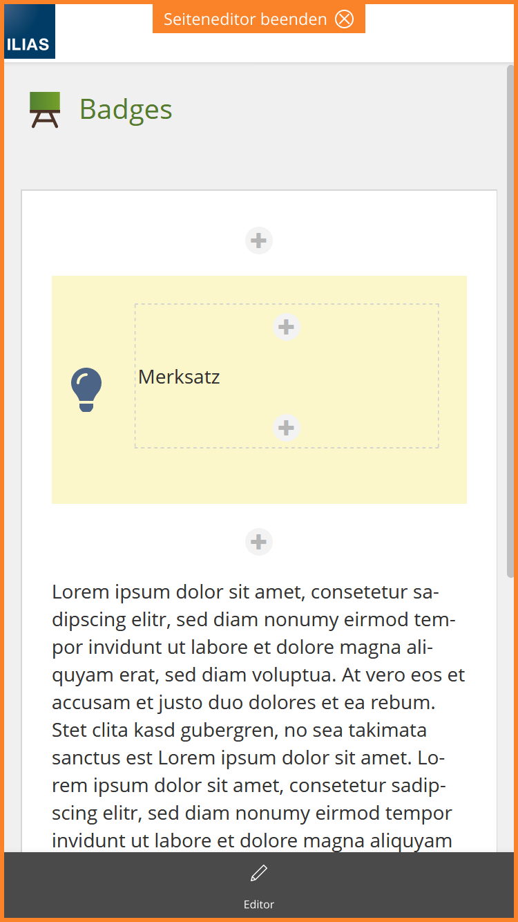
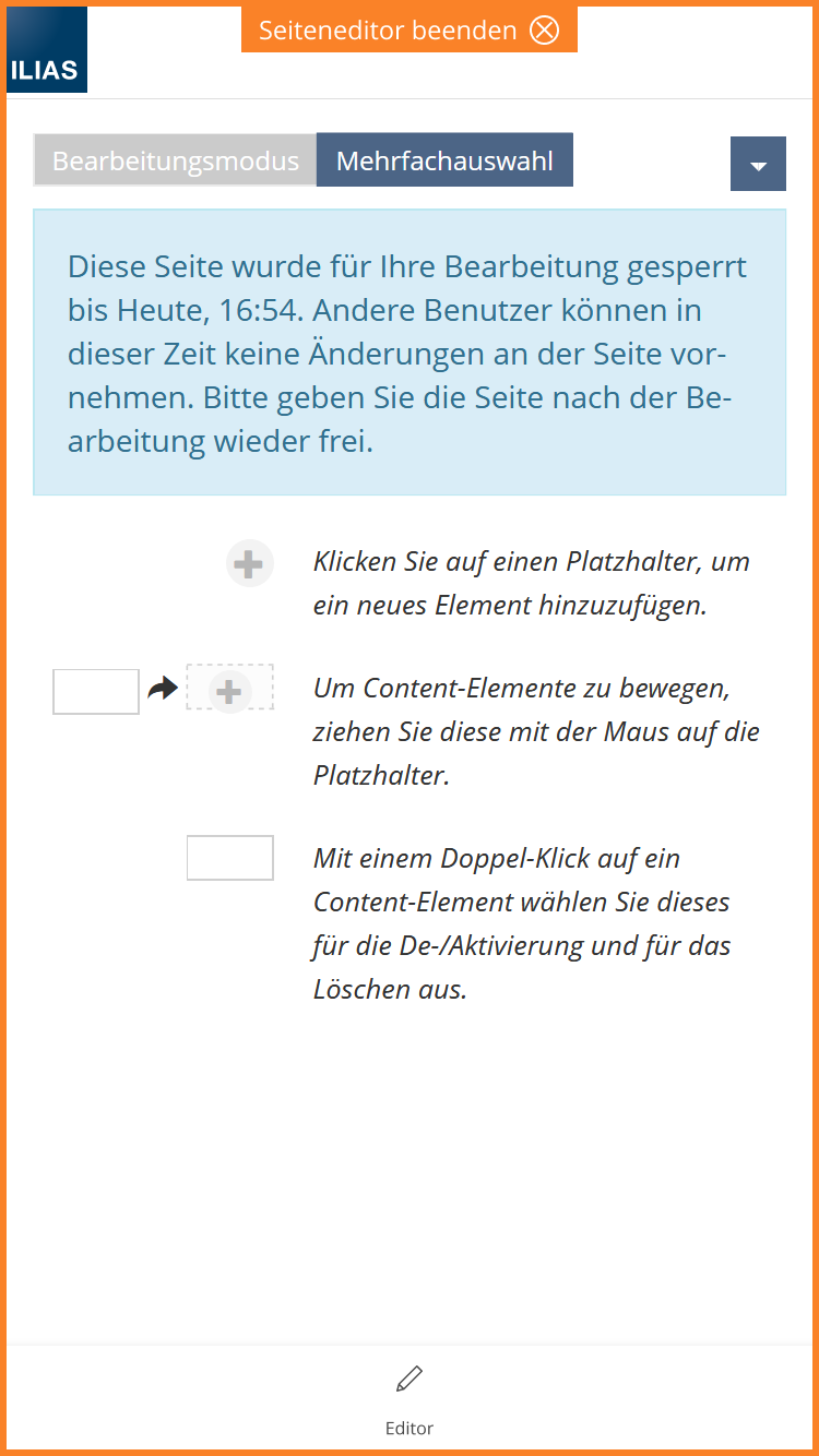
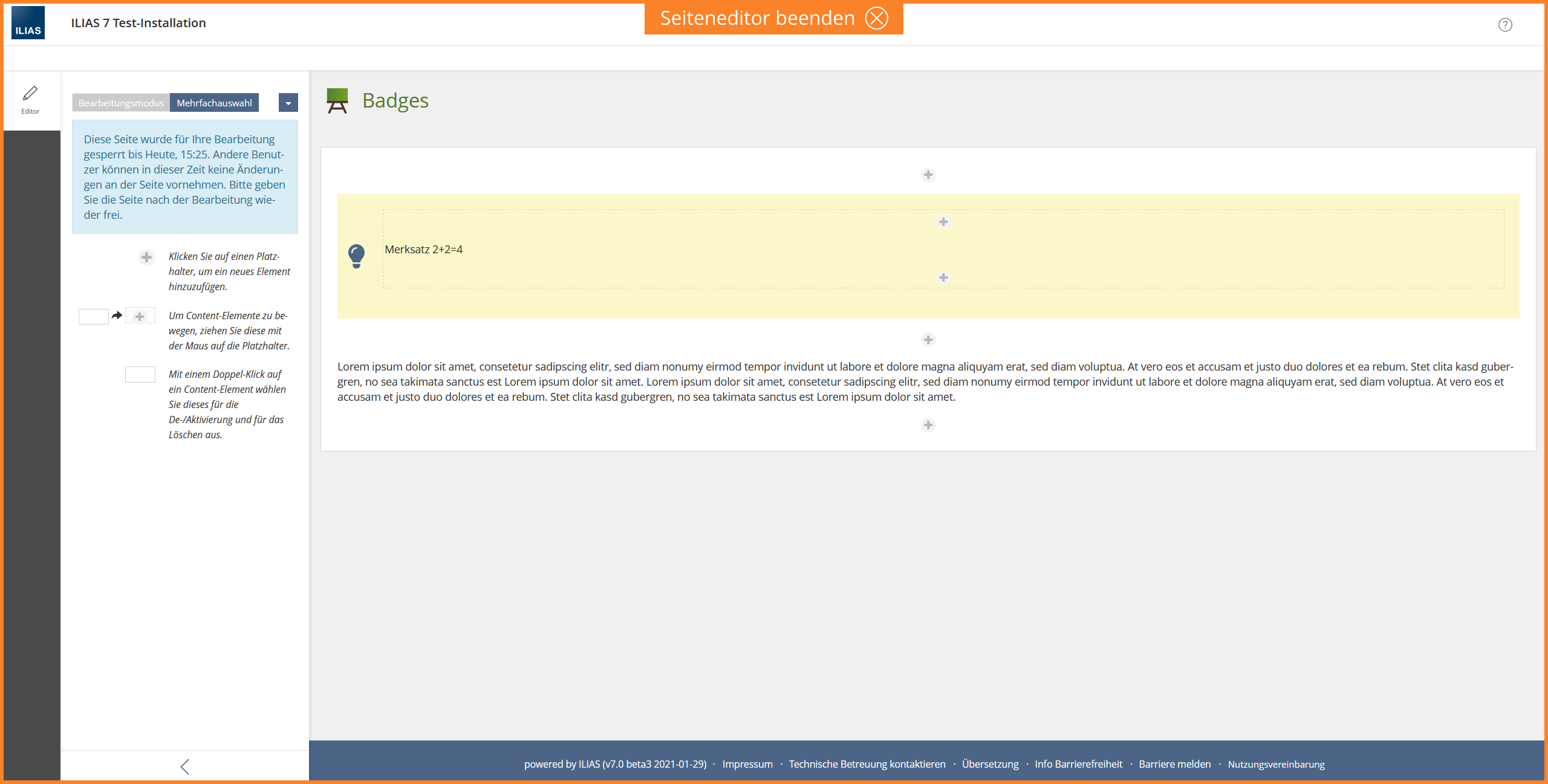
- If users click on "Edit page", the page editor opens. The menu items are no longer displayed in the MainBar. The Editor only adds one element "Editor" to the mainbar. The slate contains the editing options of the page elements and the "Blanko Slate" (Editor Introduction). All controls belonging to the Page Editor, i.e. History, Clipboard, Disable Media, etc., remain in the Actions menu in the Editor slate.
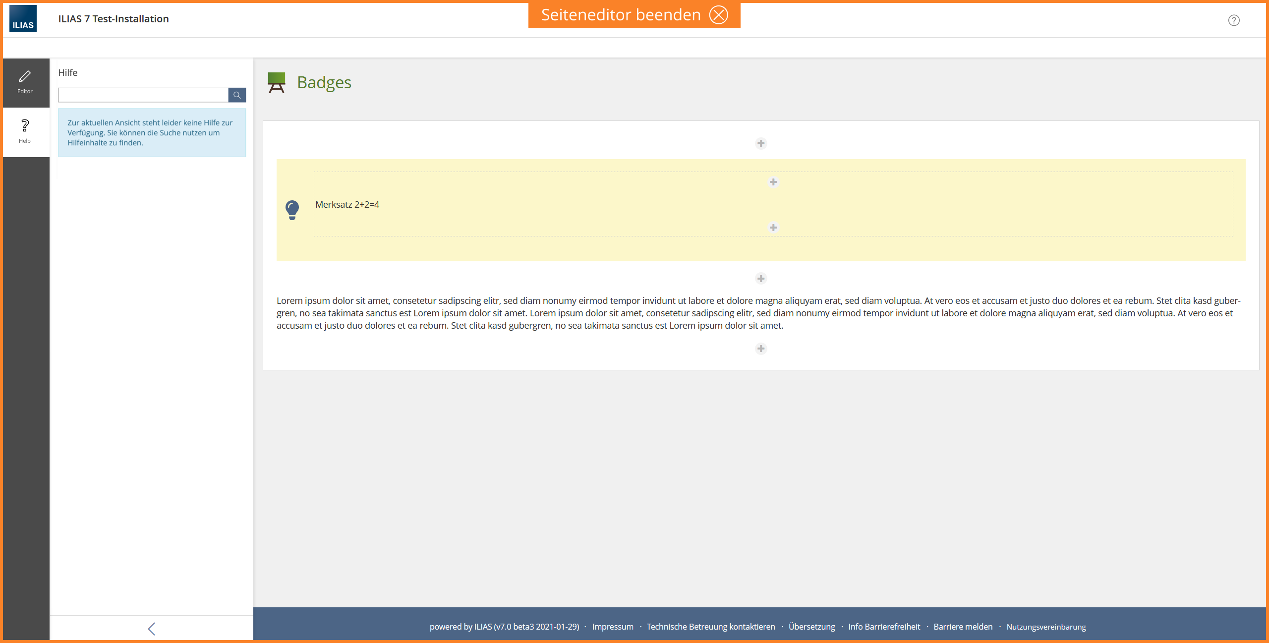
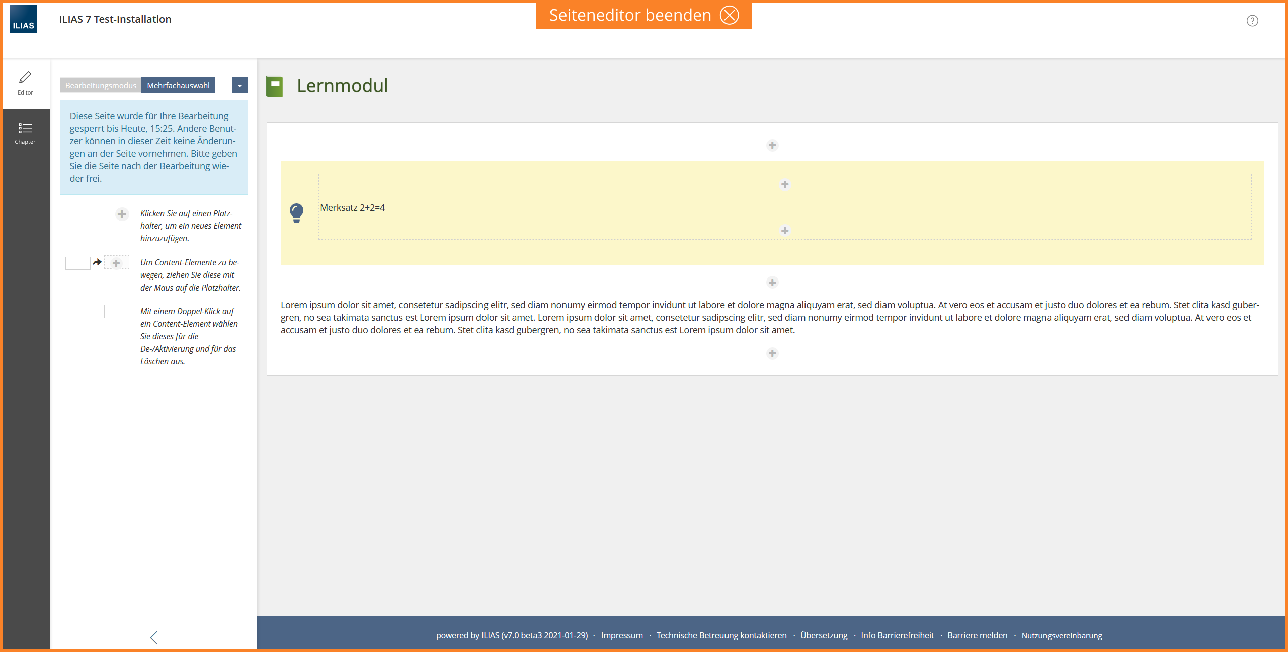
- We would suggest to offer the possibility to the Module controlling the page being worked on with the editor to add additional elements to the mainbar, e.g. a TOC in the Learning Module to make editing multiple pages easier, or the help entry. All interaction with these entries MUST not lead to leaving the page editor mode.
- By hiding the main menu, users cannot accidentally close or hide the Editor tool. The focus is on the editing process. This affects the mobile view in particular. In addition, more space is available in the editor slate on mobile devices, since the tool tile tabs do not have to be displayed.
- Following the same logic: Entries in the Metabar MUST not be shown, if they would allow to leave the mode. If the help keeps its place, it could be kept, right now no other entry springs to mind.
- The mode is indicated by the Mode Info. The Mode Info is to be used in ILIAS for all modes in the future. Accordingly, the Mode Info will also be introduced for the learning sequence.
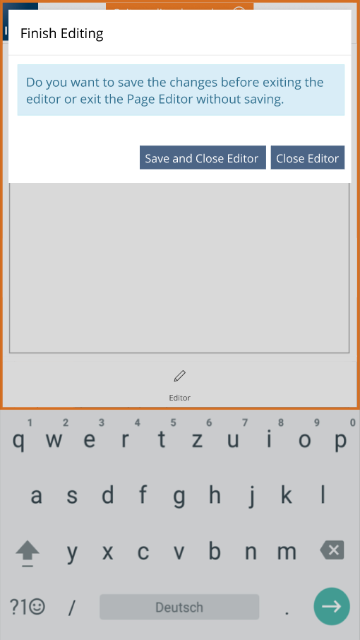
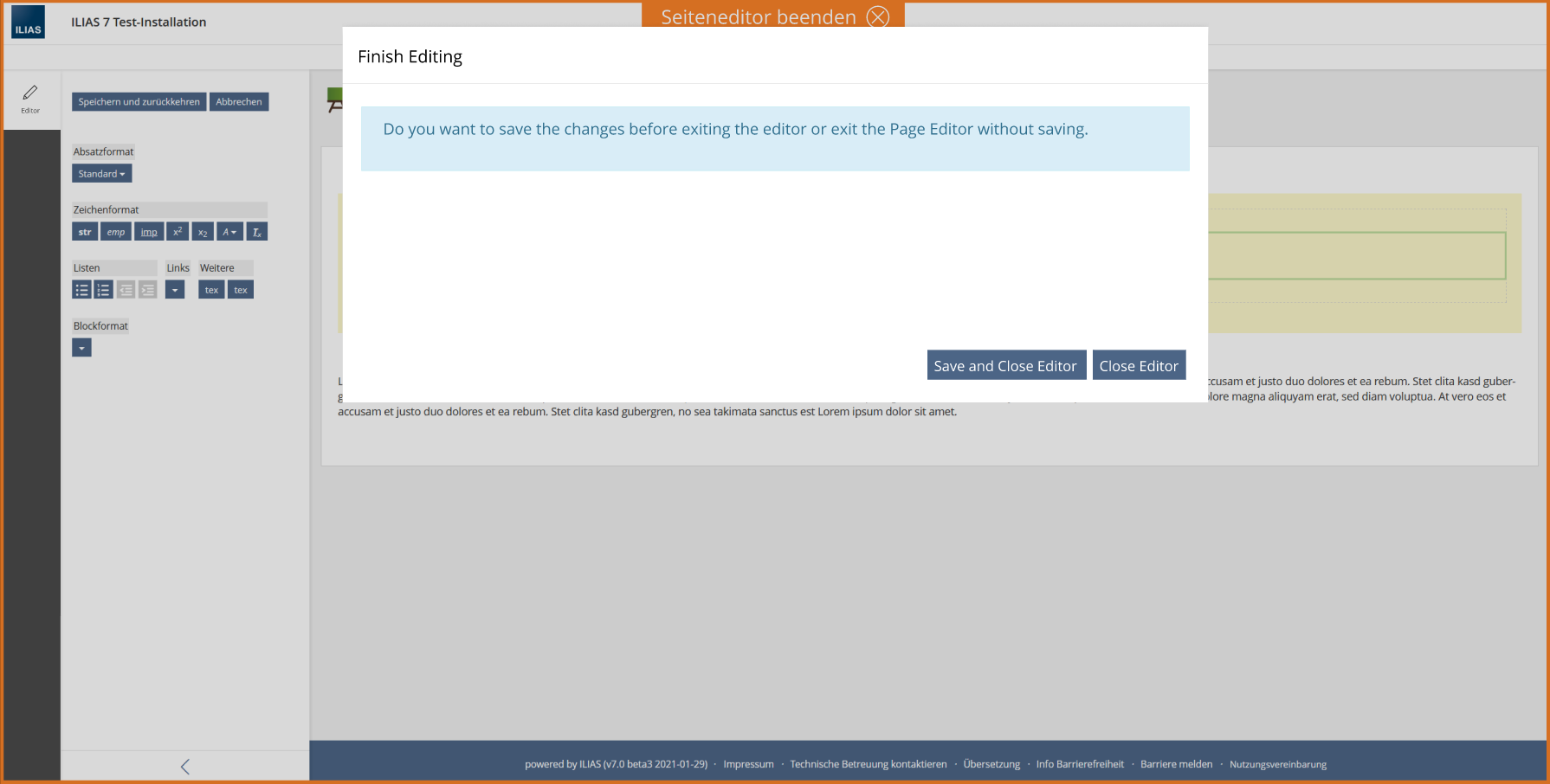
- The page editor can be closed via the Mode Info. If a user also clicks Finish Editing, a modal opens at this moment if there is unsaved content. The user must confirm whether he wants to save unsaved changes or exit the editor without saving.
Since the editor can be terminated via the Mode Info, the "End Editing" button in the Blank Slate is no longer necessary. The Actions menu should be displayed next to the Viewcontrol. This makes the slate look tidier and creates more space, especially in the mobile view.
Since some more advanced concepts already exist and have been dicussed, they are described in a separate section.
3 User Interface Modifications
- Editor Mode Demo (Mobil Device): https://www.figma.com/proto/0twPZQkzuoGuYKXdaEah4w/Page-Editor-as-Modus-ILIAS-8-mobil?node-id=102%3A828&scaling=scale-down
- Editor Mode Demo (Desktop: ): https://www.figma.com/proto/WTjYYHrB8O8pYrwYnE1q5A/Page-Editor-as-Modus-ILIAS-8-desktop?node-id=102%3A887&scaling=scale-down
3.1 List of Affected Views
- ILIAS Page Editor
3.2 User Interface Details
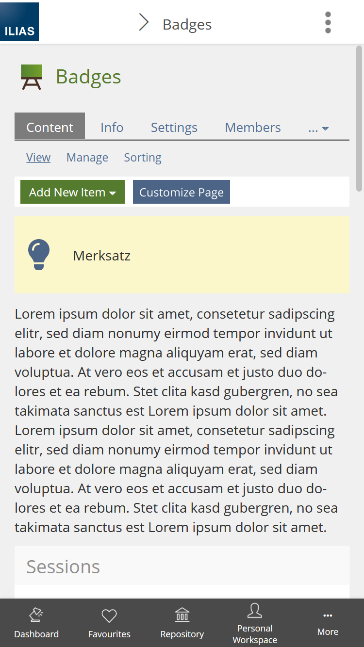
3.2.1 Page Editor Mode (Mobile Device)
3.2.2 Page Editor Mode (Desktop)
3.2.3 With other tools
3.2.4 Further ideas
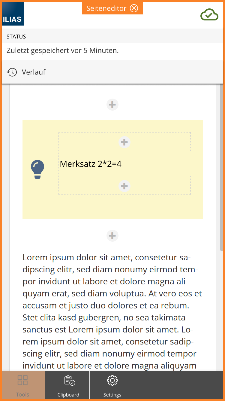
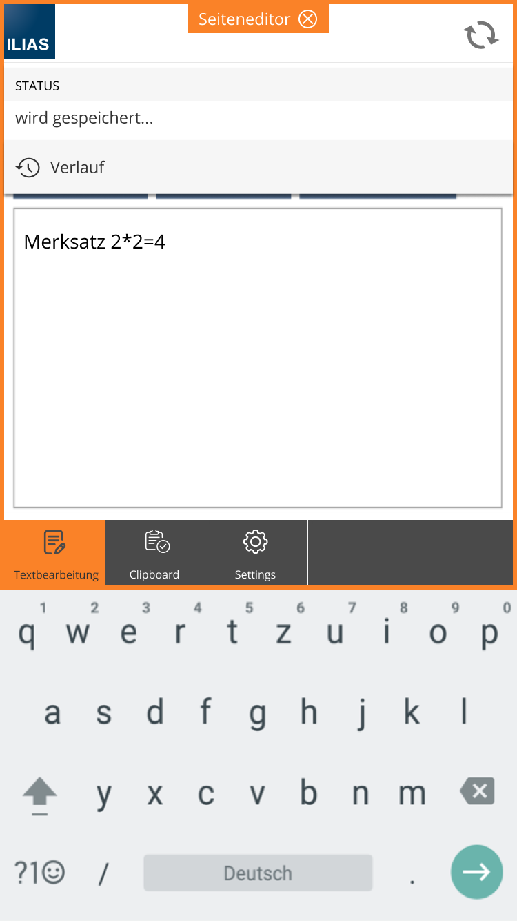
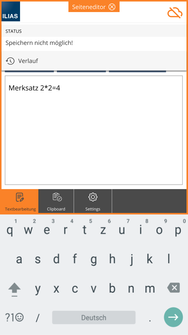
As long as the autosave is not implemented for several elements, it should remain in the respective slate (state ILIAS 7). If the Auto Save option is expanded, the Auto Save can be displayed in the Editor mode as follows.
In many other editors, the history is displayed in "close proximity" to the Auto Save icon. That the page ranges can be determined in a mode of the editor results in new possibilities here.
The Save-Icon(for Text Editing Auto Save) can be displayed in the MetaBar in the upper right corner. If users click on the icon, they can see when the changes were last saved and open the history.
3.3 New User Interface Concepts
- Extension of Mode Info to the entire page area (already implemented for the Learning Sequence)
- Modal triggered by Mode Info
3.4 Accessibility Implications
- We believe that this change will improve accessibility of the editor, by reducing extraneous page elements.
- It will be necessary to ensure that the entries of the Page Editor and the corresponding Menu in the slate are clearly and easily reachable through the keyboard.
4 Technical Information
{The maintainer has to provide necessary technical information, e.g. dependencies on other ILIAS components, necessary modifications in general services/architecture, potential security or performance issues.}
5 Privacy Information
Implementing this Feature will not lead to any additional data being collected or shown. Thus it doesn't have any implications for privacy.
6 Security Implications
We don't see that this change has any impact on the security of the system.
7 Contact
- Author of the Request: Zenzen, Enrico [ezenzen], Seiler, Yvonne [yvseiler], Kergomard, Stephan [skergomard]
- Maintainer: Killing, Alexander [alex]
- Implementation of the feature is done by: {The maintainer must add the name of the implementing developer.}
8 Funding
- …
9 Discussion
2021-07-01: How would the help be contolled and displayed in this?
Killing, Alexander [alex] 1 July 2021: As mentioned in the April meeting, we need a clarification of the semantic role of the mainbar before we decide to change it this way. Up to now its mark-up defines it as navigational area (nav):
https://www.w3.org/TR/wai-aria-practices/examples/landmarks/navigation.html
"Like the HTML nav element, navigation landmarks provide a way to identify groups (e.g. lists) of links that are intended to be used for website or page content navigation."
Help and Editor would not belong to this definition. If we change the semantics we should first declare the new semantics of this area and fill it with appropriate structure elements afterwards. Otherwise we may end up with more accessibility issues.
10 Implementation
{The maintainer has to give a description of the final implementation and add screenshots if possible.}
Test Cases
- {Test case number linked to Testrail} : {test case title}
Approval
Approved at {date} by {user}.
Last edited: 18. Oct 2024, 14:53, Kunkel, Matthias [mkunkel]
