Feature Wiki
Tabs
New Colour Picker
Page Overview
[Hide]1 Initial Problem
- Entering a hex value (i.e. '3399FF') in the text input for text colour, background colour or other inputs for colour.
- Opening the colour picker and click on the colour one wants to use (which fills out the text input with the hex value of the chosen colour).
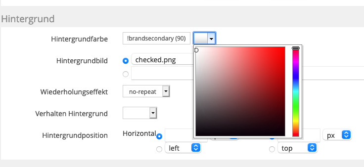
- Entering the colour code and the preferred colour flavour (gradation) of a predefined colour scheme from the related ILIAS content style sheet (e.g. '!brandsecondary (90)', see screenshot below)

All three ways work fine and have their justification. But option 3 needs a lot of background knowledge to be used properly. Main reason for this: on this screen you do not see what defined colours exist. You have to open a new tab and enter the section "Colours" for your stylesheet. Only there you find the correct colour value and flavours of this colour.
This problem could be solved by a new colour picker that also offers information about defined colours in this stylesheet.
2 Conceptual Summary
A preferred workflow for selecting a colour in the stylesheet editor should look like this:
- Starting point to select a colour is the same like today: the user is within the form of a style class and gets presented colour-related text inputs.
- Users knowing either the preferred hex value or colour code can enter the value in the text input or edit it – and have already finished the workflow.
- Users that do not know what value to enter click on the colour picker (like today).
- Now ILIAS opens a modal with two accordeons[1]. Acc. 1 (open by default) is for "Defined Colours", acc. 2 is for "All Colours".
- In the accordeon for "Defined Colours" ILIAS presents all defined colours from the stylesheet's colour scheme, incl.
- Colour Name
- Colour Code
- Colour
- Colour Flavours
- To select the preferred colour, the user either clicks on the 'pure' colour or on one of the darker or lighter colour flavours.
- In case the user want to select a hex value, she/he changes the accordeon and selects a colour from the known colour picker.
- In both cases, selecting the colour by clicking on it closes the modal and injects the related colour code and flavour or hex value into the text input field.
- Closing the modal aborts the selection process and keeps input as it was.
3 User Interface Modifications
3.1 List of Affected Views
- Administration » Layout » Content Styles » Style » Form of style class
3.2 User Interface Details
This feature request suggests to use a Roundtrip Modal for the colour picker. Unlike required in the rules of this KS element, a colour picker modal would like to abstain from a Submit and Cancel button to speed up the workflow. The submit action would be executed by selecting the preferred colour (as in the current colour picker), while canceling the workflow could be done by hitting the Close glyph of the modal. Just offering a Cancel button feels to be weird.
3.3 New User Interface Concepts
- Colour Patch: offers an area with one defined colour. Clicking on the area provides information of the defined data to a related service.
- Colour Gradient: offers an streched area with the basic colour in the middle and linear gradation of colour to dark on the left and to light on the right side (using CSS property
linear-gradient). Clicking somewhere in this area provides information of colour and gradient visualised at the click-point to a related service.
Related PRs for both UI elements will be provided in case the request is accepted.
4 Technical Information
{The maintainer has to provide necessary technical information, e.g. dependencies on other ILIAS components, necessary modifications in general services/architecture, potential security or performance issues.}
5 Privacy Information
None. No user related information is stored.
6 Security Implications
{ Does the feature include any special security relevant changes, e.g. the introducion of new endpoints or other new possible attack vectors. If yes, please explain these implications and include a commitment to deliver a written security concept as part of the feature development. This concept will need an additional approvement by the JourFixe. }
7 Contact
- Author of the Request: Kunkel, Matthias [mkunkel]
- Maintainer: {Please add your name before applying for an initial workshop or a Jour Fixe meeting.}
- Implementation of the feature is done by: {The maintainer must add the name of the implementing developer.}
8 Funding
- …
9 Discussion
Amstutz, Timon [amstutz] 2020-12-21: Thx a lot for taking the initiative here. I think this is a necessary component to tackle. As of this moment I am not yet completely sold on the tabs in modal approach, could we maybe also use accordions? Further, we should take care not the chose a concept that later proves to be very hard to adapt a11y requirements.
Kunkel, Matthias [mkunkel], 21 DEC 2020: Tabs is a good point. They are not in the KS either... We could also use accordeons if this is the more accessible way. In this case, the first accordeon would be the one for the "Defined Colours", the second for the "All Colours" wheel.
Kunkel, Matthias [mkunkel], 02 FEB 2021: I have changed the request and substituted tabs by accordeons, see chap. 2.
10 Implementation
{The maintainer has to give a description of the final implementation and add screenshots if possible.}
Test Cases
- {Test case number linked to Testrail} : {test case title}
Approval
Approved at {date} by {user}.
Last edited: 2. Feb 2021, 10:41, Kunkel, Matthias [mkunkel]