Feature Wiki
Tabs
Page Editor » Text Editing on small devices
Page Overview
[Hide]This request is part of the project for a New Page Editor.
1 Initial Problem
Problems to be solved
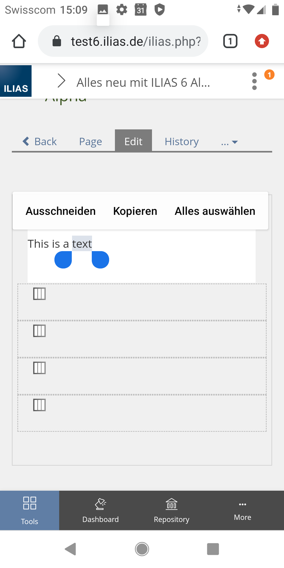
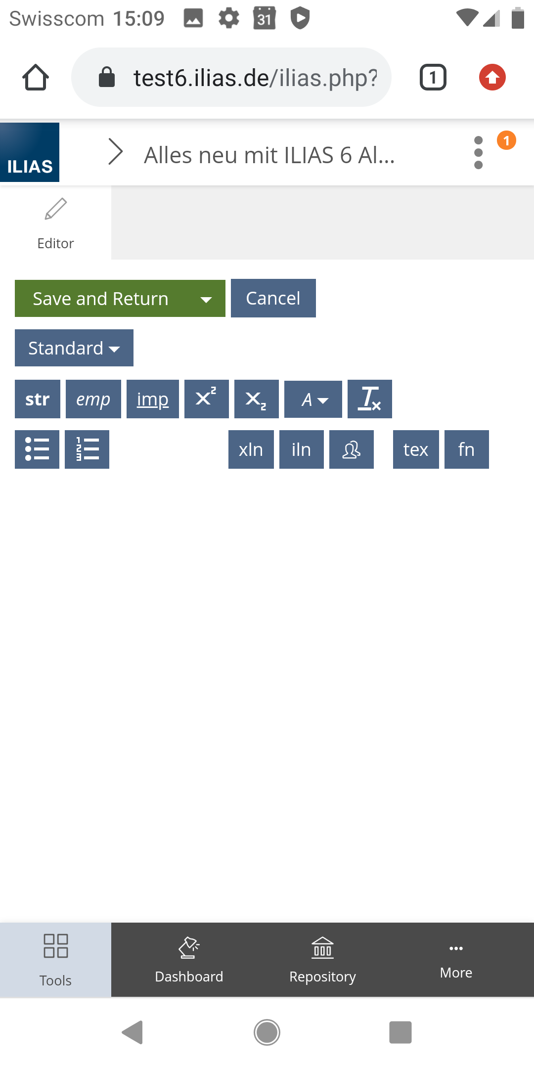
- Text should be selected and formatted (str, emp, ...)
- If a formatting is selected, you can see directly how the text changes
2 Conceptual Summary
In order to make the written text and the corresponding formatting function available in parallel on small screens, both the text input field and the formatting should be available simultaneously in the editor slate.
This variant is supported by the fact that properties and contents of other page elements are also changed in the slate (e.g. media). This behaviour is used on small screens where there is a text input field in the page editor and where the slate cannot be displayed parallel to the content (e.g. datatables).
2.1 What happens when you edit or add text?
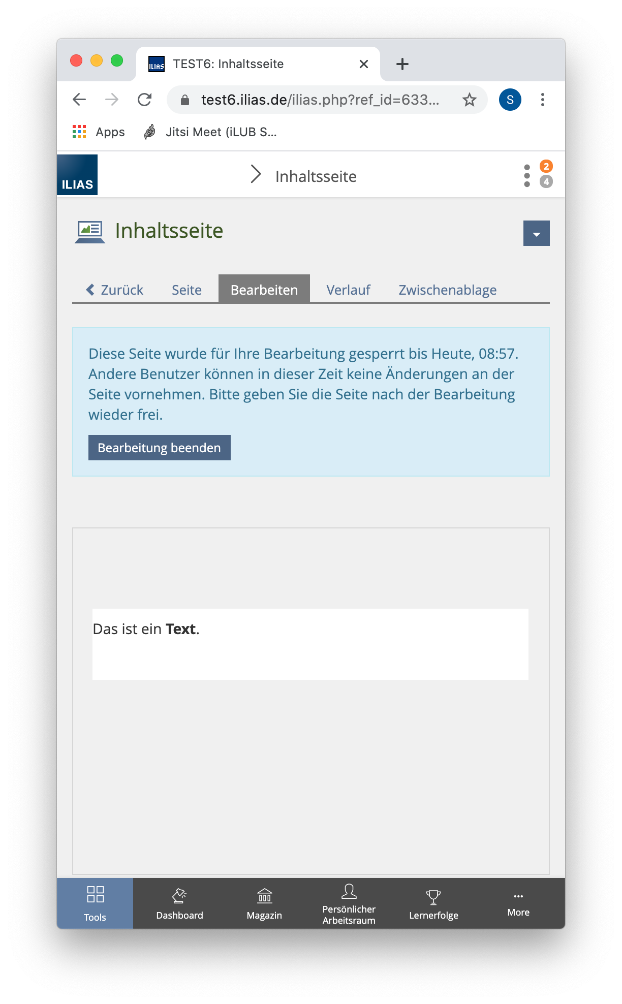
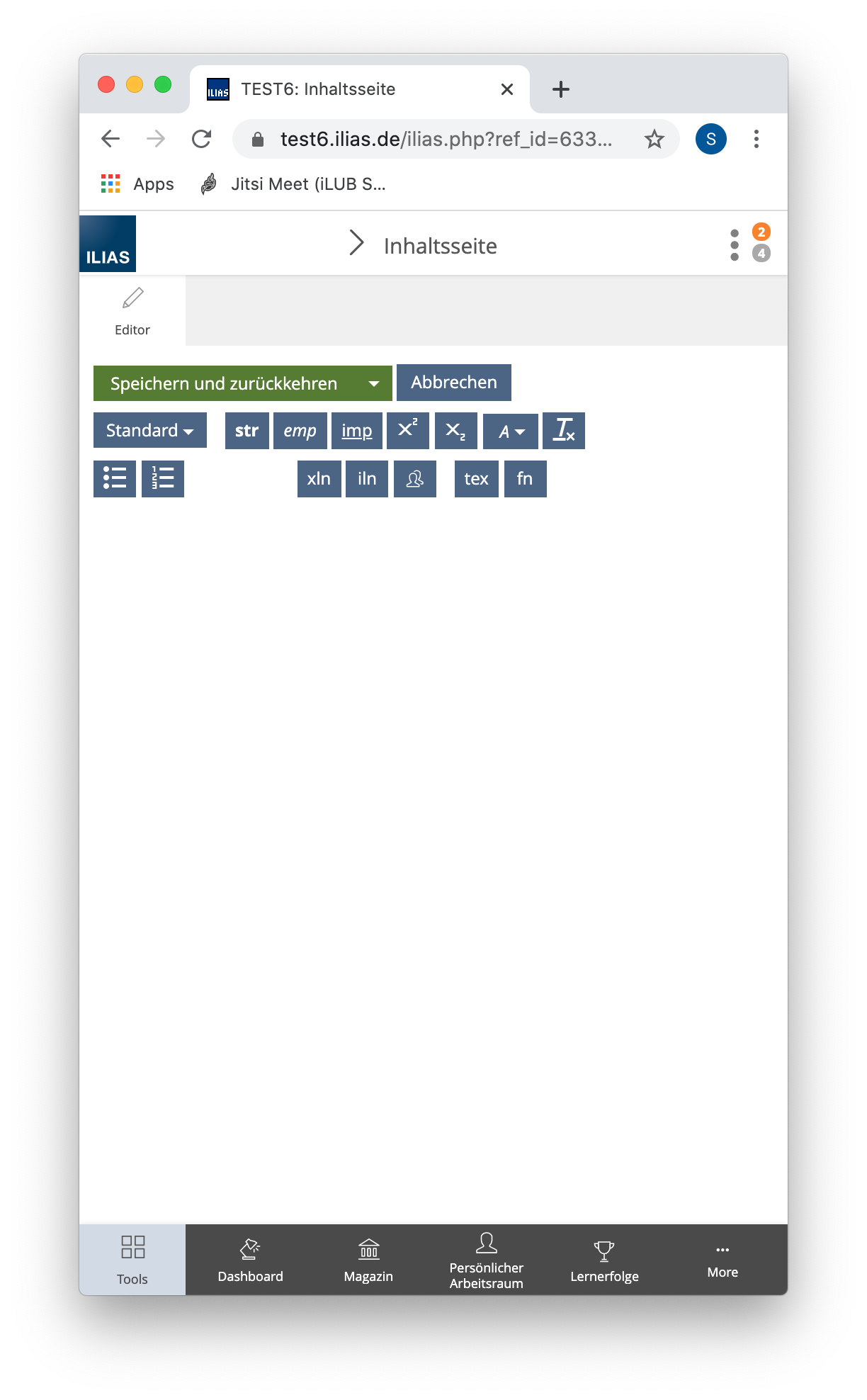
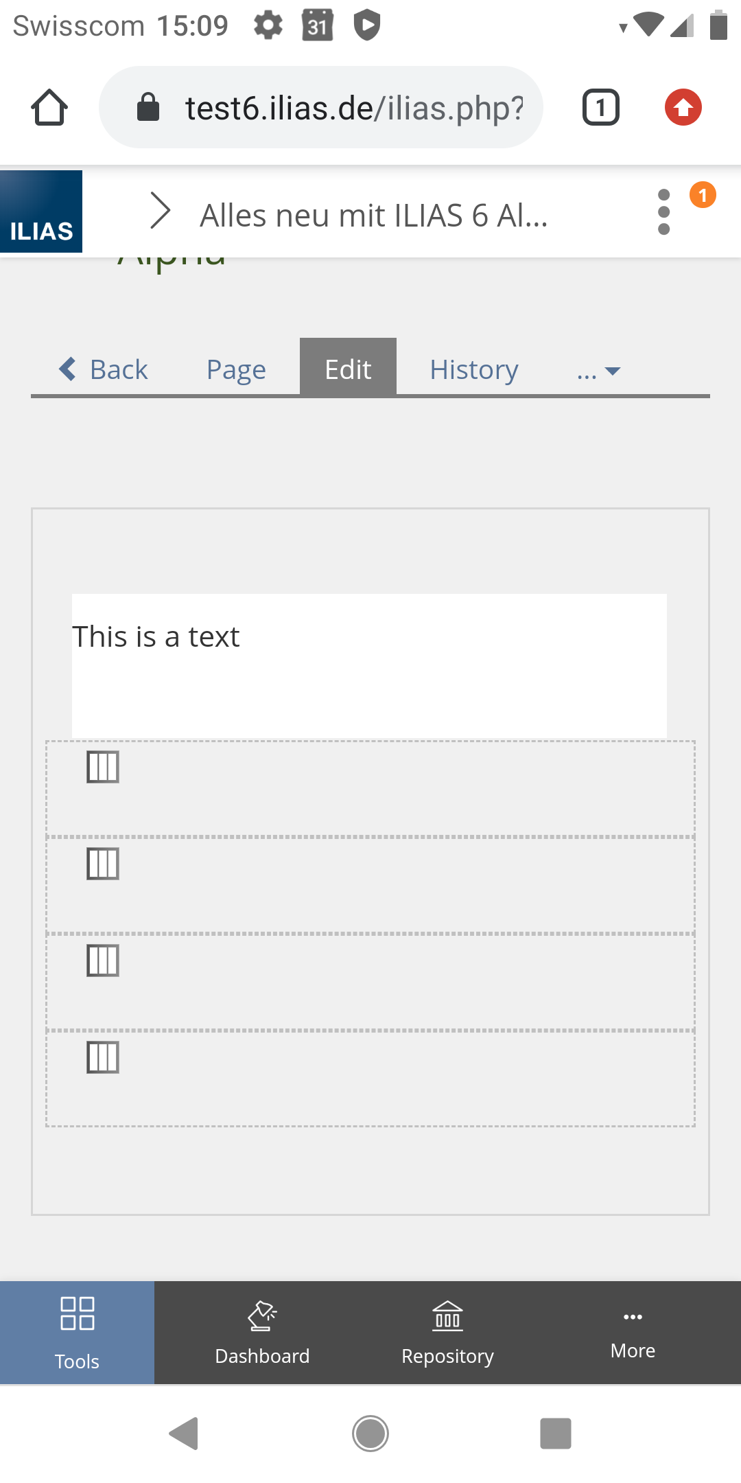
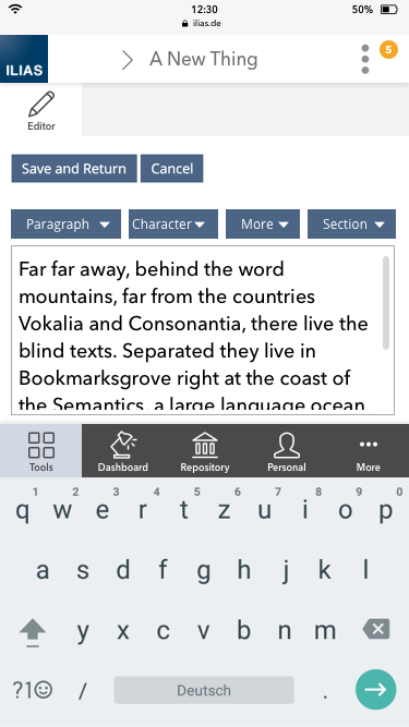
When clicking on an existing text paragraph (or when adding a new text paragraph) the editor-slate will be opened to fill the page. There you will find a text input field of fixed size and the actions (formatting).
- Editor Slate opens.
- Slate shows save buttons, formatting buttons, text area, mainbar (depends on device system) and keyboard of the device.
- Cursor/focus directly in the text area.
2.2 What happens to the formatting buttons?
We want to show a maximum of 2 lines of buttons to create enough space for the text area.
For this purpose, the formatting buttons are to be combined into dropdowns. All dropdowns should have a fixed label.
- First row:
- "Save and Return" / "Speichern und zurück"
- "Cancel" / "Abbrechen"
- Second row:
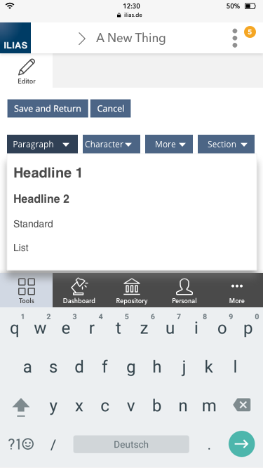
- "Paragraph" / "Absatz"
- Headline 1,
- Headline 2,
- Standard
- ...
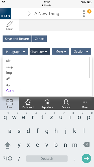
- "Character" / "Zeichen"
- str
- emp,
- imp,
- x2,
- x2,
- Accents (several),
- delete formats
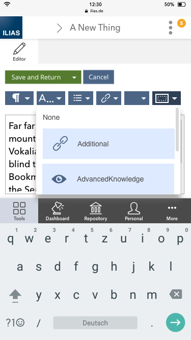
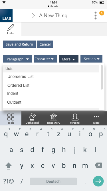
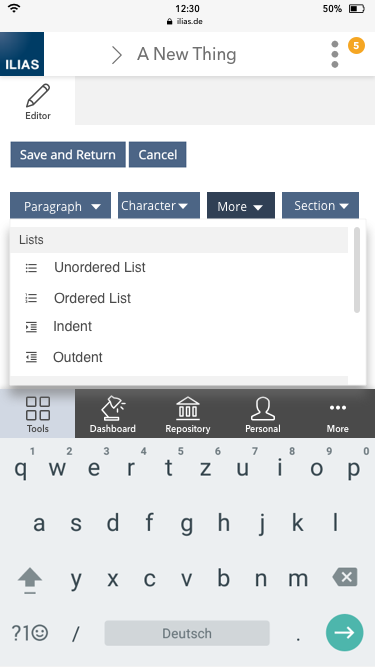
- "More" / "Mehr" (Dropdown Example 5 With divider with label)
- Lists: Unordered, Ordered, Indent, Outdent
- Links: Wiki Page (Dialog), [ [ Wiki Page ] ], External Link, Internal Link, User Profile
- More: LaTeX, Footnote, Anchor
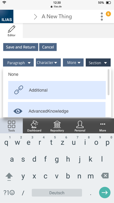
- "Section" / "Block"
- None
- Additional
- AdvancedKnowledge
- ...
- "Paragraph" / "Absatz"
- Paragraph
- Character
- Section
2.3 What happens on the content screen?
The text input field in the slate and on the content page should display the same.
2.4 How do we present the autosave?
To be decided, depending on how autosave is displayed on desktop (current discussions are still ongoing).
If the text in the text input field has not yet been saved, a note should be displayed in both the slate and content areas indicating that it has not yet been saved. Possibly adapted Message Box to place a hint message at a text input to show that it has not yet been saved (see Page Editor » Auto Save)
3 User Interface Modifications
3.1 List of Affected Views
- Customize Page > Insert Text or Edit Text
- Customize Page > Insert Datatables or Edit Datatables
- Customize Page > Insert Code or Edit Code
3.2 User Interface Details
Note: The use of icons on the buttons instead of labels was discarded after review. We prefer to combine more buttons together and use clear labels to help the user recognise what they are about, rather than introducing new icons that may need to be learned.
3.3 New User Interface Concepts
no new UI concepts.
Standard Dropdown with divider with label should be used.
4 Technical Information
There may be plenty of technical issues. The input field needs to be "moved" and resized depending on the screen size (small screen mode). It must be possible to detect (events) if the slate is currently the main view or not.
5 Privacy Information
No privacy implications.
6 Security Implications
No security implications.
7 Contact
- Author of the Request: Seiler, Yvonne [yvseiler], Kergomard, Stephan [skergomard], Zenzen, Enrico [ezenzen]
- Maintainer: Killing, Alexander [alex]
- Implementation of the feature is done by: {The maintainer must add the name of the implementing developer.}
8 Funding
- …
9 Discussion
JourFixe, ILIAS [jourfixe], 22 FEB 2021: We highly appreciate this suggestion and schedule the feature for ILIAS 8. It would be very helpful to indicate the selected section and paragraph style in the shown dropdowns above. This needs to be discussed and decided in the Kitchen Sink. In addition, the additional icons on screenshot 5 before the different list styles and other formattings would be helpful to. But at least there is already a fallback, see screenshot 4. Both topics should be decided in the KS and the ported to the page editor.
10 Implementation
{The maintainer has to give a description of the final implementation and add screenshots if possible.}
Test Cases
- {Test case number linked to Testrail} : {test case title}
Approval
Approved at {date} by {user}.
Last edited: 16. Nov 2023, 17:00, Tödt, Alexandra [atoedt]
