Feature Wiki
Tabs
Online Help-Improvements for ILIAS 8
Page Overview
[Hide]This is a feature page belonging to a larger development activity for multiple ILIAS components ([[[Project] Splitting Up Tools]]) currently using the space provided by the "Tools-Slate".
Since this Feature Request deals with usability issues the JF decided that it can be proposed for ILIAS 7 despite feature freeze (JF decision of May 25. 2020, BR 0027607).
1 Initial Problem
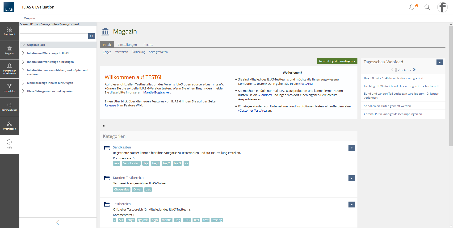
There are several bug reports about the behaviour of the online help in ILIAS 6:Currently the Online Help is opened and closed via the glyph in the metabar. When users collapse the toolslate, they are not shown that the help is active. Also, closing the online help via the glyph in the metabar is not intuitive and is not understood by users.
2 Conceptual Summary
Since the online help is permanently displayed across multiple contexts, the online help is a special case in the tools area. The online help should no longer be displayed as a tool in either option. In this way, not only the online help should be easier to use, but also the concept of the tools can be simplified by removing one special case.
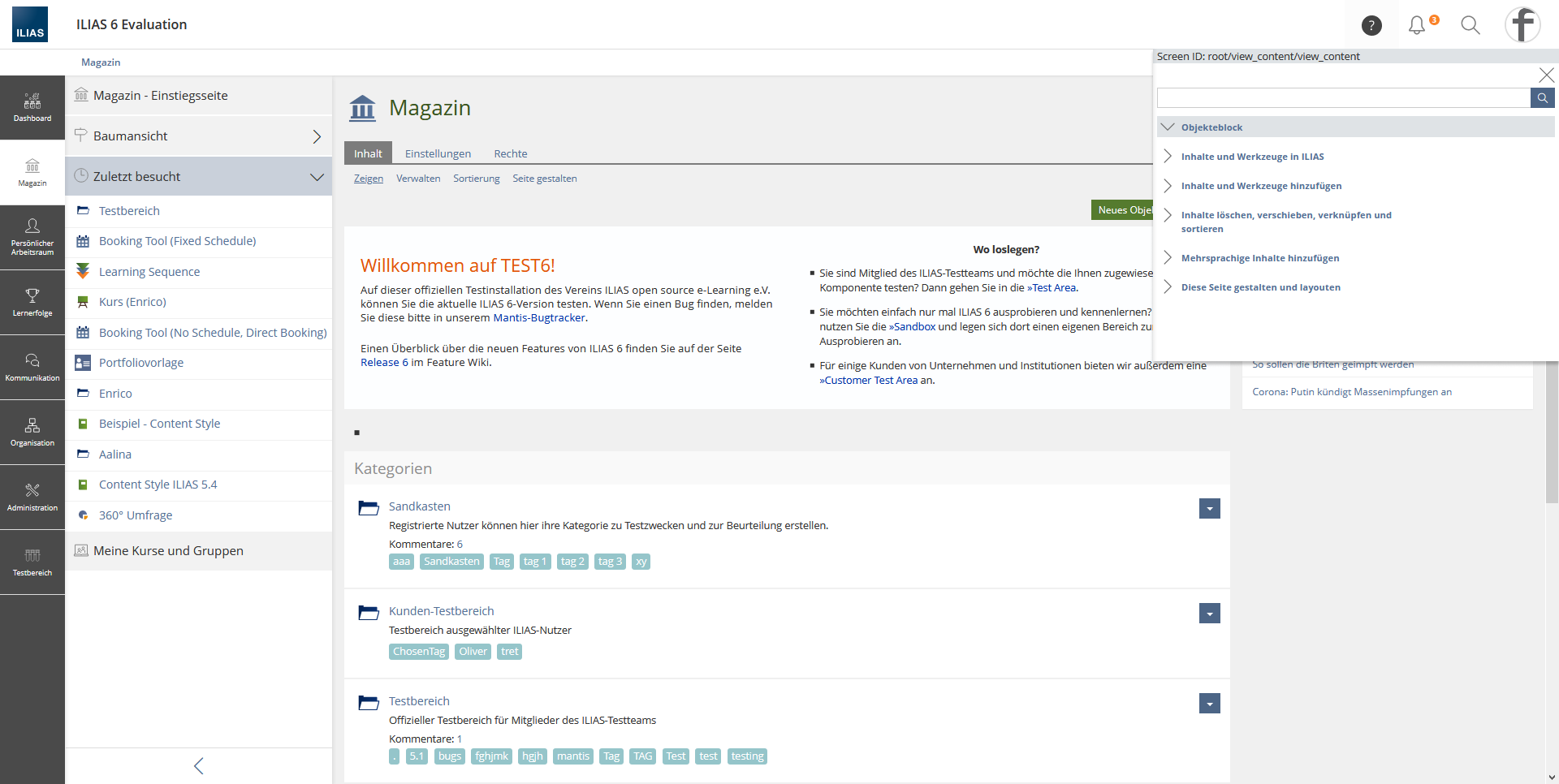
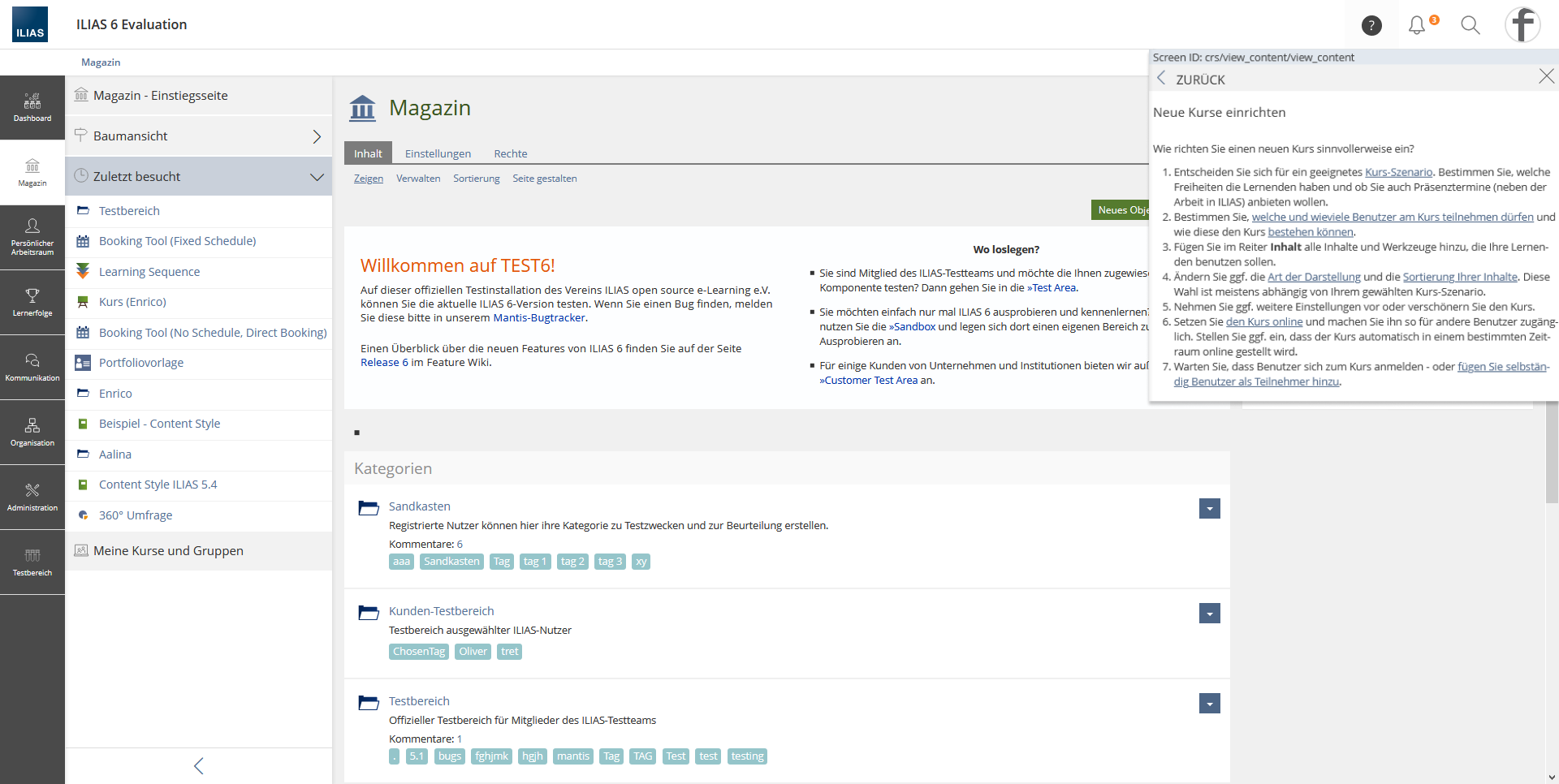
The online help should be displayed as a MainBar entry. If users click on the entry, the online help opens in a slate. It is possible to navigate within the help. If users change the context, the online help texts adapt to the new context.
- we create clear connection between trigger and content of Help
- we make it clear where the content of help can be found again
- the visibility of help becomes independent of other tools
- we reuse existing UI-concepts
This option was discussed in the Online Help editorial team and in the SIG Accessibility. It must be ensured that the implementation is accessible.
The following suggestions have already been discussed in previous meetings:
HELP TRIGGERING METABAR SPECIAL OVERLAY
The online help is activated in the MetaBar. The help glyph is displayed inverted (active). The online help opens in an overlay. The overlay slate remains open until the online help is closed via the close glyph. The overlay can not be moved.
It is possible to navigate within the help. If users change the context, the online help texts adapt to the new context
This proposal is preferred by the Online Help editorial team.
- As the metabar slate cannot be used because it would not be persistent across screens, we would need to create a new and unique UI-component.
- As multiple overlapping UI-components could exist in the same spot (metabar slate, content, toasts, Help overlay) it would be hard to define which one should be on top. We would run in the similar issues as currently in the tools slate.
- This solution would be nigh impossible to make usable on mobile screens.
- The trigger for help would again be separated from the content.
HELP AS TOOLS
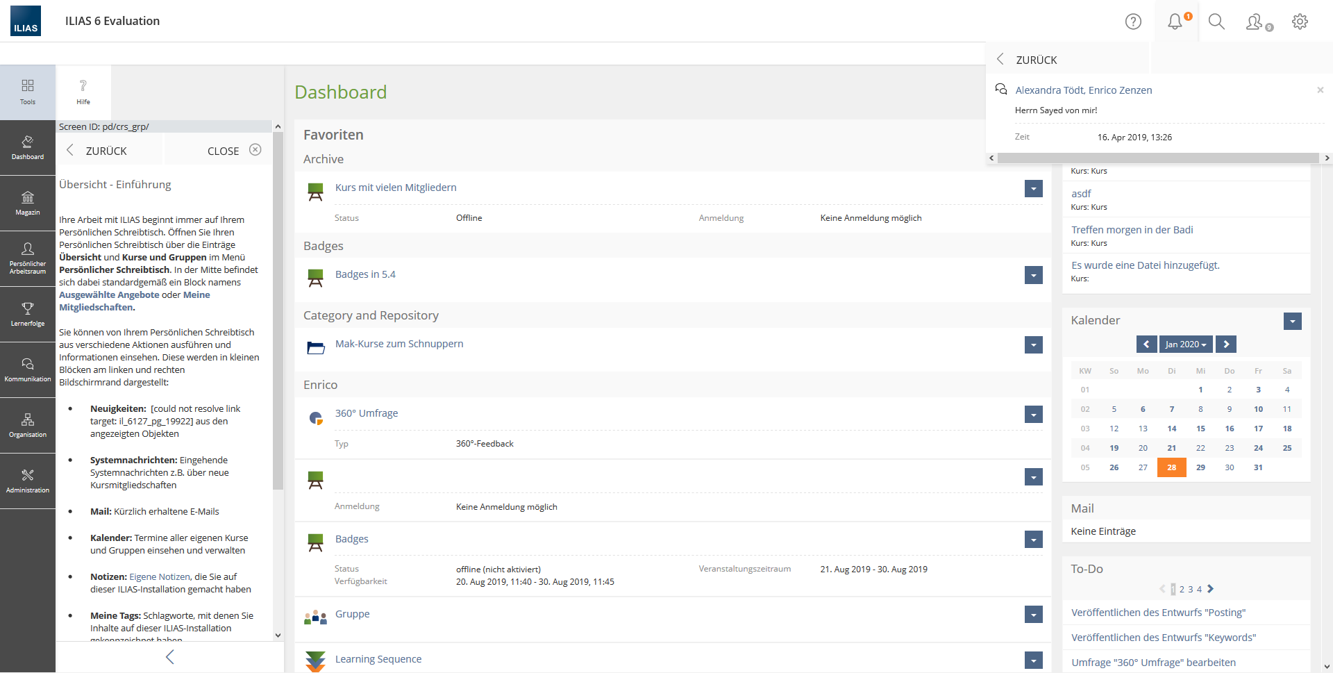
1.) The online help is the only tool that gets a "close button" and can be closed in the toolslate itself.
Hint: The Jour Fixe does not want to add a specific use case for a slate with close glyph.
3 User Interface Modifications
3.1 List of Affected Views
- Online Help Tool Slate
- Mainbar
- Metabar
3.2 User Interface Details
3.3 New User Interface Concepts
No new UI-components
4 Technical Information
{The maintainer has to provide necessary technical information, e.g. dependencies on other ILIAS components, necessary modifications in general services/architecture, potential security or performance issues.}
5 Privacy Information
no user data will be collected or processed
6 Security Implications
no changes in security
7 Contact
- Author of the Request: Zenzen, Enrico [ezenzen], Kergomard, Stephan [skergomard], Seiler, Yvonne [yvseiler]
- Maintainer: Killing, Alexander [alex]
- Implementation of the feature is done by: {The maintainer must add the name of the implementing developer.}
8 Funding
- …
9 Discussion
- The Main Bar has the nav role and including the help trigger into the main bar makes the main bar violating the control concept that comes with the nav role. This is why we see no accessible way to include the help in the main bar.
- The the upper right corner is the place where users would typically expect the help. The trigger should not be a part of the Meta Bar.
Kergomard, Stephan [skergomard], 20 Mai 2021: Thank you Tödt, Alexandra [atoedt] for your feedback. Please have a look at the section "Previous Discussions" where we have discussed your proposal and added the reasons why we believe that we cannot implement the solution you propose. We believe the arguments against it to be really strong. We also believe the solution to move the help completely (trigger and content) into the mainbar solves the biggest accessibility issue we have concerning the help: The big distance between the trigger and the content. The point you make concerning the nav-element would only be valid, if there would be something stoping us from changing the html of the mainbar into something else then a nav-element, if we decide to do so. We believe that this decision requires more conceptual work though and we also believe, we will find a solution that is going to be accessible and doesn't prevent us from using the valuable space we allocated to the mainbar and its slate productively and creatively.
Your second point, stating that people "expect the help to be there", is a stark overstatement. Although you are right that quite a few applications show the help in the upper right corner, the solutions on how to show it vary: matomo and typo3 show it as it is currently shown in ILIAS, Nexcloud has it in the Profile-Menu, Wordpress makes it part of the content, but tacks it to its upper right corner. But there are also equally many completely different solutions: Teams shows it where we would in this proposal - but Microsoft sometimes puts the help in completely other places as well, Google has it either in the footer or in the same place we propose, probably most webpages use the footer (if they even have a help), ... . Not at all surprisingly: It seems that the position of the help strongly depends on the general layout of the page and the weight given to it. We believe that by putting the help in the mainbar we make it easy to find and to use.
We came to the conclusion, after weighing all options thoroughly for a long while that the solution proposed in this FR is a big step forward. We also see a clear path forward from here, ie. this is clearly just one step, but a step that leads us onto open road and not into a cul-de-sac.
Tödt, Alexandra [atoedt]The editorial team opposes this solution. There was no suggestion made how to solve the nav-problem / accessibility issue. It is merely stated that it can be somehow solved. Unless there is a solution made for this issue this suggestion should not be moved.
I stand by my statement that the editorial team has preferred the the upper right corner for placing the help a place where users typically would look for it.
Please make a specific suggestion for the nav /accessibility issue.
- Similar to the Page Editor as Mode I would not make a decision here without a semantic clarification of the mainbar first. Current state is that it is rendered as navigation. The online help is not navigational, so it does not fit into the current semantics. A first necessary step would be to redefine the mainbar semantics.
- Even with this changed I would object to put the help at the bottom of the mainbar.
- There is no system/application I know, that chooses this location (bottom/left).
- Putting it at the bottom left might be almost the last position the user looks for (only the footer might be worse). Usually reading starts at the top left. The metabar and the top right position seems to be the most popular location for help features. Making the user scanning almost the whole screen is a bad idea when looking for help imo.
- Moreover the last position in the mainbar is the first one being moved into the "More..." button. In these cases the help would be hidden competely from the view.
- A major idea of the online help is to show it in parallel with currently explained workflows. Both positions have some kind of tradeoff here, but having it in the mainbar will hide the help content immediately for all workflows that start in the mainbar, since the user will click another menu entry. The position on the right is much better imo, even if it will hide some UI elements on the lower right (which should usually not be the most important ones). However its up to the user to hide the help slate (and show it again) in these cases. The user will be aware of this and no "auto-hiding" will be performed.
- As the metabar slate cannot be used because it would not be persistent across screens, we would need to create a new and unique UI-component. This would not be necessary. The help JS could reopen/trigger its button if necessary imo. I really would make this a simple metabar slate. The only difference would be the auto-opening behaviour. But this would not need changes in the KS implementation imo.
- As multiple overlapping UI-components could exist in the same spot (metabar slate, content, toasts, Help overlay) it would be hard to define which one should be on top. We would run in the similar issues as currently in the tools slate. See first point. I would not implement a new component for this purpose, so not introduce issues. Clicking other metabar buttons should hide the online help.
- This solution would be nigh impossible to make usable on mobile screens. I don't understand this point and I don't see an issue here at all. On the mobile screen, opening the only help will take "the whole screen". The user reads the only help and afterwards closes the online help. I think this is totally acceptable on smart screens.
- The trigger for help would again be separated from the content. Why is this? The trigger would be right with the content as for all metabar slates. There won't be any difference to the search or notification slates.
10 Implementation
{The maintainer has to give a description of the final implementation and add screenshots if possible.}
Test Cases
- {Test case number linked to Testrail} : {test case title}
Approval
Approved at {date} by {user}.
Last edited: 18. Oct 2024, 14:53, Kunkel, Matthias [mkunkel]


