Feature Wiki
Tabs
Multiple Views for a Data Collection Form
Page Overview
[Hide]This feature request is an extension and updated version of an existing feature request draft DataCollection: Muliple Views for a DataCollection Form.
DataCollection: Muliple Views for a DataCollection Form is archived here:
1 Initial Problem
There are currently two view configurations available for data collection - "Visibility and filter" and "Detailed View". These configurations can be used to define which fields should be displayed in which way in the corresponding views. But different use cases may require more configuration options:
Example 1: (very simple scenario)
A data collection should be used to collect users results for a question given by the trainer.
The trainer wants to give a short individual feedback to some (or each) student(s).
The data collection is configured, so that users can see only their own entries.
For this purpose, the data collection has two fields,
- Field 1: Student's answer
- Field 2: Teacher's reply
Field 2 is set to locked. In this case the students currently see field 2 during creation, but cannot enter data.
To avoid irritations it should be possible to show the field only in the detailed view (or probably then in the listing).
Example 2: (more complex scenario)
In a data collection ideas for a problem solution should be provided by students, and after collecting the ideas some reflection should be done by the students (after submitting the initial idea).
Let's assume, students should provide ideas for the choice of online conferencing tools.
When creating the entry to the data collection, they should enter
- the name of a suggested tool,
- the supplier of the tool
- the maximum number of participants in a conference.
More fields should not be visible while the creating form.
In a second step, they should provide more information (individually or cooperatively), like
- does the tool require installation of client software?
- is it open source?
- how does performance scale with the number of users?
These fields should be visible when editing the entry, in the list view and in the single view, but not in the creation (view).
This feature request enhances DataCollection: Multiple Views for a DataCollection Table.
2 Conceptual Summary
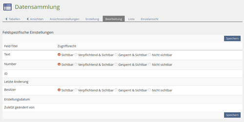
It should be possible to define "Views" for edit forms. (The form that appears when a record is edited.)
We suggest to integrate two more options to configurate:
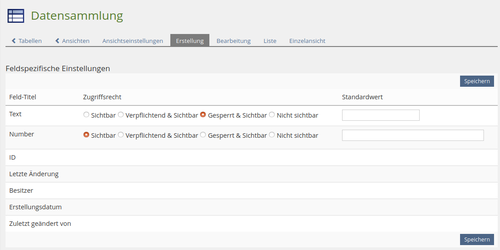
- Fields to display: Define the field access (visible, required, locked, not visible)
- Default value (if a value should already be preselected/prefilled)
- Fields to display: Define the field access (visible, required, locked, not visible)
- Some combination of settings are curently possible (like "Field is locked and required"), that cannot be fulfilled. We suggest some modifications to avoid these situations (switch from checkboxes to radiobuttons).
- Interface provides authors with some guidance to show that all configurations of a view are done (inspired by the objective driven course configuration).
- Losing entries in single view when activating the view before saving in the editor is avoided.
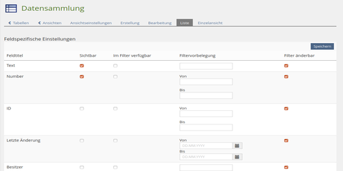
- The term "view" can be misunderstood therefore we suggest to omit the term in the tab titles.Further we we propose to rename "Visibility and filter" and "Detailed view" to "List" and "Single". With the more appropriate and shorter titles we hope to achieve a better understanding of the (new) configuration possibilities and a clarity of the interface.
3 User Interface Modifications
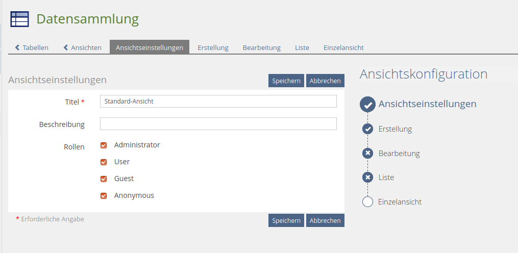
The views should be extended with a "Creation" view and an "Editing" view.
3.1 List of Affected Views
- Data Collection » Tables » Views
- Data Collection » Tables » Views » Settings
3.2 User Interface Details
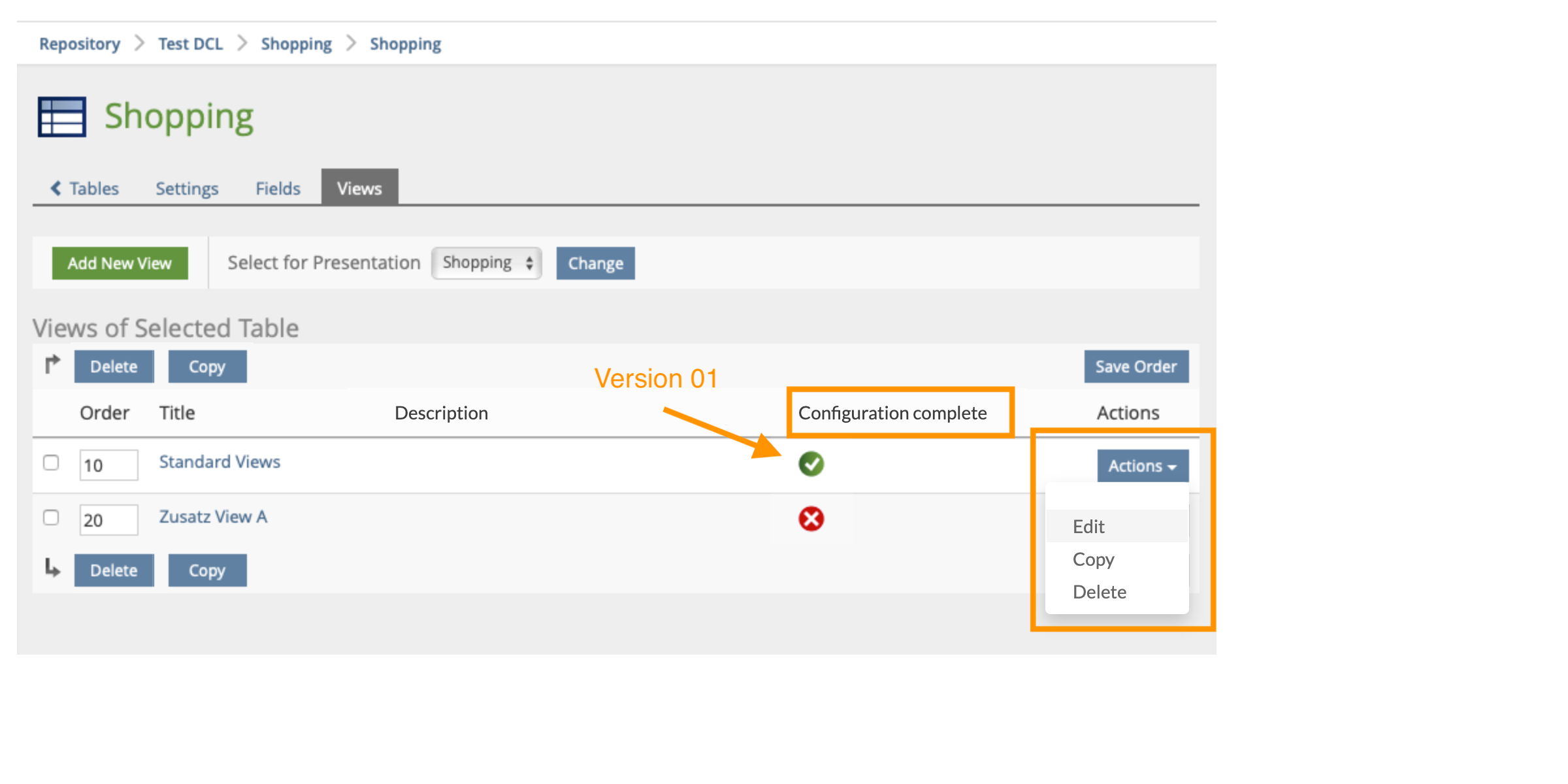
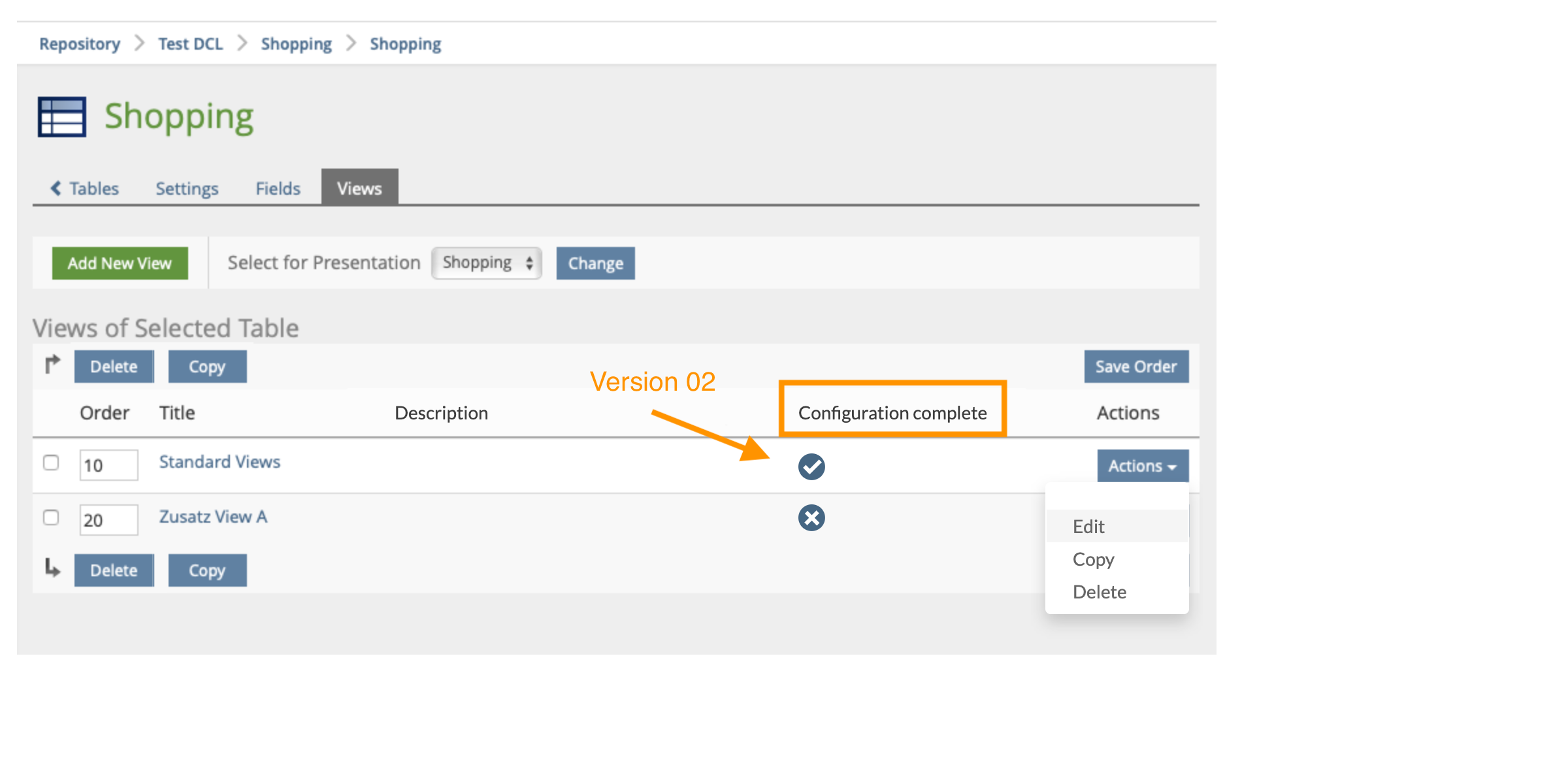
- Button “Actions” with a reduced menu (“Edit”, “Copy”, “Delete”)
- New column “Configuration complete”: So that the user can see at a glance whether the necessary configurations have be done or whether there is still something to do
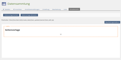
- New Tab Title “View Settings”
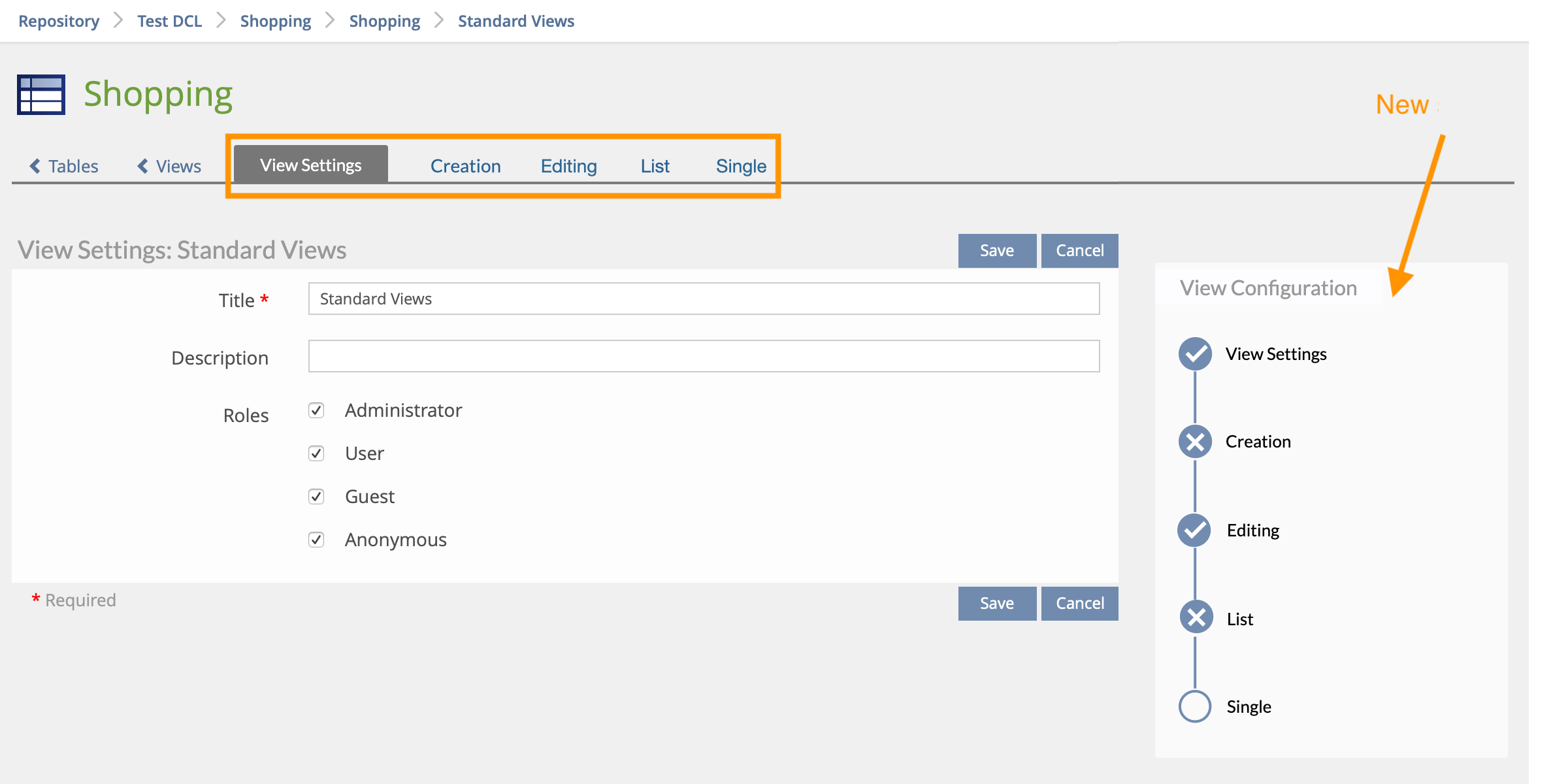
- New Tab Titles “List” and “Single” instead of "Visibility and filter" and "Detailed View" (deleting “View”)
- New Order of Tabs
- New Block on the right side with “View Configuration”: So that the user can see at a glance the status of the view configuration
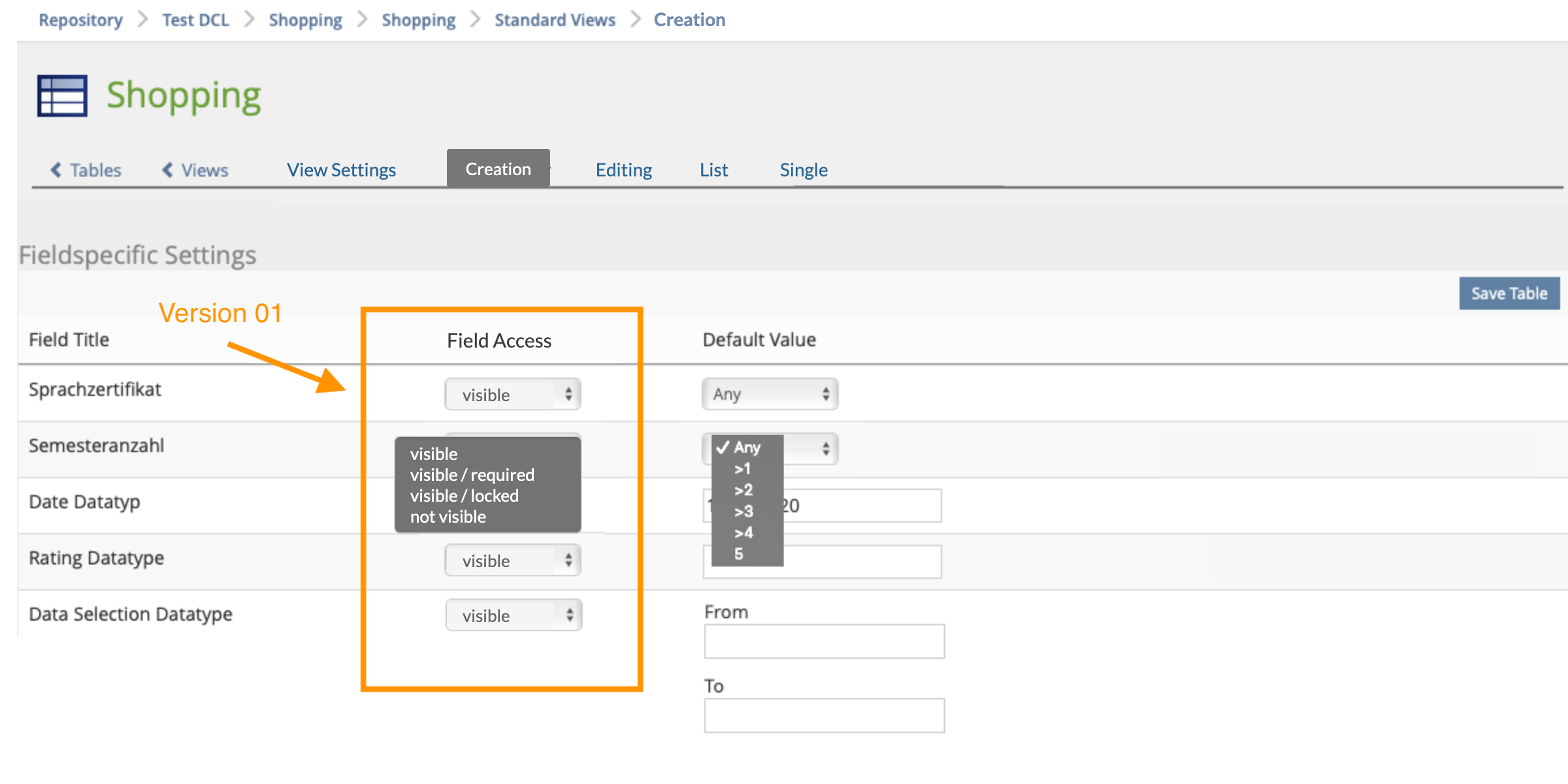
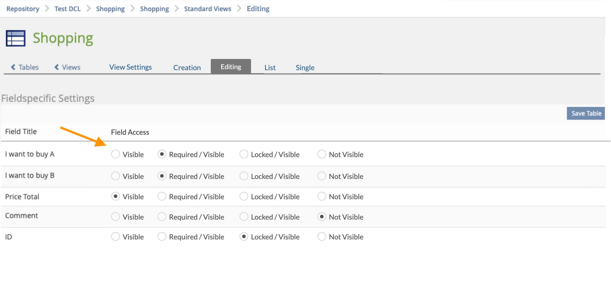
- Radiobuttons “Field Access” (visible, visible / required, visible / locked, not visible) or drop-down (s. mockup "Creation")
- This avoids non-functional combinations like required & locked, not visible & required.
- Horizontal radiobuttons makes it easy to compare between the lines when scrolling through the field configuration (version 02) vs.
Interface looks cleaner with a drop-down menu (version 01).
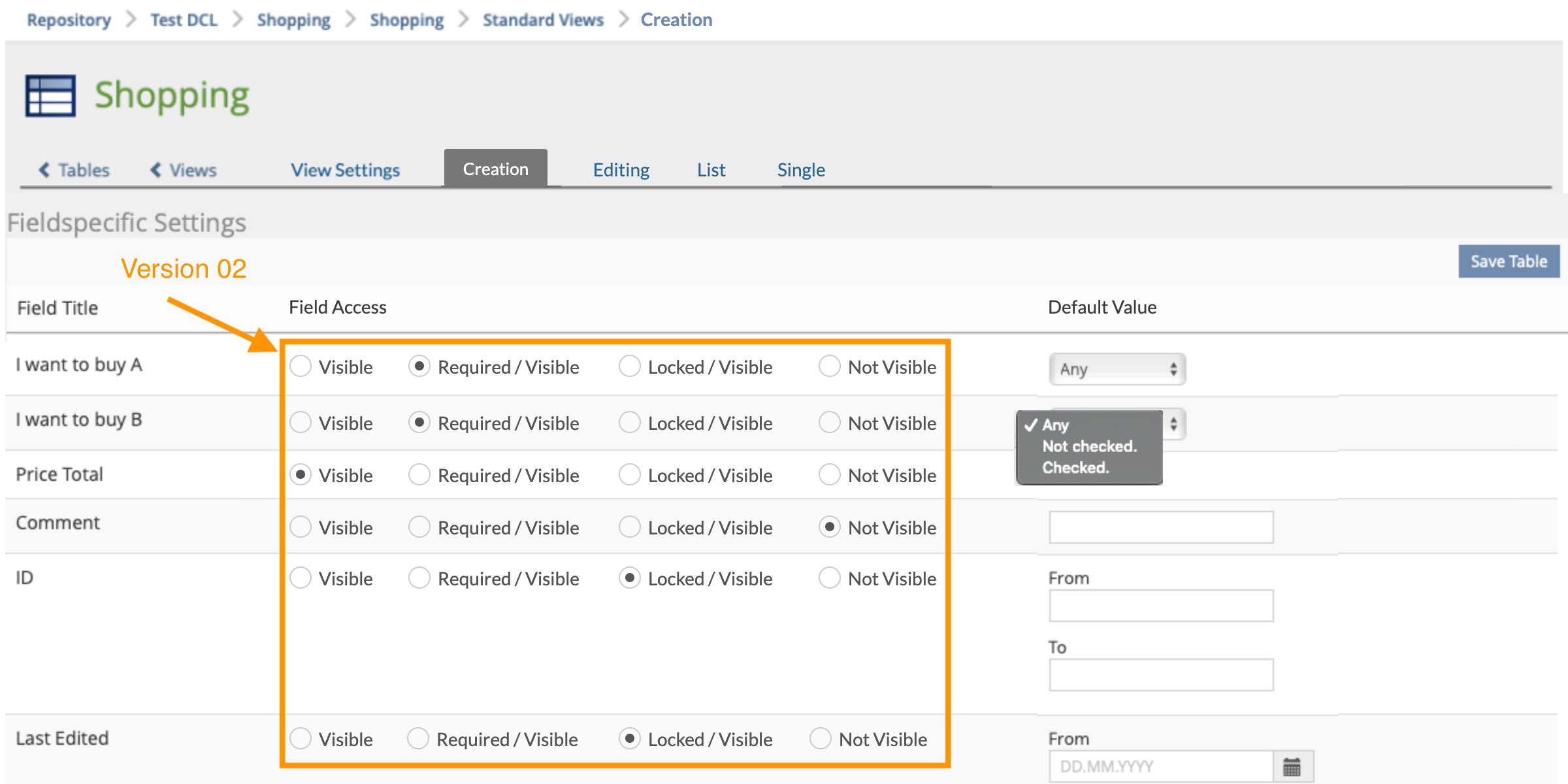
- Radiobuttons “Field Access” (visible, visible / required, visible / locked, not visible) or drop-down (s. mockup "Creation")
- This avoids non-functional combinations like required & locked, not visible & required.
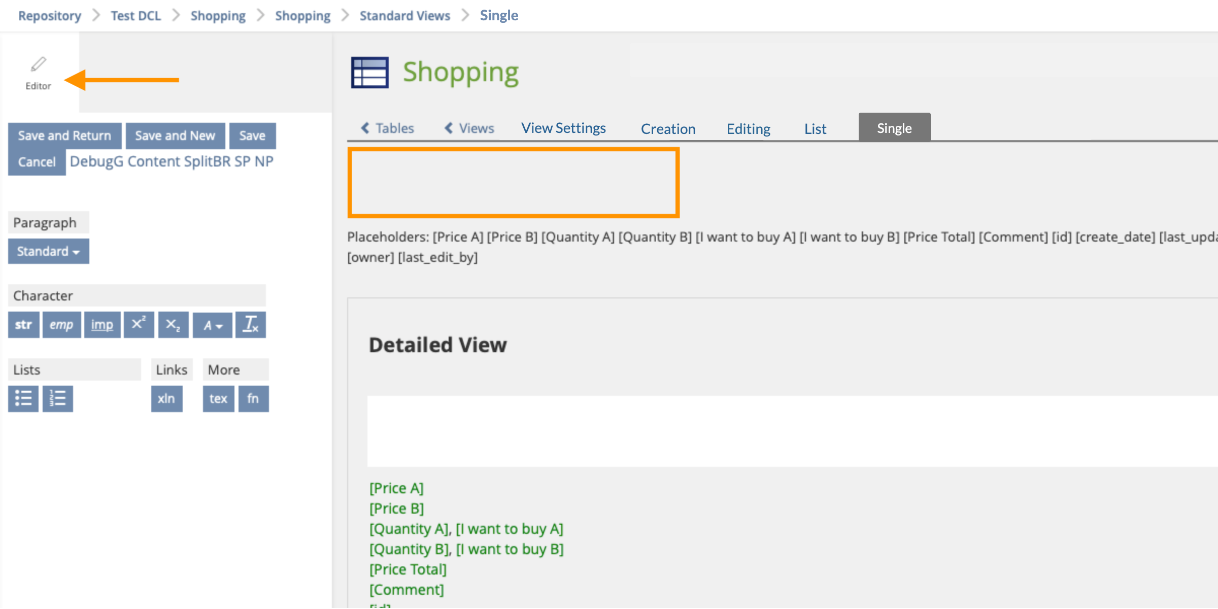
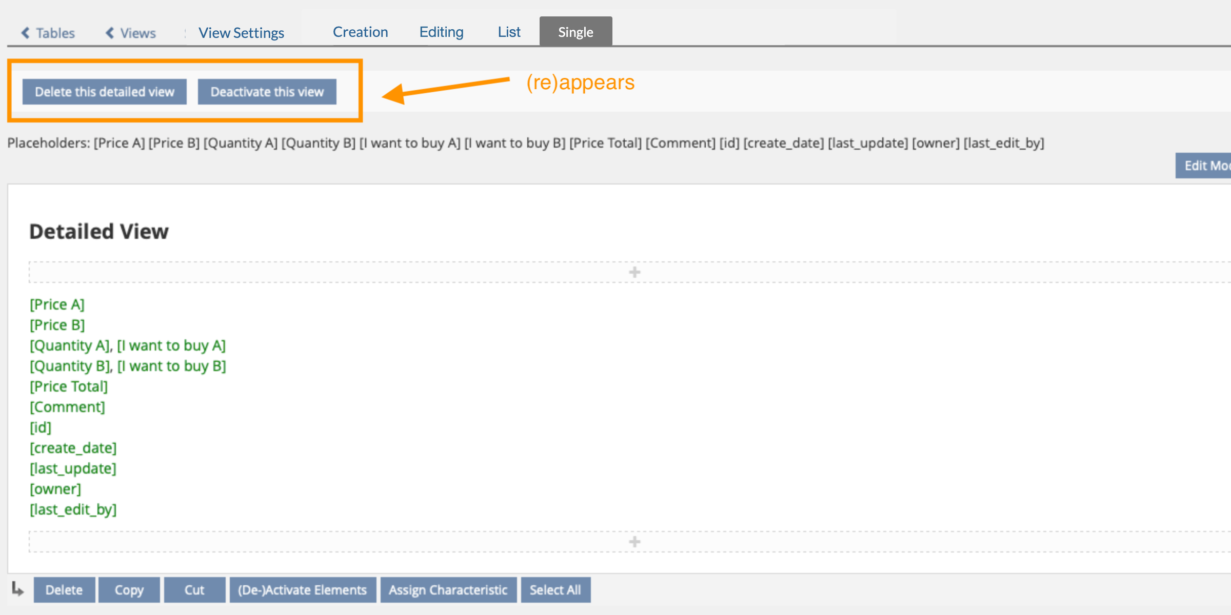
- For a better usability: The buttons to activate/deactivate/delete the list view are hidden in edit mode (1) and (re)appear after saving/editing (2).
- Currently, changes are lost, if activate/deactivate is clicked before saving on the editor-slate.
3.3 New User Interface Concepts
none
4 Technical Information
No specials, no new libraries etc.
5 Privacy Information
The previous views (e.g. list view, single view) remain the same, no change
6 Security Implications
7 Contact
- Author of the Request: Weber, Daniela [dani.weber], with some additions by Jackisch, Ingo [jackisch]
- Maintainer:
- Implementation of the feature is done by:
8 Funding
9 Discussion
- Ok / Not Ok - buttons could be use in monochrome for table.
- Column 'Field access' in new create view and Edit view could use radio buttons (even if this might result in trouble on mobile screens). But labeling should be "Visible & Required" instead of Visible / Required" a.s.o.
- All views should get an info text to explain for what the related screen is made for. Otherwise user will get confused. Tab "List" should be labeled "Overview".
10 Implementation
Test Cases
Approval
Approved at 2020/11/12 by Houssi, Dhouha [Houssi].
Last edited: 18. Nov 2020, 12:25, Houssi, Dhouha [Houssi]