Feature Wiki
Tabs
Improve Mediacast Video Presentation
Page Overview
[Hide]1 Initial Problem
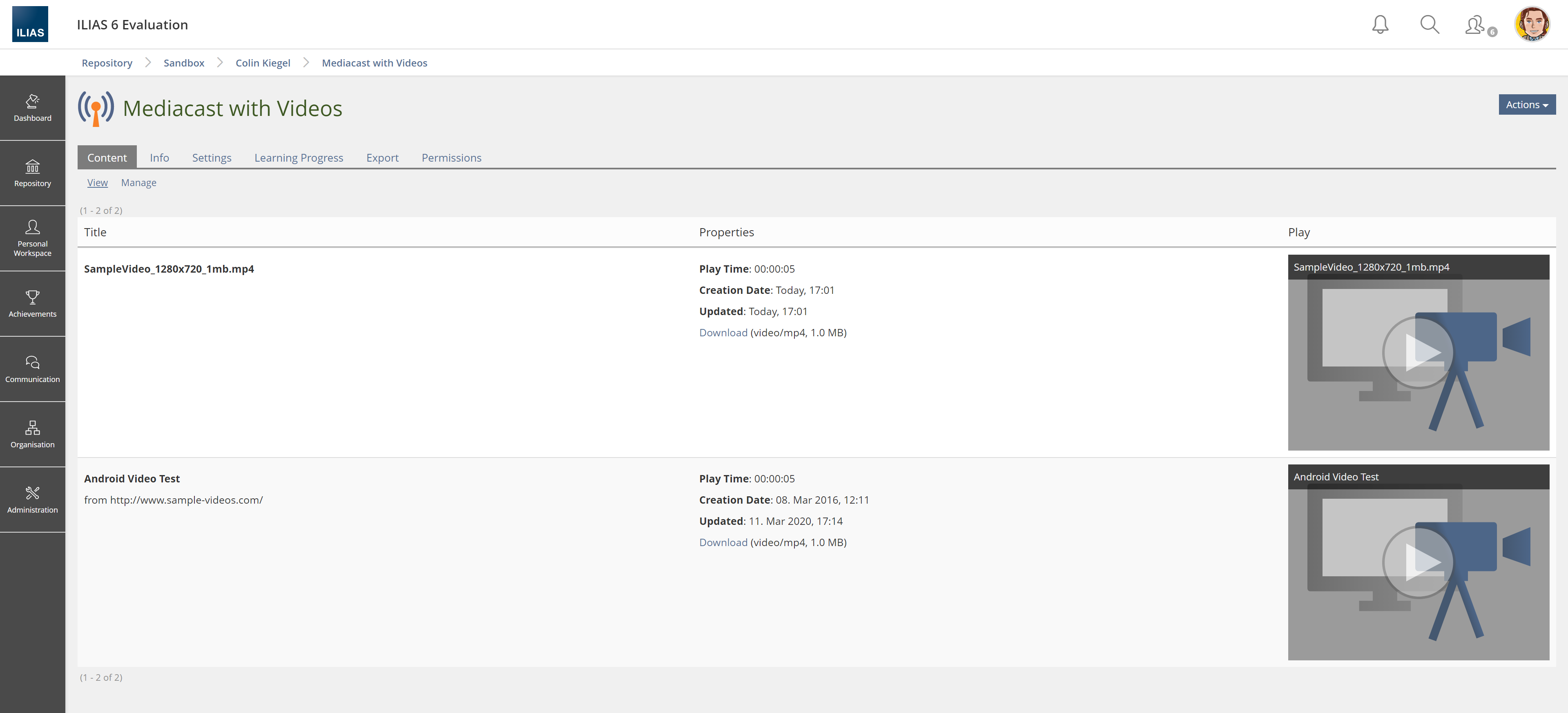
- Videos appear in a small column by default. Text and whitespace are more prominent than the video itself.
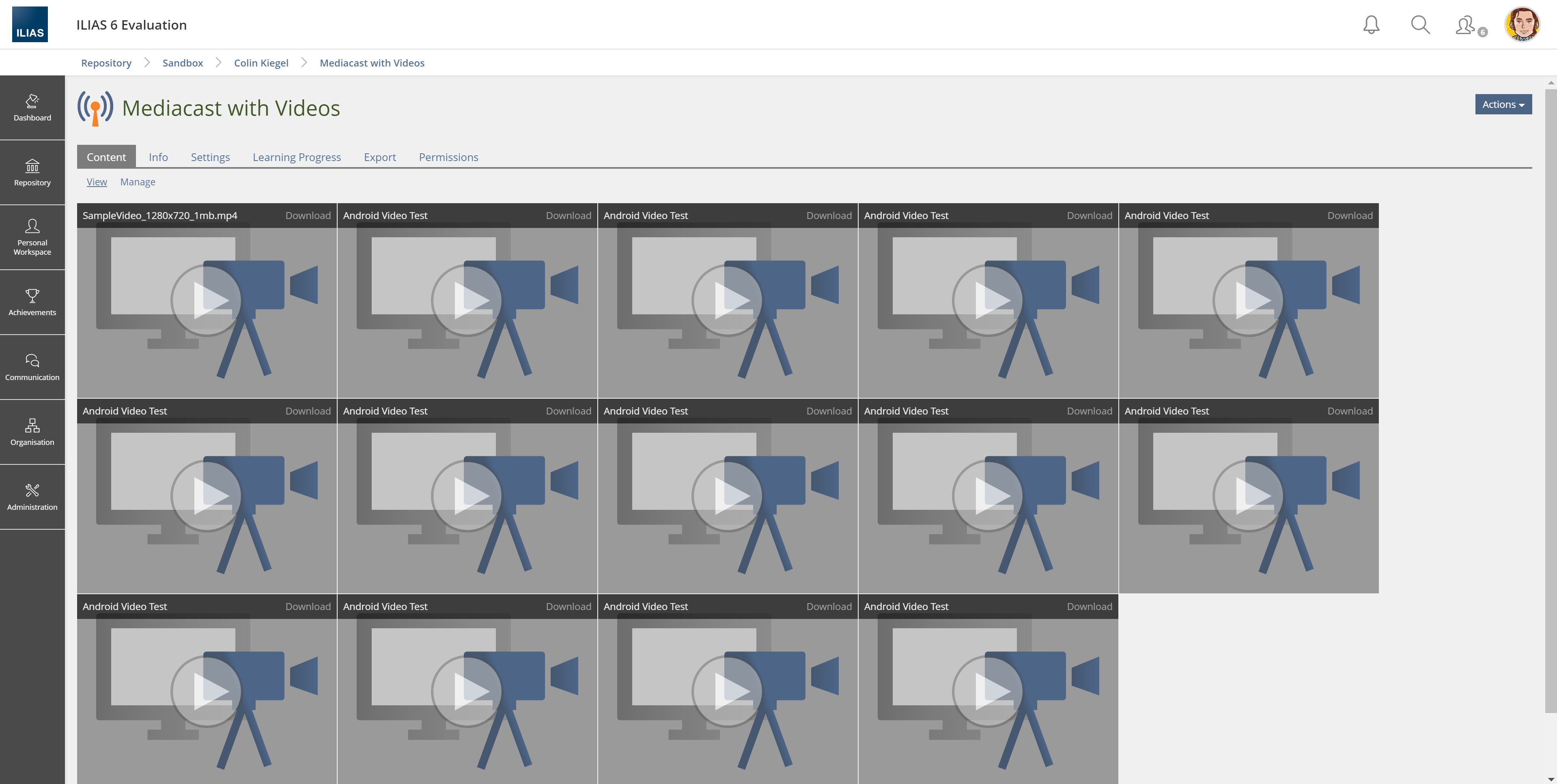
- Alternatively you get a "wall of small video tiles" if you switch to tile view.
- The user experience is quite different compared to popular video streaming services (like Youtube, Netflix, etc.)

2 Conceptual Summary
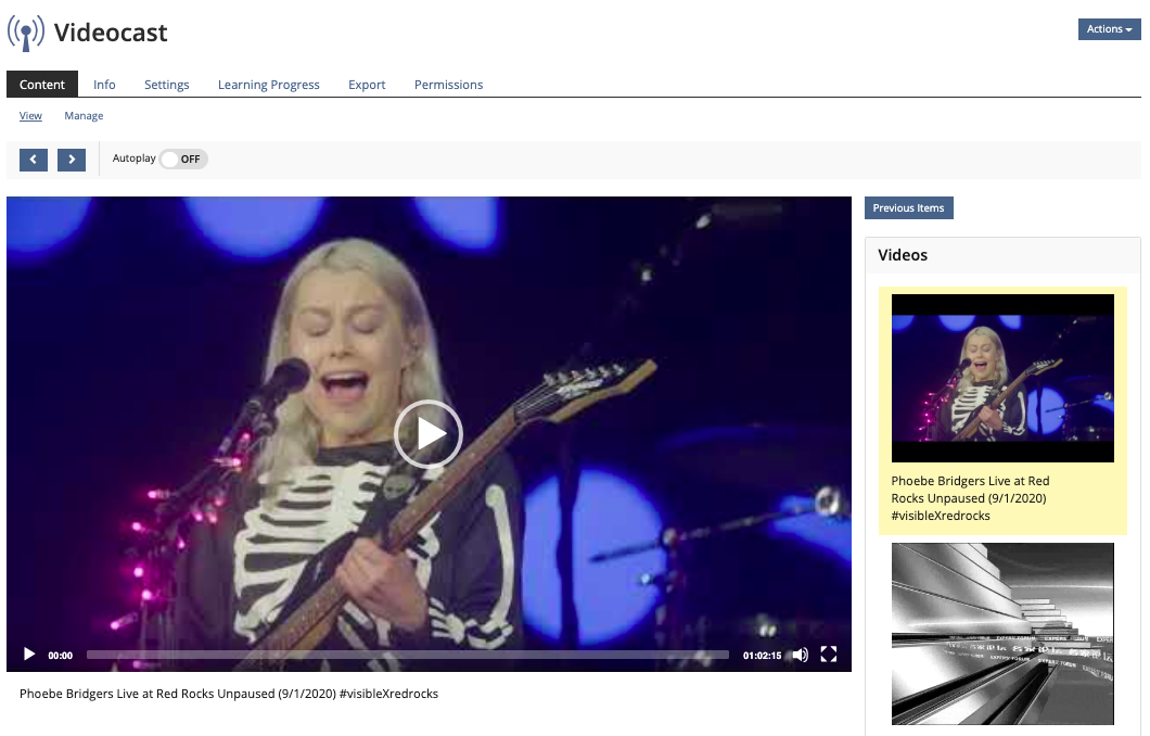
- The view of the mediacast is divided into two columns
- In a main column (left) the first video is shown in large size in the player window
- In a side column (right) all other videos stored in the mediacast are listed
- Video player / main column
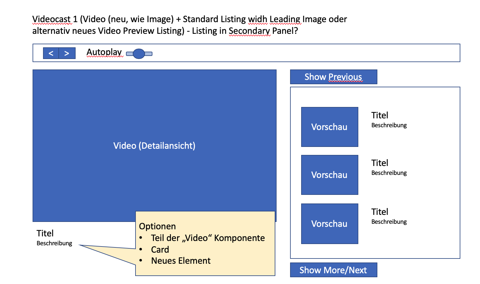
- The current video is displayed with title and description.
- The detailed description text for the currently running main video is collapsed by default and can be expanded by clicking on the "Expand description" link.
- progress bar, play / pause, next video, volume, switchable full screen function are integrated.
- Queue / side column
- Videos are displayed with a shortened title and a shortened description
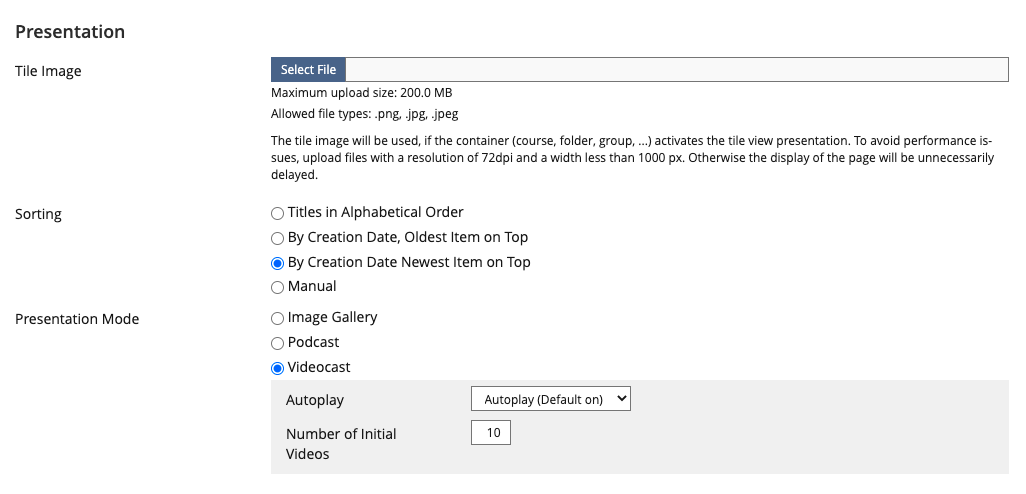
- Only a limited number X of videos is shown by default. The number X is configurable. The order corresponds to the sorting in the mediacast and begins with the currently selected video in the main column
- The currently selected video is highlighted in the queue, but is not clickable there.
- With a button "Show previous videos", previous videos can be shown step by step at the top of the list. The button is inactive or hidden if there are no previous videos.
- With a button "Show more videos", subsequent videos can be displayed step by step at the end of the list. The button is inactive or hidden if there are no subsequent videos.
- Videos already viewed are colored in monochrome.
- If the queue is empty, the corresponding column is hidden and the main column including the video player is widened accordingly.
- Autoplay: Administrators can activate an autoplay function for this presentation and assign the standard setting for users (default: autoplay available + autoplay active)
- If autoplay is activated, the next video in the queue is automatically played after viewing a video. Each learner can deactivate the function individually using the autoplay slider.
- During autoplay, videos are skipped that are already marked as “viewed”
- Responsiveness
- If the width is narrow, the page column is displayed below the main column.
3 User Interface Modifications
3.1 List of Affected Views
- Mediacast > Content > View
3.2 User Interface Details
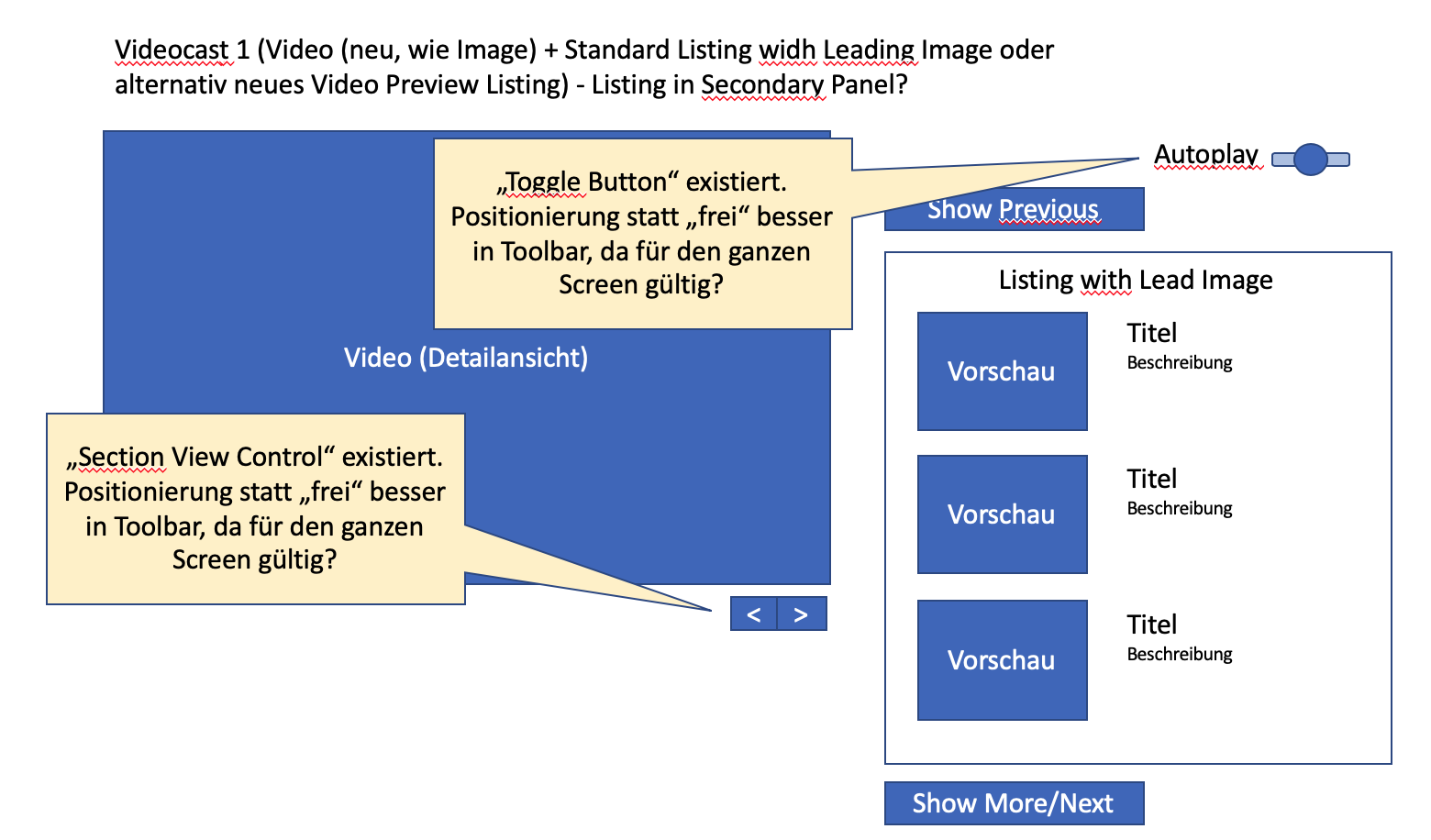
- new kitchen sink elements
- video preview image with playing time
- Use of existing elements
- video (used in main column) (existing media element player implementation)
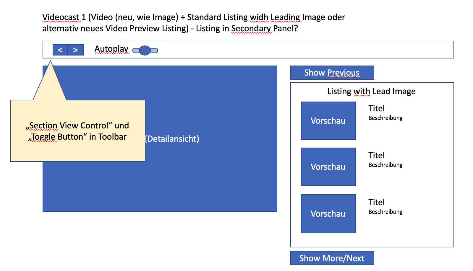
- Section View Control (used for previous / next video)
- Toggle-Button (autoplay)
- Shy buttons for previous next video links
- Alternative: standard listing panel (?)
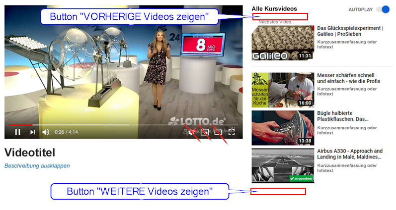
Previous / next video is controlled via section view control

The function „next title“ may appear beneath the video as link due to technical limitations of existing video players.
3.3 New User Interface Concepts
Preview Images with playing time could be a new element. Links, and Toggle Button will be used.
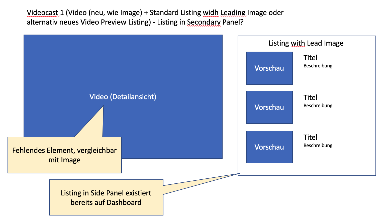
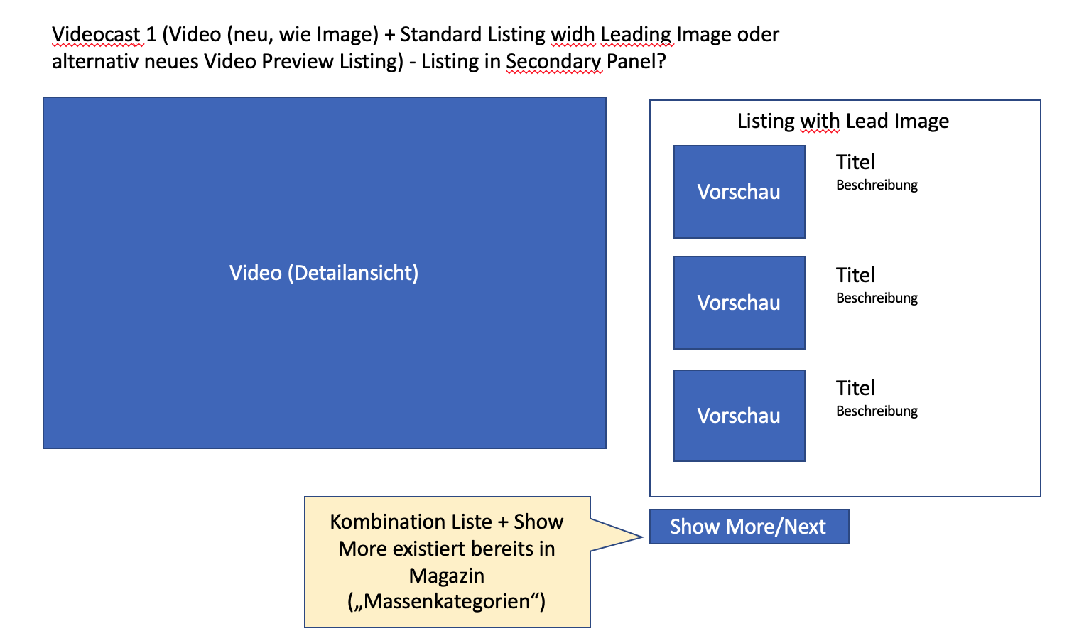
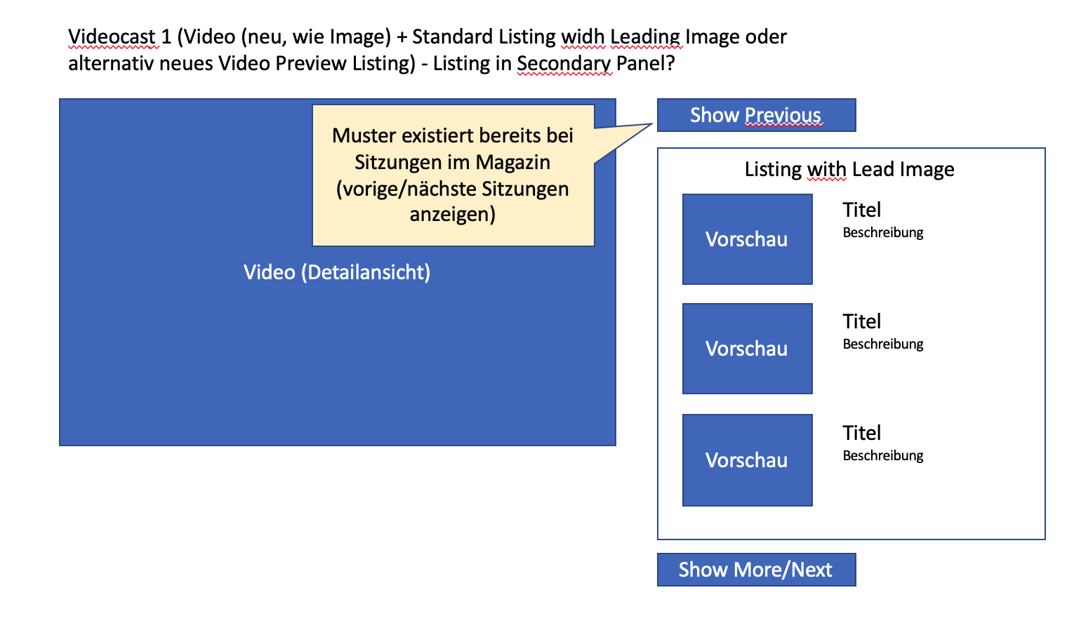
3.4 28 May 2020, A. Killing, Possible Options of KS Elements being used/developed
4 Technical Information
No technical issues.
5 Privacy Information
See https://github.com/ILIAS-eLearning/ILIAS/blob/trunk/Modules/MediaCast/PRIVACY.md
6 Security Implications
If we support Vimeo and Youtube we will access their APIs to retrieve metadata like playing time and preview image.
7 Contact
- Author of the Request: Kiegel, Colin [kiegel]
- Maintainer: Killing, Alexander [alex]
- Implementation of the feature is done by: {The maintainer must add the name of the implementing developer.}
8 Funding
- …
9 Discussion
JourFixe, ILIAS [jourfixe], 25 MAY 2020: We highly appreciate this suggestion and schedule the feature for ILIAS 7. Please check how existing KS elements could be improved to realise this request. Additionally, it should be possible to add an overview screen in the Settings as start screen to give users an option to see all (or at least a huge amount of) videos in one view.
- The use of an adapted existing view (e.g. listing panel) would allow this view to be adopted in other contexts. A useful use could be, for example, a view in the category, where a course is specially highlighted and displayed in large size with a longer description text, while further course offers are listed on the right hand side. Or in a course where one content is in special focus while the following content and objects are teased on the right. Such multiple use is only possible if we can implement a generic solution (such as a view that can be adapted for further purposes). In my opinion, our goal should be to create uniform patterns whenever possible, powerful enough to be used multiple times, instead of individual isolated solutions.
- What I am missing as an important usecase is a start screen, where a user sees all videos at once when he opens the mediacast. Other video portals also have an overview of several videos in a first step, before going into a detail mode where a video is in focus (we ask ourselves: which one is the first or the last or a selected one?). We also assume with a video podcast that a user needs a certain overview of all videos (e.g. lecture recordings) in order to select a specific one. In the proposed solution only a limited selection is visible and I have no chance to get a quick overview of all offers.
- It is questionable for me whether the buttons "Previous/Next" are necessary when the videos are available for clicking on the right side. Please check if these controls are really necessary and if so, why it seems to be necessary to have a kind of "selection control" on the right, where a few videos can be clicked. It is also important to check which effect "Previous/Next" still has when the autoplay is on, since this automatically switches to the next video. It seems as if there are three variants of "forward navigation" placed in a very small space and I'm not sure if all of them are really necessary. (Hicks Law)
- The use of known patterns is very important and valuable for the UI. At the same time, it is important to keep in mind that following well-known big players also arouses certain desires and requirements. Why, for example, do you have to show videos with a button "Weitere Videos anzeigen" on the right and can't simply scroll through the list? (Jakob's Law)
- I added some additional mockups that explain why I think that most of the patterns already exist in ILIAS. I also think that some elements like the toggle and view control element could be placed in a more common position like a toolbar. Please note that none of the mockups here is using the ILIAS style/design, so nothing (including the prototype shown in the JF) has the final "ILIAS look".
- I agree that an additional overview screen (like a deck of cards) would be valuable, but I also know that this serves a differenc didactical use case. Your case is more a "free choice" scenario, where the learner is not so much guided. However the proposed view allows much more to guide a learner through a sequence of videos to gain some learning experience and outcome. So the information "where do I stand and what comes next" is very important. Your case could also simply be implemented by using a media pool with read permissions for learners but as I said in the meeting, I am open for an additional FR that includes such a view in the media cast. I assume it would work mostly like the image gallery.
Amstutz, Timon [amstutz], 2 June 2020: Thanks Killing, Alexander [alex] for the additional mockups. The mockups are IMO very clear and nicely point out the elemetns used, the arrangements and missing aspects. My objections voiced on monday against this feature are resolved with those. Such clear abstract visualizations with labels of which element would be which help me tremendously quickly crasping a concept. They could be of great help for a JF discussion so we could focus on remaining questions (such as the start screen).
JourFixe, ILIAS [jourfixe], 06 JUL 2020 : Alexander explained which KS elements he wants to use for implementing this feature and which additional KS elements are necessary. One new element will be the video UI element to display videos. This will just wrap the already used mediaelement.js element (so no need to transfer all UI elements of the videoplayer into the KS. We fully agree with his suggestions and looking forward for the implementation.
JourFixe, ILIAS [jourfixe], 07 MAR 2022 : We highly appreciate this suggestion and re-schedule the feature for ILIAS 8.
10 Implementation
Test Cases
- Test cases completed 2022-08-03 by Tödt, Alexandra [atoedt]
- 49289 : Ansicht ändern: Videoliste
- 49290 : Videodatei hochladen
- 2139 : Videos mit / ohne Autoplay abspielen in Ansicht "Videoliste"
Approval
Note: The implementation is based on a patch funded by Lotto. However the final presentation based on KS components is very different and funded by Leifos.
Approved at 17 Apr 2022 by Killing, Alexander [alex].
Last edited: 3. Aug 2022, 19:35, Tödt, Alexandra [atoedt]
