Feature Wiki
Tabs
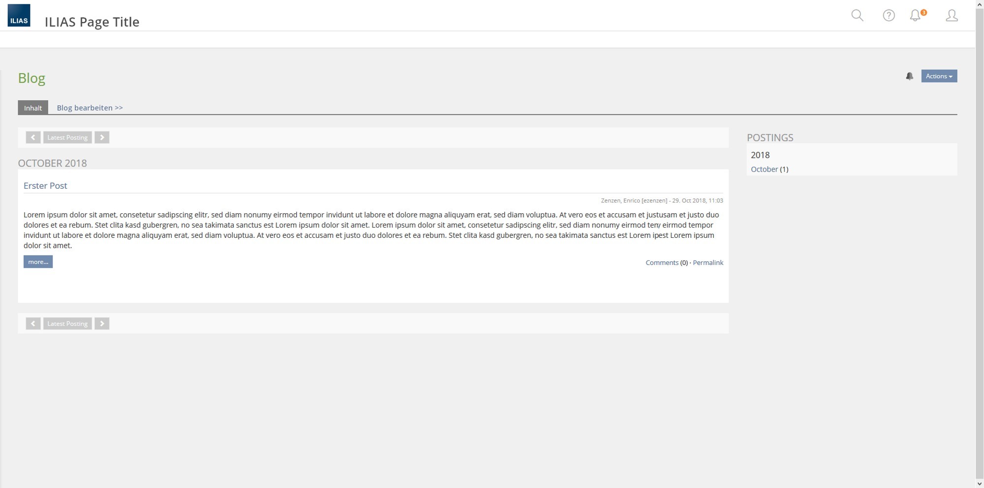
Adapt Blog/Portfolio View to new Layout
Page Overview
[Hide]1 Initial Problem
There are many different views in ILIAS, like Memberview, Bolgview etc. (see list - 2 Conceptual Summary).
With ILIAS 6.0 we want to unify the representation of these views and reduce the break that the views in ILIAS 5.4 have caused to the default ILIAS layout.
2 Conceptual Summary
Views | Object | Displayed UI Elements | tackeled by |
Memberview | Course, Group |
| Enrico? |
Blogview | Blog |
| this request |
Portfolioview | Portfolio |
| this request |
Wiki Assignement |
| Enrico? | |
Kiosk Mode |
|
| Test: Enrico? |
LTI |
| Enrico? |
- Kiosk Mode in Tests
2.1 Views without Metabar Items (LTI, Memberview, Kiosk Mode in Learning Sequences, others?)

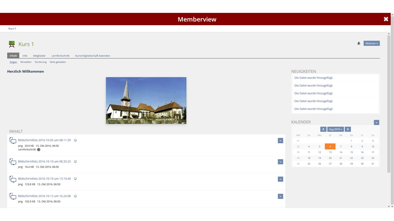
The MetaBar is still displayed. Instead of the MetaBar items, a close glyph is displayed, which can be used to close the view. The area of the ILIAS page title is used to display the title of the mode.
- An additional highlighting of the mode causes the coloring of the heading (e.b. Memberview-Mockup).

2.2 Views with Metabar Items
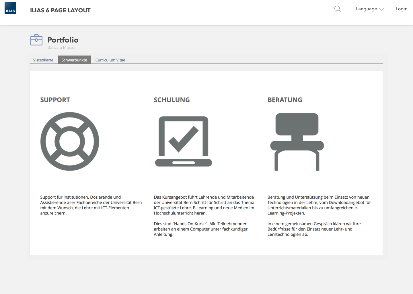
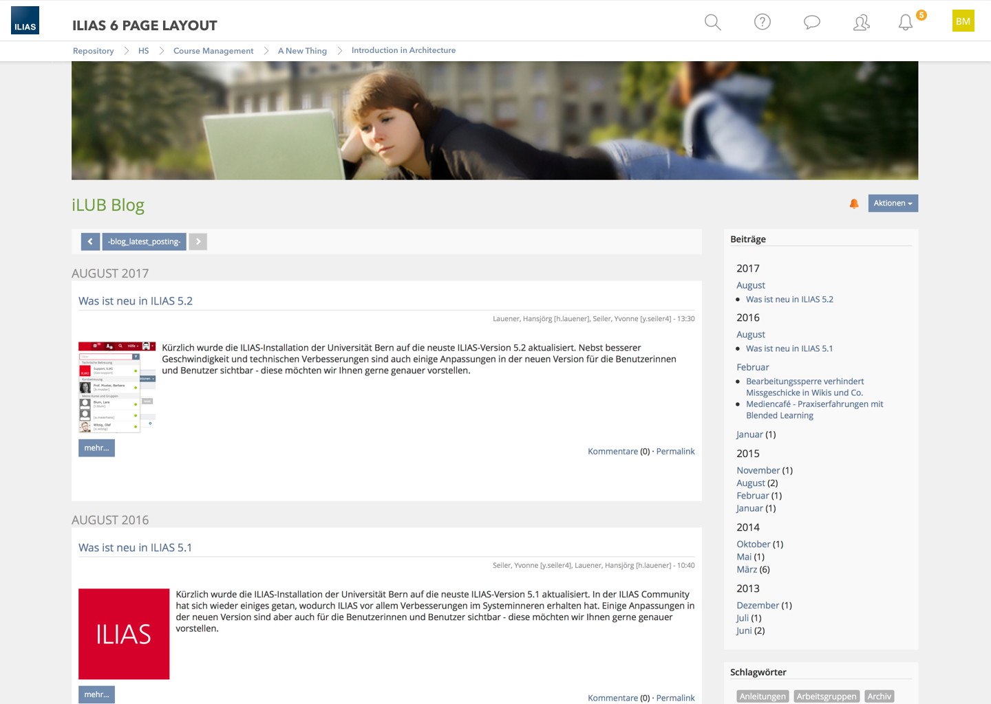
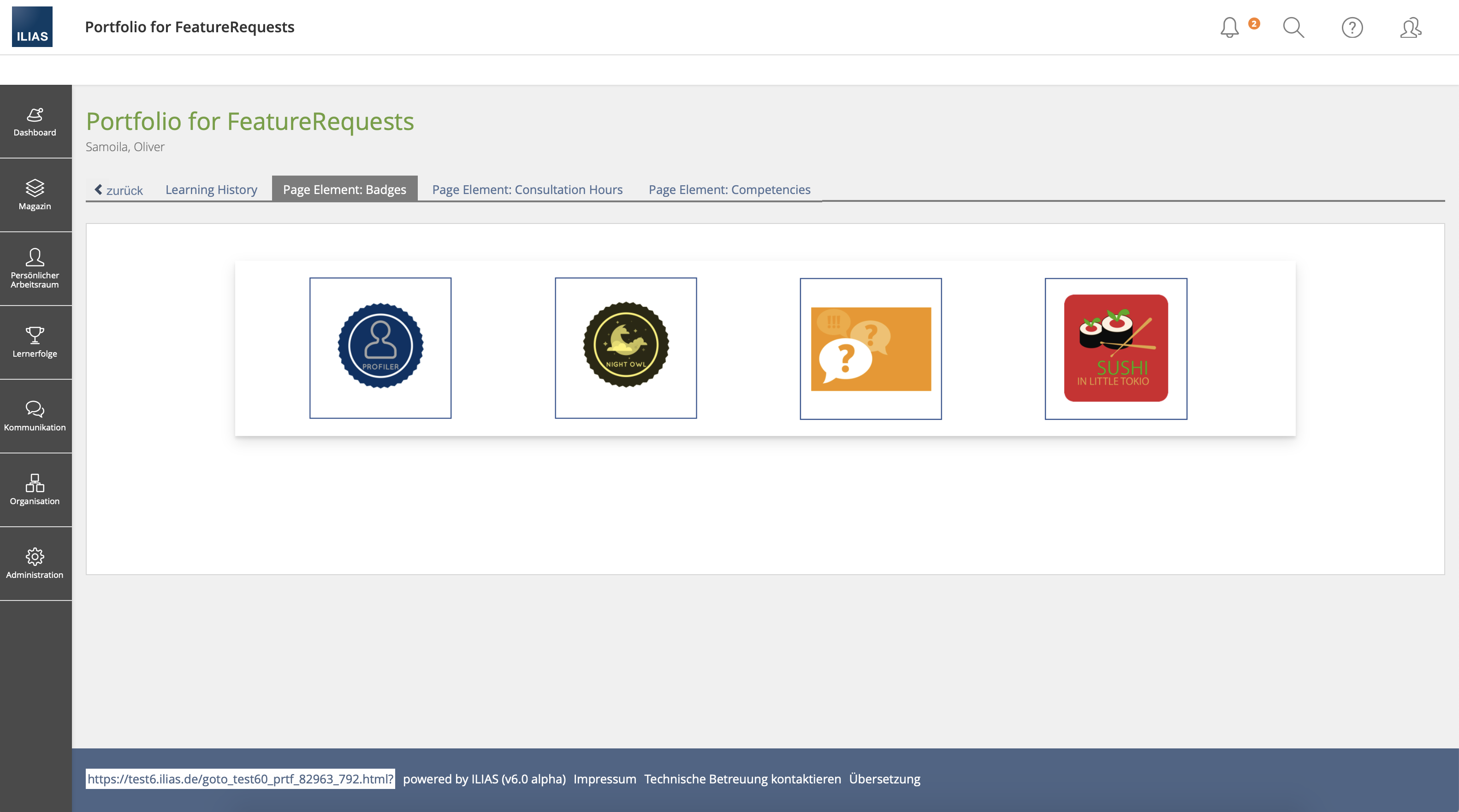
Views in which MetaBar items are displayed (e.g. Blog and Portfolio View) keep the MetaBar including all items.
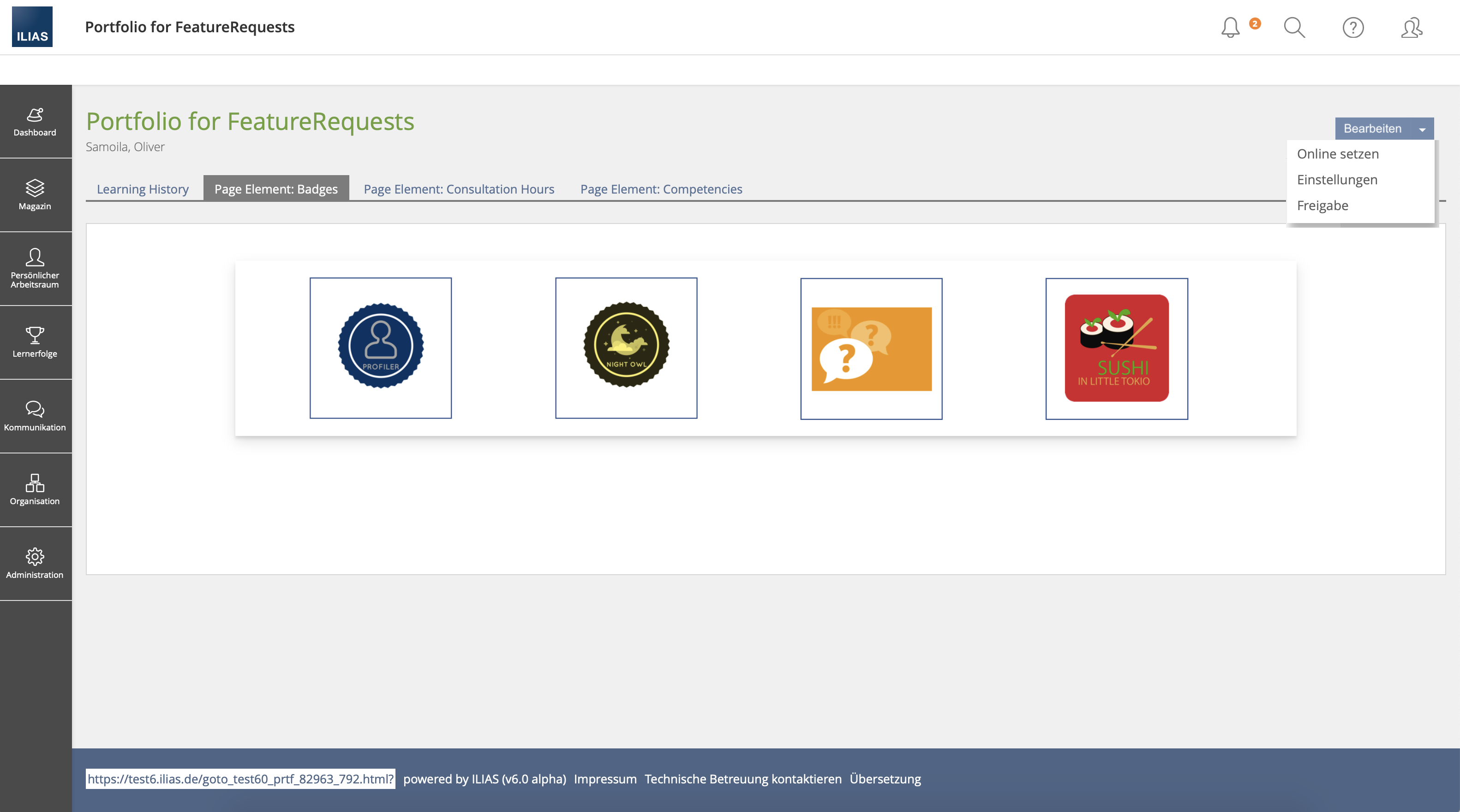
- How do users open edit mode? There is no longer a link in the MetaBar (see ILIAS 5.4). We should clarify this question in general. How are views/modis opened?
- Suggestions:
- Via a tab (see Mockup, like ILIAS Learning Module in ILIAS 5.4)
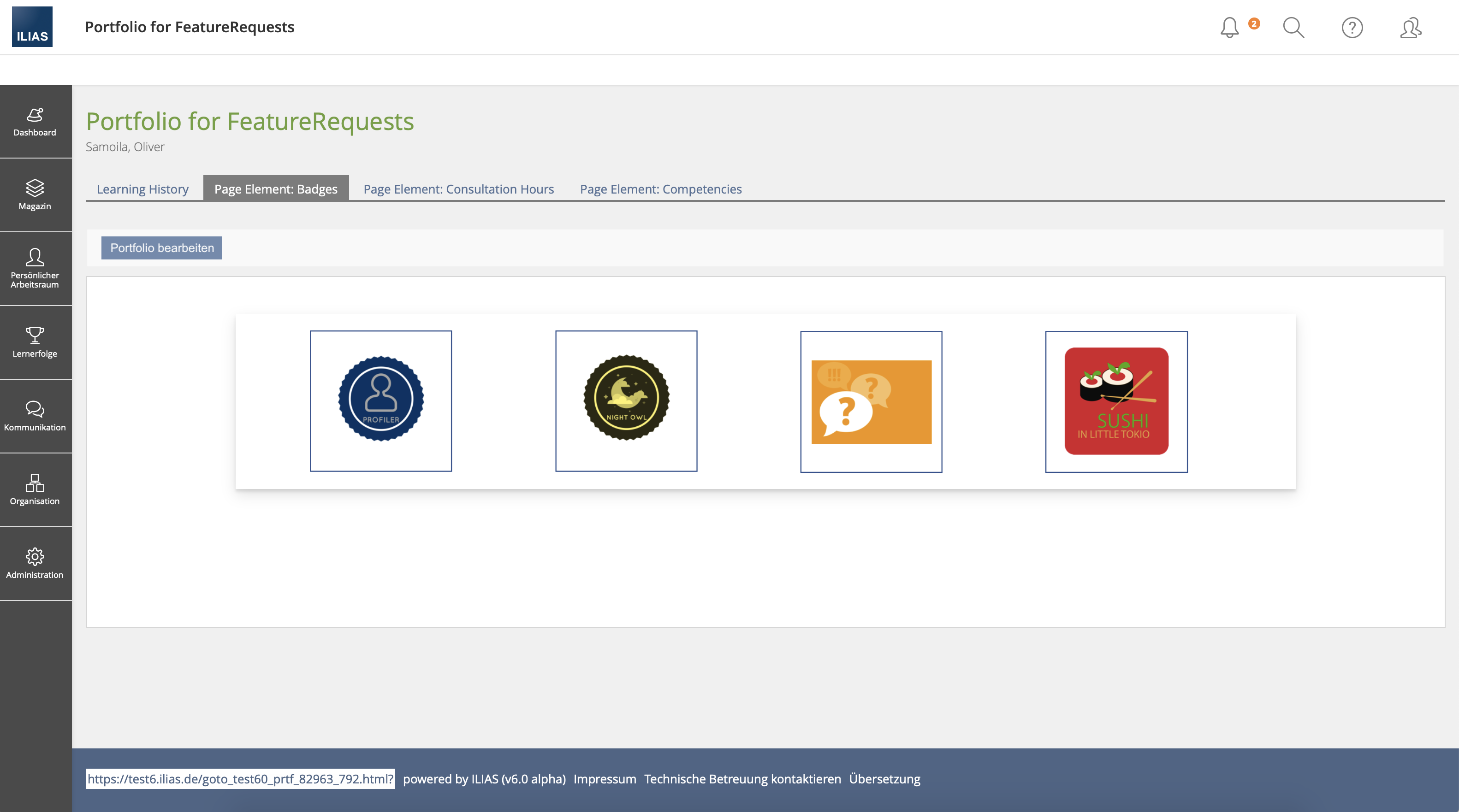
- Via a button in a toolbar
- Suggestions:
2.3 Header in Blog- and Portfolioview
3 User Interface Modifications
3.1 List of Affected Views
- Blog >> Blogview
- Portfolio >> Portfolioview
- Courses and Groups >> Memberview
3.2 User Interface Details
3.3 New User Interface Concepts
none
4 Technical Information
none
5 Contact
- Author of the Request: Zenzen, Enrico [ezenzen]
- Maintainer: Killing, Alexander [alex]
- Implementation of the feature is done by: {The maintainer must add the name of the implementing developer.}
6 Funding
- …
7 Discussion
In my understanding, we have (at least in time) not been able to find a solution that works for all particular views.
How far the solutions for LTI, test, learning sequence and member view already differ, I can't see - but it's probably not relevant anyway.
For the presentation views of Blog and Portfolio, I think the open question is how to get the user into edit mode.
» Enrico and I agreed that it should be a one-year/-release solution for ILIAS 6. During the revision of the content area for ILIAS 7, a general solution should be found.
possible solutions:
- classic Action-Menu
- Advantage: Button is a known pattern. No new UI elements
- Disadvantage: no one is looking for editing there, otherwise learners do not have authorship. Nobody's gonna find that.
- Split-Button
- Advantage: Editing is immediately visible. All other actions are also available.
- Disadvantage: The split button is not popular with everyone. (The fact that t is not an element from the KS also applies to other solutions.)
- Tab-Navigation left
- Advantage: Editing is immediately visible. No UI special solutions.
- Disadvantage: This type of navigation is otherwise used for "back". Blogs don't know tabs.
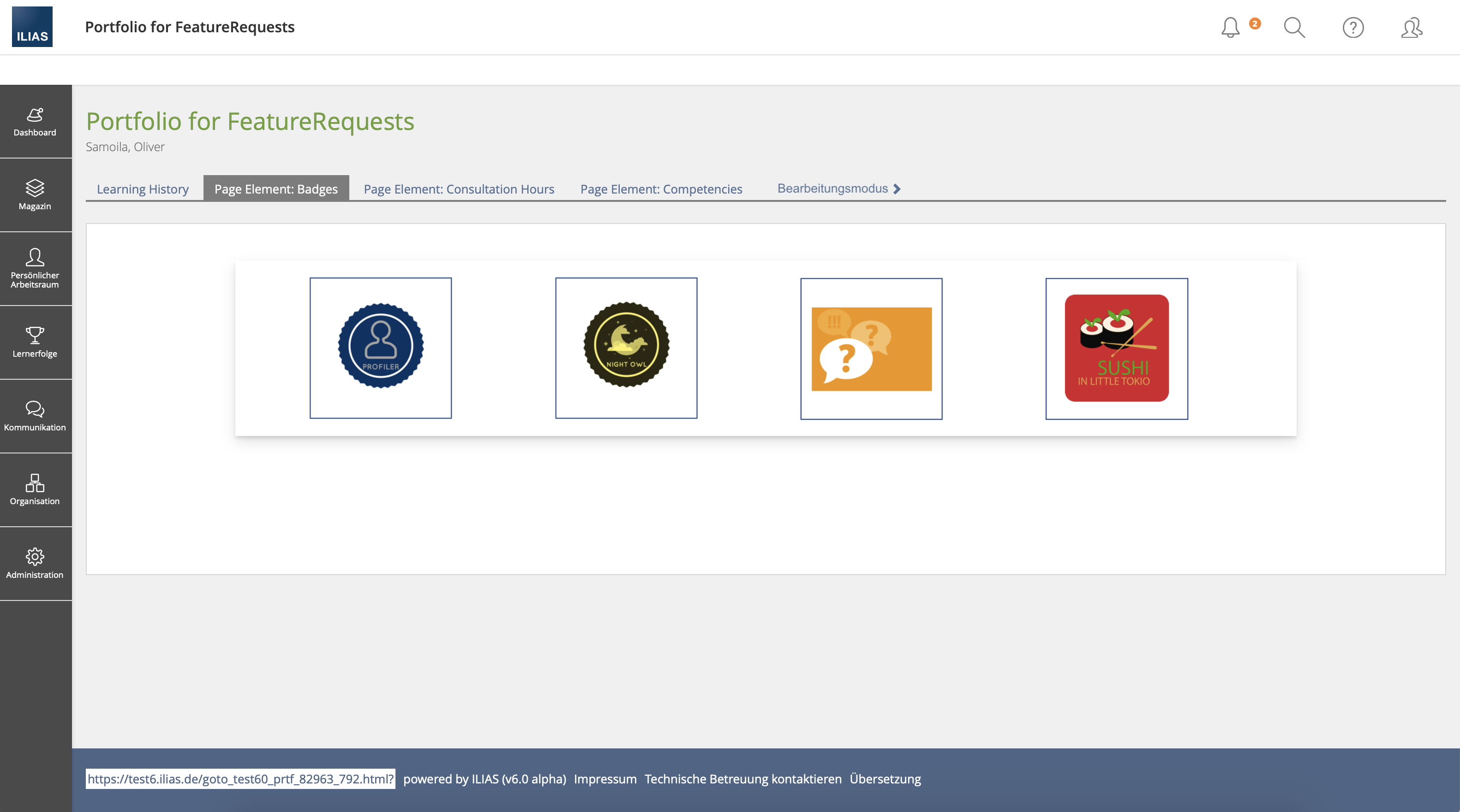
- Tab-Navigation right
- Advantage: No UI special solutions.
- Disadvantage: Editing is not immediately visible, even though it is centrally located. If there are many portfolio pages, the editing is done in Hamburg. Blogs have no tabs.
- Tab-Navigation right persistent
- Advantage: No complete UI special solution. No Hamburger on many pages/tabs.
- Disadvantage: On large screens, the navigation moves very far out. Blogs don't know tabs.
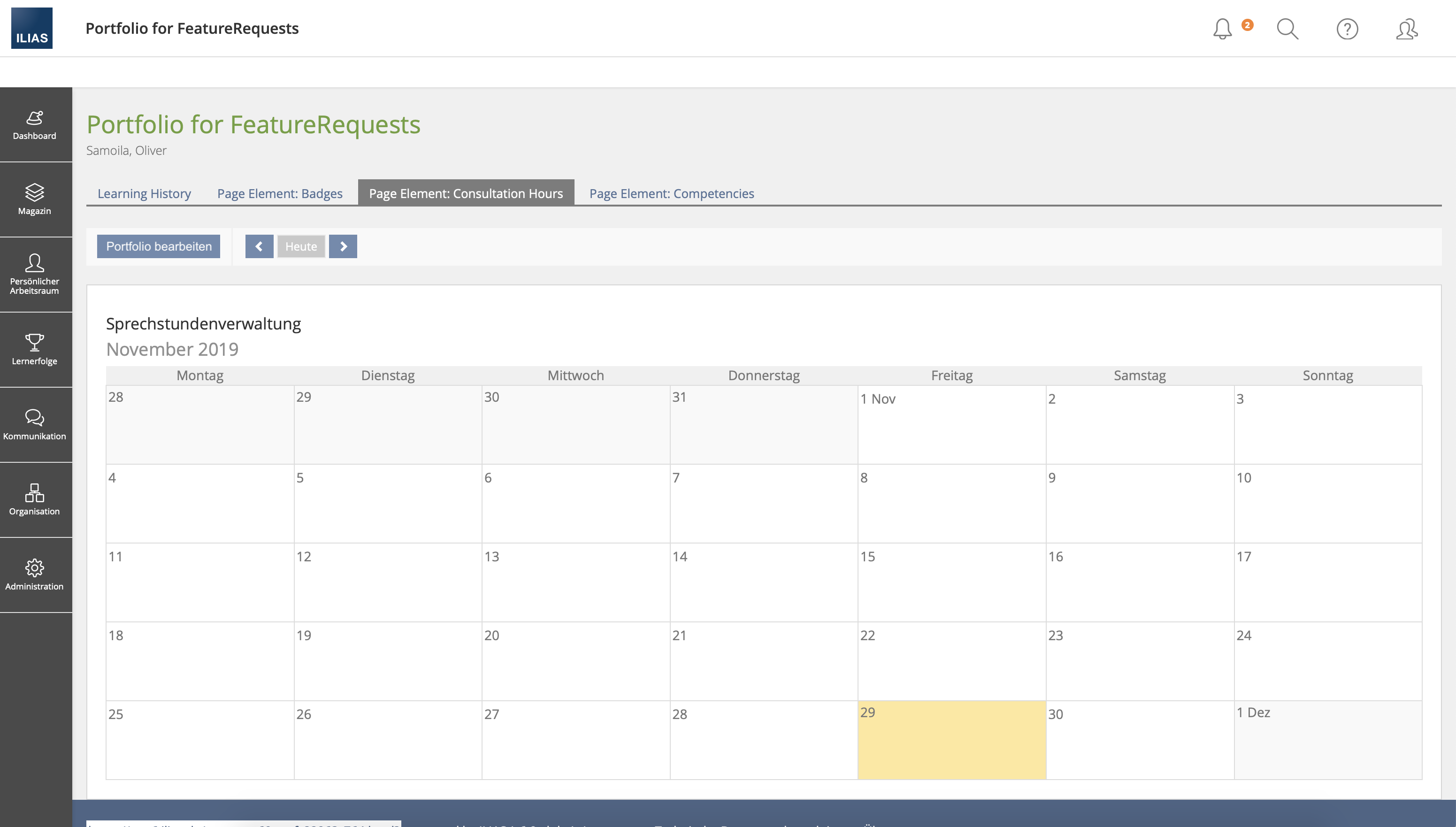
- Toolbar (two MockUps, there are Page Elements with own toolbar)
- Advantage: No UI special solution. Toolbars are well known. (Blogs already have a toolbar.)
- Disadvantage: Usually there is only one button in the toolbar.
8 Implementation
{The maintainer has to give a description of the final implementation and add screenshots if possible.}
Test Cases
- {Test case number linked to Testrail} : {test case title}
Approval
Approved at {date} by {user}.
Last edited: 1. Dec 2019, 19:45, Samoila, Oliver [oliver.samoila]
