Feature Wiki
Tabs
Presentation Option «Table» for Categories
Page Overview
[Hide]1 Initial Problem
The Presentation Table cannot be employed in categories in ILIAS. It should be a presentation Option.
2 Conceptual Summary
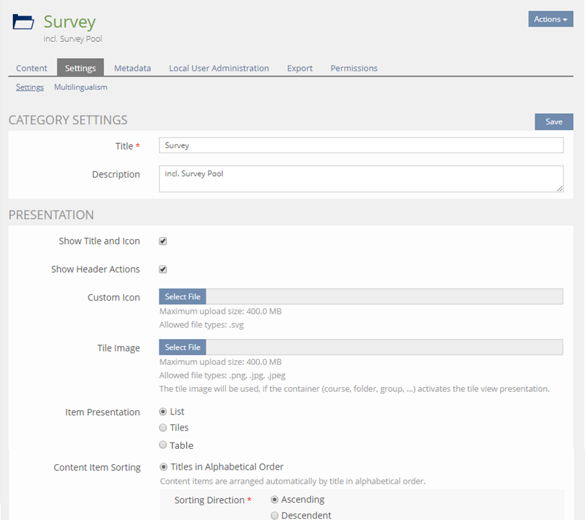
- In the Settings-tab of categories the "Item Presentation" setting gets a new, third option "Table".
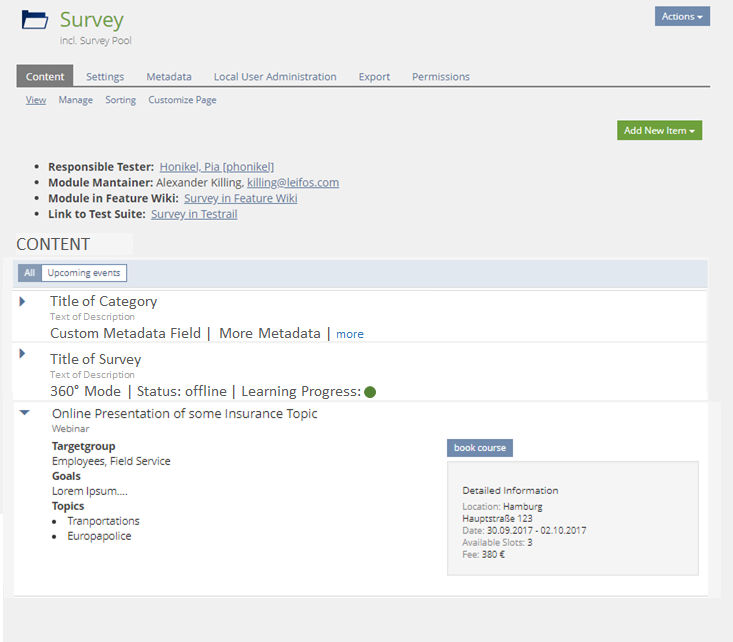
- If a categoriy is set to "Table" then objects in the category are shown as lines in a Presentation Table
3 User Interface Modifications
3.1 List of Affected Views
- Settings-tab of Categories
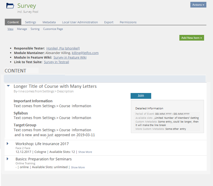
- Content-tab of Categories
3.2 User Interface Details
3.3 New User Interface Concepts
None.
4 Technical Information
- I am not sure if it will be easy/possible to integrate the show more behaviour into these tables. We might disable the combination of these two behaviours.
- I am also not sure about if the learning progress indicator can be easily embedded as shown above.
Tödt, Alexandra [atoedt]: The alternative suggestion below does adress one of the two issues raised by Alexander.
The conflicting "Show more" thingies are however not resolved.
5 Contact
- Author of the Request: Tödt, Alexandra [atoedt]
- Maintainer: Killing, Alexander [alex]
- Implementation of the feature is done by: {The maintainer must add the name of the implementing developer.}
6 Funding
- …
7 Discussion
Kunkel, Matthias [mkunkel], 29 APR 2019 : The label "Table" is irritating for this option of the item presentation. Users without knowing the related UI element won't understand this kind of presentation as a table presentation. They would expect something differen - a real table! Please provide a better label for this option.
Killing, Alexander [alex], 16 May 2019: I support the idea in general. Technical issues are listed above.
Klees, Richard [rklees], 20 MAY 2019: I would propose to name the option "presentation table".
And: Which information will be displayed where? What will be displayed in the important fields of the table, what in the further fields and what in the content?
@Alex: The learning progress indicator currently is not possible, but I would definitely support to make this label/glyph combination possible. About the "show more": I'd be happy to look into this with you (and other interested people) because I think we want this behaviour for tables (also for the normal ones, once they are in the UI-framework).
Killing, Alexander [alex], 20 May 2019: I would ask the JF that with the implementation of this feature, we could also optionally include the move from the current list implementation to the KS Standard Listing Panels for repository container lists, which would include an extension of KS Listing Panels with Selection (of course only if we agree on such an extension within a separate PR).
- Does every object type gets its own presentation table or is there another grouping of objects of different types?
- Which data is shown in the left part of a presentation table entry and which in the panel?
- Is the object type itself presented as metadata or is it sufficient to mention it in the headline above each presentation table?
- Are item groups able to use the presentation table, too? Or is this view restricted to objects in type lists due to consistent data structure within each presentation table?
Kergomard, Stephan [skergomard], 20 MAY 2019: I still feel a little bit uncomfortable with the last bulletpoint. From an users perspective I would expect the Table Item Presentation to behave like the Tiles or the List Item Presentation (as they are in the same radiobutton group), i.e. Item Groups take the Item Presentation from their parent and I can choose the Content Item Sorting I want to go along with it. The second assumption can be "countered" by greying the unavailable options out, if Table is selected, the first is something you just need to figure out (or to read up on in the manual/help). I understand the use case of the Presentation Table and I believe that conceptually we should stick to presenting uniform information in the table rows, but I feel that the expectations formulated at the beginning are of a higher order (or more basic or less "technical", i.e. have less conceptual overhead and are thus more intuitive) and thus maybe the Presentation Table is simply the wrong ui-element for this. I know this is a question of degrees, so this is just my feeling.
8 Implementation
{The maintainer has to give a description of the final implementation and add screenshots if possible.}
Test Cases
- {Test case number linked to Testrail} : {test case title}
Approval
Approved at {date} by {user}.
Last edited: 20. May 2019, 18:09, Kergomard, Stephan [skergomard]


