Feature Wiki
Tabs
Improve Start Button in Tests and Surveys
Page Overview
[Hide]This feature wiki request picks up the request 'Big Start Button'.
1 Initial Problem
The position of the button often leads to usability issues.
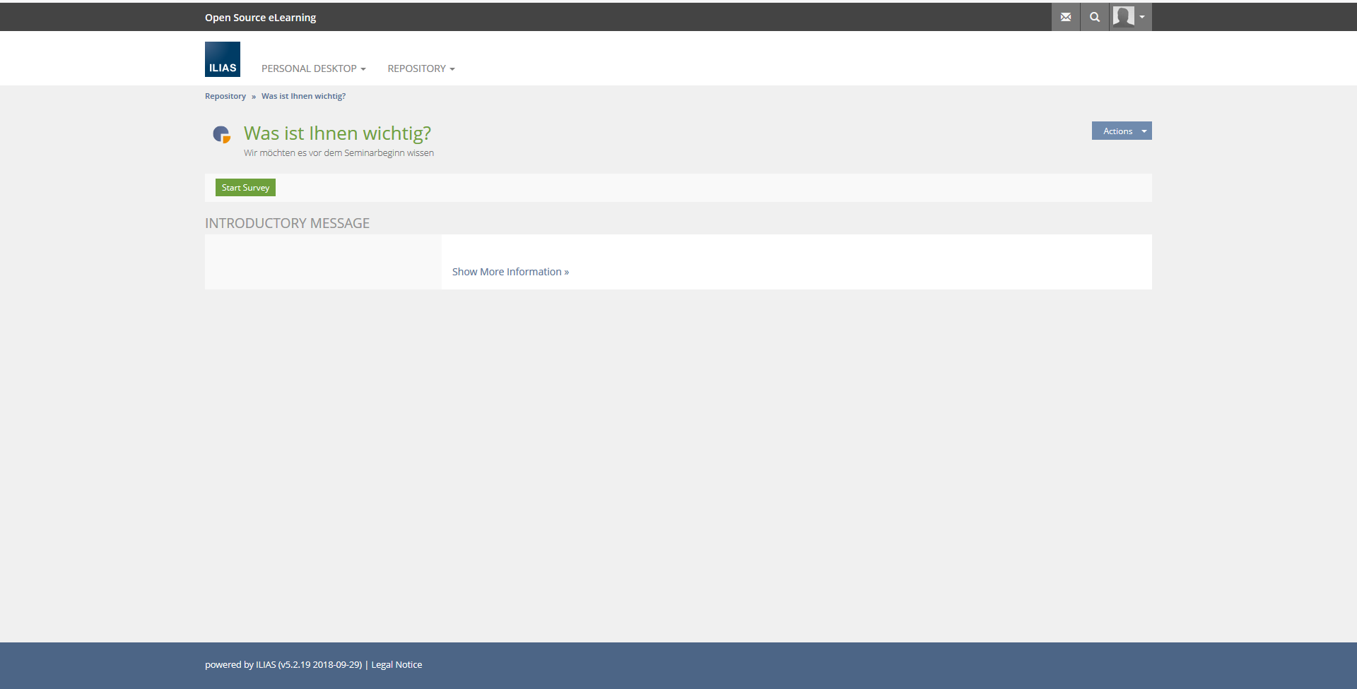
Users read the INTRODUCTORY MESSAGE and instinctively search for the Start Button on the right below the instructions.
2 Conceptual Summary
Option 1:
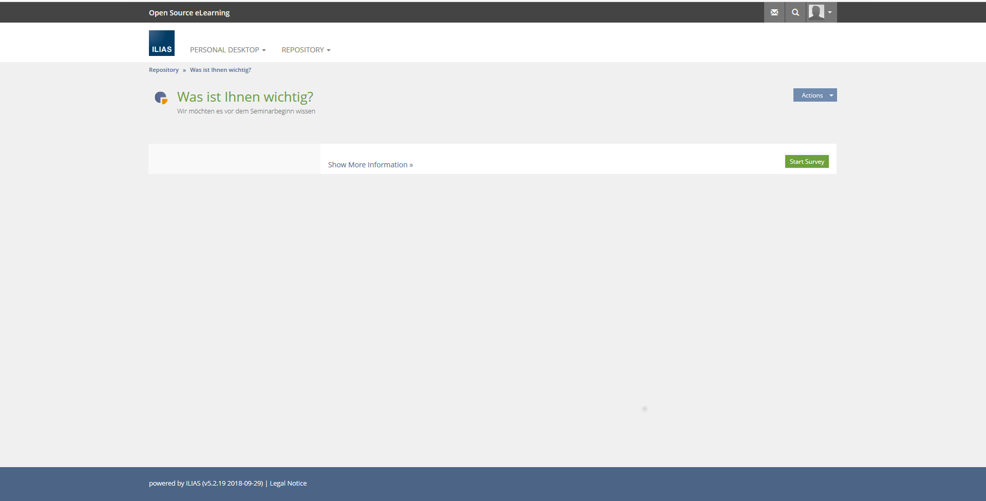
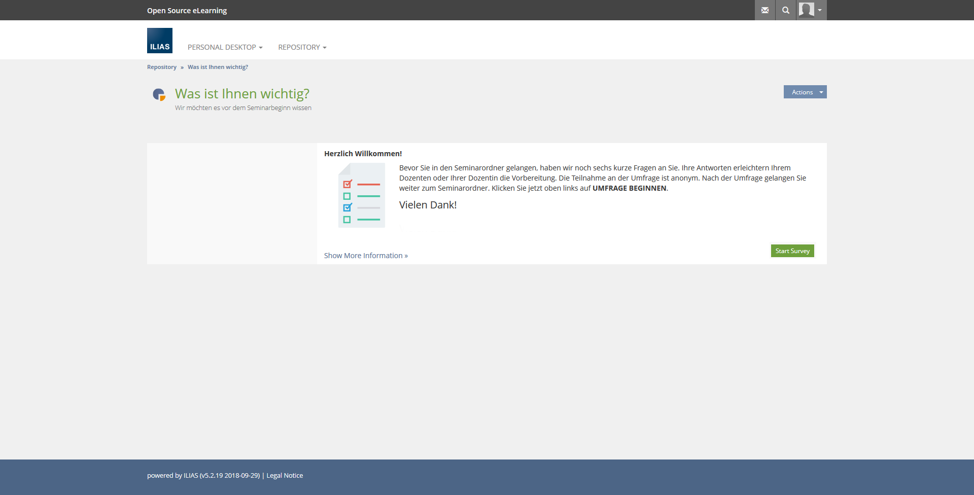
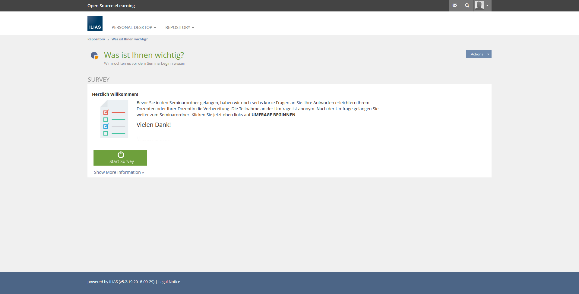
The start button should be positioned to the right below the INTRODUCTORY MESSAGE.
Option 2 + 3:
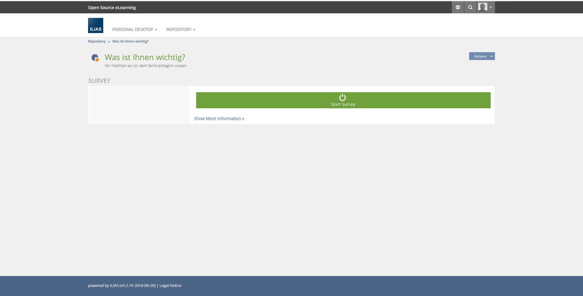
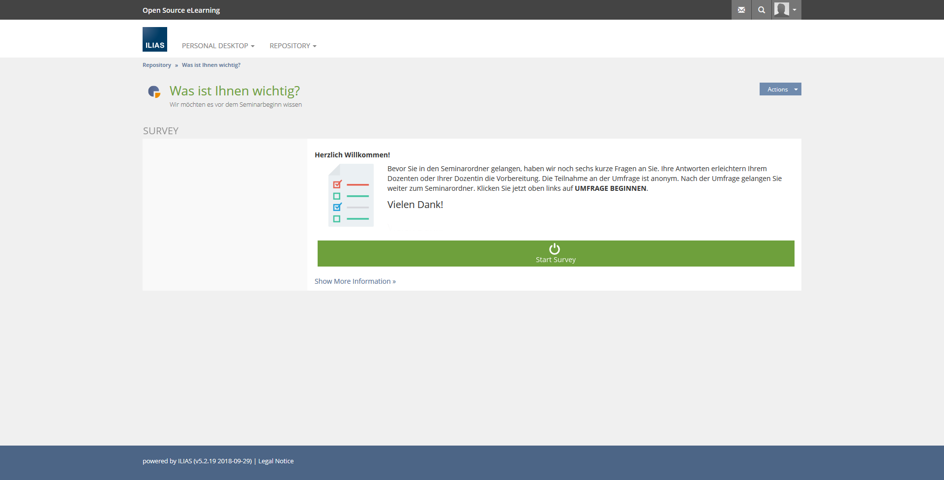
The start button should be displayed much larger and below the INTRODUCTORY MESSAGE.
In survey, the INTROCTORY MESSAGE section should not be displayed if no message has been inserted.
2.1 Questions to be clarified
- What should the section INTRODUCTORY MESSAGE be called?
- Does the section even need a name?
- What will the screen look like in the 360 survey?
3 User Interface Modifications
3.1 List of Affected Views
Test » Info
Survey » Info
3.2 User Interface Details
Option 1:
Option 2 (Bulky Button):
Option 3 (Bulky Button)
3.3 New User Interface Concepts
none
4 Technical Information
none
5 Contact
- Author of the Request: Zenzen, Enrico [ezenzen]
- Maintainer: Killing, Alexander [alex], Heyser, Björn [bheyser]
- Implementation of the feature is done by: {The maintainer must add the name of the implementing developer.}
6 Funding
- …
7 Discussion
Zenzen, Enrico [ezenzen], 19 NOV 2018: There is no concept known to me, in which a button with which you can start an application is positioned in front of information relevant for the application. Since the INTRODUCTORY MESSAGE should be read, the button should be right below the message.
Samoila, Oliver [oliver.samoila], 19 NOV 2018: I'm for option two - bulky button.
Without introductory text, the solution in Option 1 to move the button to the right is less intuitive than the current implementation.
<!-- Used for easily cloning the properly namespaced rect -->
Lauener, Hansjörg [lauener], 20. Nov. 2018. I additional suggest: a) The grey box appears because the first maintainer implemented the start of surveys and tests in the Info-tab. Get rid of this unnecessary empty "grey screen". And b) This bulky button is toooo big for me. I personally think we should only move the current start-button below the introduction-text.
<!-- Used for easily cloning the properly namespaced rect -->
Rabah, Rachid [rabah], 20 NOV 2018: I agree with the suggestion of Hansjörg. Nevertheless i think the size of the actual button should be a little bit larger, more obvious and easier to hit...
Zenzen, Enrico [ezenzen], 23 OCT 2018: Thank you for the suggestions and comments. I added the Mockup of Hansjörg as Option 3 to the Feature Wiki entry.
Strassner, Denis [dstrassner], 28 NOV 2018: I'm also for option two - bulky button (but not to bulky). And I also agree with Hans-Jörg that the grey area should go away.
Klees, Richard [rklees], 2018-12-17: To me it feels like the "New User Interface"-section ("None") here is not accurate. There is no precedence (at least none that I could think of) to put a button into a field of what is technicly a form (hence the "gray area"), and definitely so for the bulky button.
I totally agree, though, that the current position of the button is less than optimal, as well as the wasted gray space for the not really existing form. IMO we should solve this with something like an "Introductory Panel" for the KS. Further hint at this is that a similar problem exists for the Learning Sequence, which has an introductory page as well.
I'll be happy to help with such an effort. If anyone is interested I could also try explain (as layman-termed as possible) how one would push such a thingy to GitHub then, if any non-developer is interested.
JourFixe, ILIAS [jourfixe], 17 DEC 2018 : We highly appreciate this suggestion and would like to elaborate a suitable solution. We therefore pick up the idea of a UI element "Introductory Panel" and would like to discuss it. There is the common opinion that alternative 3 is the best out of the three suggestions and that a big button but not a full width button would be nice to have.
Schmidt-Sielex, Wolfgang [WSS] 2023-07-20: Feature has been discussed by a sub-group of SIG accessibility and set to 'outdated'. The buttons will be replaced by the accessible 'launcher component' in the future: https://github.com/ILIAS-eLearning/ILIAS/pull/5558
8 Implementation
{The maintainer has to give a description of the final implementation and add screenshots if possible.}
Test Cases
- {Test case number linked to Testrail} : {test case title}
Approval
Approved at {date} by {user}.
Last edited: 20. Jul 2023, 11:07, Schmidt-Sielex, Wolfgang [WSS]
