


Feature Wiki
Information about planned and released features
Tabs
KS: Shy Drop Downs


Purpose
The Shy Dropdown operates a more complex UI-composition.
Composition
The Shy Dropdown sits on the top right of the UI-component it operates. It is graphically unobtrusive. On-click a list of Shy Buttons and optional Dividers is shown.
Effect
On-click, a list of actions or settings is revealed. Clicking an item will trigger the action or apply the setting indicated. Clicking outside of an opened Shy Dropdown will close the list of items.
Rivals
Buttons, Links, Dropdown Popovers
Rules
Usage
- Block on Personal Desktop
- Tables
- Question Canvas
- Only Dropdown Items MUST trigger an action or change a setting. The Shy Dropdown trigger element is only used to show and hide the list of Dropdown Items.
- DOM elements of type "button" MUST be used to properly identify an element as a Dropdown.
- Dropdown items MUST be implemented as "ul" list with a set of "li" elements and nested Shy Button elements for the actions.
- Triggers of Dropdowns MUST indicate their effect by the aria-haspopup attribute set to true.
- Triggers of Dropdowns MUST indicate the current state of the Dropdown by the aria-expanded label.
- Dropdowns MUST be accessible by keyboard by focusing the trigger element and clicking the return key.
- Entries in a Dropdown MUST be accessible by the tab-key if opened.
- The focus MAY leave the Dropdown if tab is pressed while focusing the last element. This differs from the behaviour in Popovers and Modals.
- …
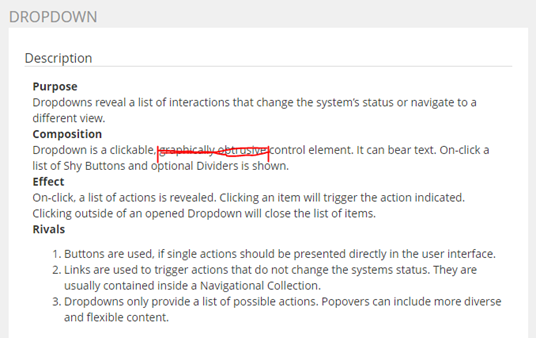
Family Article Dropdown
We apply for deleting “graphically obtrusive” from the family article to accommodate the new “Shy Dropdown” article.
Last edited: 9. Apr 2018, 09:18, Tödt, Alexandra [atoedt]