


Feature Wiki
Tabs
Page Layout Revision (Mobile)
Page Overview
[Hide]- 1 Initial Problem
- 2 Conceptual Summary
- 2.1 Navigation Patterns (Analysis)
- 2.2 New Navigation Strategy (Conclusion)
- 2.3 Conceptual Details
- 2.3.1 Meta Bar
- 2.3.2 Main Bar
- 2.3.3 Slate
- 2.3.4 Tree
- 2.3.5 Local Main Bar Entry "Tools"
- 2.3.6 Scrolling Behaviour
- 2.3.7 Breadcrumb
- 2.3.8 Kiosk and Presentation Mode
- 2.3.9 Widescreen and Customization
- 2.3.10 Plugin-Slot
- 3 User Interface Modifications
- 4 Technical Information
- 5 Contact
- 6 Funding
- 7 Discussion
- 8 Implementation
This Feature is part of the General Layout and Menu Revision and contains the mobile version of Page Layout Revision (Desktop).
We have split the concept for desktop and mobile, although both have thought of each other and have the same goals, but need different implementations. The underlying concept of main bar and slate should be implemented as similarly as possible for both devices.
The attached PDF-file provides an overview of the current status of the Page Layout Rersion. All elements of the new layout are described and clearly separated. Mock Ups help you to uniquely identify the elements. In addition, rules are defined for the behavior of all elements.
1 Initial Problem
With ILIAS 5.0 we greatly revised the ILIAS overall look including the main Page Layout composed of Header, Content Section and Footer. This was an important and necessary step to push ILIAS forward into a responsive direction. Some time has passed since then and we believe it is time to push the ILIAS main layout once again significantly forward.
The navigation concept on mobile devices in particular should be adapted to the navigation of the desktop, so that users can find their way around more easily.
In addition to the Page Layout Revision (Desktop) problematic aspects, especially the following aspects of the current layout seem problematic in our view on mobile screens:
The Top Navigation contains a various types of elements. Further, the space is limited and the elements that need to find a place there is growing (see e.g. Background Task Service User Interface).
 Small Screen
On small screens several layers can overlap each other.
F.e. menu ("hamburger menu") overlaps Content -> Help overlaps menu and content (online help is only available in German).
Help and Content can't be used beside each other. You have to close help sidebar to click to another content. If you open help again, your last visited entry won't be displayed anymore.

2 Conceptual Summary
Further version and discussions of concept: Page Layout Revision (Mobile) - Pre-Stage
2.1 Navigation Patterns (Analysis)
Based on our analysis of problematic issues we focussed on a main task we want to solve with the new page layout revision:
Simpler navigation concept
- that works on small screens and desktop devices AND
- has the possibility to be expanded by future developments.
- Top Navigation
- Main Navigation
- Tree
- Breadcrumb
 Current navigation
- tree and search offer only a different kind of view on the content.
- Some are kind of quick navigation (like Main Navigation),
- some are quick navigations in combination with notification alarms (like Top Navigation).
- And some are a way to navigate through a predefined path (like Breadcrumb and Tree).
Desktop and Small Screen View
Our second task is to bring together desktop and small screen view even more closely. That’s because page layout revision has been made with components, which are well-known in mobile and desktop application context.
Expandability and Assignment
The crowded top navigation (especially for small screens) already shows an important issue for the new page layout: It isn’t arbitrary expandable. There is also no guideline, in what case a functionality will get a place in top navigation bar.
Side effects of revision
Breadcrumb is more visible and reflects better its importance.
2.2 New Navigation Strategy (Conclusion)
- A meta bar (header) with tools, that are collections of superordinate functionalities in the upper right corner: among other things a "notification center" unifies all functionalities of ILIAS, which has the ability to send push-notifications. A notification glyph summarize all current notifications (of email, chat requests, running tasks,...).
- A main bar with 5 entries (per default) at left side on desktop and at bottom of side on mobile devices. This navigation concept contains a main bar and a slate: This gives access to all relevant points of interests in ILIAS, like personal desktop, search, repository and more.
The naming of all elements will be determined in the discussion of the respective UI-Elements.
 Revised navigation
- Meta Bar: The system pitches the user
- Main Bar and Slate: The user acts independently
Which elements are placed in which bar is determined in a separate discussion line: Default Configuration of Main Bar Items (ILIAS 6)
2.3 Conceptual Details
2.3.1 Meta Bar
Meta bar for branding section and top menu actions. Could be always available or get smaller if user is scrolling.
Branding Section consists of the logo of the application and it's name. Upon click, the user is referred to the starting page. Main Menu elements (like "Personal Desktop" and "Repository") are transferred completely to Main Bar.
Top Menu is placed on the same line as the Branding Section. However it will be purged. A clear concept defines, which items are available in the Top Menu too (see chapter 2.2). Items with push notifications will be unified in a "Notification Center" (see Notification Center). Only items that make use of counters to inform the user about news (notifications) may stay in this notification center element.
The details of such a Notification Center must be defined separately: Notification Center
"Main bar" and a "slate" give access to all main navigation points, where a user needs to go to get all relevant informations and working possibilities.
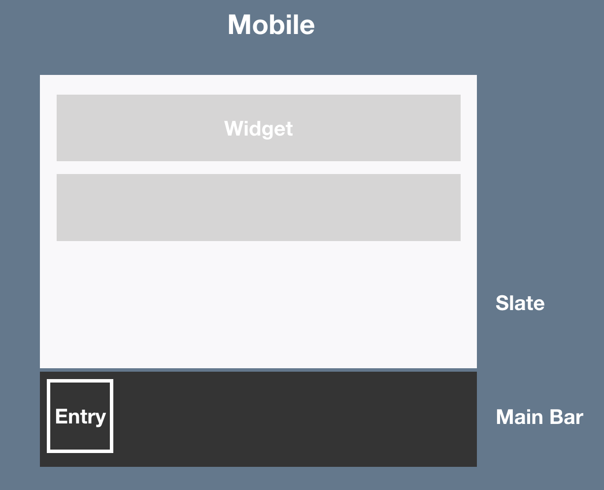
2.3.2 Main Bar
The main bar contains various "entries". An "entry" groups the items or widgets in it. We suggest a main bar on bottom of screen that indicates an overlay in full screen size ("drawer" like).
Behaviour
- If opened, it overlaps the main content of ILIAS and shows content of the chosen entry (e.g. accordion for menus or simple functionalities of a specific service). That overlay is called "slate" like in desktop version.
- To close the main bar, you can click on a close icon at the top of the slate or you can click on glyph in main bar again to close the overlay.
Good default, but customizable
- Sorting can be adopted as system administrator for own installation.
- Number of entries can be adapted by system administrator.
- Sorting decides if they are visible in small screen view: If there are more than 5 entries, 4 entries will be shown, the other ones will be pushed into a "More" entry.
The details of such a Customisable Main Menu must be defined separately: Customisable Main Menu
What happens with the current "main menu"?
Which elements are placed in which "item group" is determined in a separate discussion line: Default Configuration of Main Bar Items (ILIAS 6)
What happens with "Overview" page on current Personal Desktop is determined in a separate concept: Overview Personal Desktop Revision
2.3.3 Slate
- If opened, it overlaps the main content of ILIAS and shows content of the chosen entry (e.g. accordion for menus or simple functionalities of a specific service). That overlay is called "slate" like in desktop version.
- To close the overlay, you can click on a close icon at the top of the slate or you can click on glyph in main bar again to close the overlay.
Mockup see: Mobile - Slate
2.3.4 Tree
same like Desktop
Note that the tree behaviour will need to be discussed in detail as soon as the PR for the tree is made: Tree for General Layout and Menu Revision
2.3.5 Local Main Bar Entry "Tools"
same like Desktop
Mockup see: Mobile - Tools
2.3.6 Scrolling Behaviour
The meta bar is minimized during scrolling: This means that the breadcrumb is included in the meta bar. The glyphs available are combined in a common menu. In this menu you can see a notification-glyph as soon as a new notification needs the attention of the user.
By clicking on the collective menu, the entire meta bar is displayed in full size again.
The main bar remains. The content slides under the minimized header.
Mockup see: Mobile - Scrolling
2.3.7 Breadcrumb
The breadcrumb has a fixed place in the header area. Only the last node of the breadcrumb is displayed. A glyph indicates that the breadcrumb can be extended. This opens a full-screen overlay in which the last node to the first node (for example, repository) is displayed from top to bottom. The overlay can be closed by clicking on the breadcrumb again in the header (possibly additionally "x"-close-glyph as with other overlays). When clicking on a breadcrumb item the breadcrump is closed and the called content is shown.
Mockup see: Mobile - Breadcrumb
2.3.8 Kiosk and Presentation Mode
same like Desktop
2.3.9 Widescreen and Customization
No Widescreen.
Customization same like Desktop
2.3.10 Plugin-Slot
same like Desktop
3 User Interface Modifications
3.1 List of Affected Views
Since we propose a new overall layout, all those sections are tackled to some degree. However the main focus will be on the complete Header Section and on the Left Explorer.
-----------
Header Section
- Branding Section
- Logo
- Main Menu
- Title Section (Name of Application, e.g. ILIAS 5.2 Evaluation)
- Top Navigation (Mail, Search, Help, User Images etc.)
Content Section
- Breadcrumb
- Content Title Section
- Icon
- Title
- Description
- Comments, Notes, Tags, …
- Actions
- Tabs
- Subtabs
- Content
- Sidebar Left
- Center Content
- Sidebar Right
-----------
3.2 User Interface Details

Mockups: Page Layout Revision - Mobile
3.3 New User Interface Concepts
- Cockpit including Bar and Slate (Those names are part of the current discussion).
- Notification Center (Name is part of the current discussion).
4 Technical Information
{The maintainer has to provide necessary technical information, e.g. dependencies on other ILIAS components, necessary modifications in general services/architecture, potential security or performance issues.}
5 Contact
- Author of the Request: Seiler, Yvonne [yvseiler], Amstutz, Timon [amstutz]
- Maintainer: {Please add your name before applying for an initial workshop or a Jour Fixe meeting.}
- Implementation of the feature is done by: {The maintainer must add the name of the implementing developer.}
6 Funding
- Universität Bern (University of Bern)
- FH Aachen
7 Discussion
- We follow Yvonne's suggestion and would like to have the top bar shown when opening the screen but changing to the reduced version with the top bar items behind the "vertical more" icon and the breadcrumb.
- We follow Yvonne's suggestion concerning the behaviour when clicking on a breadcrumb item. The breadcrump is closed and the called content shown.
- We prefer version 1 to handle the "Safari problem". This requires to double-click a menu item on Safari/iOS due to the iOS navigation bar.
- Point 1: No further discussion needed, will be done as asked by JF.
- Point 2: No further discussion needed, will be done as asked by JF.
- Point 3: No further discussion needed, will be done as asked by JF.
Seiler, Yvonne [yvseiler], 10 FEB 2019: I have adjusted the FW entry according to the considerations of the JF from 10 SEP 2018 and set it on the JF agenda.
JourFixe, ILIAS [jourfixe], 11 FEB 2019 : We highly appreciate this suggestion and schedule the feature for 6.0.
8 Implementation
The implementation of this feature was a collaborative effort among all major ILIAS Service Provider. Almost all Services and Modules have been tackled. See main article for more information: Page Layout Revision (Desktop).
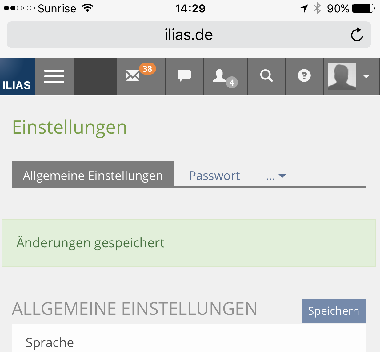
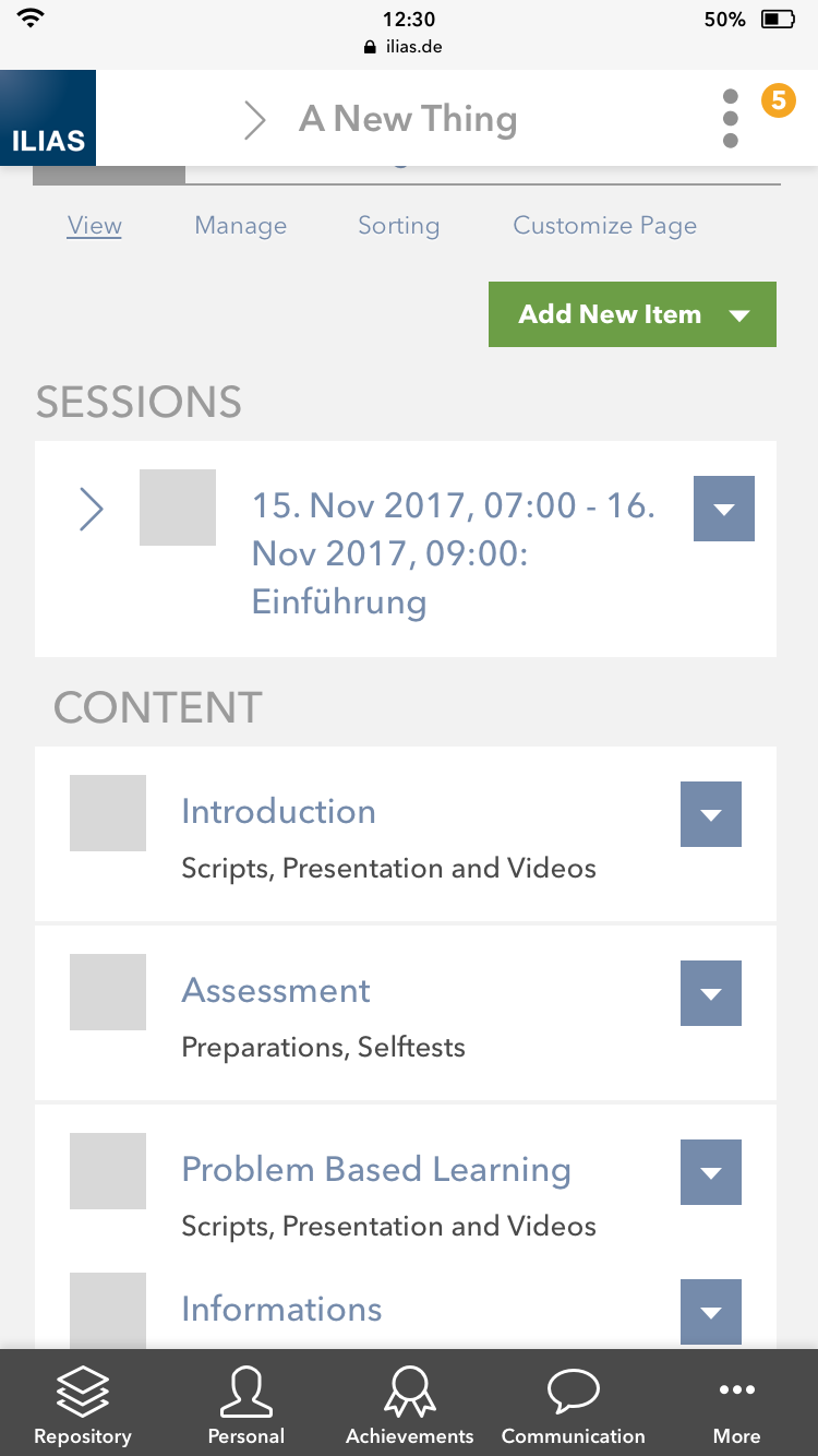
Screenshots of the Mobilie Version:

With Open Slate

Test Cases
Approval
Approved at 6.12.2019 by Amstutz, Timon [amstutz].
Last edited: 6. Dec 2019, 17:33, Amstutz, Timon [amstutz]