Feature Wiki
Tabs
Continuous Testing Mode Usability Improvement
Page Overview
[Hide]1 Initial Problem
There are three major problems with the usibility of the continues testing mode:
1.1 UI Issues with Single Row Tables
The continues testing mode does show a question statistic for the complete question pool that is connected as well as a statistic for the currently selected questions. To present these statistics data tables are used. Both tables come with a single row by definition. The table for the selected questions statistic provides its filters for selecting the questions.
In general the table is abused here as it does not show a list of entries but a single one. This is not acceptable.
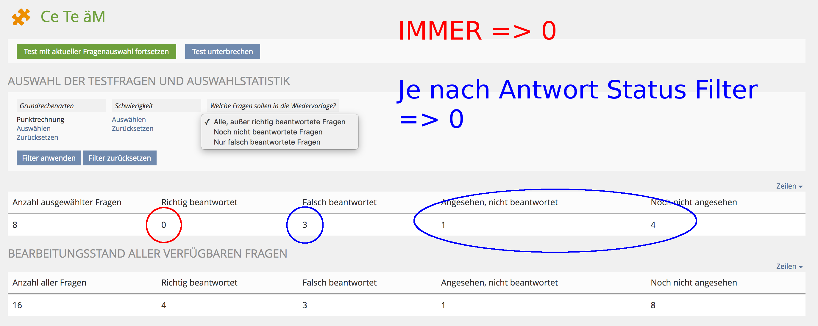
Furthermore this leads to a problem with the answer status filter.
1.2 Answer Status Filter
The continues testing mode is desired to support a long term learning process. Therefore it provides a possibility for participants to take a subset of the whole amount of questions from the connected question pool. A user can decide for a topic or difficulty for example by using the taxonomy filters in the question selection screen when he starts a test session. It is also possible to restrict the shown questions to that ones that have been not or wrong answered.
The problem with that feature is the also shown question statistic. It gives an overview for the own progress within the test by differentiating between correct answered questions, wrong answered questions and non answered or never seen questions.
When using the answer status filter this statistic is also considering this filter, so the desired overview is lost. The main problem is that the filter must be usable but it should not be considered in the question answer statistic.
1.3 Fluid Question List
The fluid question list is a similar question side list that is also provided in a test with a fix question set when enabled. Although the continues testing mode has a fluid question sequence, this list makes sense. While the participant is guided trough the question pool by an automatically determined question order using the next button, he also should have the possibility to navigate to certain questions he reminds to at any time during the test session to increase learning effects.
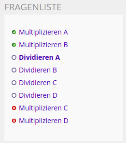
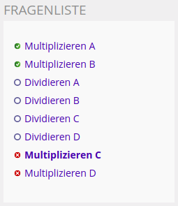
With the current concept and implementation the fluid question side list shows correct answered questions as well as wrong and non answered questions. While the user is able to recognize wich question he allready answered once, he is not able to recognize wether he answered them correctly or wrong. The fact that correctly answered questions are listed at top does not show this circumstance intuitively.
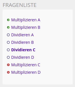
Furthermore navigating to a specific question does reorder the question list so the currently opened question is always the first question after the correctly answered ones.
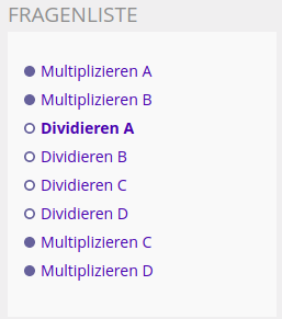 | 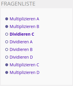 |  |
"Dividieren A" is the next relevant question in the automatic question sequence. It automatically shows up when the user enters the test with the current question selection or when using the next button from the screen showing any other question. | "Dividieren C" was requested by clicking in the question list. It has been moved to the first position after the correctly answered questions within the question side list. | Also "Multiplizieren C" was requested by using the question list. It is not possible to differ between the correctly answered questions and this once wrongly answered question. |
2 Conceptual Summary
2.1 UI Issues with Single Row Tables
The abuse of data tables stops by introducing a new UI component to show up the question answering statistics. It is desired to present information following the structure of label/value pairs.
In other words: This newly introduced UI component does rotate the single row table by 90°.
The actual question selection is separated from the answering statistic. It can either be provided as a separate screen coming with a simple form to make the choice on any taxonomy filter as well as the answer status filter, or it can be provided with a roundtrip modal, presenting the filter selection form in a multi step/page worflow (filter by filter).
2.2 Answer Status Filter
While the question statistic should NOT consider the answer status filter, this filter is of a high value for building the actual (and fluid) question list during the test run. The participant gets the opportunity to process only wrong or non answered questions.
With the separation of question selection and answering statistics the answer status filter does not need to influence the answering statistics any longer. Even the correct answered questions are counted up regardless of the set answer status filter.
2.3 Fluid Question List
The former concept of this request did intend to show different icons for correctly and wrongly answered questions as shown in the screenshots below (Former Concept).
This will show up the progress to the user in an understandable way.
During the conceptional work for this feature request a follow up idea came up (Final Concept):
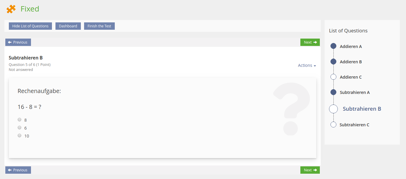
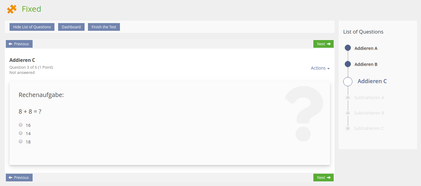
The new UI component Workflow should be used to present a question list. This component comes with the opportunity to present questions with different status as the workflow steps are able to show up a status icon. Furthermore this component does also fit for tests with a fixed or random set of questions. Even for a test configured as a keyfeature test (presenting followup questions does freeze the answer to questions left behind) as shown in the screenshots below (Final Concept).
2.4 Additionally Addressed Issues
During the feature workshops that took place regarding this feature request some additional issues came up that needs to be addressed to enhance the CTMs usibility.
2.4.1 Key Figures for the Answering Statistics
- All Questions in Pool / Questions Selected
- Questions Answered Fully Correct
- Questions Answered Partly Correct (OPTIONAL)
- Questions Answered Wrongly
- Questions not Answered, yet
2.4.2 Instant Access to Test Results
- Therefor an additional toolbar button is provided within the test player as well as on the screen for the answering statistics and the question selection. When openeing the underworld for test results is shown and the back link points back on the test run.
- Also the test result presentation needs to be enhanced. The taxonomy filters provided for the test selection needs also to be provided as table filter for the test result screen.
2.4.3 Dashboard vs. Answering Statistics
- Therefor the availability of the dashboard needs to be decoupled from the test setting for enabling/disabling the question list
- An additional setting is to be introduced for enabling/disabling the dashboard feature
- The additional setting is integrated as a subsetting of the question list setting
2.4.4 Default Question Ordering Criteria for CTMs
- The option to let the CTM order questions by its update date needs to be replaced
- Instead an option to let the CTM order question alphabetically by its title is required
3 User Interface Modifications
3.1 List of Affected Views
- Test (CTM) > Start Test > Question Selection Screen
- Test (CTM) > Start Test > Question Selection Screen > Test Player
3.2 User Interface Details
3.2.1 Question Selection and Answering Statistics
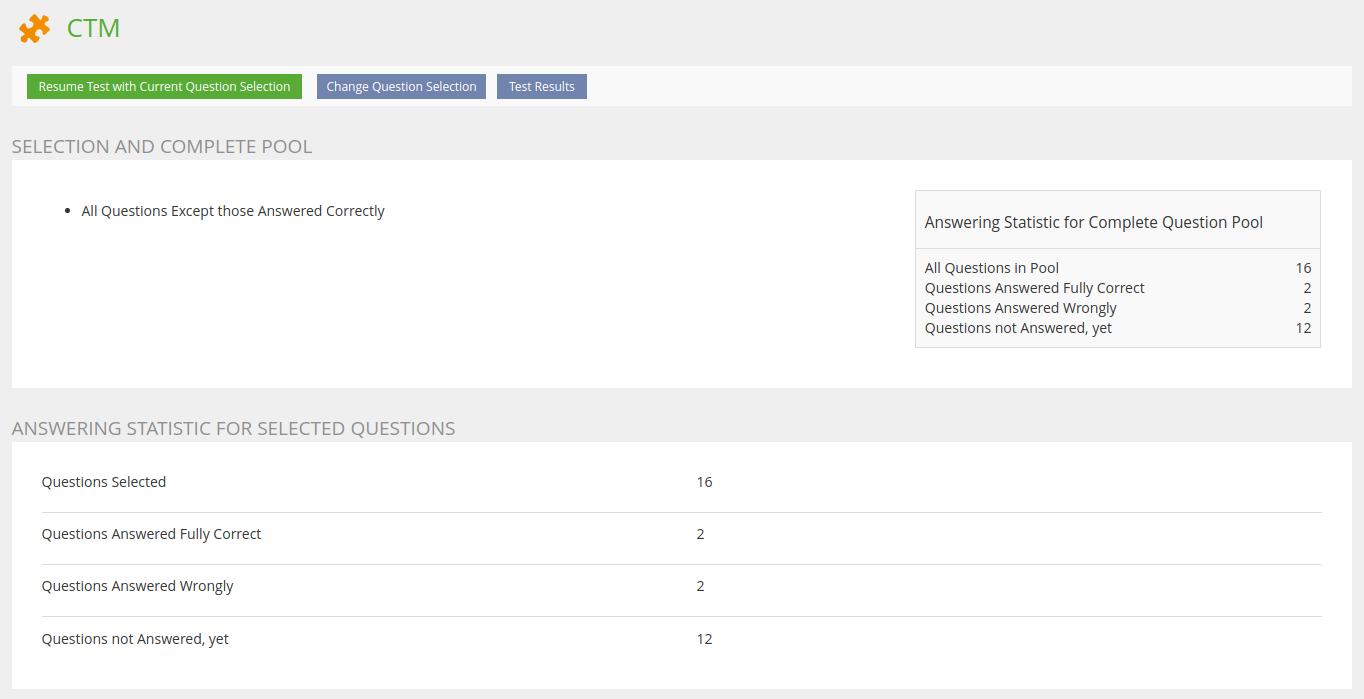
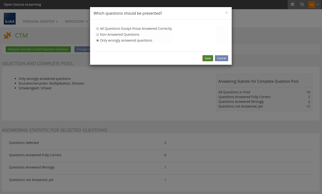
The answering statistic is the first screen when starting or resuming a test configured as CTM.
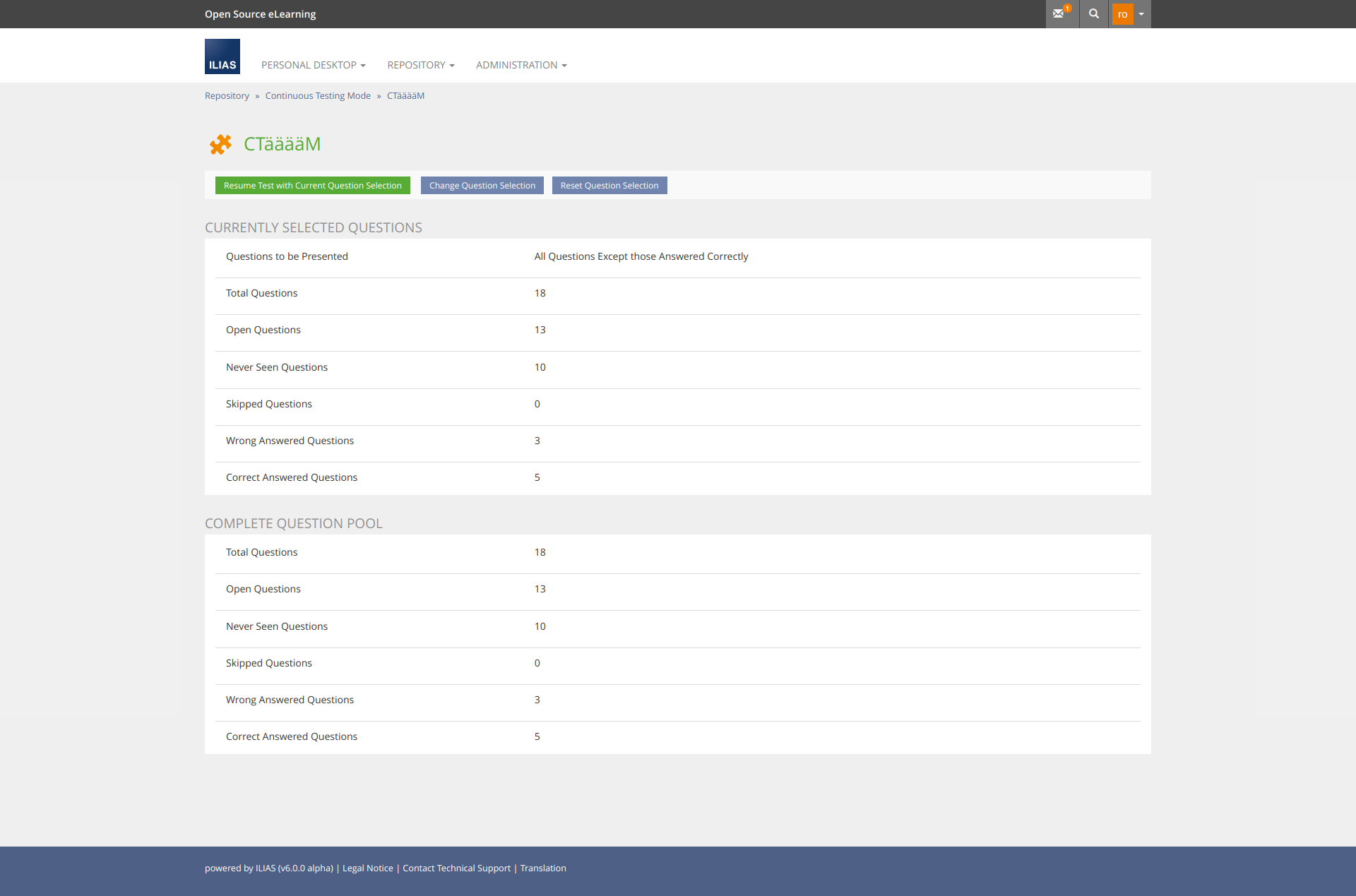
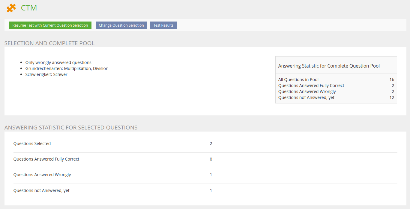
When any filter for the question selection got set the statistic looks like:
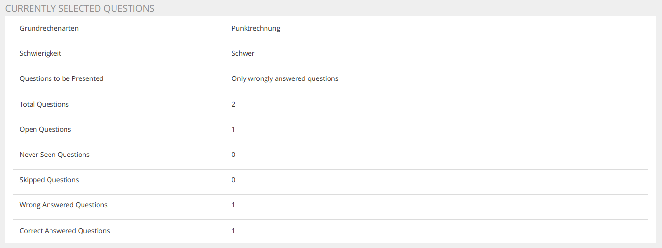
The question Selection Screen can be reached by the samely named Toolbar Button.
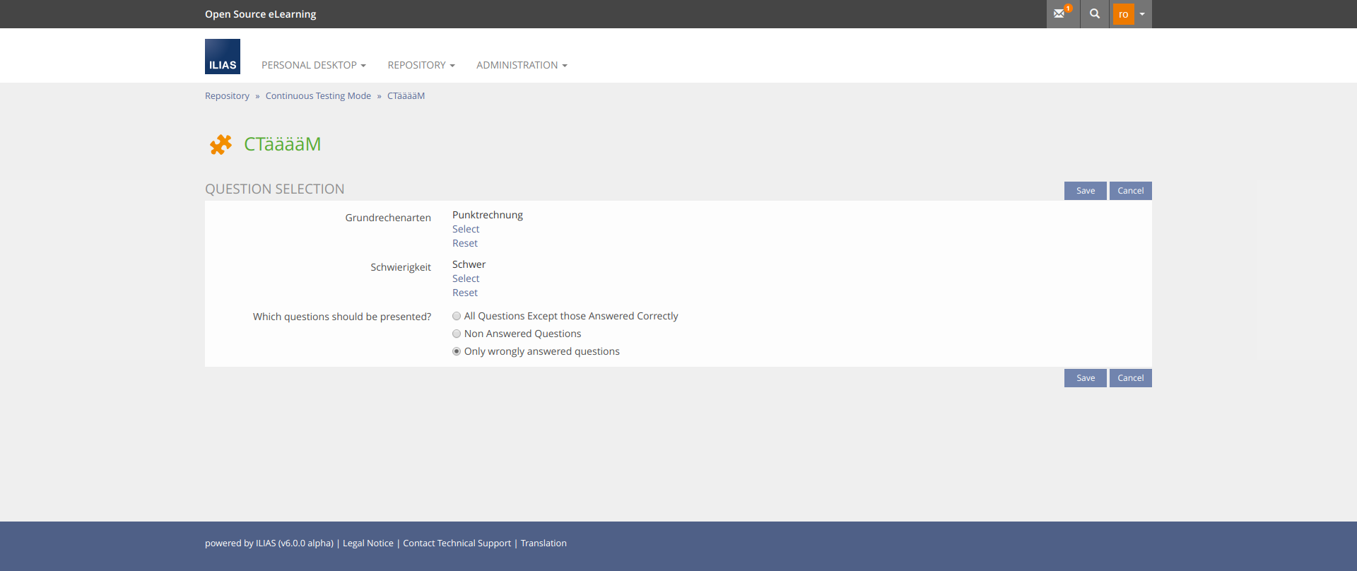
Final Concept
The following screen shows the answering statistics without any filter selection, so statistical information for the question selection and the complete pool are the very same.
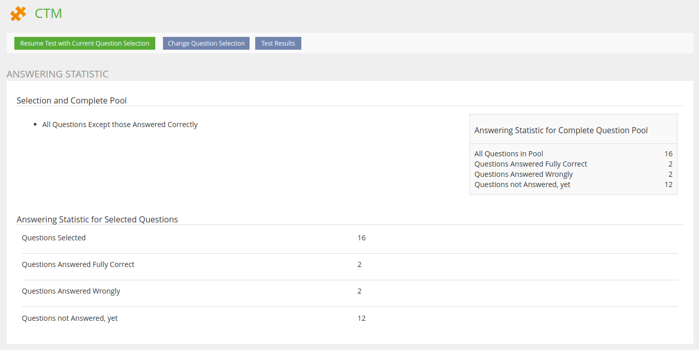
The following screen shows the answering statistics with all filters selected.
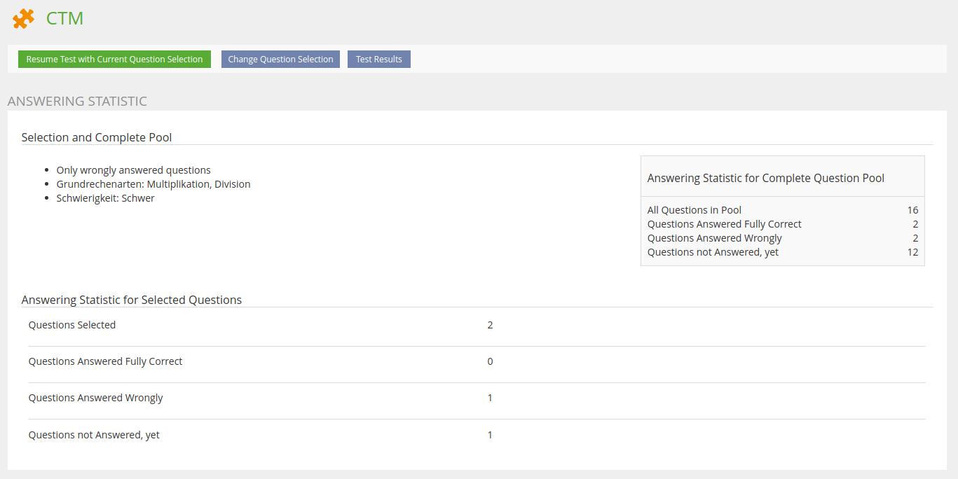
The following screen shows the answering statistics without any filter selection, so statistical information for the question selection and the complete pool are the very same.
The following screen shows the answering statistics with all filters selected.
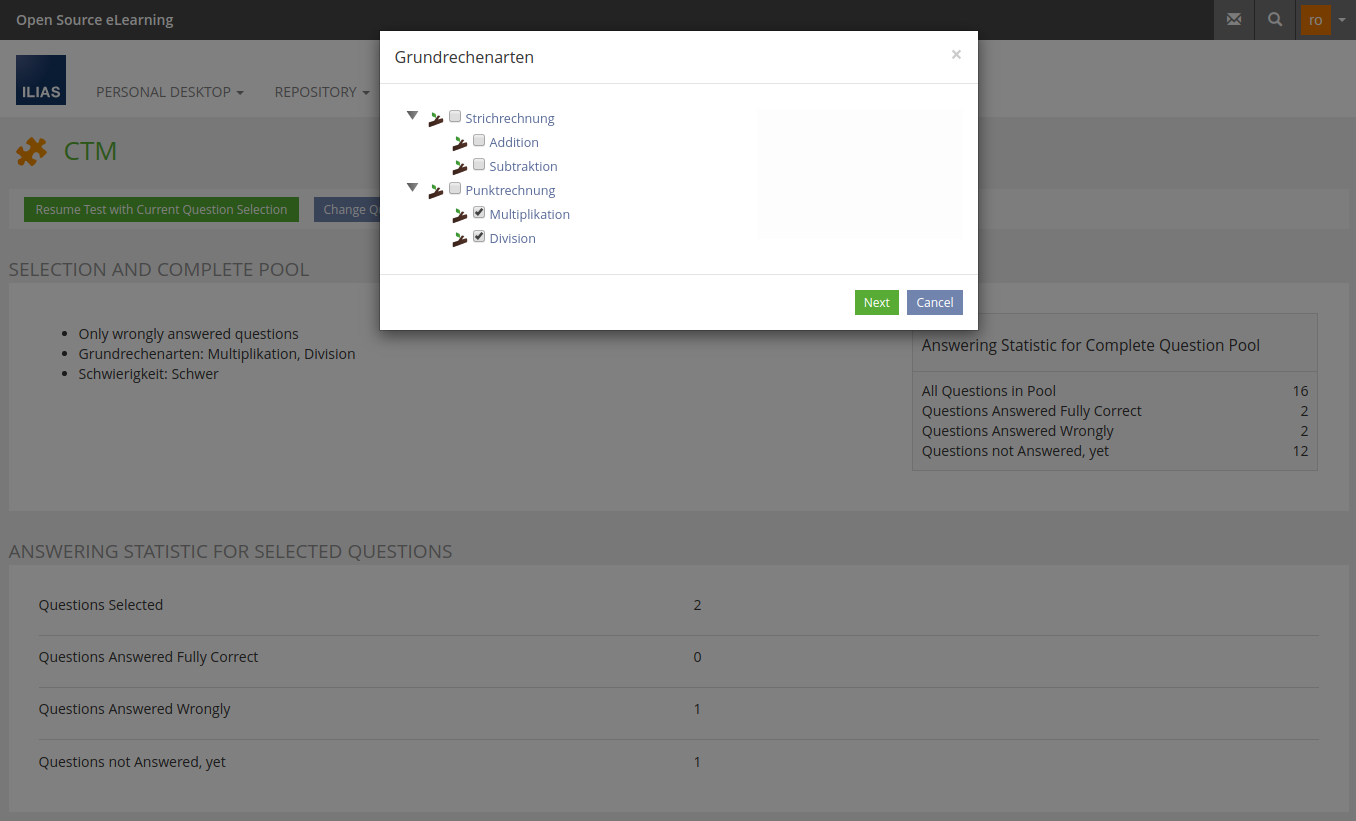
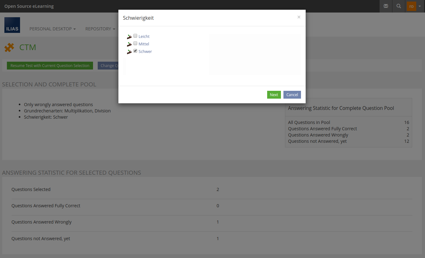
- The roundtrip modal does split up the process of question selection by presenting only one filter criteria per modal page
- For each available taxonomy the participant is asked for a selection in a screen very simple to understand
- The "Next" Button brings the participant to the next modal page
- The very last modal page does ask for the answering status to be filtered
- Confirming the selection with "Save" Button the participant gets roundtriped to the same page with the new question selection shown
3.2.2 Fluid Question List
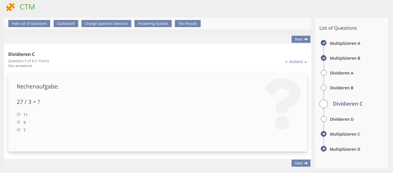
Questions keep their position in the question list. The automatically ordered question sequence is shown up in the question list all the time. Furthermore the once answered questions are visually differentiated regarding the fact wether a question was correctly or wrongly answered.
 |  |  |
Final Concept
Correctly answered, wrongly answered and not yet answered questions are recognizable for participants. The currently opened question is recognizable as well.
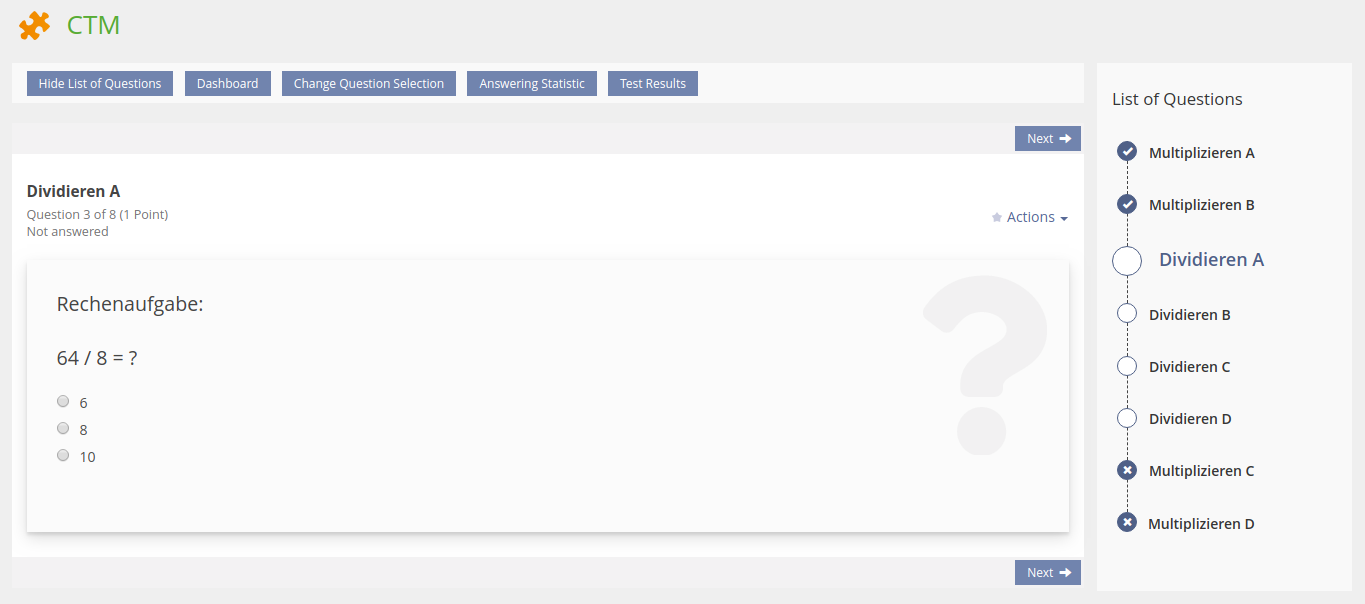
When opening any question using the question side list, this question now keeps its position within the question list, instead of moving to the very first position behind the correctly answered questions as it is known from the current CTM implementation.

The use of the workflow UI component as question list does also fit for tests with a fixed or random set of questions. The example shows three answered questions, one question was skipped. The currently opened question and the very last are not answered yet as well.
Even for tests configured as "KeyFeature" test the use of the workflow UI component makes sense as the feature of non accessible steps in the workflow does perfectly fit questions that cannot be reached prior to answering the questions before.
3.3 New User Interface Concepts
New UI component Data Panel. PR 1397
4 Technical Information
No technical issues at all.
5 Contact
- Author of the Request: Heyser, Björn [bheyser]
- Maintainer: Heyser, Björn [bheyser]
- Implementation of the feature is done by: Heyser, Björn [bheyser]
6 Funding
7 Discussion
JourFixe, ILIAS [jourfixe], 26 FEB 2018: We see the need to improve the screen for selecting and filtering questions for the CTM. But the current suggestion is not bringing us forward. We highly recommend to initiate a workshop and to work out a sound solution for this workflow. It would increase the value of this feature.
Reuschenbach, Volker [vreuschen], 10.08.2018:
1) Was die Fragensequenz angeht, sollte es in jedem Fall nicht nach dem Kriterium des Update-Datums einer Frage sortiert werden, sondern nach der Reihenfolge, die im Fragenpool vorgegeben ist. Ein Fragenpool hat aus inhaltlichen Gründen eine bestimmte didaktische Reihenfolge, z.B. beginnt man mir den leichteren Fragen und/oder mit bestimmten Unterthemen eines Hauptthemas. Das Updatedatum für die Fragensequenz eine Relevanz zukommen zu lassen, wurde in der CTM-Grundentwicklung auch NIEMALS beauftragt.
2) Wie werden Fragen behandelt, bei denen der Teilnehmer nur 3 von 4 möglichen Punkten erzielt hat, z.B. weil eine MC-Auswahl falsch angehakt wurde/falsch nicht angehakt wurde? Aus meiner Sicht muss der Fragenfilter im Testplayer diese über die Einstellung "nur falsch beantwortete Fragen" erfassen. Dann müsste der Label aber geändert werden "nicht ganz richtig beantwortete Fragen".
3a) In der jetzigen Filterlösung ist es nicht möglich, alle thematisch über eine Taxonomie ausgefilterten Fragen - nämlich schon beantwortete oder nicht beantwortete oder nicht angesehene - allesamt unabhängig vom Beantwortungsstatus zu durchlaufen. Überlegenswert wäre ein Filter "alle ausgewählte Fragen", der damit z.B. auch ganz richtig beantwortete Fragen in der Sequenz anbietet. In der jetzigen Filterlösung muss man den Filter "alle, außer richtig beantwortete Fragen" auswählen. Denn dann kann man die richtigen Fragen (grün gekennzeichnet) zumindest in der Fragenliste anklicken und sich ansehen.
3b) Im Falle einer Entwicklung gemäß 3a "alle Fragen durchlaufen" muss sich die Fragenreihenfolge nach der manuell bestimmten Reihenfolge im Taxonomiebaum (Reiter "zugewiesene Einträge") bestimmen. Liegt eine solche Festlegung nicht vor, wird die Reihenfolge aus der Abfolge im maßgeblichen Fragenpool übernommen.
4) Ich vermisse im Bereich des Testplayers eine Schaltfläche "Zurück".
5) Wenn ich im Bereich des Players "alle, außer richtig beantwortete Fragen" einstelle, erwarte ich in der linken Fragenliste keine richtig beantwortete Frage.
6) Die Auswahlstatistik erfasst die Daten "angesehen, nicht beantwortet" und "noch nicht angesehen". Wofür benötige ich diese Differenzierung? Stattdessen könnte man einen Filter "nicht beantwortete Fragen" implementieren. Der Umstand, dass ich eine Frage angesehen habe, hat keinen Aussagewert für einen Lernerfolgsbemessung innerhalb der von mir ausgewählten Fragen.
Kunkel, Matthias [mkunkel], 26 APR 2019: How about using Listing: Linear Workflow for the fluid question list (see 3.2.3)? It is already in the KS and easier to understand than the current suggestion above.
JourFixe, ILIAS [jourfixe], 01 JUL 2019 : We highly appreciate this suggestion and schedule the feature for 6.0. We prefer option B for presenting the selection rules and statistics. Matthias will help Björn to improve the labels for the selection rules. Workflow UI for fluid question list should be placed in the slate instead of right side of content screen (needs final decision for several components like LoC and others). Order of modals should be the same as ordering of selection rules.
Kunkel, Matthias [mkunkel] @ SIG EA, 13 NOV 2019 : The separation of the Test&Assessment has been postponed to ILIAS 7 because the project cannot be finished satisfactorily until 'Coding Completed' at NOV 29. Therefore, this feature won't make it into ILIAS 6 but is now suggested for ILIAS 7. Please add it to the JF agenda to schedule it again.
Kunkel, Matthias [mkunkel], 07 OCT 2021 : The Jour Fixe decided to abandon the Continuous Testing Mode with ILIAS 8 (see Abandon CTM). Therefore, this feature won't make it into the trunk. I set it to "outdated".
8 Implementation
{The maintainer has to give a description of the final implementation and add screenshots if possible.}
Test Cases
- {Test case number linked to Testrail} : {test case title}
Approval
Approved at {date} by {user}.
Last edited: 7. Oct 2021, 12:13, Kunkel, Matthias [mkunkel]