Feature Wiki
Tabs
Reporting Panel for Text Assignments
Page Overview
[Hide]1 Initial Problem
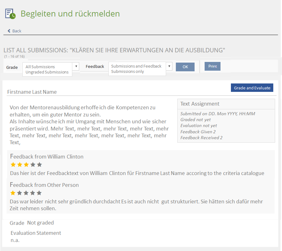
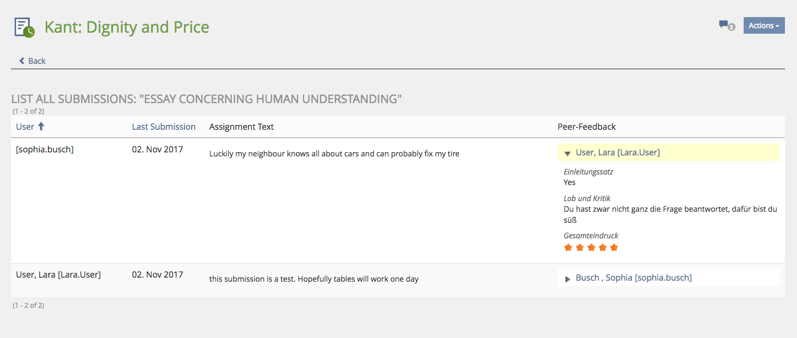
Text-submissions are currently shown in a table. This is hard to read, cannot accomodate the Peer-Feedback properly.
2 Conceptual Summary
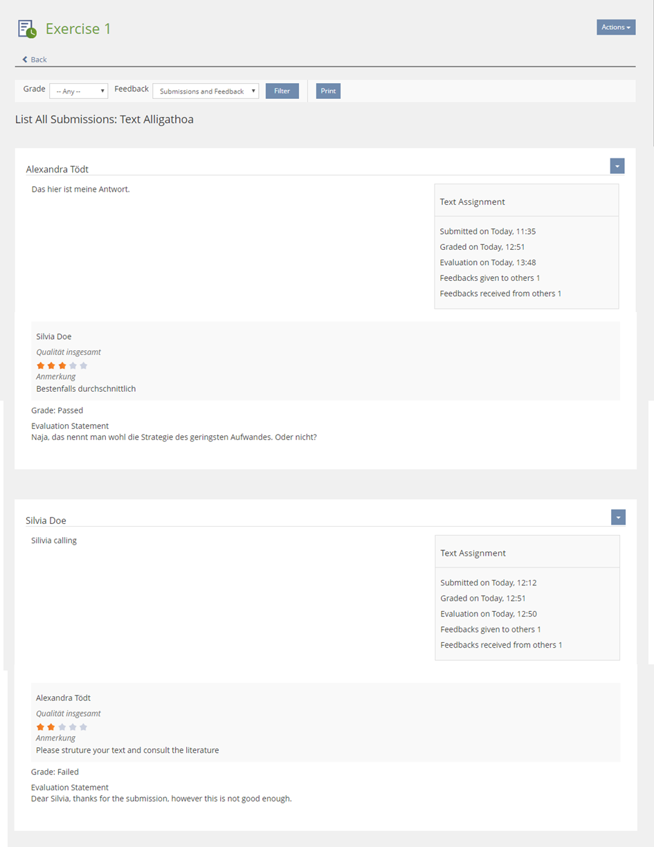
A Report Panel replaces the table by a list of all submissions of all participants:
Report title: List all submissions "Title of Assignment"
Sub Panel Title = Name of Participant
|
3 User Interface Modifications
3.1 List of Affected Views
- Underworld "List All Submissions" in Exercises
3.2 User Interface Details
3.3 New User Interface Concepts
Amend the Report Panel
4 Technical Information
{The maintainer has to provide necessary technical information, e.g. dependencies on other ILIAS components, necessary modifications in general services/architecture, potential security or performance issues.}
5 Contact
- Author of the Request: Tödt, Alexandra [atoedt]
- Maintainer: Killing, Alexander [alex]
- Implementation of the feature is done by: {The maintainer must add the name of the implementing developer.}
6 Funding
- …
7 Discussion
Comments on a former version of the article. They were remedied in new version.
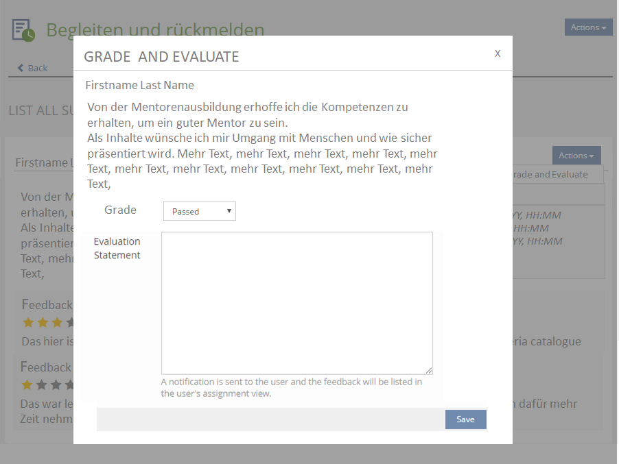
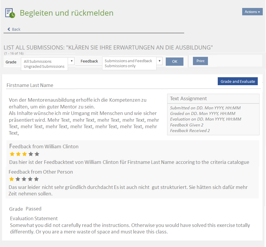
Kunkel, Matthias [mkunkel], 28 NOV 2017: Why is a second 'Actions' button suggested in option 2 to trigger the modal? Why not opening the modal when clicking on a button 'Grade and Evaluate' in the tool bar? The double 'Actions' buttons will lead to confusion. And who will understand the difference between both?
Killing, Alexander [alex], 5 Dec 2017: I think the point is that multiple panels can be listed for a number of users on the screen. Thus we need actions for each panel/participant being listed. A basic question is, if we want form elements in panels this way. Currently they do not explixitly support this. If yes, how should form buttons be managed. Always in the toolbar? That would imply that they would act on all entries and users need to scroll for longer lists (and may even overlook their existence). The modal dialog currently seems to be more straighforward to me.
Seiler, Yvonne [yvseiler], 18 Dec 2017: I have some concerns about the content in the modal: The important controls (grading and feedback text input) should be prominent and the first thing a user could do if he clicks on button "Grade and Evaluate". In the mockup shown above long text would push the controls down "below the fold" and user would have to scroll.
I would suggest: Modal only with grade dropdown and evaluation statement text input.
Later a inline editing on list submission page would be great instead of modal.
- The assignment text should only be shown in a shortened version (e.g. 300 characters), followed by a 'Show more' shy button. This allows to copy and paste phrases from the assignment text on the one hand and to have a readable modal without scrolling on the other.
- Please consider writing a pull request for the 'Show more' behaviour for the Kitchen Sink.
8 Implementation
Test Cases
Approval
Approved at 2018-09-04 by Ralf Steffen, Uni Hannover
Last edited: 4. Sep 2018, 09:26, Tödt, Alexandra [atoedt]
