Feature Wiki
Tabs
Improved presentation of learning objective status
Page Overview
[Hide]1 Initial Problem
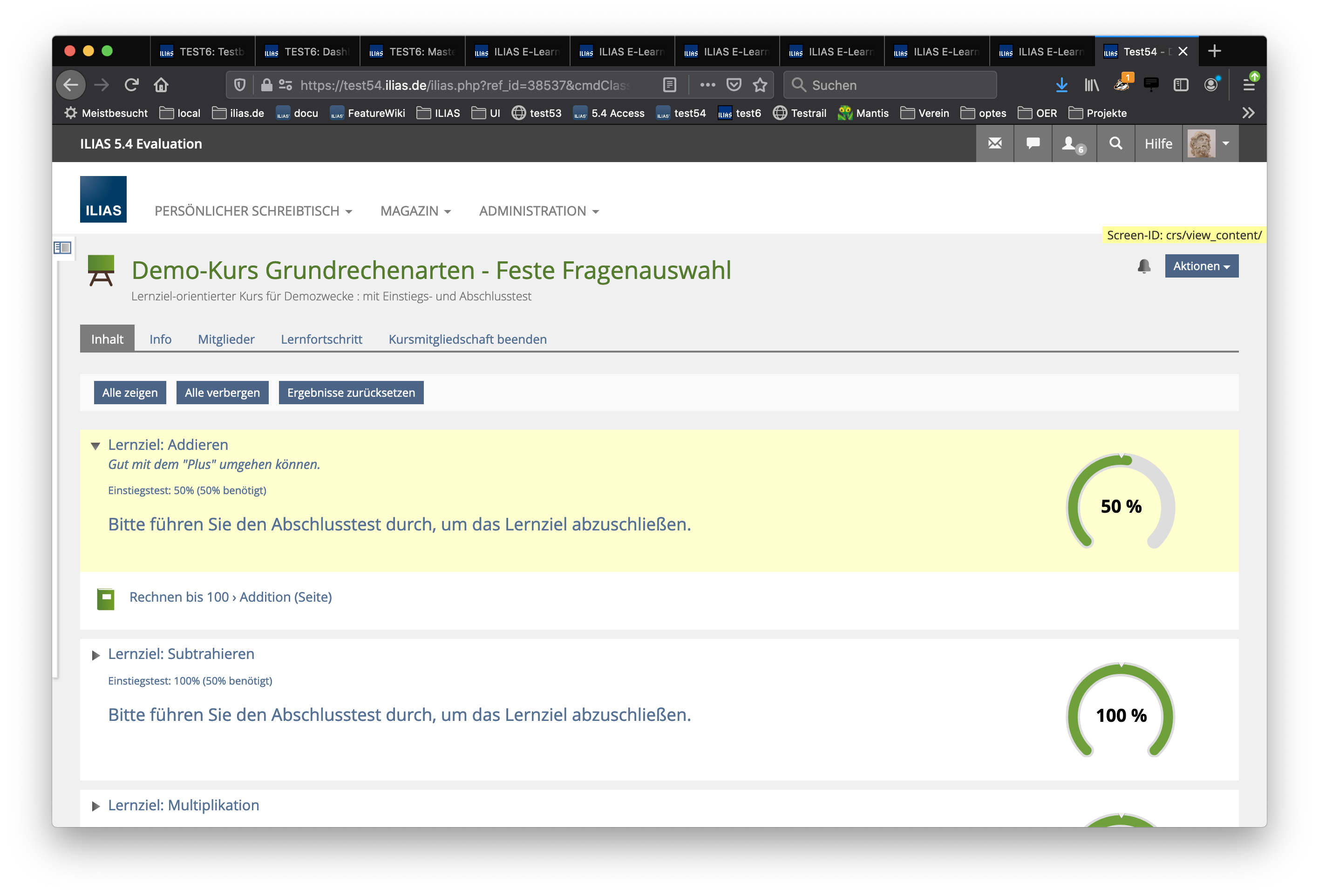
- The personal learning objective status is presented as a horizontal bar. The colour of the bar indicates if the LO has already been reached or not. The percentage of the status is shown in white on the bar. Because this number needs a darker background, the bar needs always to show at least a minimum of width to offer a background where the number can be placed, see screenshot below. It would be better if the width of the bar is always related to the percentage.
- The current implementation can only show one status - either the one from the initial diagnostic test or the one from the final qualifying test. It would be better to read if both status could be visualised in one UI element.
- The minimum percentage to reach the learning objective is currently presented as a dotted vertical line. This is not easy to understand for a lot of learners, especially when the minimum is 100% like in the screenshot below.
- The current position of the "Recommendation to the learner" is at the right side under the LO bar. As this is probably the most important information of this screen, a more prominent position is needed. Additionally, the recommendation should be clearly connected to the following recommended learning material. At the time being, it seems to be just a kind of byline of the LO bar.
2 Conceptual Summary
The usability group of the optes project (in which the course with learning-objectives is often used) suggests to make the following changes in the presentation of a learning objective and the user's status:
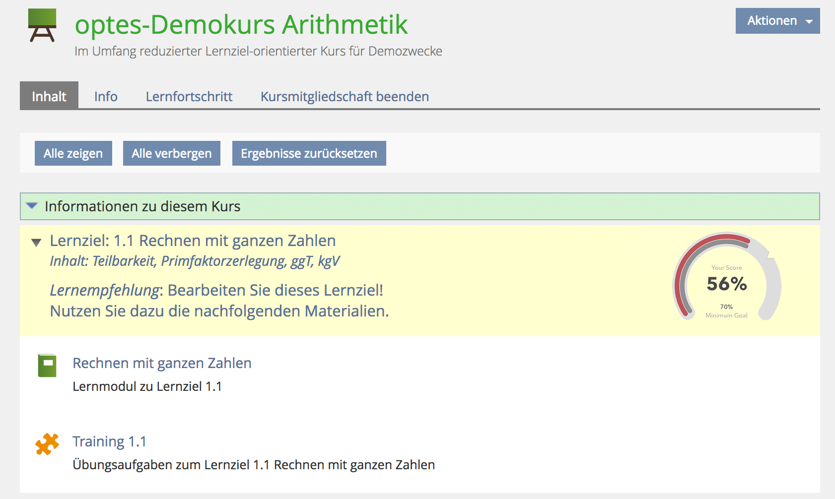
- The user's performance in the initial and in the final test can be shown one upon the other in one element.
- The percentage to reach is an obvious notch on the speedo.
- The percentage of the last assessment is presented as an emphasized number without any background problems.
- Performance in the initial test is always shown in yellow (known as colour for 'in progress' from the learning progress). The speedo does not distinguish between 'reached minimum percentage for LO' or not. This is because the initial diagnostic test gives only a first estimation but not a final statement. Therefore, the colour green should not be used for initial tests.
- User performance is presented in green when the minimum percentage to fulfill the learning objective has been reached. This can be attested only in qualifying tests (either as start or as final test - depending on the course settings).
- User performance is presented in red when it goes below the minimum percentage to fulfill the learning objective. This can be attested only in qualifying tests (either as start or as final test - depending on the course settings).
- Title of learning objective
- Description of learning objective
- Learning recommendation
3 User Interface Modifications
3.1 List of Affected Views
- Course » Content
3.2 User Interface Details
- All textual information is place left-assigned with following vertical odering:
- Title of learning objective
- Description of learning objective
- Learning recommendation
- Separated by additional padding
- Gets a key "Learning recommendation" and an extended value that points to the following learning material for learning and practicing.
- The speedo is placed on the right side as only UI element.
3.3 New User Interface Concepts
A new UI element "Speedo" will be introduced to the Kitchen Sink and can be re-used for this purpose as well as for other presentations of user performance.
- The speedo can have one or two 'speed indicators' as well as a 'speed limit' to identify the minimum percentage to reach the learning objective.
- The percentage of the last assessment is presented in big numbers.
- Optionally, a textual presentation of the percentage for the 'Minimum Goal' can be shown.
- Left: Speedo shows status after diagnostic test. Performance is shown in yellow.
- Middle: Speedo shows status after qualifying test in red because minimum goal has not been reached. Result of diagnostic test is shown in grey for comparing purposes.
- Right: Speedo shows status after qualifying test in green as minimum goal has been overreached.
4 Technical Information
No special technical information.
5 Contact
- Author of the Request: Kunkel, Matthias [mkunkel]
- Maintainer: Meyer, Stefan [smeyer]
- Implementation of the feature is done by: {The maintainer must add the name of the implementing developer.}
6 Funding
7 Discussion
We consider this a strong improvement to the previously used bars. Students can see what they achieved in relation to their previous results / learning objectives. We would like to use this feature for the optes / DHBW course pre-course designs. (K. Derr)
PS: For reasons of recognition / branding we would also suggest to adapt the color / style of bars in the learning objectives overview.
Killing, Alexander [alex], 3 Nov 2017: I think this is a very attractive presentation of a percentage + learning progress status indicator. But if we have two separate tests, they should not share the same UI element in my opinion. I would suggest to place these elements directly beside the object that leads to the result. Otherwise it is quite difficult to understand its meaning.
AT: Could you please suggest KS rules in a section of The article?
I like the new presentation and support this request.
But I also have a slight preference for seperated speedos. Furthermore there is one configuration which cannot be represented with the suggested implementation:
- Course with Qualifying Initial AND Final Test
Samoila, Oliver [oliver.samoila], 06 Nov. 2017:
I support this request. This is a very good presentation, which allows easy capture and can not lead to misunderstandings regarding the minimum requirements.
Great thing.
In the portfolio, we reuse the presentation of achived learning objective status. However, in the page element "My courses" the speedos should not be used as they would take too much space there. A bar graph based on the new speedos would be very desirable. This applies to color choice and also the rounded bars on a gray background.
JourFixe, ILIAS [jourfixe], NOV 06, 2017: We highly appreciate this suggestion and schedule it for 5.4. Nevertheless, we would like to keep the decision open if we show the result of diagnostic and qualifiying tests in one speedo. Or if we offer two for better readability. We check this once the UI element 'Speedo' is available for screen tests. Re-arrangement of information is fine for us.
8 Implementation

Test Cases
- 2287 : Einstiegstest durchführen
- 2292 : Abschlusstest beginnen, unterbrechen und wiederaufnehmen
- 2425 : Einen der Einstiegstest beginnen, unterbrechen und den gleichen Test wiederaufnehmen
- 2429 : Qualifizierenden Test über alle Lernziele beginnen, unterbrechen und wiederaufnehmen
- 7169 : Qualifizierenden Test für alle Lernziele durchführen
- 7194 : Einstiegstest beginnen, unterbrechen und den gleichen Test wiederaufnehmen
- 7209 : Abschlusstest für alle Lernziele durchführen
- 12863 : Szenario D Einstiegstest durcharbeiten
- 13744 : Szenario D Abschlusstest durcharbeiten
Approval
Approved at 29.10.2018 by .
Last edited: 30. Apr 2020, 18:13, Kunkel, Matthias [mkunkel]


