Feature Wiki
Tabs
Launcher for Survey
Page Overview
[Hide]- 1 Initial Problem
- 2 Conceptual Summary
- 3 User Interface Modifications
- 3.1 List of Affected Views
- 3.2 User Interface Details
- 3.2.1 Simple Standard Survey
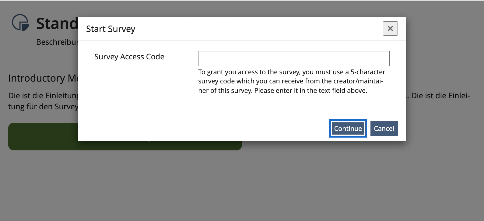
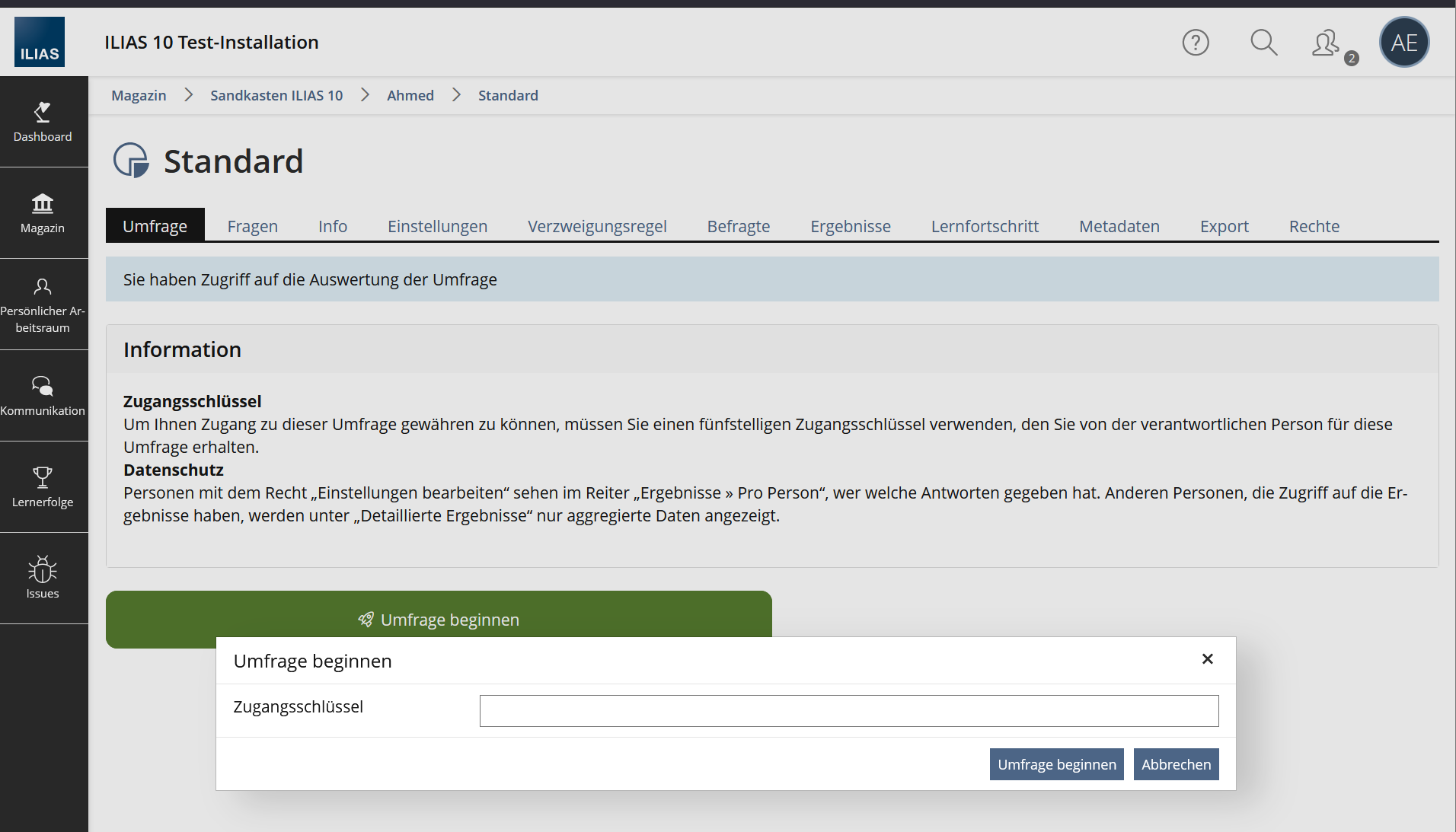
- 3.2.2 Survey with Access Codes
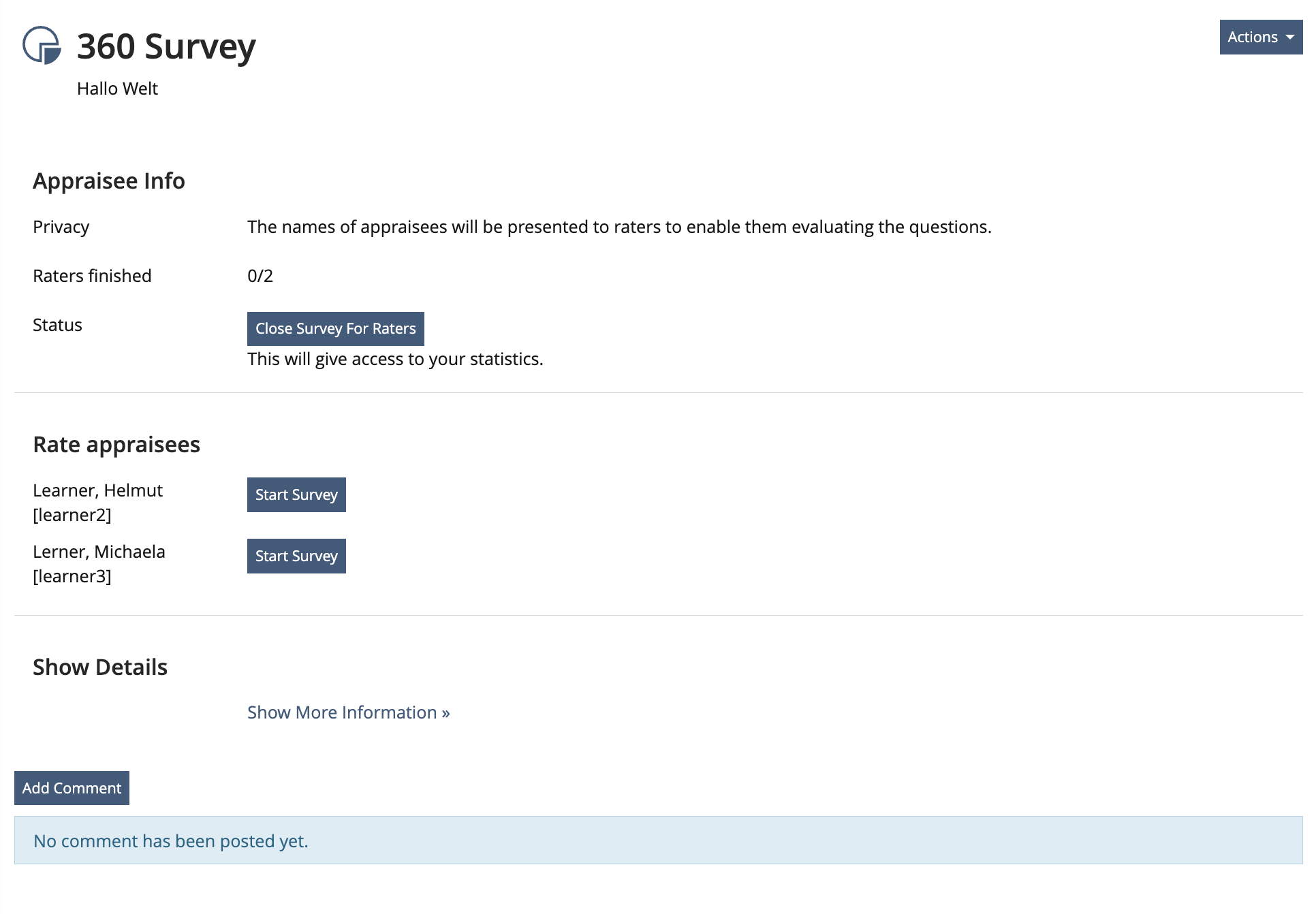
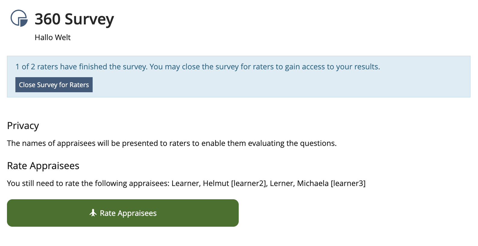
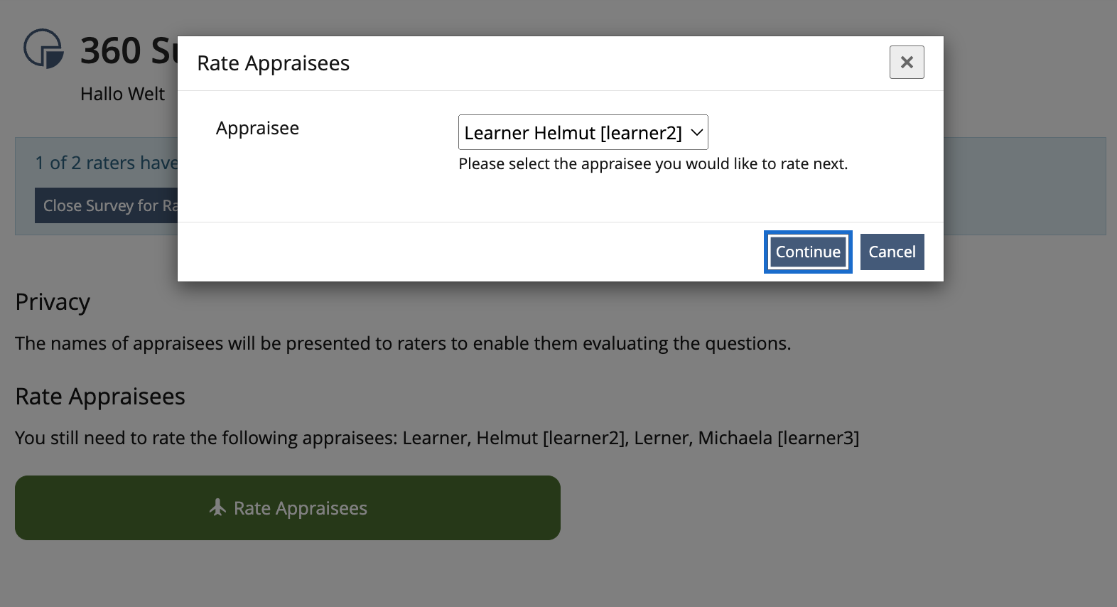
- 3.2.3 360° Survey
- 3.3 New User Interface Concepts
- 3.4 Accessibility Implications
- 4 Technical Information
- 5 Privacy Information
- 6 Security Implications
- 7 Contact
- 8 Funding
- 9 Discussion
- 10 Implementation
1 Initial Problem
- For Surveys the Info-tab serves vital funcitionality as a launching pad. Users have difficulties to unterstand that such vital functionality is to be used under the non-descript label "Info".
- An Accessibility Audit in March 2021 has reported that the location of the "Start Survey" button fails Success Criterion 2.4.3 Focus Order (Level A) / Prüfschritt 2.4.3a Schlüssige Reihenfolge bei der Tastaturbedienung: User will start the survey without reading the introductory text and thus miss out.
2 Conceptual Summary
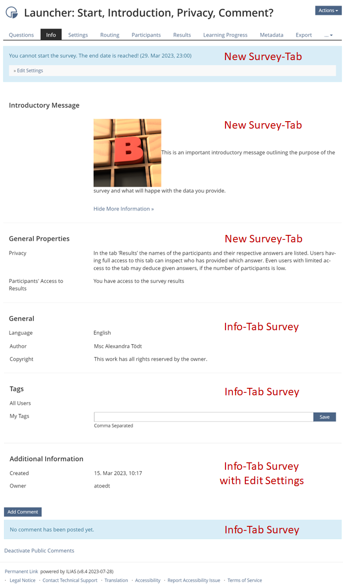
«Info»-tab
The «Info»-tab presents
- Description
- Metadata
- Tags
- Addional Information is only presented with «Edit Settings» permission
- Comments
«Survey»-tab
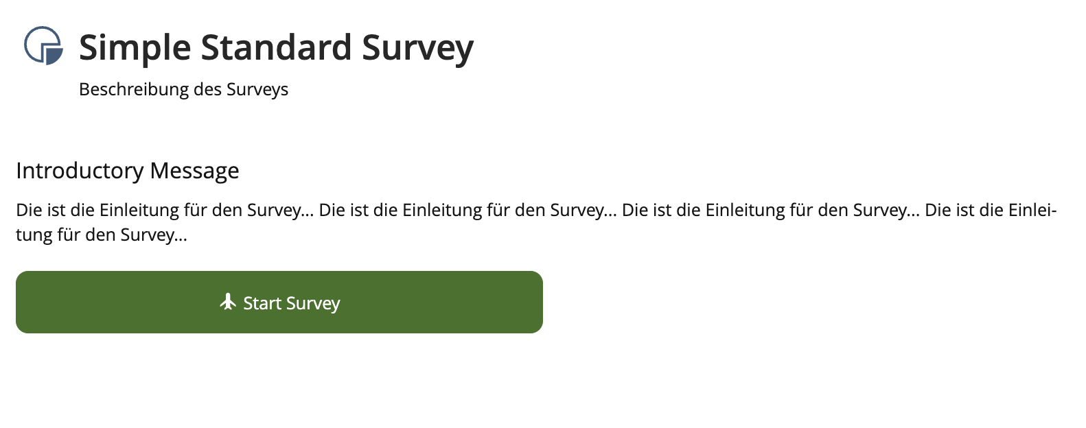
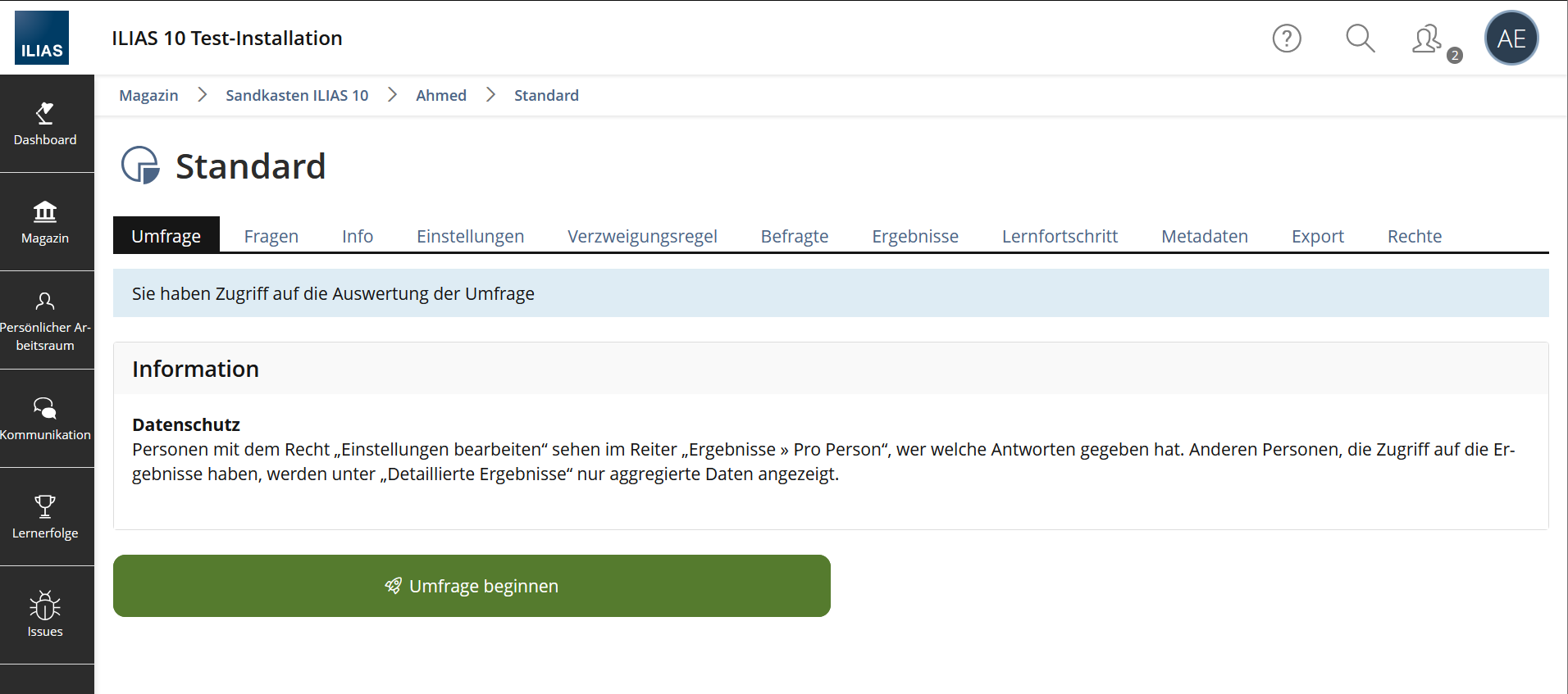
- There is a new «Survey»-tab, it is the left-most tab, left of the «Questions»-tab presented to those who can edit. If a user with "read" permission clicks on the title of a survey. ILIAS presents the «Survey»-tab displaying Introductory Message (if applicable), a primary "Start Survey" button underneath the form. Clicking on "Start Survey" will start the test.
- The «Survey»-tab gets its own Permanent Link in the footer.
- The «Survey»-tab uses the launcher to show the necessary information and process the necessary inputs.
3 User Interface Modifications
3.1 List of Affected Views
- Survey > Info
- Survey > Survey (new)
3.2 User Interface Details
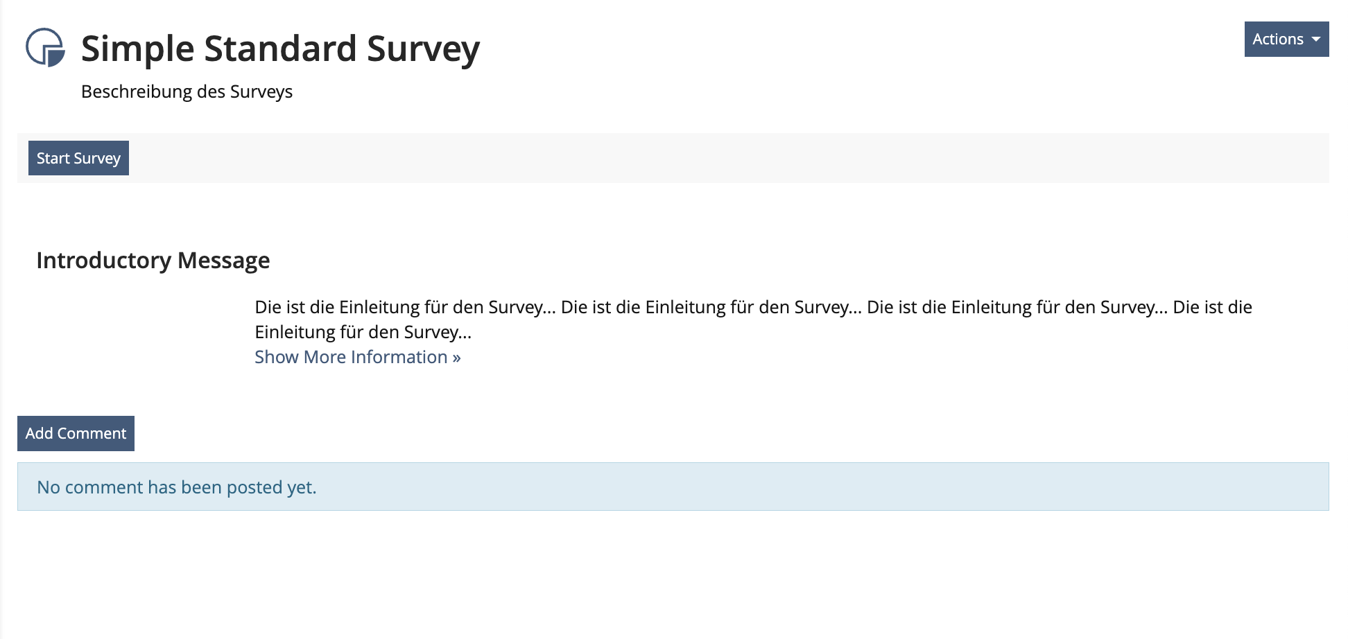
3.2.1 Simple Standard Survey
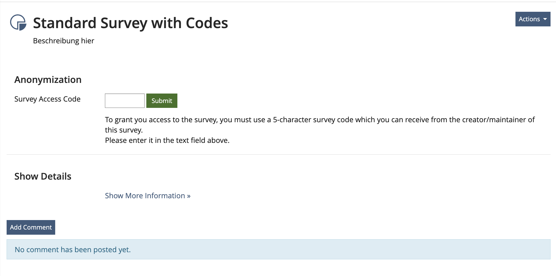
3.2.2 Survey with Access Codes
3.2.3 360° Survey
3.3 New User Interface Concepts
- The existing Launcher is used.
3.4 Accessibility Implications
- An Accessibility Audit in March 2021 has reported that the location of the "Start Survey" button fails Success Criterion 2.4.3 Focus Order (Level A) / Prüfschritt 2.4.3a Schlüssige Reihenfolge bei der Tastaturbedienung: User will start the survey without reading the introductory text and thus miss out.
- Users opening the survey must take in the information / put in information before actually opening the survey. This is why the buttons cannot be place before said infos. That is why a new type of form will be suggested by the project manager.
4 Technical Information
No technical issues.
5 Privacy Information
No new data is stored or gathered. Privacy-wise the feature does not change
6 Security Implications
No known security implications.
7 Contact
- Author of the Request: Tödt, Alexandra [atoedt]
- Maintainer: Killing, Alexander [alex]
- Implementation of the feature is done by: {The maintainer must add the name of the implementing developer.}
8 Funding
9 Discussion
Kunkel, Matthias [mkunkel], 15 NOV 2017: Rethinking the "Start" button is highly appreciated. The usability group has identified this button as a sound usability problem in tests as well. How about adding a new UI element "Start button" that is only used for such purposes, presents a bigger and middle aligned button "Start". Even users that have no ILIAS experience yet will find it immediatelly.
JourFixe, ILIAS [jourfixe], 20 NOV 2017: We highly appreciate this suggestion and schedule it for 5.4. The start button for the survey should be presented like shown on the mock-up above (in tool bar left aligned). The tab where the survey is started should not be named 'Questions' (already used for test question editing) but 'Survey' (because that is what you get). Nevertheless, we would like to pick-up the suggestion for a bigger Start button in an additional feature request.
Zenzen, Enrico [ezenzen], 19 NOV 2018: The BGHW is interested in the funding of this feature, if the feature should be implemented, it should be added that the INTROCTORY MESSAGE section won't be displayed if no message has been inserted.
JourFixe, ILIAS [jourfixe], 03 DEC 2018 : We highly appreciate this suggeestion and re-schedule the feature for 6.0. Please remove the 'Show More' link on the existing Info page (no more need for it), present the introduction message in a single column layout and extend the byline on the Settings screen for activating the Info page by a short hint that necessary information about the test run should be added to the intro message in case the Info tab is hidden.
Killing, Alexander [alex], 29 Apr 2021: I still support the idea. On the start screen the "Start Survey" button should be displayed below the indroductionary message. On this screen this is easily doable since it is now separated from the info screen.
- How is the tab labeled where I get when clicking the title of a survey in its parent container? It's might be "Survey" according to the title of the request. But this info is missing in chap. 2 and chap 3.
- Which is the suggested order of tabs when this new tab has been introduced?
- Following Alexander's suggestion to place the "Start Survey" button - will it be presented left aligned in a tool bar, too? Or might it be possible to center the button to have it closer to the "Introductory Message"?
- If this new tab for starting the survey does only contain the Introductory Message and the start button - why don't we move the title of the section for the Introductory Message in to the section and make it the "key" for the Introductory Message. Currently, the empty space at the left looks weired.
Kergomard, Stephan [skergomard], 14 MAY 2021: I feel uncomfortable tackling this topic for the survey alone. We should figure out a consistent solution accross all objects. I found multiple Feature Request targeting the "Info-Page" and we seem to never have gotten it sorted right, I think this points to a conceptual issue that should be tackled first, before moving buttons around.
Tödt, Alexandra [atoedt] Stephan is right : several years passed and not all of those articles were updated equally. I have dusted them off a bit to ensure the underlying idea can be understood:
- The solution for most objects: Hide Info-tab by Default for Course, Group and Folder or File: «Info» tab can be switched off.
- For the Learning Module it is suggested, to give the odd special functionality that is currently on the Info-tab its own tab- which would results in a normal Info-tab: Please see Learning Module ILIAS and HTML: «Info» tab can be switched off and Functionality moves to«Learning Progress»-tab. After implementing this with ILIAS the Learning Module will be like the object types in 1.
- There are object types for which the "special functionality gets its own tab, that leaves a normal Info-tab" alone is not sufficient. The new dedicated tab in Survey, Test, Course and Group serves to launch the interaction with the object, it is a kind of entrance or hallway. This launching tab requires users to provide input or take in some important information before actually starting the interaction. Having the buttons above the form will fail Success Criterion 2.4.3 Focus Order. Thus for all these object types there should be a launching form used, ensuring that the buttons are located at the end of the form only.
- Survey - this article
- Launcher for Courses and Groups
- Test: Use Launcher to Start the ILIAS Test (development started for ILIAS 7)
Kergomard, Stephan [skergomard], 25 MAY 2021: Thank you very much Tödt, Alexandra [atoedt] for the clarifications! These help quite a bit. I added a few comments on some of the other FRs and I would very much suggest to keep the discussions of these features for ILIAS 8 really close together, as to make sure we see them as a belonging together.
- In chap 2. you wrote "The "Show More Information »"-Feature is eliminated". This means that all information that is currently hidden will be displayed on the Info screen, right? So the hiding of "more information" by default is abandoned.
- And in case the "Info" tab is deactivated and a user has just "visible" permission for a survey, how will this object be presented in the parent object list (list view or tile view)? Unlinked title / description and no "Actions" dropdown? Or unlinked title / description and "Actions" dropdown with "Notes" and "Set Tags" only? At the time being, users can add tags from the parent container. But they cannot edit or delete them. And they cannot add notes or edit / delete them either. Both needs currently access from the Info page. I guess this is a general problem of the tags and notes editing and should be solved for all object types.
Kergomard, Stephan [skergomard], 28 May 2021: Just looking at this again there seems to be a little error in your second print-screen (concerning 360° survey). The first tab should be called "Survey", not "Info", right?
I currently understand the article to mean that in future there will be two different ways in which buttons can be found in forms, is that correct? One type is that of the "Launch Forms" mentioned, where the button is available at the bottom right of the form (or even several times for several form areas on the same page?). Another way is to have a button directly in the form area (see Selfevaluation).
Two questions of understanding:
- Can these two types be used in combination or are they mutually exclusive?
- Is there a reason why the "Start Survey" button is not displayed directly in the form area, e.g. below the Introductory Message? Or rather, when does a button appear directly in the form area and when is one selected outside the form area?
JourFixe, ILIAS [jourfixe], 31 MAY 2021 : We highly appreciate this suggestion and schedule the feature for ILIAS 8. The used pattern (extracting the start button and important information for users) can be reused for other components, too (see list of related feature requests). This request is not a clandestine effort to remove the Info tab in general. Adding, editing and deleting tags and notes is possible from Actions dropdown of parent ListGUI as well.
JourFixe, ILIAS [jourfixe], 17 OCT 2022 : We highly appreciate this suggestion but would like to discuss this request on the base of the suggested Launcher KS element. Please check if this new element fits for the requirements of this request and update the related mockups above.
JourFixe, ILIAS [jourfixe], 08 JAN 2024: We highly appreciate this suggestion and schedule the feature for ILIAS 10.
10 Implementation
Implemented as outlined under "3.2 User Interface Details".
Test Cases
Test cases completed on 2024-06-26 by Tödt, Alexandra [atoedt]
Approval
Approved at 08th August 2024 by Hackfort, Marvin [m.hackfort]
Last edited: 14. Nov 2024, 09:44, Tödt, Alexandra [atoedt]
