


Feature Wiki
Tabs
Default Configuration of Main Bar Items (ILIAS 6)
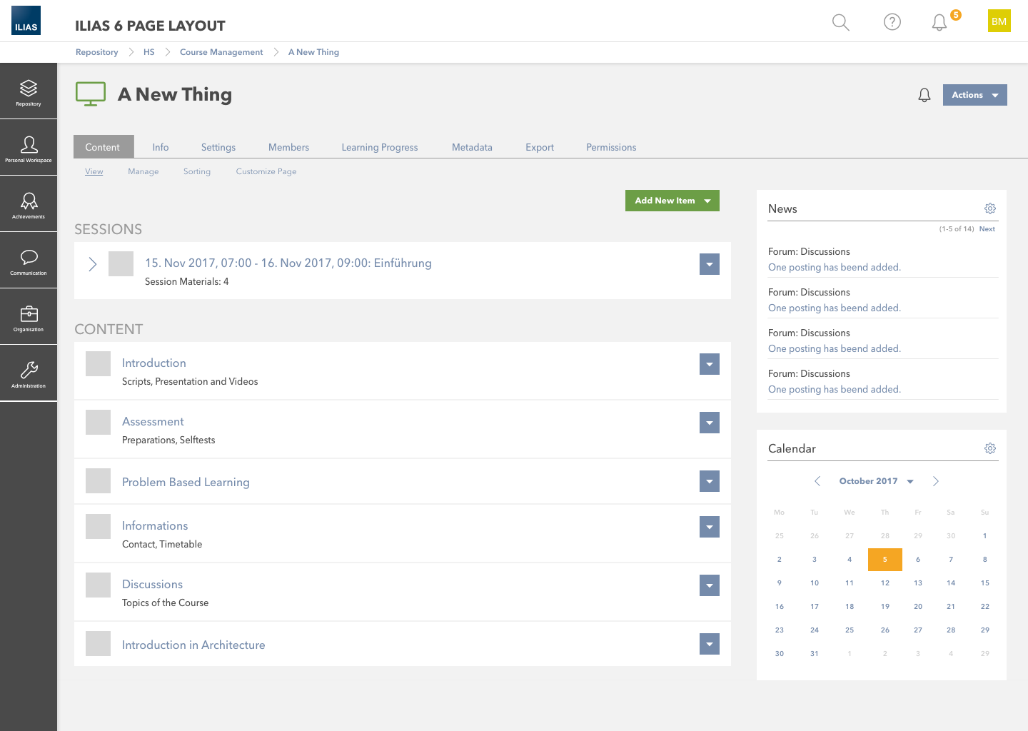
Page Overview
[Hide]This feature request is a part of the General Layout and Menu Revision.
Overview Metabar Content is laying out suggestion for upper right corner
The attached PDF-file provides an overview of the current status of the Page Layout Rersion. All elements of the new layout are described and clearly separated. Mock Ups help you to uniquely identify the elements. In addition, rules are defined for the behavior of all elements.
1 Initial Problem
At the workshop about the Page Layout Revision (Desktop) on 25 Oct 2017 we decided that an important next step is to discuss the main menu items / widgets and their names. The ultimative goal would be to find a "default" menu structure and naming that works with a maximum number of ILIAS installations. Realistically this means to try to find at least an agreement on a best solution among the community members that volunteer to participate in the discussion. Everyone is invited to do this.
For community proposals and discussions see archive in chapter 8.
Killing, Alexander [alex], 25 Oct 2017: I hope this list is complete. Feel free to add missing items (ILIAS 5.3 structure).
Personal Desktop / Persönlicher Schreibtisch
- Overview / Übersicht
- Courses and Groups / Kurse und Gruppen
- Bookmarks (Personal administration, presentation also available on "Overview")
- Notes and Comments / Notizend und Kommentare (If both activated; full overview, latest comments/notes also accessible on "Overview")
- Notes / Notizen (If only notes activated)
- Comments / Kommentare (If only comments activated)
- News / Neugikeiten (Full overview, lates news also accessible on the "Overview")
- --- (Separator)
- Staff / Mitarbeiter
- Workspace / Arbeitsraum
- Portfolio (Full list/access; list of portfolios optionally accessible on the "Overview", too)
- Competences / Kompetenzen (Full overview)
- Badges
- Learning Progress / Lernfortschritt (Full overview, object related learning progress optionally accessible in each object)
- --- (Separator)
- Calendar / Kalender (Full overview and personal administration, e.g. create new calendars; events screens are also optionally accessible in repo objects)
- Mail (Top Bar includes second entry point)
- Contacts / Kontakte
- Repository - Home
- Header: Last Visited
- Max. 10 Titles of repository objects
- >> Remove Entries (Action that only appears if activated and if entries are available)
- Higher number of grouped entries. (No need to include them all separately in your proposal)
Mail Glyph (Direct Link to Mail)
Conversations Glyph
- Conversations / Konversationen Widget (List of conversations, Public Chat Link)
- Who is Online? / Wer is online? Widget (Grouped user list, action drop downs)
- Background Task Widget (List of background tasks)
- Search / Suche Widget (Input, Options to search in repo, current location, for users (if activated)
- Topics / Themen
- Hilfe-Tooltips
- Persönliche Daten und Profil
- Einstellungen
- --- (Separator)
- Abmelden
2 Conceptual Summary
Based upon the outcome of the VC-Workshop 2017-12-07 we
- listed the obvious groupings like personal objects, communication and achievements and defined the entries of these groupings based on given proposals.
- collected the leftover entries and clustered them into reasonable groupings due to multiple nominations or gut instinct.
- placed the groupings in top or tab bar due to multiple nominations or external consistency to other web applications.
2.1 Proposals
Main Menu Item - Default Proposal V1 (as at January 08th)
Main Menu Item - Default Proposal V2 (as at January 01th)
Main Menu Item - Default Proposal V3 (as at January 06th)
Main Menu Item - Default Proposal V4 (as at February 13th)
Main Menu Item - Default Proposal V5 (as at February 28th)
This following version final (as at march 08th) is a revision based upon the workshop discussion (see vc-workshop notes below) and is the base for discussion from 08 march 2018.
(pink = need decision where to stay | red = outsourced to own fw-entry)
see: https://app.milanote.com/1ETeUX13w5kA38
TOP BAR
*******
1. Search
2. Help / Hilfe
3. Notificationtool / Benachrichtigungstool (ILIAS 6.0)
4. User / Benutzer (Avatar)
- Konto und Privatsphäre (ehemals Persönliche Daten und Profil)
- Einstellungen
- Abmelden
*******
TAB BAR
*******
1. Repository / Magazin
focussed view on content of repository (institutional superintendence)
- Magazin - Einstiegsseite
- Magazin - Baum
- Zuletzt besucht
- --
- Favoriten (Übersicht, auf Schreibtisch legen, Bookmarks)
- Kurse
- Gruppen
- --
- Studienprogramme
- --
- Eigene Magazin-Objekte
2. Personal Workspace / Persönlicher Arbeitsraum
- Übersicht
- Bookmarks
- --
- Calendar / Kalender
- --
- Task
- --
- Portfolios
- Personal Resources / Persönliche Ressourcen (all "Workspace" elements like blog, folder, files,...)
- Geteilte Ressourcen anderer
- --
- Notizen
- --
- News ( News-Archiv and Archiv von Benachrichtigungstool)
- Background Tasks (Archiv von Background Tasks)
3. Achievements / Leistungen
- Lernfortschritt
- Kompetenzen
- Badges
- Zertifikate
4. Communication / Kommunikation
- Wer ist online?
- Unterhaltungen (ehemals Konversationen)
- Kontakte
- Kommentare
- News ( News-Archiv and Archiv von Benachrichtigungstool)
- Mitarbeiterliste
- Einschreibungen
Legend: pink = need decision where to stay or what happens | red = depends on favorites- and personal desktop-concept
Nr. | Label en / label de | Effect | Reason / Purpose | Polling |
1. | Repository / Magazin | Click on Main Bar Bulky Button > opens slate | focussed view on content of repository (institutional superintendence) Das Unterscheidungsmerkmal zwischen Item Group #1 und #2 wird darüber definiert, ob die Inhalte durch den Benutzer selber erstellt und verändert werden können, oder ob die Institution gewisse Vorgaben macht, auf die man zugreifen kann. Item Gropu #1 gibt dabei fokussierte Blicke auf Inhalte im Magazin. Als Unterscheidungsmerkmal wurde die «Hoheit» davon, wie etwas genutzt wird, wie folgt festgelegt:
| |
1.a | Repository - Home / Magazin - Einstiegsseite | Click on Slate Element > Content Screen Repository root node shown | ||
1.b | Reposotory -Tree / Magazin - Baum | Click on Slate Element > tree akkordeon or drilldown in slate | ||
1.c | Last Visited / Zuletzt besucht | Click on Slate Element > tree akkordeon or drilldown in slate | ||
1.d | Favorites (was: Selected Items) incl. Bookmarks / Favoriten (Übersicht, auf Schreibtisch legen, Bookmarks) | Click on Slate Element > Content Screen Favorites (was: selected Items) is shown | ||
1.e | Courses (New) / Kurse (Neu) | Click on Slate Element > tree akkordeon or drilldown in slate | ||
1.f | Groups (New) / Gruppen (Neu) | Click on Slate Element > tree akkordeon or drilldown in slate | ||
1.g | Study Programmes (New) / Studienprogramme (Neu) | Click on Slate Element > Content Screen Study Programme is shown | ||
1.h | My Repository Objects / Eigene Magazin-Objekte | Click on Slate Element > Content Screen My Repository Objects is shown | ||
2. | Personal Workspace / Persönlicher Arbeitsraum | Main Bar Bulky Button > opens slate |
| |
2.a | Overview / Übersicht | Click on Slate Element > Content Screen Overview | Übersicht | |
2.b | Bookmarks / Bookmarks | Click on Slate Element > Content Screen Bookmarks | Bookmarks | |
2.c | Calendar / Kalender | Click on Slate Element > Content Screen Calendar | Kalender | |
2.d | Task / Task | Click on Slate Element > Content Screen Tasks | ||
2.e | Portfolio / Portfolios | Click on Slate Element > Content Screen Portfolio | ||
2.f | Personal Resources / Persönliche Ressourcen (all "Workspace" elements like blog, folder, files,... | Click on Slate Element > Content Screen My Resources | ||
2.g | Resources of Other User / Geteilte Ressourcen anderer | Click on Slate Element > Content Screen Resources of Other Users | Das Label von «Ressourcen | |
2.h | Notes/ Notizen | Click on Slate Element > Content Screen Notes | ||
2.i | News / Neuigkeiten (News-Archiv and Archiv von Benachrichtigungstool) | Click on Slate Element > Content Screen News | News | |
2.j | Background Tasks / Background Tasks (Archiv von Background Tasks) | Click on Slate Element > Content Screen ????? | ||
3. | Achievements / Leistungen | Click on Main Bar Bulky Button > opens slate |
| Mehrheitlich unumstritten sind dabei die Items #3 «Achievements/Leistungen» und #4 «Communication / |
? | Learning History / Lernhistorie | Click on Slate Element > Content Screen Learning History | ||
3.a | Competences / Kompetenzen | Click on Slate Element > Content Screen Competences | ||
3.b | Learning Progress / Lernfortschritt | Click on Slate Element > Content Screen Learning Progress | ||
3.c | Badges / Badges | Click on Slate Element > Content Screen Badges | ||
3.d | Certificates / Zertifikate | Click on Slate Element > Content Screen Certificates | ||
4. | Communication / Kommunikation | Click on Main Bar Bulky Button > opens slate |
| |
4.a | Who is online? / Wer ist online? | ??? | Who-is-online oben [1] | |
4.b | Conversations / Unterhaltungen (ehemals Konversationen) | ??? | ||
4.c | Mail / Mail | Click on Slate Element > Content Screen Mail | ||
4.d | Contacts / Kontakte | Click on Slate Element > Content Screen Contacts | ||
4.e | Comments / Kommentare | Click on Slate Element > Content Screen Comments | ||
4.f | News (News-Archiv and Archiv von Benachrichtigungstool) / Neuigkeiten | Click on Slate Element > Content Screen News | ||
5. | Organisation | Click on Main Bar Bulky Button > opens slate | (Staff-Functionalities)
(08. März 2018) | *kein eigener Hauptpunkt in #3 (aber mit Option zum Customizen) [0] |
5.a | Staff List / Mitarbeiterliste | Click on Slate Element > Content Screen Staff List | Organisation / Organisation mit Mitarbeiterliste und Einschreibungen [3] | |
5.b | Enrolments / Einschreibungen | Click on Slate Element > Content Screen Enrolments | ||
6. | Administration / Administration | Click on Slate Element > tree akkordeon or drilldown in slate |
| Unterpunkt von User (in Top Bar) |
Background Legend:
grey | stays, but changes proposed |
green | new or new arrangement |
purple | move |
red | abandon from main menu |
Nr. | Label en / label de | Effect |
| Reason / Purpose | Polling | JF, 2019-01-21 |
1. | Repository / Magazin | Click on Main Bar Bulky Button > opens slate |
| focussed view on content of repository (institutional superintendence) Das Unterscheidungsmerkmal zwischen Item Group #1 und #2 wird darüber definiert, ob die Inhalte durch den Benutzer selber erstellt und verändert werden können, oder ob die Institution gewisse Vorgaben macht, auf die man zugreifen kann. Item Gropu #1 gibt dabei fokussierte Blicke auf Inhalte im Magazin. Als Unterscheidungsmerkmal wurde die «Hoheit» davon, wie etwas genutzt wird, wie folgt festgelegt:
| PM: first level entry needs to be a meaningful name. Decision: | |
1.a | Dashboard (label tbd) | Click on Slate Element > Content Screen Dashboard is shown |
| Contains
| accepted | |
1.a | Repository - Home / Magazin - Einstiegsseite | Click on Slate Element > Content Screen Repository root node shown | possibly rename so that duplication does not exist to main term | |||
1.b | Repository -Tree / Magazin - Baum | Click on Slate Element > tree akkordeon or drilldown in slate | possibly rename so that duplication does not exist to main term | |||
1.c | Last Visited / Zuletzt besucht | Click on Slate Element > tree akkordeon or drilldown in slate | ||||
1.d | Favorites (was: Selected Items) incl. Bookmarks / Favoriten (Übersicht, auf Schreibtisch legen, Bookmarks) | Click on Slate Element > Content Screen Favorites (was: selected Items) is shown |
| moved to 2. | ||
|
| Click on Slate Element > tree akkordeon or drilldown in slate |
| Vision to go, concept still open | ||
|
| Click on Slate Element > tree akkordeon or drilldown in slate |
| Vision to go, concept still open | ||
|
| Click on Slate Element > Content Screen Study Programme is shown |
| Vision to go, concept still open | ||
1.h | My Repository Objects / Eigene Magazin-Objekte | Click on Slate Element > Content Screen My Repository Objects is shown |
| moved to 2.f | ||
2. | Personal Workspace / Persönlicher Arbeitsraum | Main Bar Bulky Button > opens slate | ||||
2.a | Favorites (was: Selected Items) incl. Bookmarks / Favoriten (Übersicht, auf Schreibtisch legen, Bookmarks) | Click on Slate Element > tree akkordeon or drilldown in slate |
| accepted, distinguishing criterion PM: I create my list myself | ||
2.a | Overview / Übersicht | Click on Slate Element > Content Screen Overview |
| Übersicht | abandoned, replaced by "Favorites" | |
2.b | Bookmarks / Bookmarks | Click on Slate Element > Content Screen Bookmarks | Bookmarks | |||
2.c | Tags | Click on Slate Element > tree akkordeon or drilldown in slate | accepted | |||
2.c | Calendar / Kalender | Click on Slate Element > Content Screen Calendar | Kalender | accepted, distinguishing criterion PM: My Calendar View different from other Users, 50/50 | ||
2.d | Task / Task | Click on Slate Element > Content Screen Tasks | accepted | |||
2.e | Portfolio / Portfolios | Click on Slate Element > Content Screen Portfolio | ||||
2.f | Personal and Shared Resources / Persönliche und geteilte Ressourcen (all "Workspace" elements like blog, folder, files,... | Click on Slate Element > Content Screen My Resources |
| Contains
| accepted | |
2.g | Resources of Other User / Geteilte Ressourcen anderer | Click on Slate Element > Content Screen Resources of Other Users |
| Das Label von «Ressourcen | move to 2.f | |
2.h | Notes/ Notizen | Click on Slate Element > Content Screen Notes | ||||
2.i | News / Neuigkeiten (News-Archiv and Archiv von Benachrichtigungstool) | Click on Slate Element > Content Screen News |
| News | will be moved to 4. Communication | |
2.j | Background Tasks / Background Tasks (Archiv von Background Tasks) | Click on Slate Element > Content Screen ????? | ||||
3. | Achievements / Leistungen | Click on Main Bar Bulky Button > opens slate | Mehrheitlich unumstritten sind dabei die Items #3 «Achievements/Leistungen» und #4 «Communication / | |||
? | Learning History / Lernhistorie | Click on Slate Element > Content Screen Learning History | accepted | |||
3.a | Competences / Kompetenzen | Click on Slate Element > Content Screen Competences | ||||
3.b | Learning Progress / Lernfortschritt | Click on Slate Element > Content Screen Learning Progress | ||||
3.c | Badges / Badges | Click on Slate Element > Content Screen Badges | ||||
3.d | Certificates / Zertifikate | Click on Slate Element > Content Screen Certificates | ||||
4. | Communication / Kommunikation | Click on Main Bar Bulky Button > opens slate | ||||
4.a | Who is online? / Wer ist online? | ??? |
| Who-is-online oben [1] | accepted | |
4.b | Conversations / Unterhaltungen (ehemals Konversationen) | ??? |
| accepted | ||
4.c | Mail / Mail | Click on Slate Element > Content Screen Mail | ||||
4.d | Contacts / Kontakte | Click on Slate Element > Content Screen Contacts | ||||
4.e | News Timeline | Click on Slate Element > Content Screen News |
| accepted | ||
4.e | Comments / Kommentare | Click on Slate Element > Content Screen Comments | ||||
4.f | News (News-Archiv and Archiv von Benachrichtigungstool) / Neuigkeiten | Click on Slate Element > Content Screen News | move to 4.e | |||
5. | Organisation | Click on Main Bar Bulky Button > opens slate | (Staff-Functionalities) | *kein eigener Hauptpunkt in #3 (aber mit Option zum Customizen) [0] | ||
5.a | Staff List / Mitarbeiterliste | Click on Slate Element > Content Screen Staff List | Organisation / Organisation mit Mitarbeiterliste und Einschreibungen [3] | |||
5.b | Enrolments / Einschreibungen | Click on Slate Element > Content Screen Enrolments | ||||
6. | Administration / Administration | Click on Slate Element > tree akkordeon or drilldown in slate | Unterpunkt von User (in Top Bar) |
- Needs decision: How should the first main bar bulky button be labeled (Repository vs. Overview vs. ??)
- Needs decision: Where should "News" be categorised?
- Needs decision: Where should "Favorites" stay? The decision about which pattern we will use in future (Overview, Bookmarks or Favorites) is dealt with in the following feature request: Overview Personal Desktop Revision
- Needs decision: Which element (submenu) are visible as separate entry and which aren't? (Courses, Groups, Study Program, Bookmarks)
- Where is the effect of a click on a slate element be defined (drill-down vs. accordion)? Order of "Last visited" depends on effect because of length?
- Please phrase reasons for each Main Bar Item what belongs here and why and what not and why?
The Main Bar is a unique page section that bundles access to content- * based navigational strategies (like the repository tree) as well as * navigation to services unrelated to the actual content, like the * administrative settings. (source: PR)
We are of the opinion that concepts of groupings ("items") have to be formulated appropriately in order to be able to differentiate the groups from each other in the best possible way.
Summary of the mainbar Items decided by the Jour Fixe on 04 FEB 2019.
Nr. | Label en / Label de | Effect | Contains (Screen in ILIAS 5.4) |
1. | Repository / Magazin | ||
1.a | Dashboard | Click on Slate Element > Content Screen | Personal Desktop >> Courses and Groups |
1.b | Home / Einstiegsseite | Click on Slate Element > Content Screen | Repository >> Home |
1.c | Tree View / Baumansicht | Tree is shown in Slate | Repository Tree |
1.d | Last Visited / Zuletzt besucht | Last visited Objects are shown in Slate | Repository >> Last visited |
2. | Personal Workspace / Persönlicher Arbeitsraum | ||
2.a | Favorites / Favoriten | Personal Desktop >> Overview | Personal Desktop >> Overview |
2.b | Tags | Tags are shown in Slate | Tags Side Block (Tag Cloud) |
2.c | Calendar / Kalender | Click on Slate Element > Content Screen | Personal Desktop >> Calendar |
2.d | Task / Task | Click on Slate Element > Content Screen | Personal Desktop >> To Do |
2.e | Portfolio / Portfolios | Click on Slate Element > Content Screen | Personal Desktop >> Portfolio |
2.f | Personal and Shared Resources / Persönliche und geteilte Ressourcen | Click on Slate Element > Content Screen | Personal Desktop >> Personal Workspace |
2.g | Notes/ Notizen | Click on Slate Element > Content Screen | Personal Desktop >> Notes and Comments |
3. | Achievements / Leistungen | ||
3.a | Learning History / Lernhistorie | Click on Slate Element > Content Screen | Personal Desktop >> Learning History |
3.b | Competences / Kompetenzen | Click on Slate Element > Content Screen | Personal Desktop >> Competences |
3.c | Learning Progress / Lernfortschritt | Click on Slate Element > Content Screen | Personal Desktop >> Learning Progress |
3.d | Badges / Badges | Click on Slate Element > Content Screen | Personal Desktop >> Badges |
3.e | Certificates / Zertifikate | Click on Slate Element > Content Screen | Personal Desktop >> Certificates |
4. | Communication / Kommunikation | ||
4.a | Mail / Mail | Click on Slate Element > Content Screen | Personal Desktop >> Mail |
4.b | Contacts / Kontakte | Click on Slate Element > Content Screen | Personal Desktop >> Contacts |
4.c | News | Click on Slate Element > Content Screen | Personal Desktop >> News |
4.d | Comments / Kommentare | Click on Slate Element > Content Screen | Personal Desktop >> Notes and Comments |
5. | Organisation | ||
5.a | Staff List / Mitarbeiterliste | Click on Slate Element > Content Screen | Personal Desktop >> Staff List |
5.b | Enrolments / Einschreibungen | Click on Slate Element > Content Screen | Personal Desktop >> Enrolments |
6. | Administration / Administration | ||
6.a | System Settings and Maintenance / Systemeinstellungen und Wartung | Click on Slate Element > DrillDown Menu> Content Screen | Administration >>
|
6.b | Layout and Navigation / Layout und Navigation | Click on Slate Element > DrillDown Menu> Content Screen | Administration >>
|
6.c | User Administration / Benutzerverwaltung | Click on Slate Element > DrillDown Menu> Content Screen | Administration >>
|
6.d | Personal Workspace / Persönlicher Arbeitsraum | Click on Slate Element > DrillDown Menu> Content Screen | Administration >>
|
6.e | Achievements / Lernerfolge | Click on Slate Element > DrillDown Menu> Content Screen | Administration >>
|
6.f | Search and Find / Suchen und Finden | Click on Slate Element > DrillDown Menu> Content Screen | Administration >>
|
6.g | Extending ILIAS / ILIAS Erweitern | Click on Slate Element > DrillDown Menu> Content Screen | Administration >>
|
6.h | Repository and Objects / Magazin und Objekte | Click on Slate Element > DrillDown Menu> Content Screen | Administration >>
|
Nr. | Label en / label de | Effect | Reason / Purpose | Description |
1. | Repository / Magazin | Click on Main Bar Bulky Button > opens slate | Criterion: | |
1.a | Dashboard | Click on Slate Element > Content Screen Dashboard is shown | Contains
| |
1.b | Home / Einstiegsseite | Click on Slate Element > Content Screen Repository root node shown | Possibly combine with repository tree | |
1.c | Tree View / Baumansicht | Click on Slate Element > tree akkordeon or drilldown in slate | Possibly combine with repository home | |
1.d | Last Visited / Zuletzt besucht | Click on Slate Element > tree akkordeon or drilldown in slate | ||
|
| Click on Slate Element > tree akkordeon or drilldown in slate | Vision to go, concept still open | |
|
| Click on Slate Element > tree akkordeon or drilldown in slate | Vision to go, concept still open | |
|
| Click on Slate Element > Content Screen Study Programme is shown | Vision to go, concept still open | |
2. | Personal Workspace / Persönlicher Arbeitsraum | Main Bar Bulky Button > opens slate | Criterion: | |
2.a | Favorites / Favoriten | Click on Slate Element > tree akkordeon or drilldown in slate | Criterion: | Contains:
|
2.b | Bookmarks / Bookmarks | Click on Slate Element > Content Screen Bookmarks | ||
2.c | Tags | Click on Slate Element > tree akkordeon or drilldown in slate | ||
2.d | Calendar / Kalender | Click on Slate Element > Content Screen Calendar | Criterion: | |
2.e | Task / Task | Click on Slate Element > Content Screen Tasks | Criterion: | |
2.f | Portfolio / Portfolios | Click on Slate Element > Content Screen Portfolio | ||
2.g | Personal and Shared Resources / Persönliche und geteilte Ressourcen (all "Workspace" elements like blog, folder, files,...) | Click on Slate Element > Content Screen My Resources | Criterion:
| Contains
|
2.h | Notes/ Notizen | Click on Slate Element > Content Screen Notes | ||
|
| Click on Slate Element > Content Screen Background Tasks | Vision to go, concept still open | |
3. | Achievements / Leistungen | Click on Main Bar Bulky Button > opens slate | Criterion: | |
3.a | Learning History / Lernhistorie | Click on Slate Element > Content Screen Learning History | ||
3.b | Competences / Kompetenzen | Click on Slate Element > Content Screen Competences | ||
3.c | Learning Progress / Lernfortschritt | Click on Slate Element > Content Screen Learning Progress | ||
3.d | Badges / Badges | Click on Slate Element > Content Screen Badges | ||
3.e | Certificates / Zertifikate | Click on Slate Element > Content Screen Certificates | ||
4. | Communication / Kommunikation | Click on Main Bar Bulky Button > opens slate | Criterion: | |
4.a | Mail / Mail | Click on Slate Element > Content Screen Mail | ||
4.b | Contacts / Kontakte | Click on Slate Element > Content Screen Contacts | ||
4.c | News | Click on Slate Element > Content Screen News | Contains
| |
4.d | Comments / Kommentare | Click on Slate Element > Content Screen Comments | ||
| move to Metabar until solution of notification center is available | |||
5. | Organisation | Click on Main Bar Bulky Button > opens slate | Criterion: Staff-Functionalities
| This entry is only displayed to persons who have access to the entries it contains. |
5.a | Staff List / Mitarbeiterliste | Click on Slate Element > Content Screen Staff List | ||
5.b | Enrolments / Einschreibungen | Click on Slate Element > Content Screen Enrolments | ||
6. | Administration / Administration | Click on Slate Element > tree akkordeon or drilldown in slate | Criterion: Administration-Settings for installation
| This entry is only displayed to persons who have access to the entries it contains. |
6.a | System Settings and Maintenance
| |||
6.b | Layout and Navigation
| |||
6.c | User Administration
| |||
6.d | Personal Workspace
| |||
6.e | Achievements
| |||
6.f | Search and find
| |||
6.g | Extending ILIAS
| |||
6.h | Repository and Objects
|
2.2 Final Proposal
The proposal accepted in the Jour Fixe at 04 FEB 2019 has some serious conceptual issues. It prevents usage scenarios and configurations that are possible with 5.4 and needed by some institutions. Therefore, we had to revise the Jour Fixe decision in a workshop at 14 AUG 2019 and change the default sorting of main bar items for ILIAS 6 as follows:
- DASHBOARD ( shown content depends from configuration: [ recommended content ] [ my memberships in study programmes, courses, groups | favourites ] [ side blocks ] )
- REPOSITORY
- Home
- Tree View
- Last Visited
- My Memberships ( deactivated in default! )
- PERSONAL WORKSPACE
- Favourites ( slate and manage screen; activated in default )
- Tags
- Calendar
- Tasks
- Portfolio
- Personal and Shared Resources
- Notes
- ACHIEVEMENTS
- Learning History
- Competences
- Learning Progress
- Badges
- Certificates
- COMMUNICATION
- Contacts
- News
- Comments
- ORGANISATION
- Staff
- Enrolments
- ADMINISTRATION
- System Settings and Maintenance
- Layout and Navigation
- Dashboard (Bulky Link)
- Repository and Objects
- Personal Workspace
- Achievements
- Communication
- Organisation (Bulky Link
- User Administration
- Search and Find
- Extending ILIAS
3 User Interface Modifications
3.1 List of Affected Views
- Header
- In general all screens, because main menu items are visible in every screen on ILIAS
3.2 User Interface Details
ILIAS 6.0
3.3 New User Interface Concepts
{If the proposal introduces any completely new user interface elements, you might consult UI Kitchen Sink in order to find the necessary information to propose new UI-Concepts. Note that any maintainer might gladly assist you with this.}
4 Technical Information
none
5 Contact
- Author of the Request: Seiler, Yvonne [yvseiler], Amstutz, Timon [amstutz], Universität Bern, Zenzen, Enrico [ezenzen]
- Maintainer: several
- Implementation of the feature is done by: Schmid, Fabian [fschmid]
6 Funding
- …
7 Workshops
6th VC-Workshop 2018-03-08
We discussed the last "Problemhaushalte": Placing of Organisation Elements and Administration. Starting position of discussions was default proposal v5 in virtual meeting on Skype:
08. March 2018, 09:00 -10:10h
Based upon this discussion we adapt the default proposal above to "Default Proposal Finale".
Discussions based upon:
Default Proposal v5
Discussion Notes: https://edupad.ch/S5HNjDC36l
5th VC-Workshop 2018-03-06
We discussed the next "Problemhaushalte": Overview Page, Placing of Search, Notification Tool, Placing of Who-is-online. Starting position of discussions was default proposal v5 in virtual meeting on Skype:
06. March 2018, 14:30 -16:20h
Based upon this discussion we adapt the default proposal above to "Default Proposal v6".
Discussions based upon:
Default Proposal v5
Discussion Notes: https://edupad.ch/EA2ZcrafMT
4th VC-Workshop 2018-02-28
We've defined labels and group allocations. Startin position of discussions was default proposal v4 in virtual meeting on Skype:
28. February 2018, 13:30 -15:20h
Based upon this discussion we adapt the default proposal above to "Default Proposal v5".
Discussions based upon:
Default Proposal v4
Discussion Notes: https://edupad.ch/EA2ZcrafMT
3rd VC-Workshop 2018-02-13
We've defined differenciator and label of item group #1 and #2 of default proposal v3 in virtual meeting on Skype:
13. February 2018, 10:30 -12:00h
Based upon this discussion we adapt the default proposal above to "Default Proposal v4".
Discussions based upon:
Default Proposal v3
Discussion Notes: https://edupad.ch/lXKoaLW8g5
2nd VC-Workshop 2018-02-06
Comments on suggested default proposals (v1 and v2) submitted until 05th february 2018 were discussed in virtual meeting on Skype:
06. February 2018, 14:00 -15:30h
Discussions based upon:
Default Proposal v3
Discussions: https://edupad.ch/gn2W2vwz3D
1rst VC-Workshop 2017-12-07
Proposals submitted until 24th november 2017 were discussed in virtual meeting on Skype:
07. December 2017, 15:00 -16:30h
First analysis of proposals: https://app.milanote.com/1Ekk1j11l1Cv2M
Discussions: https://edupad.ch/gn2W2vwz3D
8 Discussion
- The following discussions related to the workshops and the then versions of the default proposal (from 07.12.2017 to 08.03.2018).
- In general I think this is a good starting point and represents many ideas, so thank you for working it out.
- My biggest concern: The term Personal Workspace currently represents my own personal "repository tree" where I can organize blogs, files, certificates and more in a folder structure. This proposal seems to change this concept fundamentally. How should the "Blogs" menu item work, if Blogs are at several places in the structure? How will the current "structure by folder" concept be aligned with the "structure by type" concept of the menu?
- Medium concern: The term Finder may be problematic. Mac users may have another idea of what functionality would be represented and in general users may think it provides also search functionality, which is separated in this proposal.
- Small issue: I would make the Repository - Home page the first entry in the Finder menu, since it is the most important first entry point into the content.
- Small issue: I would separate Courses and Groups (membership) views on separate items/screens. This allows to reorganize these screens (e.g. to separate past courses).
- Small issue: News and an archive of notifications are currently very far from being the same thing. I am not sure if they ever will be.
- Small issue: The Staff item under Communication is problematic. In many cases superiors want to do things like check the Achievements of their staff or invoke course memberships for their staff. Possible alternatives are:
- Name this menu People and Communication or even
- Staff and Communication (if the Staff feature is enabled) or
- add an additional separate menu item under Achievements (e.g. Achievements of my staff) or
- add a complete new separate top menu Organisation, which includes Staff and Org Unit related features, maybe also reporting tools in the future.
AT 2017-01-10: Even if there was a magic fix to the folder-issue AK pointed out we MUST NOT use a label for an existing concept (Personal Workspace) and slap it on something new next to the old place.
Please change the label. I did suggest to "Own and shared Ressources".
- The separation of groups and courses would be very helpful for our scenarios.
- Mitarbeiter / Organisation
Strategically, we should place the topic "employees" or "organizations" much more prominently.
It's about much more than communication: Executives need an overview of the learning activities of their employees; Executives need an overview of the competencies of their employees, Executives need an overview of the regularly staff talks etc. Our customers always have new ideas. ...
In order to make ILIAS even more attractive to companies, we should consider the topic at the top menu level. Institutions that do not need this topic should be able to deactivate the item centrally.
Based upon your discussion input we generated a new version of the main menu item default proposal (see above version 2 as at february 1th).
We would like to give it back in our feedback loop and thanks for your feedback until our skype meeting on 6th february.
Following here are our comments to your (Alex Killing, AT and Norbert Bromberger) commentaries:
ALEX
- My biggest concern: The term Personal Workspace currently represents my own personal "repository tree" where I can organize blogs, files, certificates and more in a folder structure. This proposal seems to change this concept fundamentally. How should the "Blogs" menu item work, if Blogs are at several places in the structure? How will the current "structure by folder" concept be aligned with the "structure by type" concept of the menu? We see that the first proposal would offend the actual "Workspace" component. We agree that this is a rather big issue. We gave it some thoughts and took a step back and revised our concept for the separation of the first two items in the cockpit. In the revised version of the proposal we suggest a "Resource" top menu (instead of "Finder" menu), where "Workspace" get an own place as submenu. We move the "Notes" menu into this "Resource" top menu as well. The actual "Personal Workspace" top menu is now a top menu called "Schedule" and contains calender, news archive, background tasks (perhaps later tasks modules, etc.).
- Medium concern: The term Finder may be problematic. Mac users may have another idea of what functionality would be represented and in general users may think it provides also search functionality, which is separated in this proposal. In the revision of the first two cockpit items we relabeled the "Finder" menu into a "Resource" (german "Ressourcen") top menu. It holds elements, that represent repository objects or own and shared resources.
- Small issue: I would make the Repository - Home page the first entry in the Finder menu, since it is the most important first entry point into the content. We changed the order and placed "Repository - Home" and "Last visited" as first and second entry in default settings. Administrators of an installation it would be possible to change this default sorting to a sorting, that's best for their institution and scenarios.
- Small issue: I would separate Courses and Groups (membership) views on separate items/screens. This allows to reorganize these screens (e.g. to separate past courses). We separated "Courses" and "Groups" into to separate menus in top menu "Resources".
- Small issue: News and an archive of notifications are currently very far from being the same thing. I am not sure if they ever will be. You are right. We think the "News" menu as a combination of "News" from courses, forums, etc. AND archive of notifications (f.e. could be sort by all news or notifications of notification tool or could be displayed in two tabs,...). We described it a bit more in the new version 2 of proposal and hope it is now easier to understand.
- Small issue: The Staff item under Communication is problematic. In many cases superiors want to do things like check the Achievements of their staff or invoke course memberships for their staff. Possible alternatives are:
- Name this menu People and Communication or even
- Staff and Communication (if the Staff feature is enabled) or
- add an additional separate menu item under Achievements (e.g. Achievements of my staff) or
- add a complete new separate top menu Organisation, which includes Staff and Org Unit related features, maybe also reporting tools in the future. In combination with Norbert Brombergers comment, we separate "Staff" into a fifth top menu item called "Organisation / Organisation".
Thanks for your proposal to have as few as possible menu items in top or left bar. In the process of renaming "Finder" into "Resources" we think "Search" should keep as top bar menu. We suggest as fifth top menu "Organisation", as sixth top menu "Administration". In combination with Page Layout Revision (Desktop) concept, on mobile view the fifth and sixth menu would be placed into a "More" menu. On desktop every item would be displayed.
AT
- Even if there was a magic fix to the folder-issue AK pointed out we MUST NOT use a label for an existing concept (Personal Workspace) and slap it on something new next to the old place. Please change the label. I did suggest to "Own and shared Ressources". We discard the option to split the "Workspace" concept (see answer above) into something new and extended "Personal Workspace". Our version 2 proposal shows, that "Workspace" could be placed into the new "Resource" top menu.
- In order to make ILIAS even more attractive to companies, we should consider the topic at the top menu level. Institutions that do not need this topic should be able to deactivate the item centrally. We propose "Organisation" as fifth top menu. If "Organisation" menu is active as default, or if this option needs to be activated via ADMINISTRATION need to be discussed separately.
Klees, Richard [rklees], 2017-02-02:
Hi Yvonne,
thanks for your all effort, patience and your second proposal.
To me, the first proposal is better than the first. I understand the remarks that were made about the first proposal, but I think we could tackle them in a different way.
The reasons, I liked the first proposal better are mainly routed in the groupings, which seem to be conceptually clearer than these in the second proposal.
The first group for general ressources, the second group for ressources and tools I currently need for my work, the third group for achievements. This reminds me of a general flow I observed in our scenarios, that is "search some interesting or required ressources in the pool" -> "make it your thing and acquire the implied knowledge and compentencies" -> "collect the tokens of your success". One may of course argue whether the titles are good as proposed or if individual entries should be part of the one or the other.
The "Schedule"-group in the second proposal to me seems to be odd at best. How do News and Background Tasks fit in?
I see the value of an "Organisation"-group for marketing purpose, but how does a one item grouping serve usability of the system?
The titles of the groupings in the first proposal also seem to be less dry to me. They tell the user, why she would want to open that grouping, instead of just giving a taxonomy of the stuff in that group. This imo is most obvious in the "Ressources" naming of the second proposal. That word is so dry and general, it could contain most of the items from the other groupings. Even "Staff", for the MBA-minded people. The "why"-grouping of the first proposal to me seems to give clearer guidance to the user as well as for our futures selves, when introducing new entries.
I think most of Alex concerns and proposals can be addressed and incorporated while maintaining the grouping of the first proposal.
Most prominently:
The issue with the wording of "Personal Workspace". Contrary to Alexandra, I would be willing to sacrifice the naming of the current "Personal Workspace". It might well get a new name, e.g. "Personal Repository" as borrowed from Alex. This imo also is closer to the actual concept than the current name.
"Finder" could be "Explorer" as well, Windows still has a huge market share and the purpose of our grouping and the tool from Microsoft is very similar.
The rest of the concerns may be smoothly integrated with the first proposal without changing the groupings.
I second the motion of Alex, to put the "Search" into the "Finder/Explorer". It seems to fit there better than in the top bar and I would value internal consistency over external consistency. This will also decrowd the top bar even more. We could also split the search in two (ressources, users) and put the second half of it into the "Communication/People/Whatever" section.
Best regards!
I like the direction of Richards proposal of an Explorer - "Workspace" split. But I agree, that we should avoid reusing words with existing connotation in ILIAS (like workspace). What about Organizer? That would make Explorer - Organizer - Achievements.
- Explorer: The open world.
- Organizer: My stuff / tools.
This is looking very promising, thanks for all your work so far!
Just two very short remarks:
- Please refrain from using the English term "Account" in German. Our current suggestion in the ILF group is "Benutzerkonto" or simply "Konto". It has not been presented to JF, but I believe it is superior to using the English variant.
- Concerning "Organisation", this should be decided considering future developments. If these are indeed likely, we should rather include it right away, even if there aren’t enough sub entries in 5.4.
- Mixing it up with the Communication group doesn’t seem like a good fit to me after talking to business users at Learntec. They were not at all interested in chats, internal mails et cetera.
- Colin’s "Organiser" would not work if "Organisation" indeed remains an entry on its own. Too close.
- Magazin
- Eigene Magazinobjekte ("eigen" nicht "persönlich", siehe unten)
- Persönlicher Arbeitsbereich (kleine Umbenennung um Änderung zu verdeutlichen)
- Persönliche Ressourcen ("persönlich" meint nicht nur "eigen", sondern zusätzlich "nur für mich")
- Geteilte Ressourcen anderer ("persönliche" Ressourcen anderer Benutzer für mich "persönlich" geteilt)
- Kalender (ich teile hier das Argument, dass die persönliche Aggregation im Vordergrund steht)
- Kommunikation
- Neuigkeiten (die Neuigkeiten-Funktion bewegt sich mehr in ein Kommunikationsfunktion: Die Timeline ermöglich Lernern Neuigkeiten zu erstellen, mit ILIAS 5.4 gibt es Kommentare an Neuigkeiten)
- I like the labels "Personal Ressources" and "Shared Resources" as part of item group #2 (Personal Workspace) as Alexander suggests. Shared resources of others should not be part of communication, because it reflects a state and not events. I understand all kinds of communication as some stream of events. But "Resources of others" has no such representation as stream of events. It's also not bi-directional, if it doesn't include my own resources shared with others. My preference would be item group #2 (Personal Workspace), but I could also live with item group #1 (Repository).
- Calender should be part of item group #2 (Personal Workspace)
- News is difficult, because it's both a tool for discussion (Communication) and for monitoring changes in the repository. I can live with both item group #1 (Repository) and item group #4 (Communication). But as Alexander points out, I think the right place in the future will be communication.
Kruse, Fabian [Fabian], 27.02.2018:
I like Alex's suggestion with one exception: News. I too find it hard to make a decision here, but as a user I would rather look for it under Personal Working Area (Persönlocher Arbeitsbereich).
I understand both Alex’s and Colin’s arguments, but it doesn’t feel right to me elsewhere. Maybe this has to do more with imaginary feature requests than with reality, but it is how it is. I would not look for it under Communication.
- Starting point are our current main menu and top bar items.
- Everyone is invited to make proposals. Add yours in section "2 Conceptual Summary".
- This is only about the naming and structure (items/sub items). A simple bullet list with text items will do as a proposal on this page.
- Please have a look at the design proposal at Page Layout Revision (Desktop) first. Especially the widget concept. Widgets may be included in the structure.
- Please also note that the current design proposal would work especially good, if it includes only max. of five top entries (one might be a "more" entry). So looking for solutions that work well under this restriction is appreciated. However if you come to the conclusion that this is difficult or not to achieve, proposals might include more top entries as well.
- You hand in multiple alternative proposals.
- Your proposal does not need to stick to the current naming (e.g. you might replace "Bookmarks" by "Favourites" or similar. Even if this includes slight changes to how the existing features are currently intepreted or work.
- Try to find solutions / namings / groupings that work well if new features are added to ILIAS in the future. Try to include possible future features you have knowledge of in your solution.
- You may either use English or German terms in your proposal (or even both).
Proposal AK1, Alexander Killing
- Die "Hilfe" ist über die Top Bar auf oberster Ebene erreichbar. Es wurde in der Vergangenheit schon diskutiert und festgestellt, dass die Hilfe kaum gefunden wird, wenn das Wort (Desktopversion) "Hilfe" nicht irgendwo direkt auf dem Bildschirm steht.
- Der "Benachrichtigungs"-Teil von Funktionen wie Mail, Who-Is-Online, Neuigkeiten, Chat oder Background-Tasks sollte auf der obersten Ebene sichtbar sein.
- Die "Suche" ist Teil der Top Bar auf oberster Ebene. Das ist ein gewisser Standard in Web-Anwendungen.
- Alle den angemeldeten Benutzer direkt betreffenden Funktionen und Daten liegen unter einem Menüpunkt.
- Profilbild + Name
- Persönliche Daten und Profil
- Portfolios
- Arbeitsraum
- Notizen
- Kompetenzen
- Badges
- Lernfortschritt (eigener)
- Einstellungen
- Background Tasks
- Abmelden
- Lerninhalte
- Einstiegsseite Magazin
- Aktuell belegte Kurse
- Abgeschlossene Kurse
- Zuletzt besucht?
- Favoriten (Auf den Schreibtisch legen)
- Bookmarks
- Getaggte Inhalte
- Aktivitäten
- Neuigkeiten (Was ist passiert?)
- Kalender (Was ist geplant?)
- Tasks (Was ist zu tun?)
- Personen und Kommunikation
- Wer ist online?
- Gruppen
- Kontakte
- Mitarbeiter
- Lernfortschritt (anderer Benutzer)
- Konversationen
- Kommentare
- Administration
- Hilfe
- Hilfethemen
- Tooltips
- Suche
- Benachrichtigungstool (eine Liste)
- Person X ist online gegangen (mit User Actions)
- Mail "..." erhalten (mit Link zur Mail)
- Background Task X be endet (mit Task Actions)
- Wikiseite wurde geändert...
Proposal AK2, Alexander Killing
- Der Eintrag (meine) "Kurse" wandert auf die oberste Ebene. Für die Lerner ist die Übersicht der aktuell belegten Kurse und die Navigation zu den Kursen m.E. eine so wichtige Funktion, dass sie eine prominente Stelle im Menü verdient und somit in vielen Fällen zusätzliche Klicks einspart. Kurse sind in vielen Fällen "Klammer" für fast alle anderen Magazinobjekte in ILIAS. Viele andere Lernmanagement-Systeme konzentrieren sich wesentlich mehr auf Kurse als Haupteinheiten, als ILIAS das tut. Oft finden fast alle Aktivitäten innerhalb von Kursen statt. Die Reduktion von ILIAS auf ein "Kursmanagementsystem" ist eines der häufigsten Kundenanpassungen.
- Der Eintrag "Magazin" wandert auf die oberste Ebene. Der Magazin "Hauptknoten" ist traditionell der Einstiegspunkt in die (Kategorien-)Struktur der ILIAS Lernobjektewelt. Diese Grundstruktur wird nicht aufgegeben. Da das Magazin aller Angebote gegenüber dem Lerner enthält, muss es m.E. prominent auf oberster Ebene erscheinen. Auch wenn der Begriff in anderen Systemen unüblich ist, ist er von vielen ILIAS Anwendern mittlerweile gelernt.
- Der Eintrag "Favoriten" wandert auf die oberste Ebene. Der Begriff ist neu, Idee ist die Funktion "Auf den Schreibtisch legen", "Bookmarks" und "Tagging" zusammenzufassen, optional auch mit der Liste der "Zuletzt besuchten Objekte". Die Hauptidee dieser Funktion ist es, den Lernern einen schnellen Zugriff auf die für sie wichtige Objekte zuzugreifen. Hier kann die Lernerende die ihr angebotene Navigation direkt beeinflussen. Wenn sie sich die Mühe macht, Objekte in dieser Art als wichtig zu kennzeichnen, sollte der Zugriff auch schnell und prominent möglich sein. Wird diese Funktion auf unterer Ebene "versteckt" erfüllt sie ihren Hauptzweck nicht mehr.
- Der Eintrag "Inhalte" ist damit aufgelöst.
- Profilbild + Name
- Persönliche Daten und Profil
- Portfolios
- Arbeitsraum
- Notizen
- Kompetenzen
- Badges
- Lernfortschritt (eigener)
- Einstellungen
- Background Tasks
- Abmelden
- Kurse
- Aktuell belegte Kurse
- Abgeschlossene Kurse
- Magazin
- Einstiegsseite
- Zuletzt besucht?
- Konfigurierte Liste von wichtigen Einstiegspunkten?
- Favoriten
- "Auf Schreibtisch legen" + Bookmarks + Tags + Zuletzt besucht?
- Personen und Kommunikation
- Wer ist online?
- Gruppen
- Kontakte
- Mitarbeiter
- Lernfortschritt (anderer Benutzer)
- Konversationen
- Kommentare
- Aktivitäten
- Neuigkeiten (Was ist passiert?)
- Kalender (Was ist geplant?)
- Tasks (Was ist zu tun?)
- Administration
- Hilfe
- Hilfethemen
- Tooltips
- Suche
- Benachrichtigungstool (eine Liste)
- Person X ist online gegangen (mit User Actions)
- Mail "..." erhalten (mit Link zur Mail)
- Background Task X be endet (mit Task Actions)
- Wikiseite wurde geändert...
- Konversationen und Wer-ist-online Tool treten etwas zurück. Dies liegt in der Feststellung, dass die Top Bar nicht skaliert, daran lässt sich leider wenig ändern. Daher hier nur die Benachrichtigungen (x ist online gegangen) in der Top Bar und die Hauptübersicht unter "Personen/Community".
Proposal 3, Timon Amstutz
- I make some destinction between mobile and desktop (help and administration move into a generic more on mobile)
- I leave the important items on the second level. However, I agree that some items in "discover/navigate/Explore/content"-Section are of crucial importance. I therefore propose to automatically open that section after login.
- I put the user picture along with logout, personal data and profile and settings into the topbar.
- I use verbs as label to directly communicate what can be done by opening something and not just naming what should be listed there. However, I failed to do it for the first section. So I stick with the version of alex by using the users name.
--------------------------------
Top Bar:
- Notifications/Benachrichtungstool: (eine Liste, Copied from AK2, like this)
- Person X ist online gegangen (mit User Actions)
- Mail "..." erhalten (mit Link zur Mail)
- Background Task X be endet (mit Task Actions, only listed here)
- Wikiseite wurde geändert…
- Kontaktanfragen
- Forum Posting
- …
- Picture
- Einstellungen
- --- (Separator)
- Abmelden
1. Generic User Icon (NOT personal picture, same layout as other Icons in the cockpit, to stress to personal nature in this block) + Name (e.g. Timon Amstutz)
- Overview / Übersicht (Rename to Home, link to „landing page like overview in content area“, maybe also remove, at least remove small column on the left)
- Portfolio
- Persönliche Daten und Profil
- Workspace / Arbeitsraum
- Notes / Notizen
- Competences / Kompetenzen
- Badges
- Learning Progress / Lernfortschritt (Own)
- Calendar / Kalender (TBD: This might be moved to Discover as well, however I feel that calendar is something very personal and would like to keep it here).
- Local Navigation (This should not be discussed here, only if we decide to keep that in the Cockpit, Highlighted, automatically in focus if active, name depends on context, E.g. „Computer Networking Forum“)
- Bookmarks/Favourites
- Courses (as Alex proposes, running and finished)
- Repository - Home
- Last Visited
- Search / Suche Widget
- Who is Online? / Wer is online? Widget (Grouped user list, action drop downs)
- Conversations / Konversationen Widget (List of conversations, Public Chat Link)
- News / Neugikeiten (Full overview, lates news also accessible on the "Overview“)
- Comments / Kommentare
- Learning Progress / Lernfortschritt (Others)
- Contacts / Kontakte
- Staff / Mitarbeiter
- Topics
- Tooltips
- Support (Link to support staff mail if activated, administration or similar)
Alexandra
- Profile Picture / Profilbild
- Account and Privacy (instead of Personal Data and Profile)
- Settings
- Logout
- Notifications / Benachrichtigungen
- Search / Suche
- Help / Hilfe ( Tooltips control dies quietly)
1. Learning Ressources / Lerninhalte
- Landing Page / Einstiegsseite
- Current and Upcoming Courses and Groups
- Overview
- Last Visited / Zuletzt besucht
- Favourits / Favoriten (Auf Schreibtisch gelegte Objekte)
- Private Notes / Private Notizen
- Tags / Tags
- Bookmarks / Bookmarks
- News / Neuigkeiten
- Reminder List / Erledigen
- Background Tasks
- Mail / Mail
- Who is online? / Wer ist online?
- Conversations / Unterhaltungen
- Contacts / Kontakte
- My Contacts: sub-tabs List, Gallery (toggle to replace sub-tabs)
- My Mailing Lists (please let this die quietly)
- My Courses
- My Groups
- Public Comments / Öffentliche Kommentare
- Learning History
- Certificates / Zertifikate
- Personal Learning Progress /Persönlicher Lernfortschritt (eigener)
- Badges / Badges
- Competences
- Selected Skills
- Assigned Profiles
- Portfolios / Portfolios
- Blogs / Blogs (extracted from My Ressources)
- Files & Folders / Dateien und Ordner (extracted from My Ressources)
- Own Repository Objects / Eigene Magazin-Objekte
- Shared Ressources / Ressourcen von Anderen (merged Portfolios of other users and Resoucres of other users)
- Staff List / Mitarbeiterliste
- Enrolements / Einschreibungen
- Agenda / Agenda
- Consultation Hours / Sprechstundenverwaltung
- Manage Carelndars / Kalender verwalten
- Settings / Einstellungen
- 55 Entries / Einträge
Proposal 5 HL, Hansjörg Lauener
Im Detail wird angepasst
=> TOP BAR Notifications: Dito wie TA
=> Hilfe und Support ist ein wichtiger Querschnitts-Bereich, den ich gerne in der TopBar sähe. Ist auch zu klein, um einen eigenen Bereich zu machen.
=> Die Administration gibt es als 6. SIDE-Bereich, aber nur in der Desktop Version (ev. als More unter Alternative Navigationsarten - passt zwar schlecht). Aber Administration wird eh nur in der Mobile-Version gebraucht.
=> Personal Workspace: Hier sehe ich als User mich und meine Objekte, wie ich mich selber beschreibe, welche Objekte ich in Resources angelegt habe habe, meine Notizen und Kommentare. Neu sollte "My Respository Objects" getrennt von Resources sein, damit man als Institution diesen wichtigen Bereich unabhängig vom bisherigen Workspace aufschalten kann.
=> Kurse: Das ist der Institutionelle Bereich. Der Titel müsste noch gefunden werden "Kurse" ist noch nicht ganz passend. Hier erhält man die Landing Page (Overview), das Repository, und Courses und Groups
=> Im Kommunikationsteil werden Kontakte gelistet, dort können die Kommunikationen (zwischen Personen) und Benachrichtigungen und News (automatisiert) erreicht werden, und auch das Mail
=> Neu sollte ein Dashboard eingeführt. Hier soll dem Gedanken "Learning Analytics" Rechnung getragen werden können, auch für Weiterentwicklungen. Hier sieht der User kursübergreifend, welche Tasks zu erledigen sind. Der Lernprozess ist mit dabei. Kompetenzen und Badges gehören dorthin, sowie der Staff-Bereich, der für hierarchisch gegliederte Institutionen eine Übersicht bietet.
Dann könnten zukünftige Lern-Dashboards entwickelt werden, die Überblickmässig und Kalendermässig darstellen, in welchen Kursen/Gruppen welche Aktivitäten passieren, wo ich im StudyProgramm bin, welche Aktivitäten am interessantesten sind, in welchen Kursen ich wo stehe, welche Übungen ich dringend abgeben muss, und ob mir ILIAS aufgrund der Learning Analytics was vorschlägt.
=> Navigation: Hier sind alternative Zugänge, wie "Last visited", die Suche, sowie die Bookmarks, zu finden.
=> beim Wording der Titel, und der Reihenfolge, sind Anpassungen gut möglich und zum Teil noch optimierungsbedürftig.
Der Vorschlag:
TOP BAR
Notifications/Benachrichtungen: (eine Liste, Copied from AK2, like this)
- Person X ist online gegangen (mit User Actions)
- Mail "..." erhalten (mit Link zur Mail)
- Background Task X be endet (mit Task Actions, only listed here)
- (Wikiseite wurde geändert…)
- Kontaktanfragen
- (Forum Posting)
- ...
Picture
- Einstellungen
- (Separator)
- Hilfe Themen
- Hilfe Tooltips
- (Support/GET Help)
- (Separator)
- Abmelden
1 Personal Workspace (ohne Bild, Konto, Abmelden)
- Persönliche Daten und Profil
- Portfolio
- Resources (meine und andere, aus my Workspace)
- (My Repository Objects) // Neu getrennt.
- Notes and Comments
- Overview (Landingpage)
- Magazin/Repository
- Kurse und Gruppen (um Favoriten für Overview zu setzen)
- Kontakte
- News, Neueste Einträge
- Benachrichtigungen
- Mail (Posteingang)
- (Conversations)
- Taskliste
- Kalender
- (Overall-Dashboard (Alle Aktivitäten, Meine Aktivitäten, Learning Analytics) // Neue zukünftige Möglichkeiten
- (Dashboard pro Kurs/Gruppe, Lernstand/Woche in Kurs) // Neue zukünftige Möglichkeiten
- Learning Progress
- Kompetenzen
- Badges
- Staff / Mitarbeiter
- Suche
- Last visited
- (Back / Forward) - oder andere zukünftige neue Navigationsoptionen
- Bookmarks
- - ... More ??
- nur bei Desktop
Proposal 6 YS, Yvonne Seiler
- Top Bar collects comprehensive functions, which have to do with the whole ILIAS or the view I have on ILIAS.
- Tab Bar collects access to "Create", "Control", "Cruise" or "Communicate" inside ILIAS.
- Search field: Represent a "overall search" like google, facebook, instagram,... Means: You can search for people, content or help topics. A label within the searchfield will point on help functionalities, f.e. "Search for content, people or help".
- Help Topics: As link or glyph beneath search field. "Help Topics" opens a right sidebar to provide help functionalities beside the tab bar.
- "Fifth Entry": As a fifth entry this place could be used for "local navigation" (f.e. learning module tree, forum tree, course tree) or for page editor sidebar. This fifth entry would only be visible if context needs the sidebar.
T O P B A R (linked as Glyphs)
Search goes into top bar: Consistency with other well known application and services, where search is a global and central service. ILIAS would get a powerful search functionality to search overall ILIAS (not specially in courses (content) or in communication section (people) or help (for help topics)), that’s why search get a place in top bar.
- Search (search f.e. persons, content, help content like a google, instagram or facebook “overall search”)
- Search Field (“Search for content or help”)
- Help Topics (link which opens right sidebar)
- Notifications/Benachrichtungstool: (current changes)
- Person X ist online gegangen (mit User Actions)
- Mail "..." erhalten (mit Link zur Mail)
- Background Task X be endet (mit Task Actions, only listed here)
- Wikiseite wurde geändert…
- Kontaktanfragen
- Forum Posting
- Konversationsanfrage from XY
- News ZZ in Course ABC
- …
- Settings (change global system controls/states) => Account Letter Avatar as representation “in which role I see the whole ILIAS view”
- Administration (depends on role, links to a administration dashboard or drilldown)
- --- (Separator)
- Help Tooltips
- Settings
- --- (Separator)
- Logout
T A B B A R
- Create/Kreieren (I can make something, I can change something and publish it (WORK/PRESENT STH))
- Favorites (Bookmarks and PD Overview, Tags)
- --- (Separator)
- Personal Data & Profile
- --- (Separator)
- Portfolio
- Workspace
- --- (Separator)
- Calendar
- Control/Kontrollieren (Dashboard Overview: Collection of informations from several places to get an overview (KEEP TRACK OF STH))
- Notes and Comments
- News
- --- (Separator)
- Learning Progress
- Competences
- --- (Separator)
- Badges
- --- (Separator)
- Background Tasks
- Cruise/Navigieren (Where do I go? Where come I from? (IMMERGE))
- Courses and Groups
- --- (Separator)
- Last visited
- --- (Separator)
- Repository Home
- Communicate/Kommunizieren (Communication)
- Who is online
- Staff
- --- (Separator)
- Contacts
- --- (Separator)
- Conversations
- Local Navigation, Customize Page Sidebar (if available)
Proposal 7 Qualitus, Kiegel, Colin [kiegel] and
==== Main Menu ====
- Navigation
- Search
- Favorites (former Overview)
- Memberships (former Courses and Groups)
- Repository
- Last visited
- Organization (as in 'self-organization')
- Calendar
- Workspace
- Bookmarks
- Notes and Comments
- Achievements
- Learning Progress
- Competences
- Badges
- Communication
- Who's online
- Contacts (including user search)
- Staff
- Help
- Administration
- Notification Center
- Background Tasks
- News (including timeline, with counter)
- User Menu
- Account and Privacy (instead of Personal Data and Profile)
- Settings
- activate profile or use portfolio
- Logout
Proposal 8, Enrico Zenzen
WORK IN PROGRESS NOT FINAL
- Hauptmenü
- Home/Startseite (ehemals Übersicht)
- Courses/Kurse
- Neuigkeiten
- WorkspaceArbeitsraum
- Portfolio
- Favorites/Favoriten (ehemals Bookmarks)
- Background Task
- Personal Data and Profil/ Persönliche Daten und Profil
- Einstellungen
- Accomplishments
- Competences/Kompetenzen
- Badges
- Learning Progress/Lernfortschritt
- Certificates/Zertifikate
- Organizer/Planer
- Calender/Kalender
- Mail/Mail
- Contacts/Kontakte
- Community/Personen
- Groups/Gruppen
- Staff/Mitarbeiter
- Who is online (Wenn nicht in der Top Bar)
- Conversation/Unterhaltungen
- Comments/Kommentare und Notizen
- Magazin
- Home/Einstiegsseite
- Last visited/Zuletzt besucht
- Administration
Top Bar (linked as Glyphs)
- Hilfe
- Themen
- Hilfe-Tooltips
- Search/Suche
- Notifications/Benachrichtigungen
- Mail "..." erhalten (mit Link zur Mail)
- Background Task X be endet (mit Task Actions)
- Wikiseite wurde geändert...
- Who is online?
- Logout/Abmelden
- Gut ist natürlich zunächst die Begrenzung auf max. fünf Hauptpunkte.
- Es ist noch kein klarer Benennungsvorschlag. Bitte immer die erste Wahl bei den Bezeichnern klar deutlich machen. Es ist schwer etwas wie „Discover/Navigate/Explore“ zu kritisieren. Es wirkt dann auch schon fast beliebig.
- Kein klares Angebot an die Benutzer ihre Kurse schnell zu finden. Fehlt der Punkt? („Übersicht“ ist nicht gleich „Meine Kurse“)
- Wie soll die „Übersichts“ Ansicht wird mit einem linksstehenden Menü funktionieren (drei Spalten + Menüspalte)? Ich habe diese Ansicht in die anderen Funktionen aufgelöst, da ich denke sie funktioniert noch weniger als vorher (und damit überhaupt nicht mehr).
- Kein eindeutiger Platz für Funktionen mit persönlichen/personenbezogene Daten. Insbesondere Profil und Portfolio tauchen an zwei sehr unterschiedlichen Plätzen auf. Nach welcher Regel erfolgt diese Aufteilung?
- Persönliche Notizen sind keine „kollaborative“ Funktion, sondern gehören m.E. dem personenbezogenen Menüpunkt zugeordnet.
- Keine klare Repräsentation für Aktivitäten (was ist passiert, was wird passieren, was muss ich machen?). Das sind m.E. die Hauptfragen die sich Nutzer immer wieder stellen, wenn sie auf die Plattform gehen. Dies wird u.a. bei der Unsicherheit den Kalender zu platzieren deutlich. Ebenso haben die „Neuigkeiten“ nur bedingt etwas mit Kollaboration zu tun.
- Favoriten nicht auf oberster Ebene. Ich bitte einmal darüber nachzudenken, was es bedeutet, wenn im eignen Browser der Punkt „Lesezeichen“ nur über ein Untermenü erreichbar wäre. Wenn man diesen Punkt nicht stärkt, wird er m.E. weiterhin kaum genutzt. Und es ist m.E. wichtig hier die Elemente die ehemals „auf den Schreibtisch gelegt wurden“ schnell erreichbar zu machen - statt auf einer m.E. nicht mehr funktionierenden „Übersichts“ Ansicht.
- Magazin nicht auf oberster Ebene. Der (nicht einfach zu lernende) Begriff taucht nun unter einem weiteren, noch nicht klare benannten, Menüpunkt auf. Das kann das Verständnis m.E. kaum fördern.
- Suche nicht auf oberster Ebene. Ähnlich wie die Hilfe habe ich das im Vorschlag AK2 nun in die Top Bar hochgezogen.
- Interact/Collaborate. „Interact“ ist m.E. ein zu allgemeiner Begriff (siehe auch „Interaction Design“). „Collaborate“ beschreibt m.E. dagegen engere Nutzungsszenarien, die wenig auf das Vorgesetzten/Mitarbeiter oder auch Tutor/Student Verhältnis passen.
- Es ist noch kein klarer Benennungsvorschlag. Bitte immer die erste Wahl bei den Bezeichnern klar deutlich machen. Es ist schwer etwas wie „Discover/Navigate/Explore“ zu kritisieren. Es wirkt dann auch schon fast beliebig.
- Kein klares Angebot an die Benutzer ihre Kurse schnell zu finden. Fehlt der Punkt? („Übersicht“ ist nicht gleich „Meine Kurse“)
- Wie soll die „Übersichts“ Ansicht wird mit einem linksstehenden Menü funktionieren (drei Spalten + Menüspalte)? Ich habe diese Ansicht in die anderen Funktionen aufgelöst, da ich denke sie funktioniert noch weniger als vorher (und damit überhaupt nicht mehr).
- Kein eindeutiger Platz für Funktionen mit persönlichen/personenbezogene Daten. Insbesondere Profil und Portfolio tauchen an zwei sehr unterschiedlichen Plätzen auf. Nach welcher Regel erfolgt diese Aufteilung?
- Alles (logout, settings, personal data and profile) wandert nach links ins cockpit (dein Vorschlag)
- Settings und Logout bleiben in der Topbar oben rechts (neu in meinem Vorschlag, ich favorisiere diese Lösung etwas)
- Settings, Personal Data and Profile bleiben in der Topvar (ursprünglicher Vorschlag)
- Persönliche Notizen sind keine „kollaborative“ Funktion, sondern gehören m.E. dem personenbezogenen Menüpunkt zugeordnet.
- Interact/Collaborate. „Interact“ ist m.E. ein zu allgemeiner Begriff (siehe auch „Interaction Design“). „Collaborate“ beschreibt m.E. dagegen engere Nutzungsszenarien, die wenig auf das Vorgesetzten/Mitarbeiter oder auch Tutor/Student Verhältnis passen.
- Keine klare Repräsentation für Aktivitäten (was ist passiert, was wird passieren, was muss ich machen?). Das sind m.E. die Hauptfragen die sich Nutzer immer wieder stellen, wenn sie auf die Plattform gehen. Dies wird u.a. bei der Unsicherheit den Kalender zu platzieren deutlich. Ebenso haben die „Neuigkeiten“ nur bedingt etwas mit Kollaboration zu tun.
- Favoriten nicht auf oberster Ebene. Ich bitte einmal darüber nachzudenken, was es bedeutet, wenn im eignen Browser der Punkt „Lesezeichen“ nur über ein Untermenü erreichbar wäre. Wenn man diesen Punkt nicht stärkt, wird er m.E. weiterhin kaum genutzt. Und es ist m.E. wichtig hier die Elemente die ehemals „auf den Schreibtisch gelegt wurden“ schnell erreichbar zu machen - statt auf einer m.E. nicht mehr funktionierenden „Übersichts“ Ansicht.
- Magazin nicht auf oberster Ebene. Der (nicht einfach zu lernende) Begriff taucht nun unter einem weiteren, noch nicht klare benannten, Menüpunkt auf. Das kann das Verständnis m.E. kaum fördern.
- Suche nicht auf oberster Ebene. Ähnlich wie die Hilfe habe ich das im Vorschlag AK2 nun in die Top Bar hochgezogen.
Thanks a lot for the inspiring proposals. I tried to find another access to all those ILIAS elements, but reused the following proposed solutions from above:
- +1 Notification/Benachrichtigungstool from Proposal AK2
- +1 Use active labels like verbs see Proposal 3
- +1 Favorites from Proposals above (Bookmarks, PD Overview, perhaps Tags)
In my Proposal 6 I tried to distinguish between “where can I make something” and “where can I observe something”, “where can I communicate” and “where can I immerge into the whole ILIAS world”. There are some changes how some links would behave than in the actual ILIAS 5.3:
- Search Field: Can be used to search for content, people, help topics, and others. If Search-Glyph is clicked search field will be opened where keywords can be entered. Additional a “help topics” link/glyph can be clicked to open right sidebar (mobile search will open a fullscreen-menu).
- Help: If help is available in the left sidebar, it is not possible to use it parallel to the other sidebar elements. If we place it on the right side, we have an interference with actual page editor sidebar revision. How would it be to set the page editor sidebar on the left side (like “local navigation” see below) as a tab entry if “Customize page” is activated and use the right side for the help?
- “Local Navigation”: Could be part of tab bar as a fifth entry. Would be only visible, if an object offers a local navigation (f.e. learning module, forum, course…)
Hello, everybody,
as part of the Overview Personal Desktop Revision we have started to draw detailed MockUps. This raises very specific questions and suggestions for implementation.
I doubt it, even though many have worked on the above draft and thought that it will be possible to implement it with 6.0. Excuse me.
Proposals for implementation:
- As long as we don't have a notification tool, OnScreen Chat and Who-is-Online should be available in the top bar. (This will also eliminate the need for (4) Who-is-Online and OnScreen Chat. The value of the OnScreen chat is thus literally destroyed. It moves into the depths of the system. Thus the concept of Learning Communities, developed over several years, is hit hard. Therefore I am strongly against this step. (Apart from that, we also contribute funding into the concept and implementation.)
- Bookmarks are added to the Favorites. (The section is omitted under (2) Personal Workspace)
- Achievements does not get any subpoints in the Slate.
- Which contents can be classified under News?
- Own Repository objects show contents from the Repository, but in my opinion belong to personal resources. Wouldn't we like to make a common point "personal and shared resources"? (Content in Subtabs: Personal Resources | Shared Resources |My Repository Objects)
- Should the tree (Main-Bar (1) Repository (Tree)) only be shown in the slate or in the content area in full size? What happens if the tree is switched off?
- What can you see on the Screen of "Background Tasks"?
- Do all menu entries of the administration come into the Slate? If not are presented all entries in ListGUI?
- Repository (Category Page)
- Repository (Tree)
- Last visited
- Courses (This will dissolve My Memberships.)
- Groups (This will dissolve My Memberships.)
- Study programmes (Must be removed from the overview screen.)
- Background Tasks (what should it look like?)
- Contacts
- Employee list (Somebody please help me.)
- Enrolments (Somebody please help me.)
- Administration
- Repository » Favorites
- Personal Workspace » Overview
- Personal Workspace » Private Notes
- Personal Workspace » Tasks
- Communication » Public Comments
- Repository (Category Page)
- Repository (Tree)
- Last visited
- --
- Favorites
- Courses
- Groups
- --
- Study Programmes
- Overview
- --
- Calendar
- Task
- Personal notes
- --
- Portfolios
- --
- Personal and shared resources (Personal resources | Own magazine objects | Shared resources of others)
- --
- Background Tasks
4. communication
- Contacts
- Public comments
- employee list
- enrolments
- all
Seiler, Yvonne [yvseiler], 20.12.2018: The work on the revision of the personal desktop (thanks a lot!) shows two things from my point of view, which apart from the assignment of the "News" (where they belong to) also still have to be determined:
1. Move menu "Favorites" to "2. Personal Workspace":
"Favorites" was assigned in the "main menu items" discussion to the entry "1. Repository", because we assumed that objects which have to do with the repository will end up here.
Since the focus of the Overview Personal Desktop Revision of the "Favorites" is that I can put them together myself, I would recommend to place the "Favorites" under "2. Personal Workspace". Favorites have to do with my personal work, with the fact that I arrange my workspace the way I need it. The "Favorites" in the concept of Overview Personal Desktop Revision say the same thing.
2. Rename the term "Overview":
The new "Overview" concept has been given by the Overview Personal Desktop Revision: It contains important organizational guidance. It still fits into the entry "2nd Personal Workspace" because it is also about "personally motivated" entries (my calendar, my mails, my news, my memberships). BUT "Overview" doesn't seem to be the right term for this page anymore, because you might think it gives an overview of the menu "2. Personal Workspace" - but it only contains some aspects of it, but also others (Mail, News).
In addition, the term "Overview" would be continued as an already familiar term, but used differently. This could lead to additional confusion.
I would recommend to change the term "Overview". This page must be on an equal footing with "Favorites", but must also be clearly separated from it by its own term: With "Favorites" I as a user have an idea in my head what I could do here (known pattern); but what can I expect from "Overview"? I'm still looking for a suitable term for something like orientation, compass, guide, control, guidepost?!
- News in this proposal here contains the same as the previous menu "News". Whether there will be a change in the concept or whether the news should be prepared differently would be a separate project from my point of view, which looks at how this page "News" can provide meaningful information for the user. Currently it would be with this FW entry here a pure structural rearrangement.
- The idea of this splitting of the Personal Resources / Shared Resources and My Repository Objects was the idea to put the valuable feature "My Repository Object" more in the foreground. But you can also consider leaving these three functions as tabs and referencing them only via a menu entry in the slate.
- Currently the representation of the tree is being worked out. In our page layout revision concept the tree will find its place in the "Slate", not in the content area. If the tree is deactivated and not available, this entry "Repository Tree" would not be available either.
- Background Tasks: In my way of thinking this would be like e.g. in News a table that lists the last background tasks, where if necessary already performed background tasks can be triggered again or files can be downloaded. You might be able to filter and sort this in time (as with the news). However, this is not yet specified.
- Administration Menu: Also here my previous consideration: The slate gets all entries of the administration, be it as a list or as a tree (i.e. "accordions" can be opened and the entries can be seen in it) - this still has to be defined. I had also created a mockup where the administration menus would appear in the content area - we as community would have to decide if we wanted that or not. The disadvantage of this is that you can't change pages so quickly. With the variant with the slate I can simply open the menu again, see beside it still my last Admin side and select a new Admin side.
Proposal to Main Menu Tödt, Alexandra [atoedt], Killing, Alexander [alex] & Samoila, Oliver [oliver.samoila] (2019-01-10)
1. | OVERVIEW |
2. | PERSONAL WORKSPACE |
3. | ACHIEVEMENTS |
4. | COMMUNICATION |
5. | ORGANISATION |
6. | ADMINISTARTION |
Note to Section "Communication": Who-is-online remains in TopMenu until a solution for NotificationCenter is available.
Comment on the workshop of January 11, 2019:
At the next elaboration of the proposals, we should describe behind EACH menu entry what kind of behavior is to be expected. For this purpose, a uniform wording should be used for menu items, so that the proposal for the reader is to be understood clearly.
Examples:
- Slate: (Clicking on a menu entry doesn't lead to a new page in the main content area, but rather to navigation elements being displayed in the slate.)
- Slate > actions (Elements are displayed in the slate (eg bookmarks). In the slate actions can be selected to manage the elements.)
- New page (Clicking on the menu entry leads to a new page in the main content area)
- Metabar (aka Top Bar, the thing on the very top of the page, see also the main concept, Page Layout Revision (Desktop)): The Meta Bar is a unique page section to accomodate elements that should permamently be in sight of the user. The Meta Bar shall, first of all, host Prompts, i.e. notifications from the System to the user, but may also accomodate components and links deemed important, like help or search. The content of the bar does not change when navigating the system, but may depend on a configuration.
- Main Bar (aka, Main Menu, the thing on the left): The Main Bar is a unique page section that bundles access to content-based navigational strategies (like the repository tree) as well as navigation to services unrelated to the actual content, like the administrative settings. The Main Bar holds Slates and Bulky Buttons. In a desktop environment, a vertical bar is rendered on the left side of the screen covering the full height. Clicking an entry will carry out its configured action. For slates, this is expanding the slate, while for Bulky Buttons this might be, e.g., just changing the page.
- Slate (the things than can be rendered inside the Main Bar, if expanded): A Slate is a collection of Components that serve a specific and singular purpose in their entirety. The purpose can be subsummed in one Icon/Glyph and a very short label, for Slates will act as elaboration on one specific concept in ILIAS. Slates are not part of the content and will reside next to or over it. They will open and close without changing the current context. Slates may hold a variety of components. These can be navigational entries, text and images or even other slates. When content-length exceeds the Slate's height, the contents will start scrolling vertically with a scrollbar on the right.
- Slate actions: Note sure, what this is. Is this contained in slates if you read the above description (or the complete linked in the PR)?
- New Page: I know that there have been rather controversial discussions arount this in the language group. Tödt, Alexandra [atoedt] has there been any accepted output on this? The linked PR gives a partial answer: "The Page is the user's view upon ILIAS in total." along with the standard page as one concrete member of this page family: "The Standard Page is the regular view upon ILIAS. The main parts of a Page are the Metabar, the Mainbar providing main navigation, the logo, breadcrumbs and, of course, the pages's content. "Content" in this case is the part of the page that is not Mainbar, Metabar, Footer or Locator, but e.g. the Repository-Listing, an object's view or edit form, etc. The locator (in form of breadcrumbs) and the logo are optional.". "New Page" would therefore be a complete reload of the afore mentioned components.
However, it is important that ALL proposals have the same wording.
Full ack. Note that this agreed upon wording is relatively new. It will take some time to refactor work that has been done prior to the acceptance of the above PR.
- Metabar (aka Top Bar / Meta Bar shall, first of all, host Prompts. Entries in the Metabar may open a Slate when clicked.)
- Mainbar (aka Main Menu / Clicking on a menu entry leads to navigation elements being displayed in a slate. No new screen is called.)
- Content (Clicking on a menu entry calls a new screen.)
- Nr. 1 Repository/Magazin:
- PM: first level entry needs to be a meaningful name.
- Decision: "Repository / Magazin", not only describes the repository concept, but also underlines its institutional character.
- Nr. 1.a Dashboard: accepted
- Nr. 1.a Repository - Home:
- possibly rename so that duplication does not exist to main term
- Suggested Label: "Starting Page / Einstiegseite"
- possibly combine with repository tree
- depending on future development
- Nr. 1.b Repository - Tree:
- possibly rename so that duplication does not exist to main term
- Suggested Label: "Starting Page / Einstiegseite"
- possibly combine with repository tree
- depending on future development
- Nr. 1.d Favorites: move to 2.
- Nr. 1.e-1.g: Vision to go, concept still open. Will be implemented in a second step, at the moment only available in Dashboard
- Nr 1.h My Repository Objects: moved to 2.f
- 2.a Favorites: accepted,
- distinguishing criterion PM: I create my list myself
- 2.a Overview: abandoned, replaced by "Favorites"
- 2.c Tags: accepted
- 2.c Calendar: accepted,
- distinguishing criterion PM: My Calendar View different from other Users
- 2.d Task: accepted,
- distinguishing criterion PM/Maintainer: Tasks are processed by me, I'm responsible for them.
- 2.f Personal and Shared Resources: accepted,
- distinguishing criterion PM: Owner-Principle on "Own repository objects" (it belongs to me); combine to one entry;
- Maintainer: Personal resources and shared resources of others belongs together
- 2.g Resources of Other User: move to 2.f
- 2.i News: will be moved to 4. Communication
- 3.a Learning History: accepted
- 4.a-4.b Who-is-online/Conversations: accepted, moved to metabar (forever or until solution for notification center available)
- 4.e News Timeline: accepted
- Label: News
- Contains Timeline view of News
Seiler, Yvonne [yvseiler], 22. JAN 2019: Adapted the table above after JF decisions from 21. JAN 2019.
The variant presented on January 21 can be found under 2.1 "Former Versions".
One issue still open: Do we need a separate "Bookmark" entry, if "Favorites" collects all my bookmarks?
JourFixe, ILIAS [jourfixe], 04 FEB 2019 : We highly appreciate the latest list of default mainmenu items and schedule them for 6.0. For the moment, Bookmarks get a proper entry until a final decision about this feature has been made.
Kunkel, Matthias [mkunkel], 09 SEP 2019 : Added final decision about default sorting of main bar in ILIAS 6, see chap 2.2 above.
JourFixe, ILIAS [jourfixe], 23 SEP 2019 : Changed order of default main menu items is highly appreciated and accepted for 6.
9 Implementation
9.1 Default MainBar Configuration
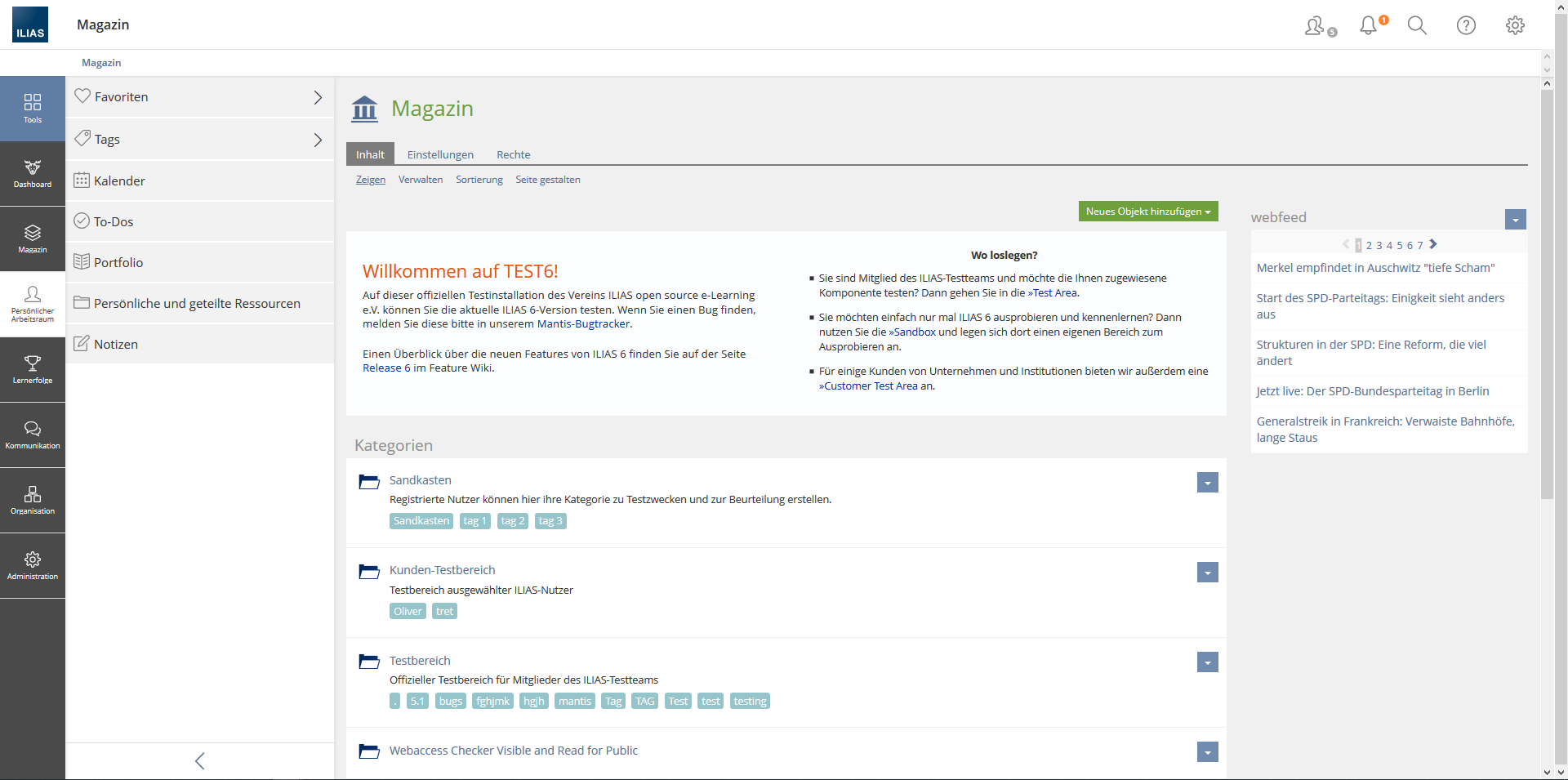

Approval
Approved at 06 DEC 2019 by Zenzen, Enrico [ezenzen] as project manager of the General Layout and Menu Revision.
9.2 Seperate Notes and Comments
 Comments
 Notes
NotesTest Cases
Approval
Approved at 06 DEC 2019 by Kunkel, Matthias [mkunkel].
Last edited: 9. Dec 2019, 12:07, Zenzen, Enrico [ezenzen]