


Feature Wiki
Tabs
Page Layout Revision (Desktop)
Page Overview
[Hide]- 1 Initial Problem
- 2 Conceptual Summary
- 2.1 Navigation Patterns (Analysis)
- 2.2 New Navigation Strategy (Conclusion)
- 2.3 Conceptual Details
- 2.3.1 Meta Bar
- 2.3.2 Main Bar
- 2.3.3 Slate
- 2.3.4 Tree
- 2.3.5 Local Main Bar Entry "Tools"
- 2.3.6 Scrolling Behaviour
- 2.3.7 Breadcrumb
- 2.3.8 Kiosk and Presentation Mode
- 2.3.9 Widescreen and Customization
- 2.3.10 Plugin-Slot
- 3 User Interface Modifications
- 4 Technical Information
- 5 Contact
- 6 Funding
- 7 Discussion
- 8 Implementation
This Feature is part of the General Layout and Menu Revision. See also mobile version Page Layout Revision (Mobile).
We have split the concept for desktop and mobile, although both have thought of each other and have the same goals, but need different implementations. The underlying concept of main bar and slate should be implemented as similarly as possible for both devices.
The attached PDF-file provides an overview of the current status of the Page Layout Rersion. All elements of the new layout are described and clearly separated. Mock Ups help you to uniquely identify the elements. In addition, rules are defined for the behavior of all elements.
1 Initial Problem
With ILIAS 5.0 we greatly revised the ILIAS overall look including the main Page Layout composed of Header, Content Section and Footer. This was an important and necessary step to push ILIAS forward into a responsive direction.
Some time has passed since then and we believe it is time to push the ILIAS main layout once again significantly forward.
Especially the following aspects of the current layout seem problematic in our view:
The Top Navigation contains a various types of elements. Further, the space is limited and the elements that need to find a place there is growing (see e.g. Background Task Service User Interface).

 Desktop
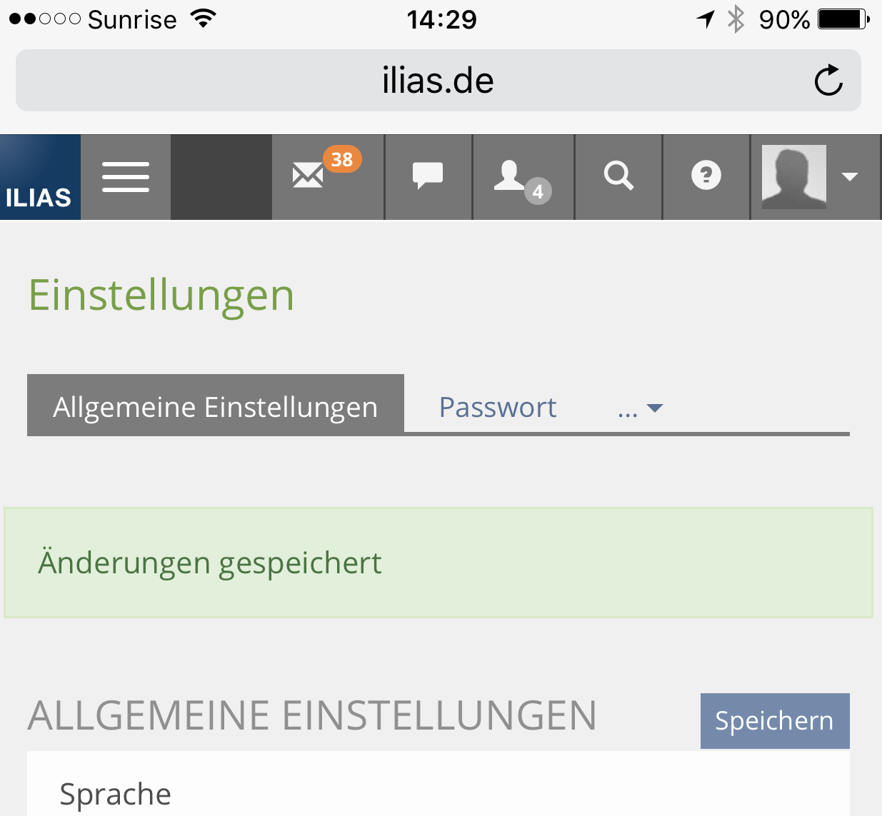 Small Screen
We believe that the brandig area (white space on the image above) occupies to much space.
 Desktop
We observe, that the switch to display the explorer is hard to find on the vey left side. The position is especially confusing, if the explorer is open, since it is not directly next to the object it operates.
 Desktop
 Small screen
(see also DR 5.1: Issue 08: Presentation of Tree Explorer on small media devices from Design Revision Part 2)
User has no access to tree of repository to navigate quickly trough repository. User needs to navigate trough list view.
This point is controversial. We see the benefit of fixing the screen width for better readability of text and in several cases for shorter distances to operate the cursor. However, we believe that there are too many scenarios where this fixed width is frustrating, especially on big screens. This image shows such a case.

2 Conceptual Summary
Further version and discussions of concept: Page Layout Revision (Desktop) - Pre-Stage
2.1 Navigation Patterns (Analysis)
Based on our analysis of problematic issues we focussed on a main task we want to solve with the new page layout revision:
Simpler navigation concept
- that works on small screens and desktop devices AND
- has the possibility to be expanded by future developments.
- Top Navigation
- Main Navigation
- Tree
- Breadcrumb
 Current navigation
- tree and search offer only a different kind of view on the content.
- Some are kind of quick navigation (like Main Navigation),
- some are quick navigations in combination with notification alarms (like Top Navigation).
- And some are a way to navigate through a predefined path (like Breadcrumb and Tree).
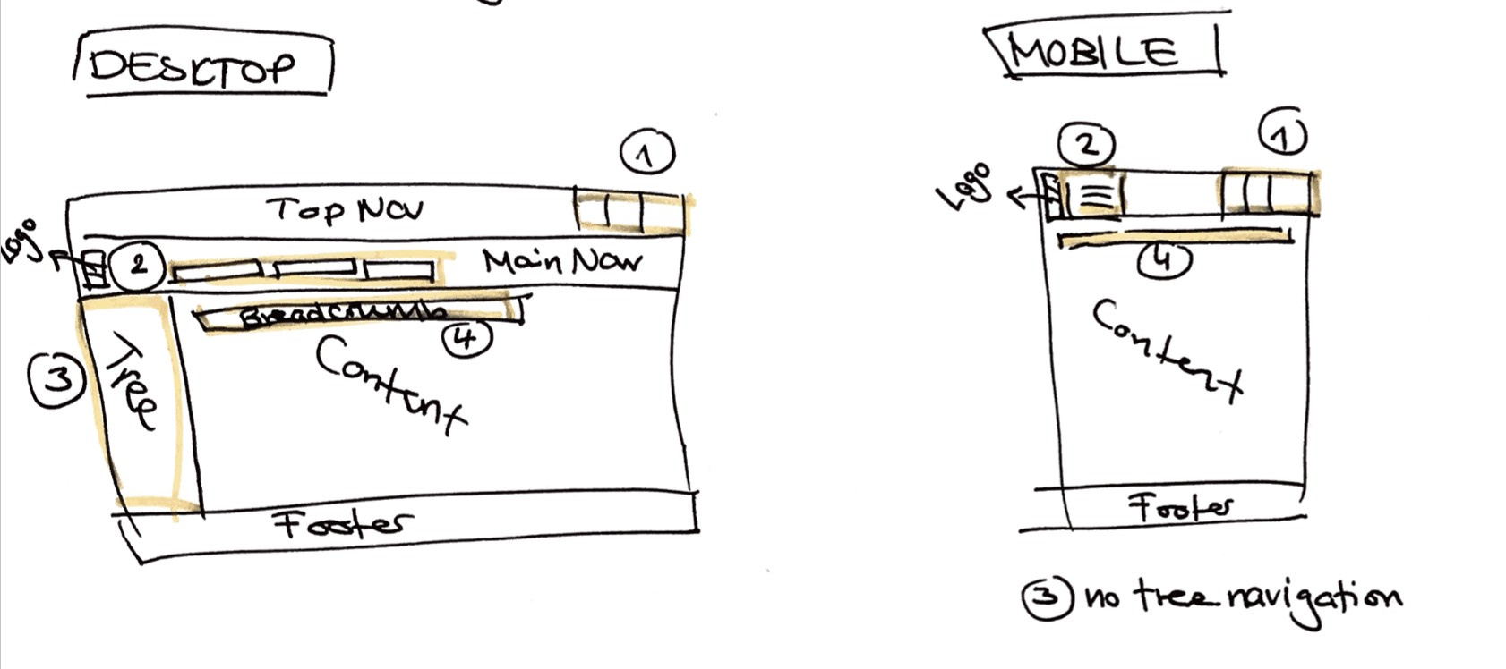
Desktop and Small Screen View
Our second task is to bring together desktop and small screen view even more closely. That’s because page layout revision has been made with components, which are well-known in mobile and desktop application context.
Expandability and Assignment
The crowded top navigation (especially for small screens, see chapter 1.) already shows an important issue for the new page layout: It isn’t arbitrary expandable. There is also no guideline, in what case a functionality will get a place in top navigation bar.
Side effects of revision
Breadcrumb is more visible and reflects better its importance.
2.2 New Navigation Strategy (Conclusion)
- A meta bar (header) with tools, that are collections of superordinate functionalities in the upper right corner: among other things a "notification center" unifies all functionalities of ILIAS, which has the ability to send push-notifications. A notification glyph summarize all current notifications (of email, chat requests, running tasks,...).
- A main bar with around 5 entries (per default) at left side on desktop and at bottom on mobile devices. This navigation concept contains the main bar (menus) and a slate: This gives access to all relevant points of interests in ILIAS, like personal desktop, search, repository and more.
The naming of all elements will be determined in the discussion of the respective UI-Elements.
 Revised navigation
- Meta Bar: The system pitches the user
- Main Bar (Menu bar and Slate): The user acts independently
Which elements are placed in which bar is determined in a separate discussion line: Default Configuration of Main Bar Items (ILIAS 6)
2.3 Conceptual Details
2.3.1 Meta Bar
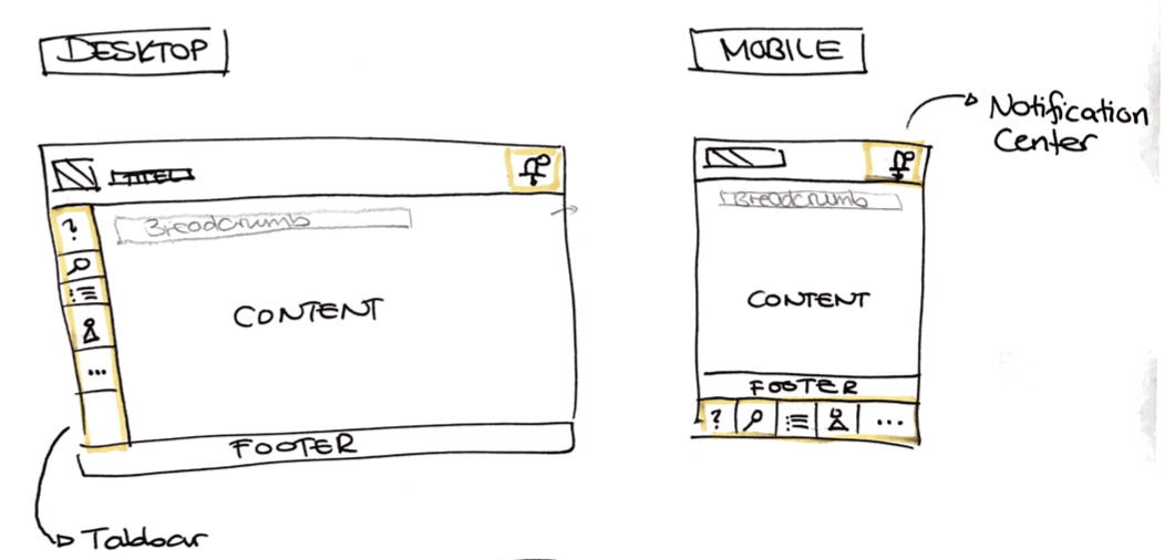
Meta bar for branding section and top menu actions. Could be always available or get smaller if user is scrolling.
Branding Section consists of the logo of the application and it's name. Upon click, the user is referred to the starting page. Main Menu elements (like "Personal Desktop" and "Repository") are transferred completely to Main Bar.
Top Menu is placed on the same line as the Branding Section. Items that pitch the user are placed here (see chapter 2.2). Items with push-notifications will be unified in a "Notification Center" (see Notification Center). Only items that make use of counters to inform the user about news (notifications) may stay in this notification center element.
The details of such a Notification Center must be defined separately: Notification Center
The detailed conten of the MetaBar is defined in: Overview Metabar Content
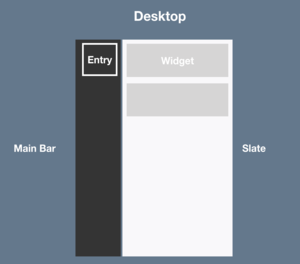
"Main bar" and a "slate" give access to all main navigation points, where a user needs to go to get all relevant informations and working possibilities.
2.3.2 Main Bar
The main bar contains various "entries". An "entry" groups the items or widgets in it. If main bar is open additional content is visible in a "slate". This slate contains appropriate content and functionalities ("widgets").
Behaviour
- If opened, main content will be push together or wrap (like on mobile screens). A "slate" section extends and accordions for navigation entries or other functionalities of this service are shown.
- To collapse the main bar, you can click on a close icon at the bottom of slate or you can click on the glyph in main bar again.
Good default, but customizable
- Sorting can be adopted as system administrator for own installation.
- Number of entries can be adapted by system administrator.
- Sorting decides if they are visible in small screen view (see Page Layout Revision (Mobile)).
The details of such a Customisable Main Bar must be defined separately: Customisable Main Menu
What happens with the current "main menu"?
Which elements are placed in which "item group" is determined in a separate discussion line: Default Configuration of Main Bar Items (ILIAS 6)
What happens with "Overview" page on current Personal Desktop is determined in a separate concept: Overview Personal Desktop Revision
Mockups see: Desktop - Main Bar and Slate
2.3.3 Slate
In a first execution, the slate will often contain links and link collections. However, it should be possible to provide more functions than just links. These are used f.e. by the context-related-entry ("Tools" entry, see 2.3.5), but also by candidates such as the who is online tool.
Also plausible would be e.g. a search field, which makes it possible to search for content within repository trees or learning module trees (needed for help). Furthermore it should also be possible to place content of plugins in a slate.
Mockups see: Desktop - Main Bar and Slate
2.3.4 Tree
To use the repository tree, it is necessary that entries can be viewed and opened in parallel (accordion behavior). But it can also make sense to offer nested trees in a so-called drill-down menu, so that the essential contents are easier to see and do not disappear in a huge tree.
A combination of drill-down and accordion menus is therefore recommended. The first navigation level (f.e. "Repository") mainly offers drill-down menus. If you want to switch to a detailed tree (e.g. "Repository Tree" or "Learning Module Local Navigation") you have to switch to an accordion tree.
Note that the tree behaviour will need to be discussed in detail as soon as the PR for the tree is made: Tree for General Layout and Menu Revision
Mockups see: Desktop - Tree
2.3.5 Local Main Bar Entry "Tools"
- This entry, currently called "Tools", appears as soon as at least one "Context Related Items" has been opened via a trigger from the content section or the header bar.
- The different "tools" can be arranged side by side within the slate ("tabs").
- They are available as long as the user needs them or "closes" them (e.g. Help), or until the content no longer needs these functions (e.g. page editor tools).
- Local Navigation (incl. List of Question in Tests and Taxonomy Trees)
- Help
- Page editor functions
- Assignment tasks
- Conversations
Behaviour: The general "Tools" icon is already displayed in the main bar when you open a tool. If you click on a second tool, it will only occupy an already indicated place. The tool icon in the main bar does not change.
The temporary entry contains elements that have "tool character", but this does not mean that everything that has "tool character" should be put into this temporary entry.
Mockups see: Desktop - Tools and Desktop - Local Navigation
2.3.6 Scrolling Behaviour
The meta bar including breadcrumb remains when scrolling. The main bar also remains. The content slides under the meta bar.
Mockups see: Desktop - Scrolling
2.3.7 Breadcrumb
The breadcrumb has a fixed place in the header area. It is only used on one line. If the breadcrumb is longer than one line, it is shortened (...).
When shortening, make sure that the first node is always visible (f.e. "Repository > ... > Category XY"). In addition, the node that was clicked on should remain visible first or at the very back as a reference.
If the breadcrumb is very long, it may be shortened both after the first node and at the very end of the line. The maximum width of the header is used and as many nodes as possible are displayed.
The arrow icons should no longer be linked. Since these are not clickable anyway, the user should be aware that they cannot be clicked.
Breadcrumb should only appear where it is already shown in ILIAS 5
Mockups see: Desktop - Breadcrumb
2.3.8 Kiosk and Presentation Mode
Exceptions:
- The test is performed in kiosk mode. Then no main bar is displayed. Depending on the setting, a header with minimized display (test title and user name) can be displayed.
- Public blogs and portfolios are displayed without main bar. They will receive a special header (login header).
Mockups see: Desktop - Kiosk and Presentation Mode
2.3.9 Widescreen and Customization
With a very large screen, the content is displayed in the middle. The main bar is displayed on the far left of the screen. Opening the slate has no effect on the content in the middle, while there is enough space (no sliding together).
Mockups see: Desktop - Wide Screen and Custom
2.3.10 Plugin-Slot
A plugin slot for the slate should make it possible to display and offer not only links, link collections and drilldown or accordion trees but also other elements within the slate (e.g. link to portfolio, learning progress display, plugin content, etc.).
Mockups see: Desktop - Plugin-Slot
3 User Interface Modifications
3.1 List of Affected Views
Since we propose a new overall layout, all those sections are tackled to some degree. However the main focus will be on the complete Header Section and on the Left Explorer.
-----------
Header Section
- Branding Section
- Logo
- Main Menu
- Title Section (Name of Application, e.g. ILIAS 5.2 Evaluation)
- Top Navigation (Mail, Search, Help, User Images etc.)
Content Section
- Breadcrumb
- Content Title Section
- Icon
- Title
- Description
- Comments, Notes, Tags, …
- Actions
- Tabs
- Subtabs
- Content
- Sidebar Left
- Center Content
- Sidebar Right
-----------
3.2 User Interface Details


Mockups: Page Layout Revision - Desktop
- Open first mockup.
- Click on "Play" button in the header (right)
3.2.1 Mobile (small screen)
Please have a look at Page Layout Revision (Mobile)
3.3 New User Interface Concepts
- Cockpit including Bar and Slate (Those names are part of the current discussion).
- Notification Center (Name is part of the current discussion).
4 Technical Information
{The maintainer has to provide necessary technical information, e.g. dependencies on other ILIAS components, necessary modifications in general services/architecture, potential security or performance issues.}
5 Contact
- Author of the Request: Seiler, Yvonne [yvseiler], Amstutz, Timon [amstutz]
- Maintainer: {Please add your name before applying for an initial workshop or a Jour Fixe meeting.}
- Implementation of the feature is done by: {The maintainer must add the name of the implementing developer.}
6 Funding
- Universität Bern (University of Bern)
- FH Aachen
7 Discussion
- We would like to know how clicking through the tree could be possible without the need to present more than two indentations (left aligned + one). Matthias made a related suggestion. But there is also the need for opening more than one node at once to administer the course or category.
- We support the suggestion to always show the "Tools" menu item - even if only one tool is available at the moment. In our opinion this is easier to learn and helpful in case of support - except for the case when only one tool is offered at the installation (e.g. no help activated and only local navigation shown).
- We agree that the breadcrumb should only appear where it is already shown in ILIAS 5.
- Point 1: Good suggestion. Note that the tree behaviour will need to be discussed in detail as soon as the PR for the tree is made.
- Point 2: No further discussion needed, will be done as asked by JF.
- Point 3: No further discussion needed, will be done as asked by JF.
Seiler, Yvonne [yvseiler], 10 FEB 2019: I have adjusted the FW entry according to the considerations of the JF from 10 SEP 2018 (see new FW Tree for General Layout and Menu Revision and set it on the JF agenda.
JourFixe, ILIAS [jourfixe], 11 FEB 2019 : We highly appreciate this suggestion and accept to discuss the tree behaviour is a separate feature request as suggested by Yvonne. Page Layout Revision (Desktop) is scheduled for 6.0.
JourFixe, ILIAS [jourfixe], 22 NOV 2019 : We decided on our extra JF today, that the entrance point for the tree view of the repository is called "Repository Tree" / "Magazinbaum" and that the top node of the tree "Repository" shall be hidden.
8 Implementation
Test cases are listed in the respective individual feature requests.
Approval is given in the respective individual feature requests.
TestCases
Approval
Approved at 6.12.2019 by Amstutz, Timon [amstutz].
Last edited: 6. Dec 2019, 17:58, Seiler, Yvonne [yvseiler]