Feature Wiki
Tabs
2017 Concept for Revamping the Page Editor
Page Overview
[Hide]This page is maybe not what you are looking for. Please consult New ILIAS Page Editor.
History and Project Documentation - 2017 Concept for Revamping the Page Editor provides detailed information how we arrived at the suggestions presented on this page.
1 Small Screens
- All editing functionality has to be available on mobile devices, not just a sub-set.
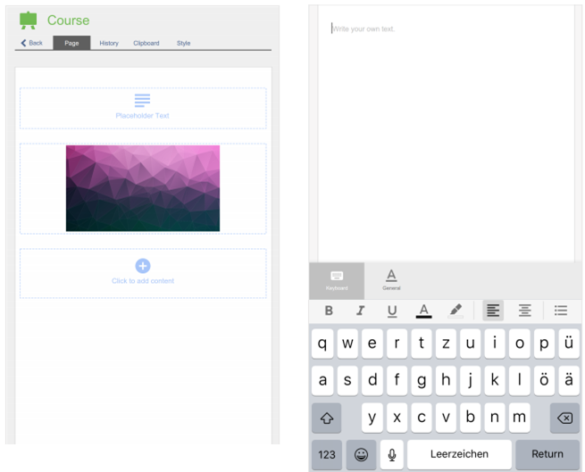
- What is conceptualised as the Sidebar for the big screen devices becomes a full-screen overlay for all content element besides "Text".
- The text editing does not get a Sidebar-turned-Overlay but the text editing gets a screen whose top 2/3 are an editing area and whose bottom 1/3 is a mini-keyboard that has tabs.
- While editing text the formatting should be visible while typing.
- When editing users focus on the editing and are NOT shown the rest of the page that surrounds that very text. Users will "dive" into the text editing.
- We would prefer the character formatting to use glyphed buttons.
- We have not decided on "Save".
- Content is added on the small screen with an Overlay covering the whole small screen. This avoids nasty scrolling issues.
- The Sidebar becomes a full screen controll allowing to devise settings or upload files. This controll is tabbed and free of Icons.
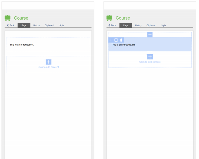
- Tapping on an existing content element provokes the Actions for this element to be presented.
- The Actions are presented by Icons, which are supposed to be a bit bigger than in the current mock-up.
- All elements must be at least twice as high as the Actions-Icons height to avoid that the Action-Icons are overlapping the content element.
- Mobile concept put on hold due to general Page Layout Revision (Desktop). The two projects cannot move ahead without finding common ground: Thinking about the mobile version depends on the leeway there is which can be derived only from the results of the Page Layout Revision (Desktop).
- We will further conceptualize the big screen editing.
- We devise mobile editing concepts for the elements.
2 Big Screens
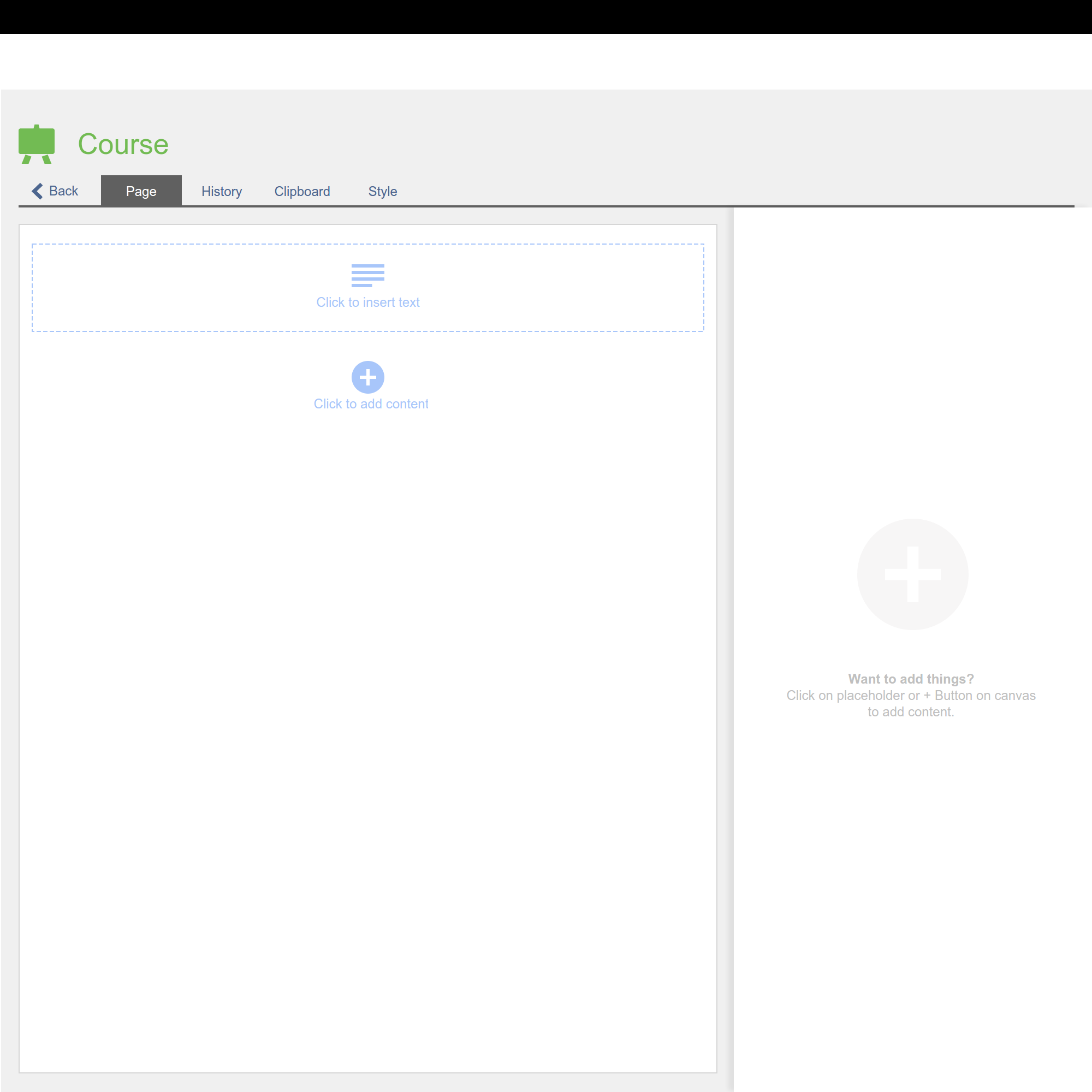
- We want a clean start screen, so user knows what they can do and are not overwhelmed by a host of possibilities.
- On every page there is placeholder for "Text", so users can add text with one click. "Text" is considered the most likliest element.
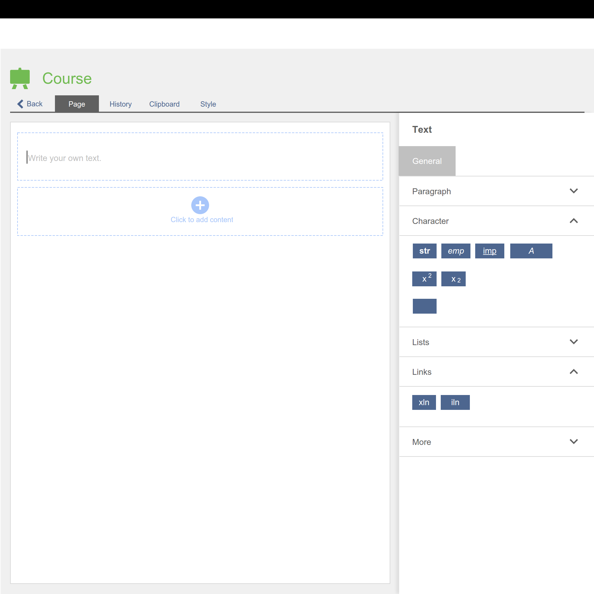
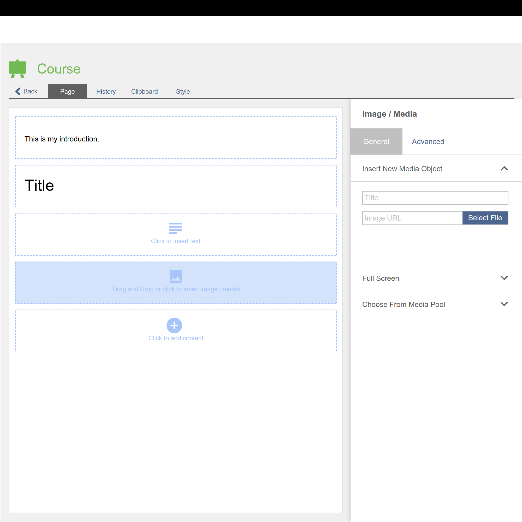
- If user edits content elements, a sidebar on the left-hand side offers all settings in this context.
- Settings could be arranged in accordeons, and if its necessary several tabs offers other functionalities and settings for this object.
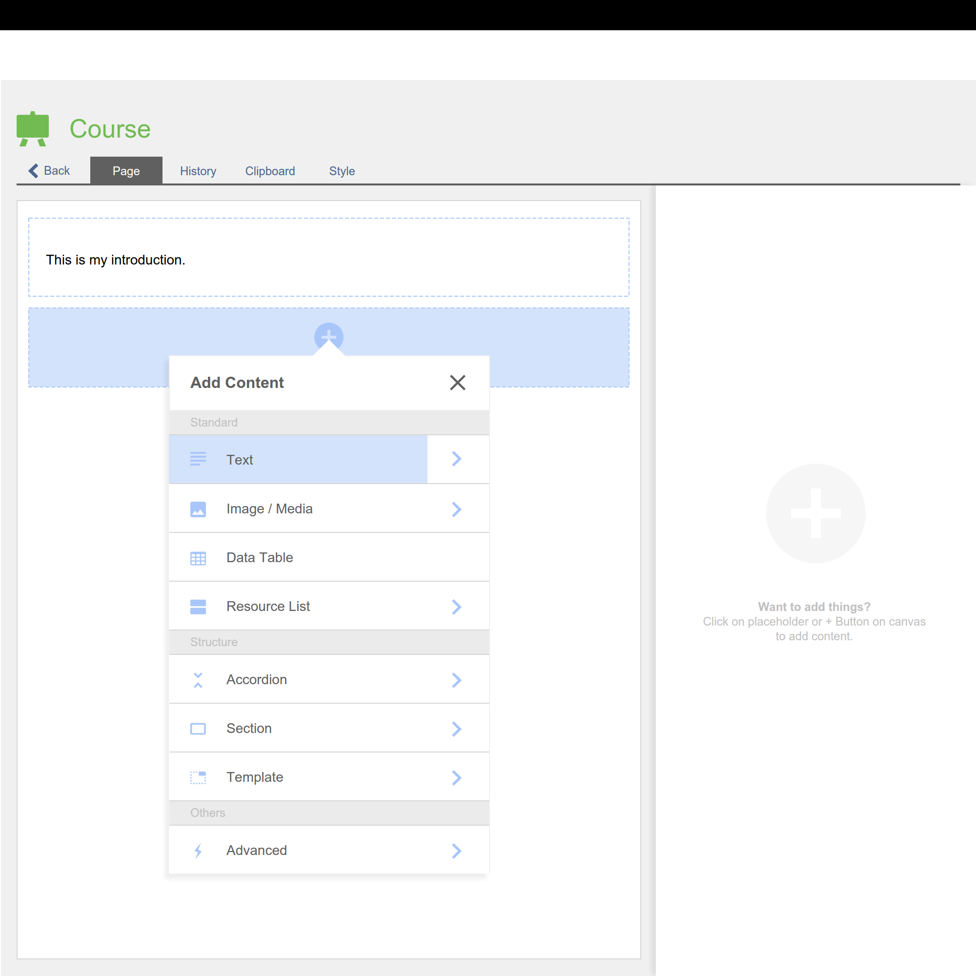
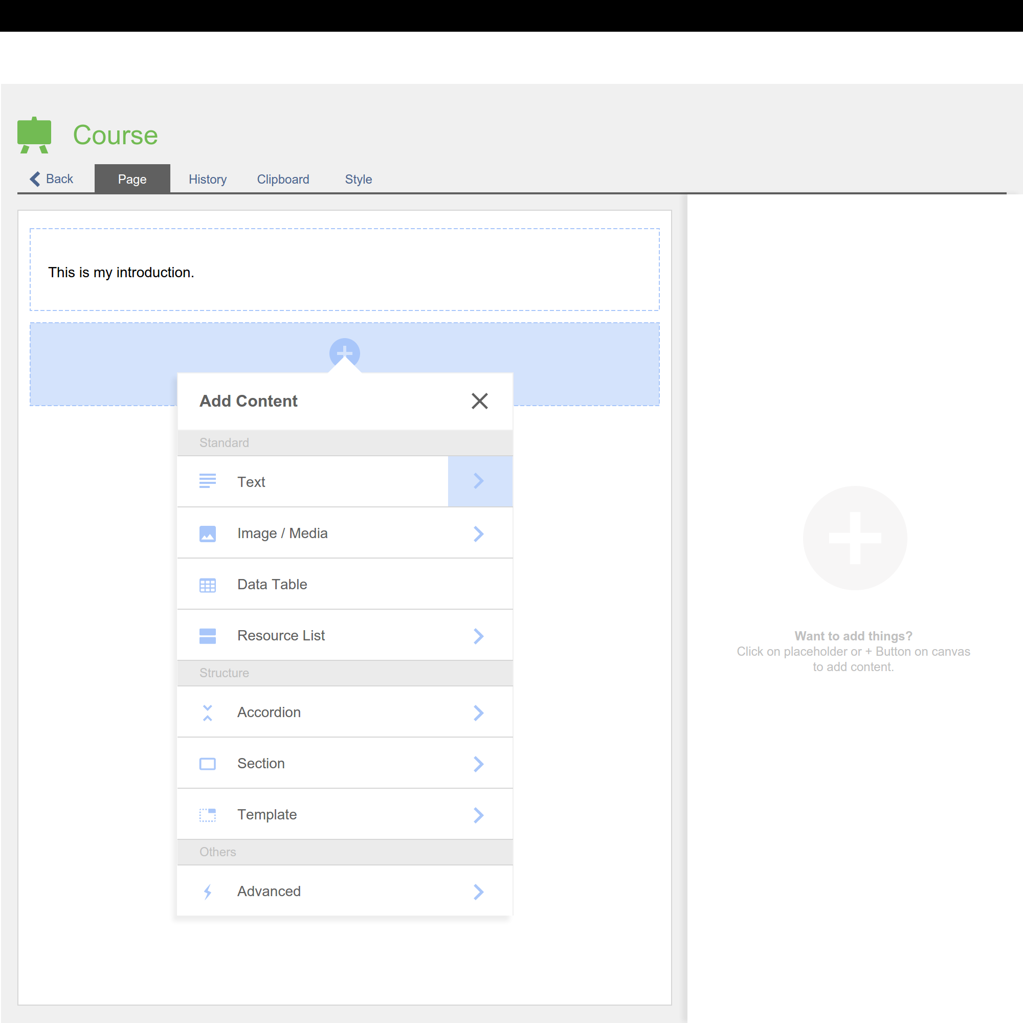
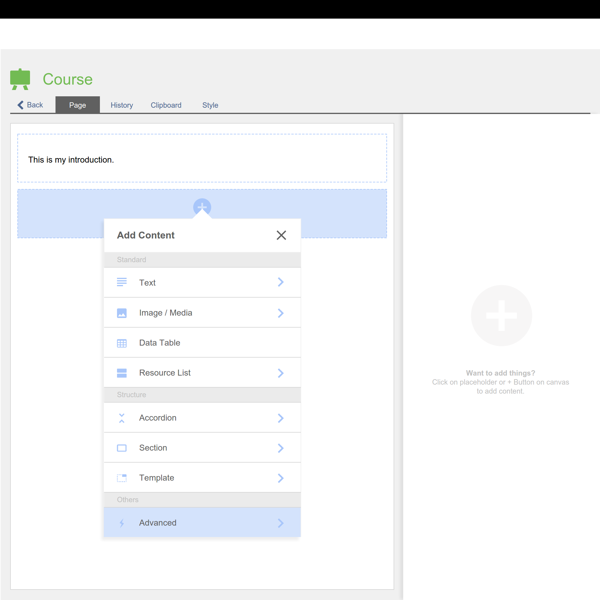
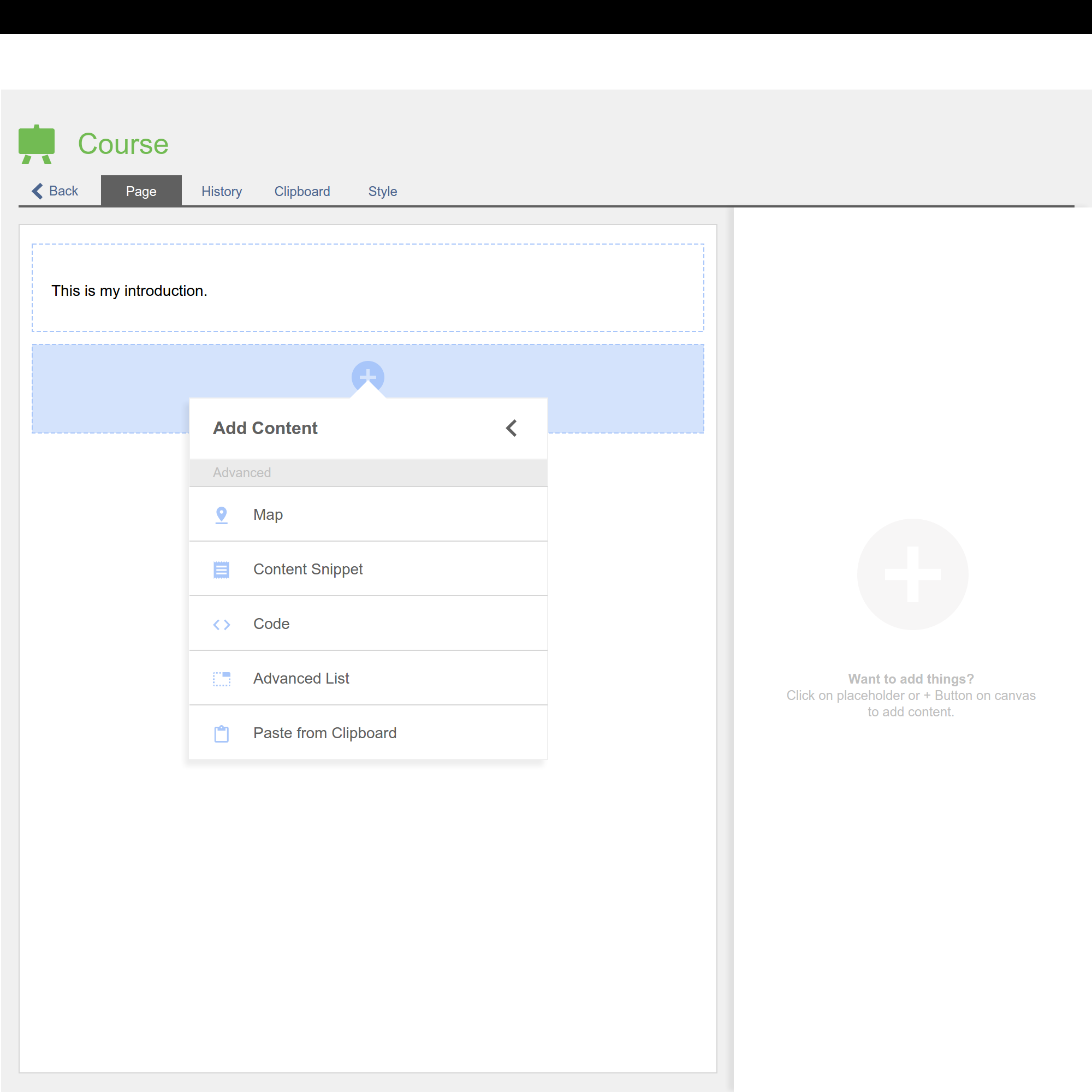
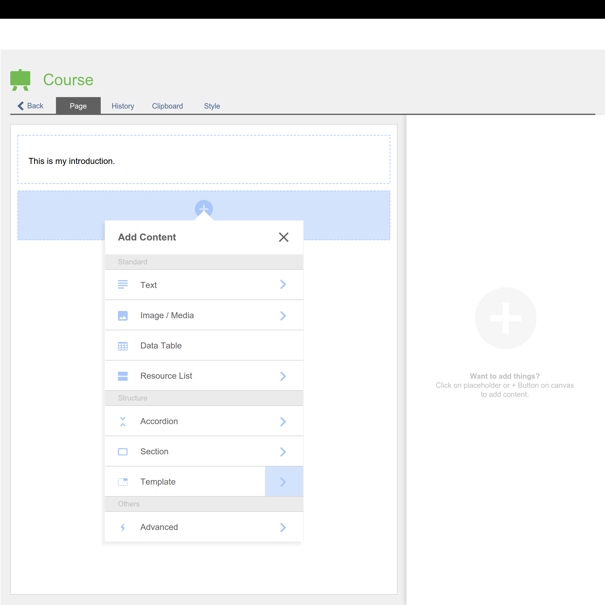
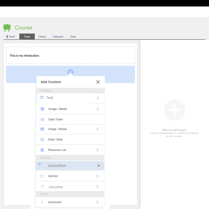
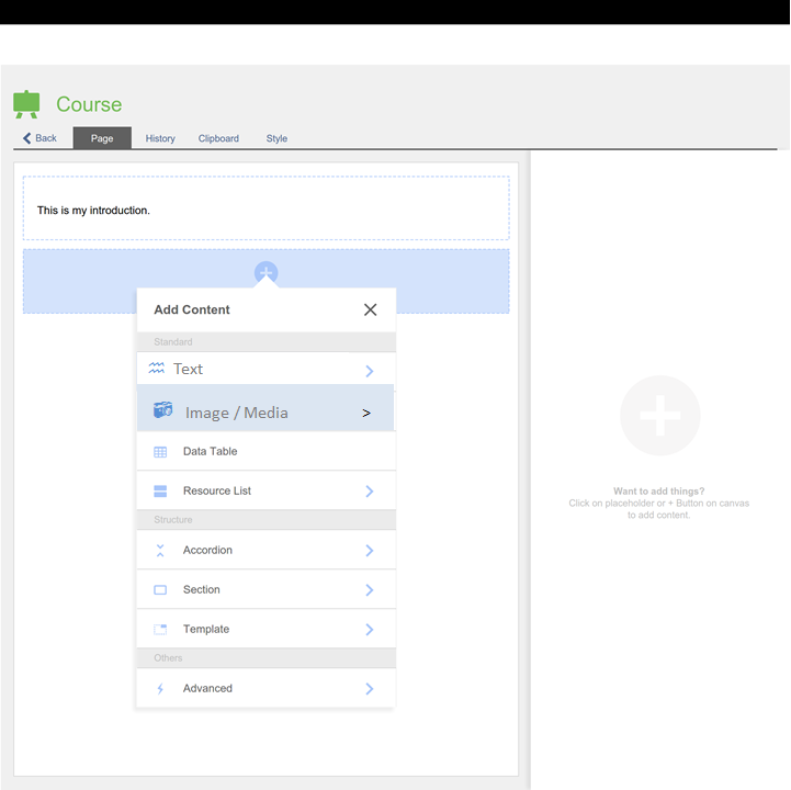
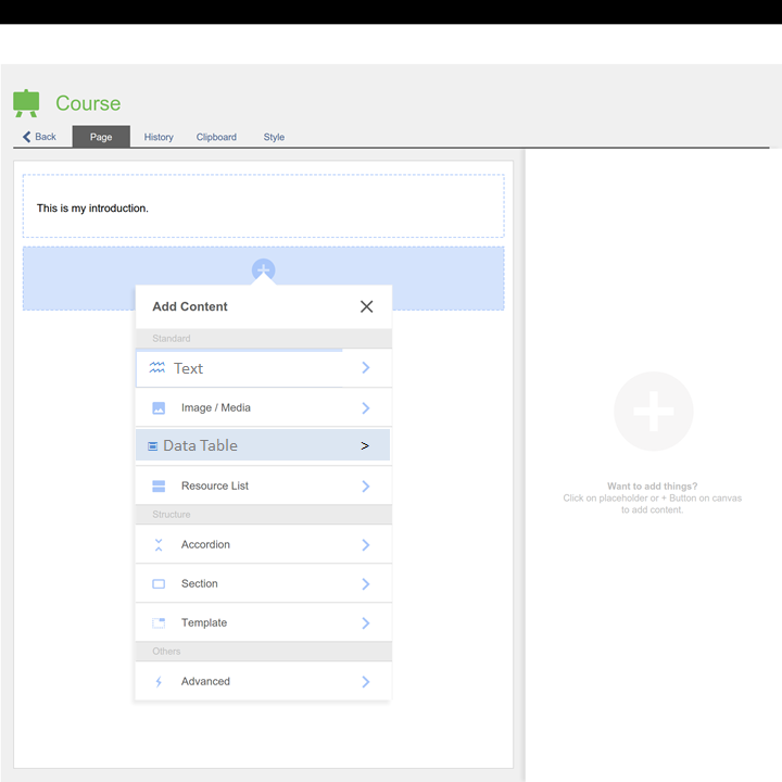
- A add-new-content glyph (+) provokes a drill-down-menu offering content elements.
- Entries of the drill-down are clustered, to support users finding the elements relevant to their objective.
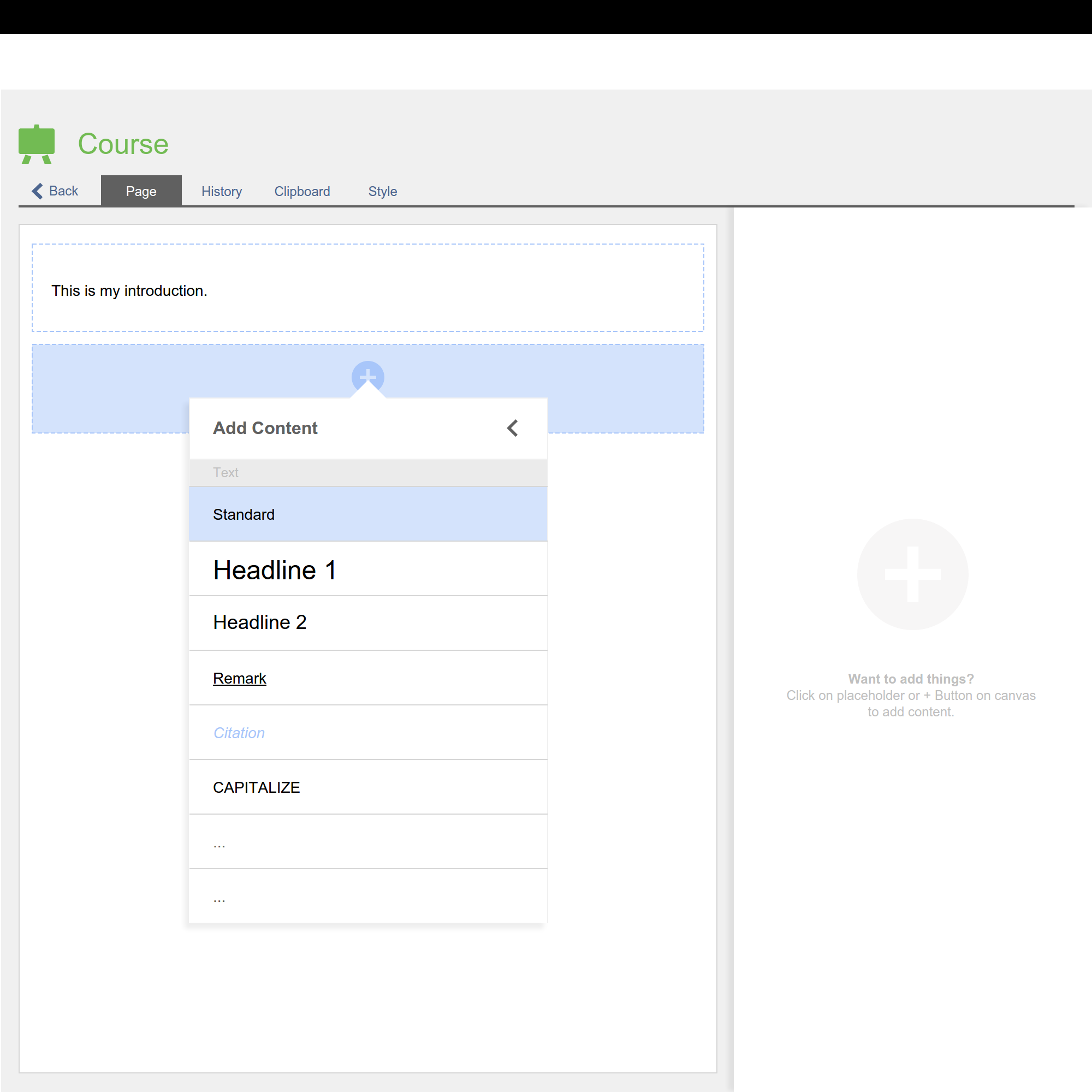
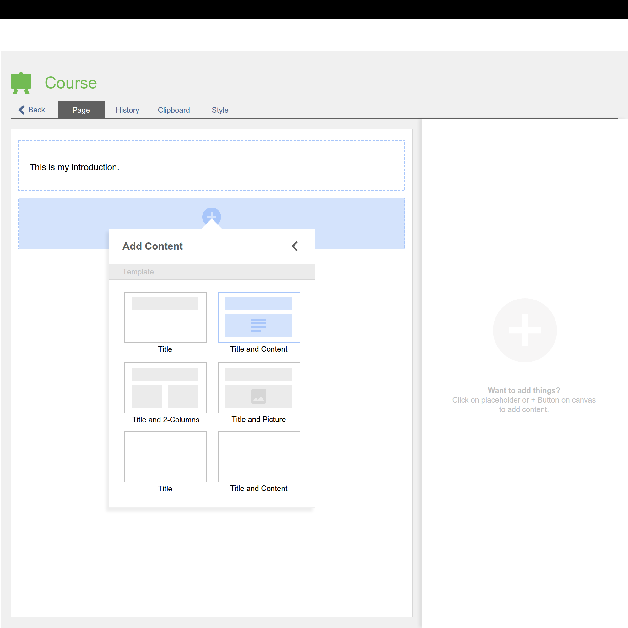
- Either a user adds content element (f.e. text) or drills deeper into the menu (>) choosing a desired type of an element (f.e. paragraph). This allows advanced user to quickly add the specific content element, if several types of this content element is available.
- Content elements which are not used most often, are clustered into a separate group allowing to switch into a deeper level of the menu (drill-down menu)
- We would like to use Mark-Up and Short-Cuts
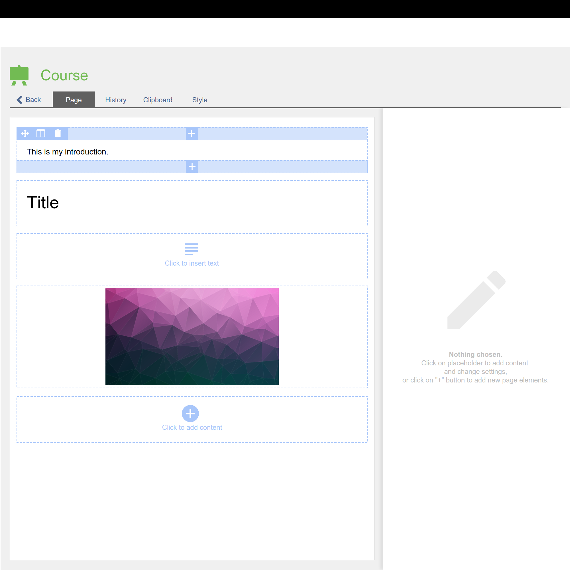
- Existing content is edited by clicking on the content element or placeholder (f.e. image). Whole block is highlighted.
- In the right sidebar the settings are shown and can be changed.
- Settings are clustered into "General Settings" and "Advanced Settings" or further tabs. General Settings are all settings, that are required to set or often used.
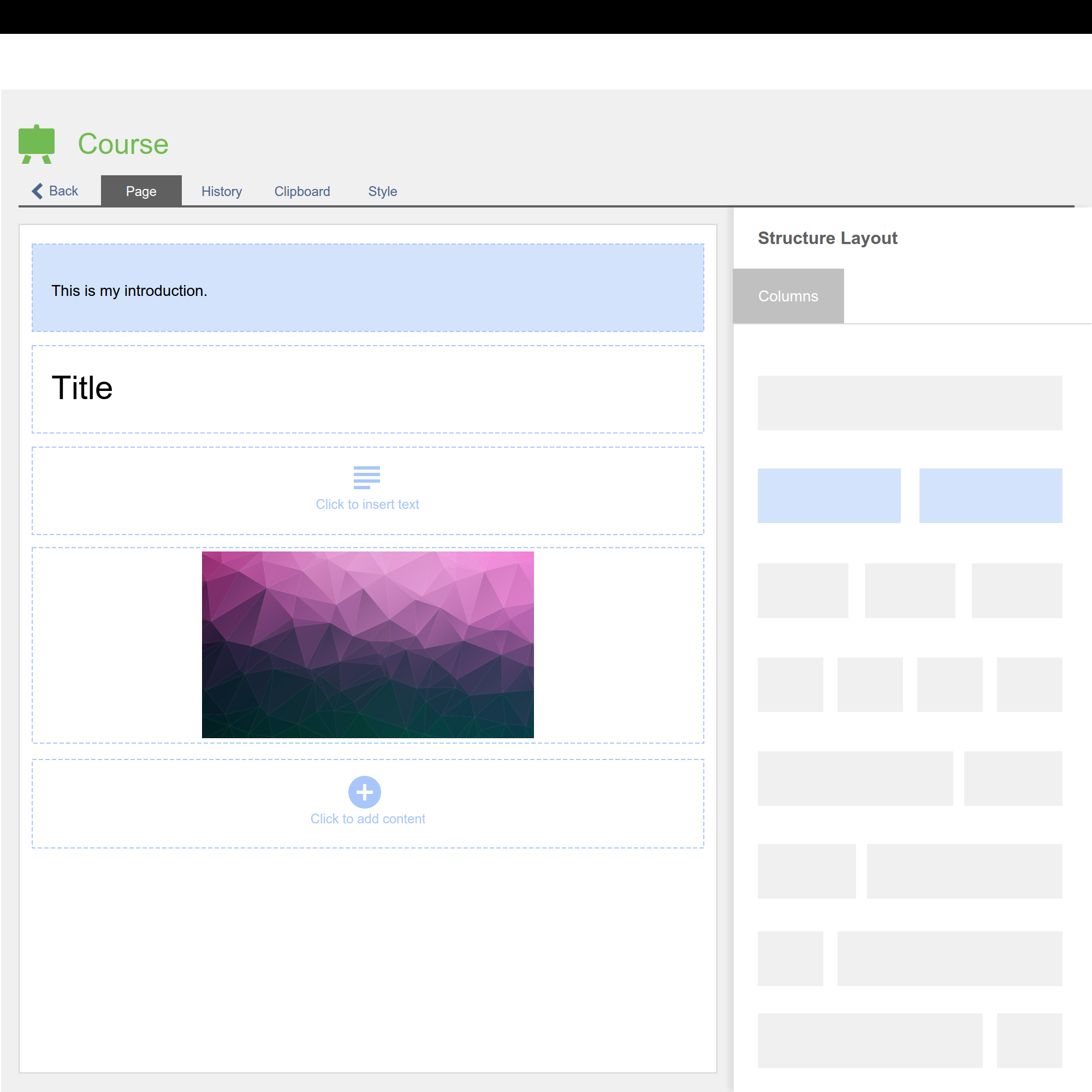
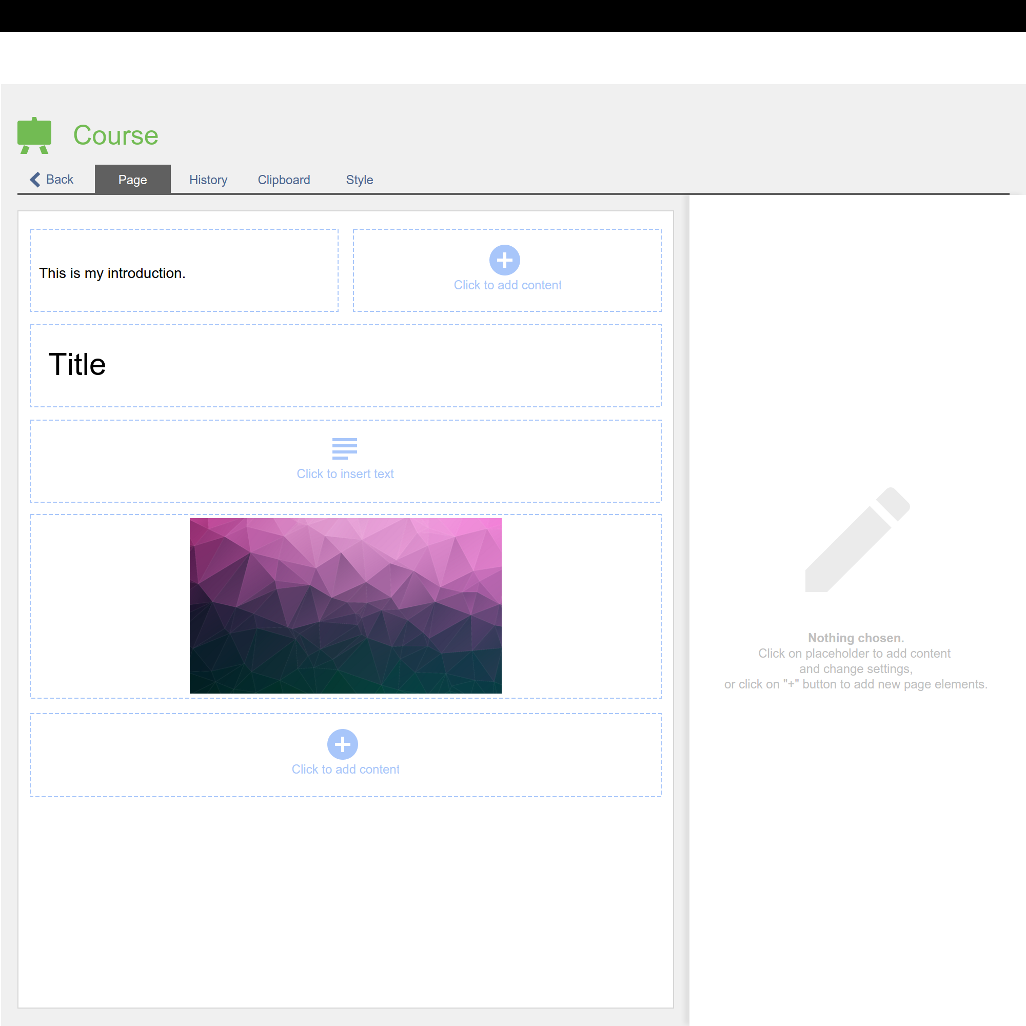
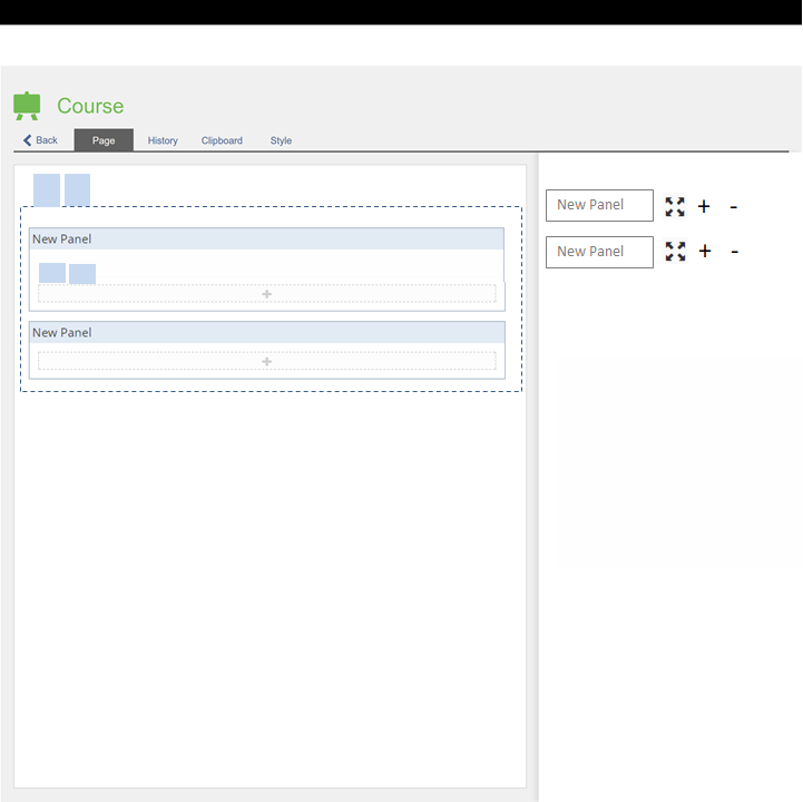
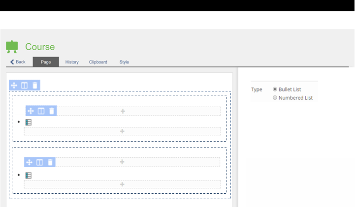
- Users can move, divide and delete blocks over a special mini-menu in the left upper corner of the content block. Divide blocks indicate that users can add columns.
- Users can add more content elements with the add-new-content-glyph (+) above or below an existing block.
- Autosave should save all changes that are made directly without a "Save"-button.
Drill Down Menu for Page Editor
2.1 Structure, Layout and Content
- Structuring Elements are to be comprised in one menu along with the other Content Elements (like Data Table, Resource List).
- Structuring Elements can comprise all other elements. Structuring Elements are:
- Accordion
- Section
- Multi-Column Layout / Grid
- Advanced List (Problembär)
- Structuring Elements should allow for highlighting and drag & drop.
- Adding Column Layouts / Grids MUST NOT be available only after adding an element.
- Page Templates as known from the SCORM Editor are to be available in all instances of the Page Editor.
2.2 Image / Media
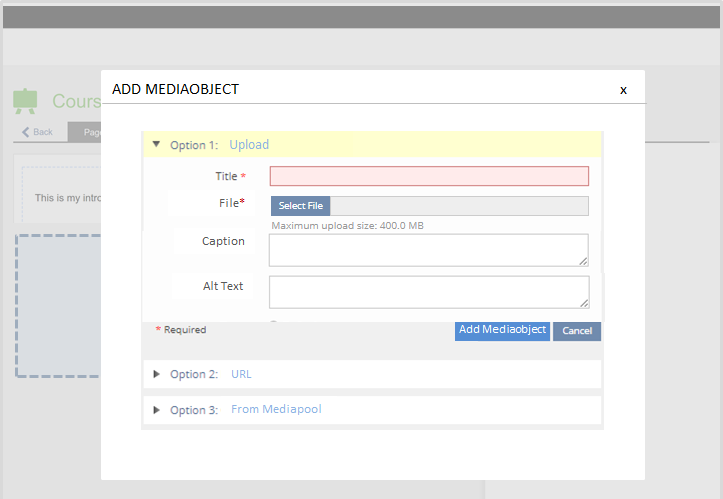
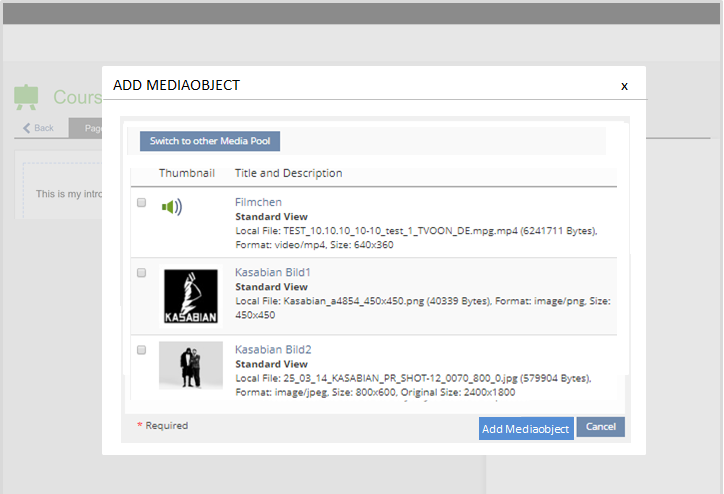
- We want to keep the one and single entry "Image / Media" and not have separate adding-options for a) images, b) video, c) Audio to keep the menue short
- We want that automatically a full screen version (magnifying glas) in the very same size as the media object (as done for the execrise in 5.3)
- Uploading a video should allow for selecting a startpic.
- We refuse to have fixed sizes.
- We would welcome the option to crop pictures.
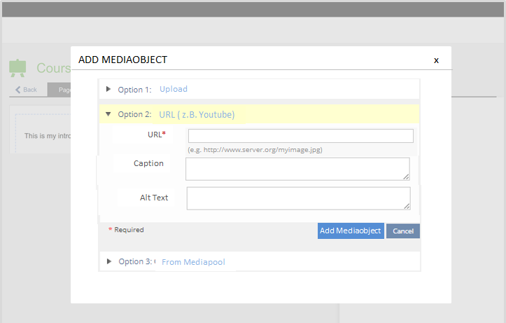
- We would welcome to feature the term "Youtube" in the URL option
- We think about options to transform video to HTML5
- We thought about separating Streaming and URL-options
2.3 Tables
Caveat: The content element "Advanced Table" is no longer offered to be added. However existing advanced tables will remain as they are, but no new ones can be added. Instead of Advanced tables the responsive Column Layout is to be used.
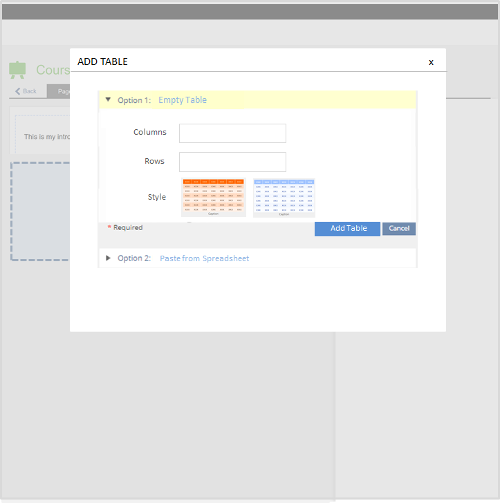
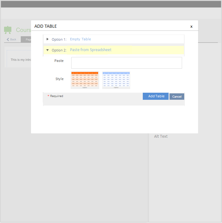
- The pasting from spreadsheets is to be offered much more prominently.
- Google sheets is truely inspirational.
- Whole rows, whole columns and multiple cells should be easy to mark for editing
3 Identified Kitchensink Elements
We have identified the following key candidates
Working Title | Description | Purposes / Possible Uses |
|---|---|---|
Side Bar | The Side Bar could be similar to the current left area with the explorer, but would most probably be presented on the right side. The Side bar could replace current uses of the Round Trip Modal while being less disruptive. The Side Bar does however somewhat conflict with the existing side blocks. |
|
Drill Down Menu | The Drill Down can hold many options and allows for an additional selection of options after selecting the first one. |
|
Trigger Area | Trigger Areas can open drop down or drill down menues. |
|
A sortable list extends a list by adding drag/drop zones / trigger areas for allowing to add/remove elements and to change their order. |
| |
Mini Tabs | Mini Tabs break forms into portions where there is little space. |
|
Mini Forms | Mini Forms are small versions of big forms allowing for inline editing. Mini Forms could be standard forms "in mobile view" (accordion behaviour discussion can be postponed) |
|
4 Next Steps
4.1 Prototype Status March 2019
- Code Organisation of Complex Front End Components (Javascript)
- Client/Server Communication
- Decoupling of (asynchronous) server requests from user interactions
4.2 Envisaged Next Steps (Dec 2017)
- Prepare initial rule sets for KS elements: Side Bar, Trigger Area, Sortable Lists, Mini Forms (End of January)
- Full PR of KS elements including interfaces (Needs funding, possibly end of February)
- Full implementation of KS elements (Needs funding, possibly end of March)
- First Page Editor Prototype based on new KS elements (Needs funding, possibly end of April)
- allowing to add text paragraphs
- allowing to edit text paragraphs
- allowing to add media/images
- Getting feedback on prototype
- Full implementation of first version of new page editor
- Further conceptualisation of content elements are so complex that they may need old school editing (i.e. Image Maps)
- Further conceptualisation of Structure Elements (i.e. get rid of the table in accordion-editing).
Moving forward with the Mobile Concept
Mobile concept put on hold due to general layout revision. It will be furthered once there is a solution for the page layout.
5 Discussion
Schmid, Fabian [fschmid], 2017-09-13: Thanks for the very mature concept, I like it very good! A few hints and questions have come to mind:
• Editing on Mobile Devices: How is the list above the keyboard generated? This seems to me to be very complex UI elements, especially as they are forms and thus actually everywhere where forms are used mobile
• Advanced List: From my point of view much too cumbersome, why not offer as an option for text fields?
• Competition of the mobile edit bar to the TabBar of the page layout revision, these will not work together IMO
All for now, I will be glad to give you more feedback after further thinking from my side.
- Copy-Paste: I wouldn't burry the
pasteaction in a drill-down menu as something advanced. I think the paste action should be a prominent action on the first layer of the action drill-down menu. This seems to be common practice in other UI as well. - We all know that mouse-over is not mobile friendly. But screen-size is not a reliable indicator if you are mobile or not. Some tablets come with desktop-size dimensions - but still don't have mouse-over functionality. IMO a better approach would be to handle touch-events different than mouse-like-events. My understanding is that you can tell by javascript, whether someone is using a mouse-over-capable pointing device (or not). I've often seen a paradigm where mouse-hover-actions are mapped to single-touch events and mouse-click actions are then mapped to double-touch events (or single-touch events, if there is no mouse-hover-action to be mapped).
- It may be impractical to get rid of advanced tables. But that doesn't make advanced tables a layouting tool (like the grid). IMO you could also call it advanced data table. Now my point is: Would it be feasible to merge the current "data table" and "advanced table" into one more general table tool (with advanced and simple editing modes)?
I like this proposal very much and thank you for all the work. Here are just a few things:
- I see two possibilities for the tables: Either we stick to one table-element (the data tables, maybe allowing html in the table cells) or we still have a data and an advanced table but we clearly define the second one as a container element (see below). The second option would always make the table a layouting element, it should just not become an element for column creation. Personally I prefere the first option, but it would mean to take something away from somebody.
- On a few mockups I see the pointer-move-symbol. Please make sure that I don't need to click on it to move the object. That is very annoying :-). Click and hold anywhere on the object should to the trick (I think everybody got used to this by now).
- I really don't like the idea of having a huge white area on the right, when no element is selected. If we keep this idea (and don't make the area disapear dynamically if empty), I would support Alexandra's suggestion of promoting all elements there (I know it is not fully consistent, but I still believe it makes sense).
- I'm still confused about the two different ways of layouting. If I'm understanding correctly you can either use "container elements" or "formatting" after an element is created through the tiny symbol in the left-upper corner. Personally I would prefere to be consistent and stick to the "containter elements"-solution. This might also solve the advanced list issue and allow to put the advanced tables somewhere (see above).
, 2020-03-30: Markdown
I was suggested after posting my initial thoughts on Twitter to also leave them here.
I missed markdown support in general, but especially in the simple text boxes like i.e. "description".
It's a very fast way to apply basic formatting, and having a format supported _everywhere_ is a good way to consistently documentation quality among multiple places. Personally I love it because I can write texts offline and later publish and even later again improve them.
So, my suggestion is to enable markdown where possible, without the goal of interfering or replacing things..
If you wonder about the limitations, there's also an extension markdeep (some javascript/css stuff) that renders math related things.
Myself, to repeat that, I'm concerned just "more efficient" variant - having markdown support in the text boxes.
Last edited: 16. Nov 2023, 17:00, Tödt, Alexandra [atoedt]
