Feature Wiki
Tabs
Revision of consulting hours in portfolio
Page Overview
[Hide]1 Initial Problem
- Typically, consultation hours are offerd once a week or even bi-weekly or monthly.
- Currently the presented grid view requires a lot of space conveying little information.
- The consultation hour slot is small to click at and no specifics for the appointment are displayed.
- The print of the presentation is unsightly.
2 Conceptual Summary
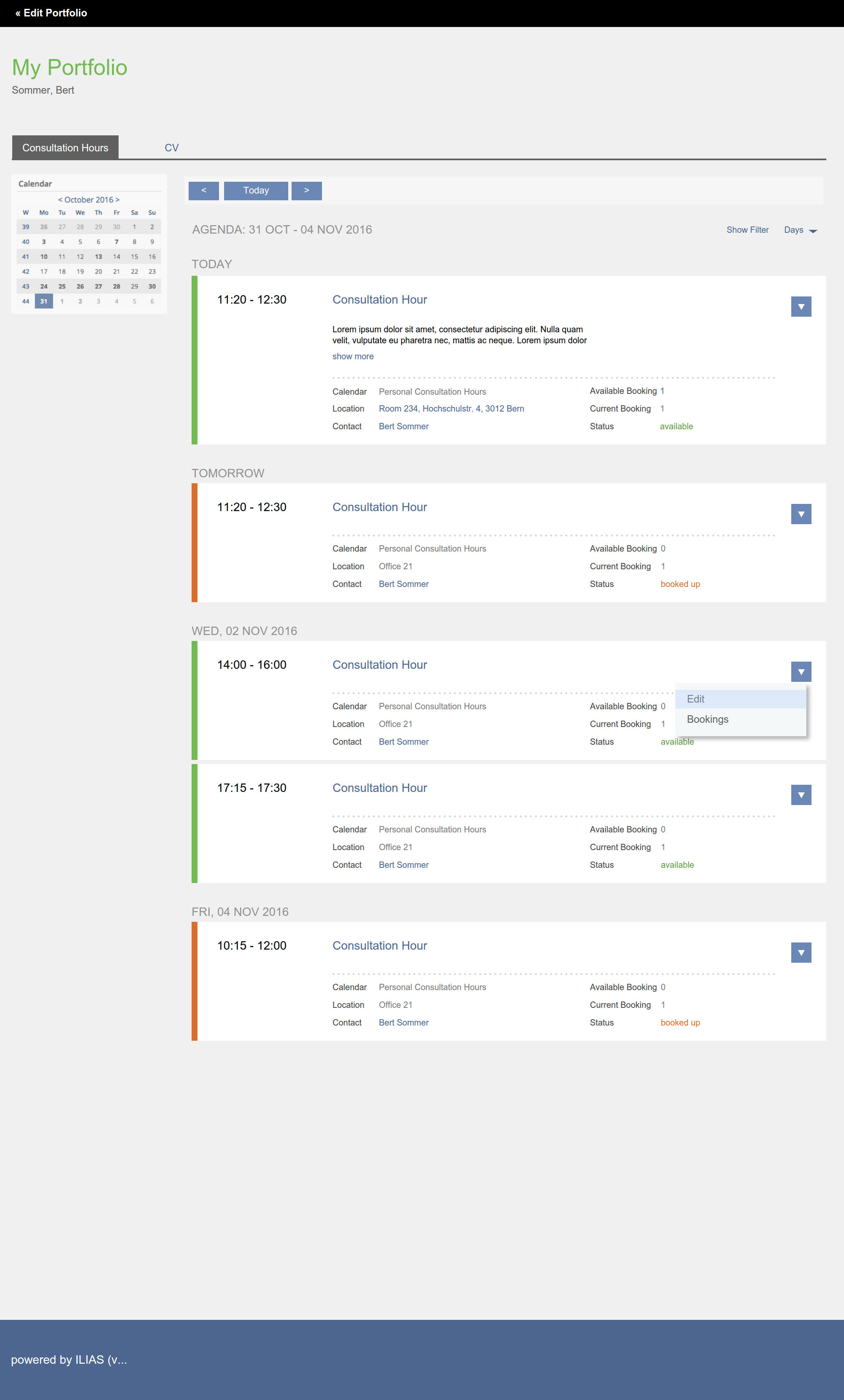
The consultation hours should be presented as list of appointments including as day, time, origin, location, booking status and contact.
3 User Interface Modifications
- The owner of the portfolio and the respective consultation hours sequence is presented with the actions:
- Edit > calling for the form "EDIT MULTIPLE APPOINTMENTS" editing the sequence
- Bookings > calling for the table "BOOKED APPOINTMENTS"
- Assign Users > calling the form "ADD MEMBERS"
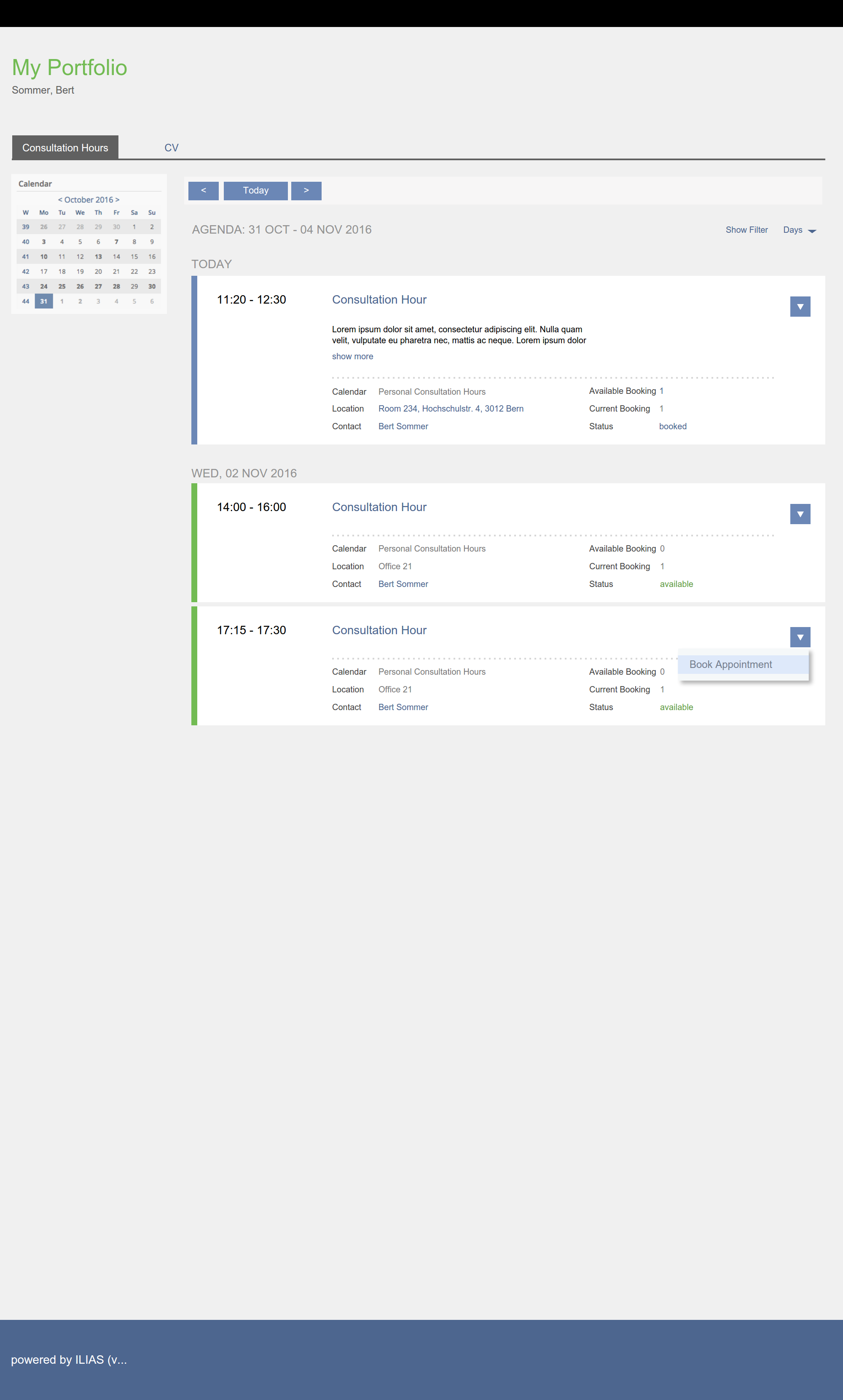
- All users that view the portfolio will be presented only with those slots that are either available or booked by themselves. Slots that are fully booked up by others are not displayed, as it has been in 5.2 and prior.
- For a slot that a user has booked the action "Cancel Booking"
- For a slot that is still available the user has the action "Book Appointment".
3.1 List of Affected Views
- page element "Consultation Hours"
3.2 User Interface Details
Page Element "consultation hours" in Portfolios
- No small calendar grid. (as in 5.3)
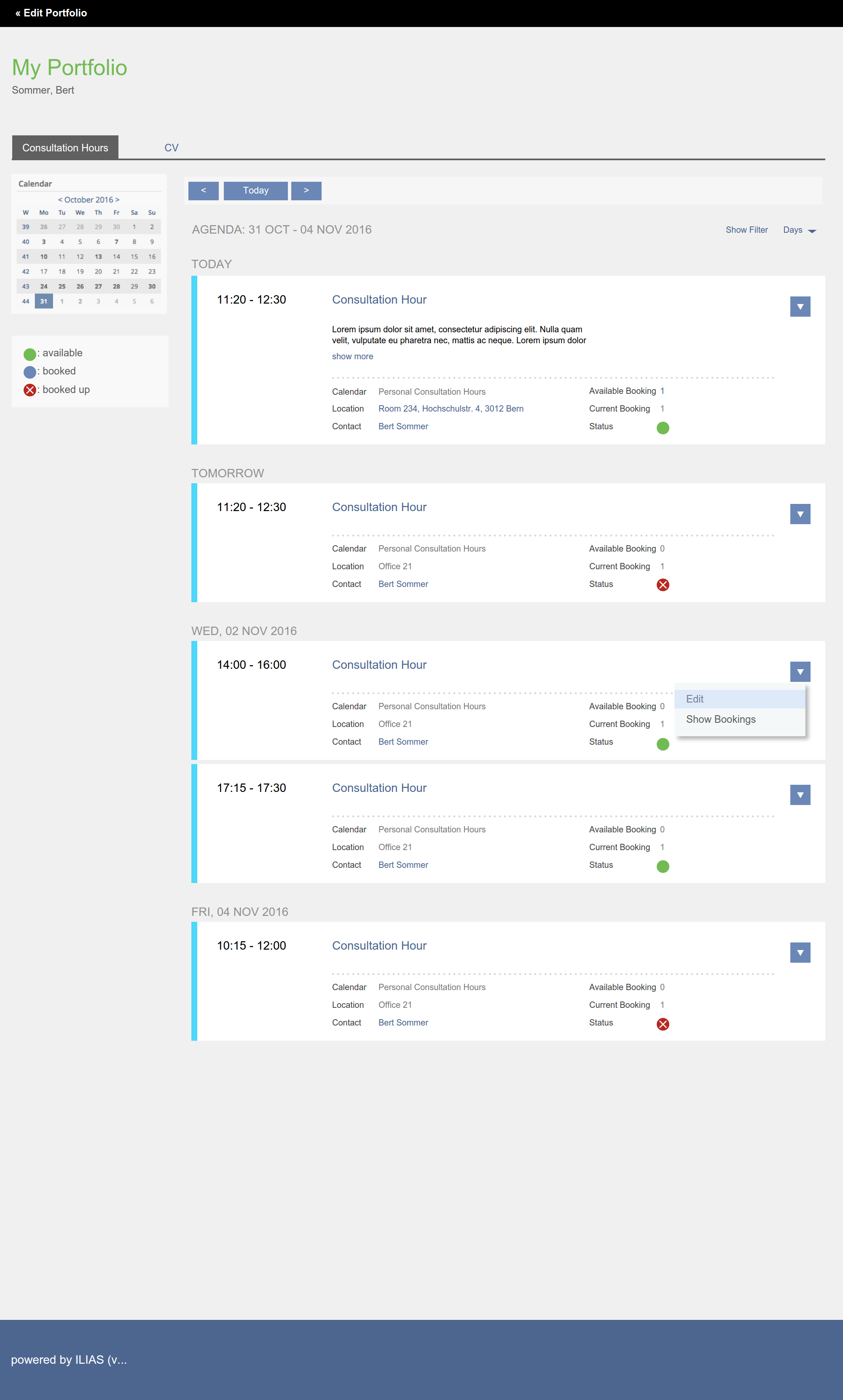
- Use status labels with coloured text (no green or red dot for booking)
- Use the colour of the consultations hours for the line on the left. (No coloured line on the left for status. Such behavior does not exist anywhere else.)
- Note: Colour of consultations hours can not edit. (Apparently a feature.)
- No Filters and no Navigation like in Calendar (as in 5.3)
- Days default is month.
MOCKUP after Discussion with Yvonne and Timon.
3.3 New User Interface Concepts
No
4 Technical Information
The current integration of the consultation hours into the porfolio is quite complex, since it offers the interactivity directly in the portfolio.
5 Contact
- Author of the Request: Samoila, Oliver [oliver.samoila]
- Maintainer: {Please add your name before applying for an initial workshop or a Jour Fixe meeting.}
- Implementation of the feature is done by: {The maintainer must add the name of the implementing developer.}
6 Funding
- possibly Technische Hochschule OWL
7 Discussion
Killing, Alexander [alex], 4 May 2023: The current integration of the consultation hours into the porfolio is quite complex, since it offers the interactivity directly in the portfolio. I would prefer a solution that only presents an overview of upcoming available consultation hours and then links out of the portfolio to the consultation hour main screen (maybe in a course context).
8 Implementation
{The maintainer has to give a description of the final implementation and add screenshots if possible.}
Test Cases
- {Test case number linked to Testrail} : {test case title}
Approval
Approved at {date} by {user}.
Last edited: 4. May 2023, 11:01, Killing, Alexander [alex]


