Feature Wiki
Tabs
Revamp Personal Profile
Page Overview
[Hide]- 1 Initial Problem
- 2 Conceptual Summary
- 3 User Interface Modifications
- 3.1 List of Affected Views
- 3.2 User Interface Details
- 3.2.1 User Profile
- 3.2.2 Administration
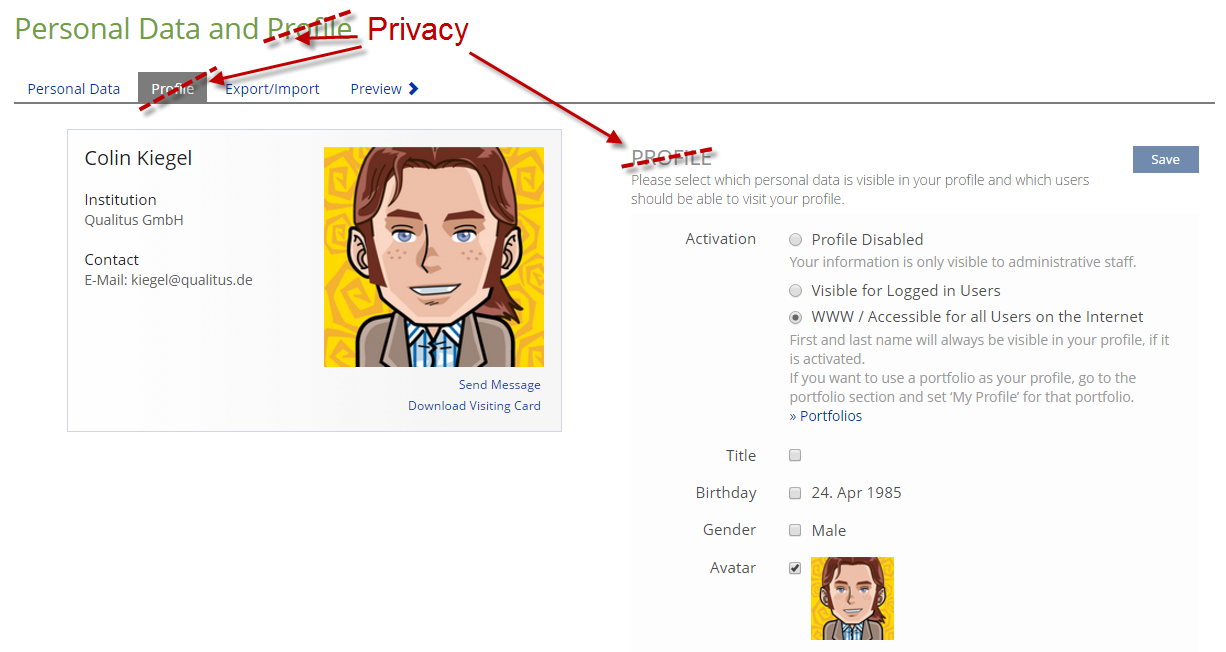
- 3.2.3 Personal Data and Privacy
- 3.3 New User Interface Concepts
- 4 Technical Information
- 5 Contact
- 6 Funding
- 7 Discussion
- 8 Implementation
1 Initial Problem
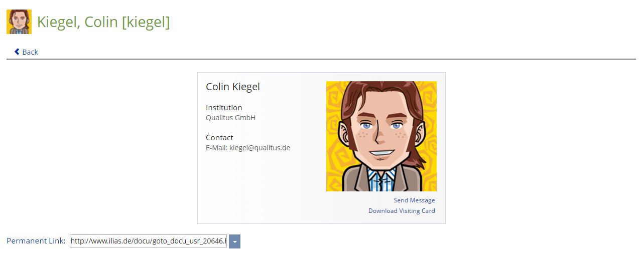
The current profile profile is presented as a visiting card. This metaphor limits the available screen space.
Due to the limitations of the personal profile, many institutions replace it with the portfolio, where users can also present their courses, skills, etc.
2 Conceptual Summary
- It should have a user actions dropdown
- on my own profile: [edit] and [privacy]
- on other profiles: the usual suspects defined by the user action service (e.g. Request Contact, Send Mail, etc.). But not 'personal profile' - because we are already there.
- It should have tabs
- the primary tab will be called 'Info' and show all the profile data which is currently in the visiting card
- new tabs will be defined in separate feature requests
- it should be extensible by other ILIAS components and plugins
- plugins and components should be able to register new tabs, whose privacy settings can be customized by the user
- the Info tab should be organized in customizable clusters of user data fields
- admins can organize user data fields into clusters with customizable titles
- admins can sort fields within clusters
- admins can sort clusters within the columns of the Info tab (left / main / right column like on the personal desktop)
2.1 Related Features and Outlook
- Things to be published on the profile
- Personal Profile Contacts Tab
- Personal Profile Groups Tab
- Personal Profile Social Media
- Personal Profile Motto
- Blog
- Portfolio
- Learning Progress
- more granular control about publishing information (e.g. approved contacts may see more stuff than others, global overrides vor tutors, etc.)
- some rules/conditions when system administrators or other roles may information, even if the user did not opt-in to publish it
- privacy templates
- ilias ships with different privacy templates for user accounts
- administrators can customize these templates and set a default template
- users can choose a template on first login / account creation (or apply a template later)
- the clusters should reorganize in a responsive way (e.g. like http://masonry.desandro.com/layout.html). This would replace the concept of left/main/right column of the Info tab with only one area. Of course, this would be a new user interface concept, that could be reused for other presentations of content with variable dimensions (especially height).
- in place editing: user can edit profile data on his profile without reloading the page (how can the edit mode be triggered from the preview? ...?)
3 User Interface Modifications
3.1 List of Affected Views
- User Profile (and my own profile, i.e. Personal Data and Profile > Preview)
- Personal Data and Profile (renaming the tab "profile" to "privacy")
- Administration > Profile (new category)
3.2 User Interface Details
3.2.1 User Profile
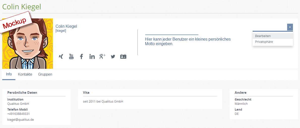
- the user profile image is shown in the top left
- the user actions menu is shown in the top right
- on your own profile you will find the actions "edit" and "privacy" instead
- published profile data is shown in clusters of little boxes (like on the personal desktop)
- additional tabs (contacts, groups, etc.)
- social media icons
- motto
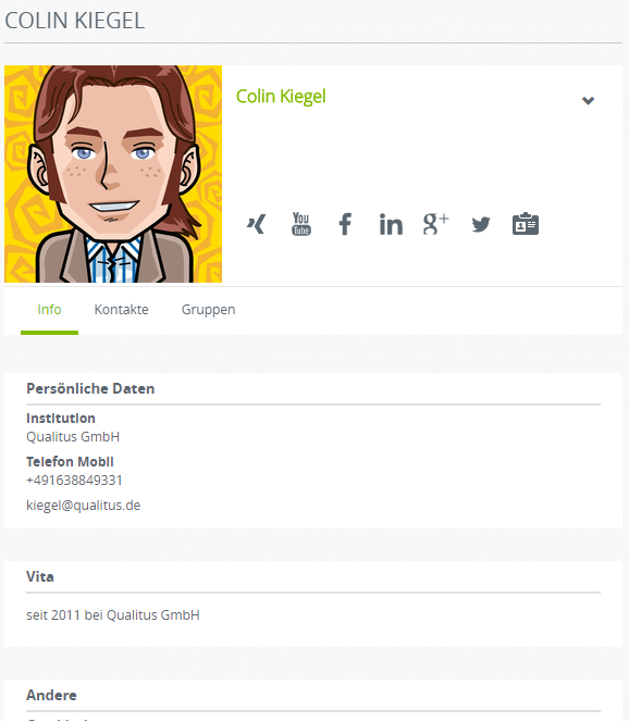
... on small screen devices all info boxes will be stacked in one column
3.2.2 Administration
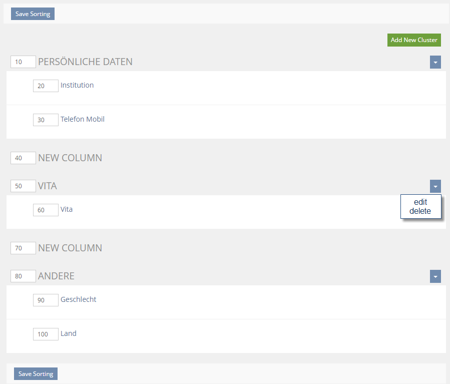
- sortable list of all user data fields and cluster titles
- cluster titles
- are highlighted to make them distinctive from user data fields
- have actions: edit/delete
- have only one editable property: title
- create cluster action
Administration > Profile (new category) > Settings
- should have a link to the clustering settings
- further settings are introduced here by sub-feature requests
3.2.3 Personal Data and Privacy
3.3 New User Interface Concepts
-
4 Technical Information
{The maintainer has to provide necessary technical information, e.g. dependencies on other ILIAS components, necessary modifications in general services/architecture, potential security or performance issues.}
5 Contact
- Author of the Request: Kiegel, Colin [kiegel]
- Maintainer: {Please add your name before applying for an initial workshop or a Jour Fixe meeting.}
- Implementation of the feature is done by: {The maintainer must add the name of the implementing developer.}
6 Funding
If you are interest in funding this feature, please add your name and institution to this list.
7 Discussion
- Conceptual Summary: "it should be extensible by other ILIAS components and plugins“. Please describe the plugin slot further. Where and how can you manipulate screens with this? Can the slot enable users to add additional information? How?
- Conceptual Summary: "the Info tab should be organized in customizable clusters of user data fields“. Please add mockups for those screens or explain verbally what happens in the affected screens. I have a hard time currently to see how this exactly works.
- Related Features and Outlook: Are those just vague ideas or for some parts an aspect of the proposal? If those are just vague ideas you might think about generating an overview page, link this page here and move all information not specifically targeting actual changes here on this overview page to avoid any confusion.
- The mockup looks like a new UI-Component to me. You find the relavant information on how to propose a new UI-Component here: https://github.com/ILIAS-eLearning/ILIAS/blob/trunk/src/UI/README.md#how-to-implement-a-component. You can ask the responsible maintainer or me if you need any help with this.
- Please do not forget the mobile view. How does you mockup look like on small screens?
- Plugins should only be able to define new tabs and would be completely free what they show there. IMO the plugin API will be very small.
- I added a mockup for the mobile view
- I added a mockup of the sorting-approach to define the clusters
- Please note that the sorting approach is based on the UI for sorting a category which contains item groups and sub-items. The mockup is indeed a screenshot with some icons and action menus removed. I would like to argue that it is therefore not a completely new concept if we decide that this is apropriate here.
- This feature wiki page is both the foundation for the revamp and kind of an overview of future extensions (like subtabs). I would rather keep it like this now if it is ok.
8 Implementation
{The maintainer has to give a description of the final implementation and add screenshots if possible.}
Test Cases
- {Test case number linked to Testrail} : {test case title}
Approval
Approved at {date} by {user}.
Last edited: 3. Mar 2017, 14:54, Kunkel, Matthias [mkunkel]