Feature Wiki
Tabs
Background Task Service User Interface
Page Overview
[Hide]1 Initial Problem
The introduction of a new background task service needs a user interface. It is discussed in this feature wiki page.
Deployment of Background Tasks as a General Service
2 Conceptual Summary
Please make sure to only discuss user interface related issues in this wiki page.
3 User Interface Modifications

3.1 List of Affected Views
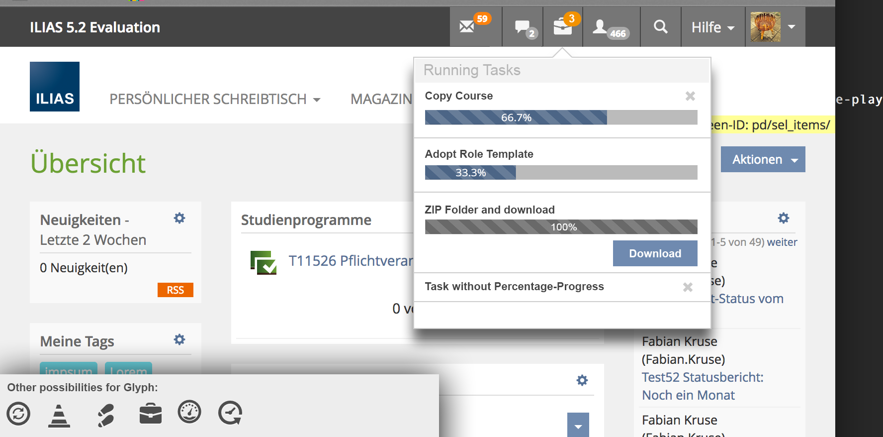
- There will be a new topbar glyph and a dropdown with different entries.
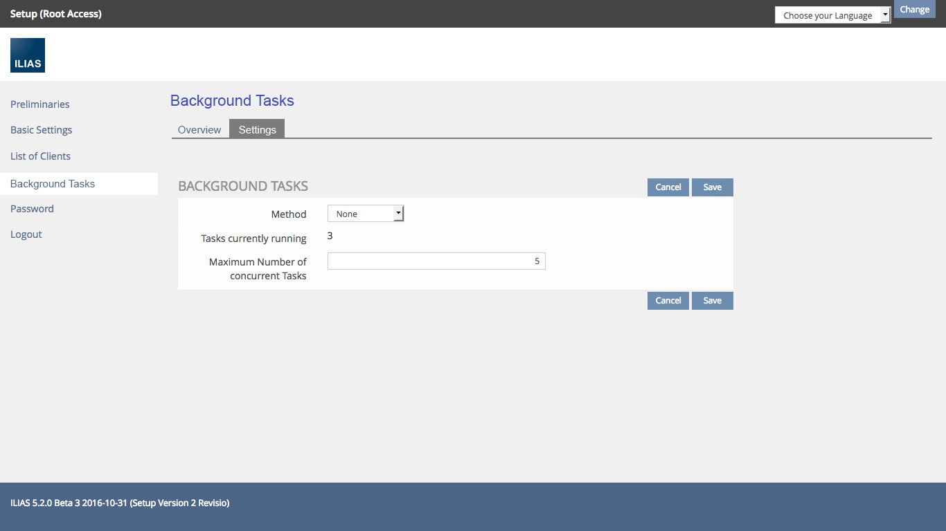
- The setup will get a new Menu Point "Background Tasks".
- The management of background tasks will offer several implementations in the future, where some will need administrative permissions on the server (not only on one client).
- A restart of a server needs the tasks to terminate in order to not leave the installation in an inconsistent state. Thus you need to make sure that no background task is running on the whole system before rebooting gracefully.
- The setting of concurrently running background tasks must be obeyed over all clients.
3.2 User Interface Details
Used UI elements are pop-over, progress bar, button (for user interaction) in combination. If there is funding available we would like to implement as much as possible with the new UI Service.
We need to define a glyph icon, the possibilities are shown in the screenshot.
We suggest the two counters:
- Novelty-Counter: These are the user interactions that are currently available.
- Status-Counter: These are the tasks that are running in the background that currently do not need a user interaction.
Setup-Administration


3.3 New User Interface Concepts
There are in general no new concepts.
4 Technical Information
The technical implementation is discussed in the entry: Deployment of Background Tasks as a General Service.
5 Contact
- Author of the Request: Schmid, Fabian [fschmid]
- Maintainer: Schmid, Fabian [fschmid]
- Implementation of the feature is done by: {The maintainer must add the name of the implementing developer.}
6 Funding
- ...
7 Discussion
AT 2017-01-14: Very few users have permissons to carry out actions that take so long that they have to be relegated to the background. Those with according permissions carry out few actions that have to be relegated to the background.
These few and far between moments do NOT deserve the prominent place suggested in this article. This is one of the most precious pieces of screen estate. It should be used by something that ist important to many / most users in daily business.
Please find another location.
- Zipping and Downloading things
- Copy things
- Things that are running via SOAP currently
- sending a mail to many recepients
- ...
Schmid, Fabian [fschmid], 16.01.2017: I changed the part describing the used counters because they were mentioned as "badges" before.
AT 2017-01-16: I have wrongly thought it would behave like the Chat-Menue, which persists and shows its purpose and shows it is empty (see screenshot). You have been thinking about a control that "jumps in" only if it has content, right?
- show tasks that cannot deliver percentages without percentage on the progress bar
- show tasks that have been finished with a 'checked' icon (similar to copy courses) and
- either show an additional user interaction - if implemented by a task (e.g. 'Download')
- or - in case of no additional user interaction - to remove the task from the list.
- show percentages without decimal values (67% instead of 66,7%).
JourFixe, ILIAS [jourfixe], 16 Jan 2017: We highly appreciate this suggestion and schedule it for 5.3. We would highly appreciate if the list of tasks (combination of UI elements progress bar, close button and button) could become part of the UI service.
25. Januar 2017:
I added the requested mockup for a setup GUI and an explanation why it's placed in the setup and not the administration.
- Forms MUST NOT be used on the same content screen as tables => Place place form an table bellow different tabs.
- Pleace add proper cancel and save buttons on bottom and on top of the forms
Schmid, Fabian [fschmid] Hi Timon
I'm not sure if thoses
rules apply to the setup, too because of the state of the setup we have currently which lack of nearly every application of rules.
Amstutz, Timon [amstutz] 13. March 2017: I see no good reasons why they should not apply in the setup. There is much legacy content there, but this applies for many places in ILIAS (e.g. administration). So we apply rules only for new elements to be added. Especially in this case, I see no reason not to apply them. Can you give any? Btw, precise wirefrimes might also be a valid alternative for mockups, if this is easier for you.
2017-03-28 Tödt, Alexandra [atoedt]: These rules apply to anything newly implemented. There is no indication that these rules are restricted to some soft criteria of visibility. How could this be easily and clearly decided. The criterion is devised to be unambiguous: if it is new, rules apply.
Schmid, Fabian [fschmid] 28.3.2017: :) The discussion is already a bit outdatet, sorry. As you can see the Mockups have already been replaced.
Amstutz, Timon [amstutz] 30.3.2017: Thank you for revising the mockups. The UI concept of this PR in the setup is now a lot better.
8 Implementation
The representation of a BackgroundTask has been implemented as legacy component and not as a specific UI-Service-Component at the moment. This has the following reasons listed beneath. We will provide a UI-Service-Component when we findsolutions to the question we had.
- Unfortunately the planning from our side was insufficient since we missed that there won't be a last JF on 14.08.2017. To propose the UI-Component on JF 28.08.2017 would be problematic in my
- We think that the UI-Service should not hold Items which can be used only one. A specific BackgroundTask-Item currently would have exactly one place: In the Popover for Background-Tasks. Will there be other places such an item could be placed? Currently I see none. Bus as said above, we will provide a UI-Component for BackgroundTasks as soon as possible if needed or if we see a more generic Item.
Besides this there are little differences in the implementation against the mockups above:
- There is no Close-Button in the Tasks since the Taskhandler can not stop running tasks since they are in a possible state wich could leave the system in a broken state (e.g. while recalculating some permissions)
- A completed Task will have a blue Progressbar with the text "Completed" in it since in bootstrap something like a grey or disabled Progressbar does not exist
Test Cases
- The general Feature is tacked by Testxases in Modules such as Calendar (ATM).
Approval
Approved at 15. August 2017 by Amstutz, Timon [amstutz].
Last edited: 28. Aug 2017, 15:19, Schmid, Fabian [fschmid]