Feature Wiki
Tabs
Marginal Grid/List Calendar: Settings-Icon only for changing view mode
Page Overview
[Hide]This feature request is a part of the Calendar Revision.
1 Initial Problem
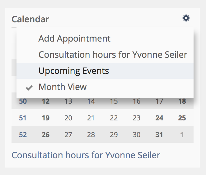
In Marginal Grid/List Calendar of Courses and Groups there are several actions and options in the Settings-Menu. There is no possibility for user to know what's hidding behind the setting icons.

2 Conceptual Summary
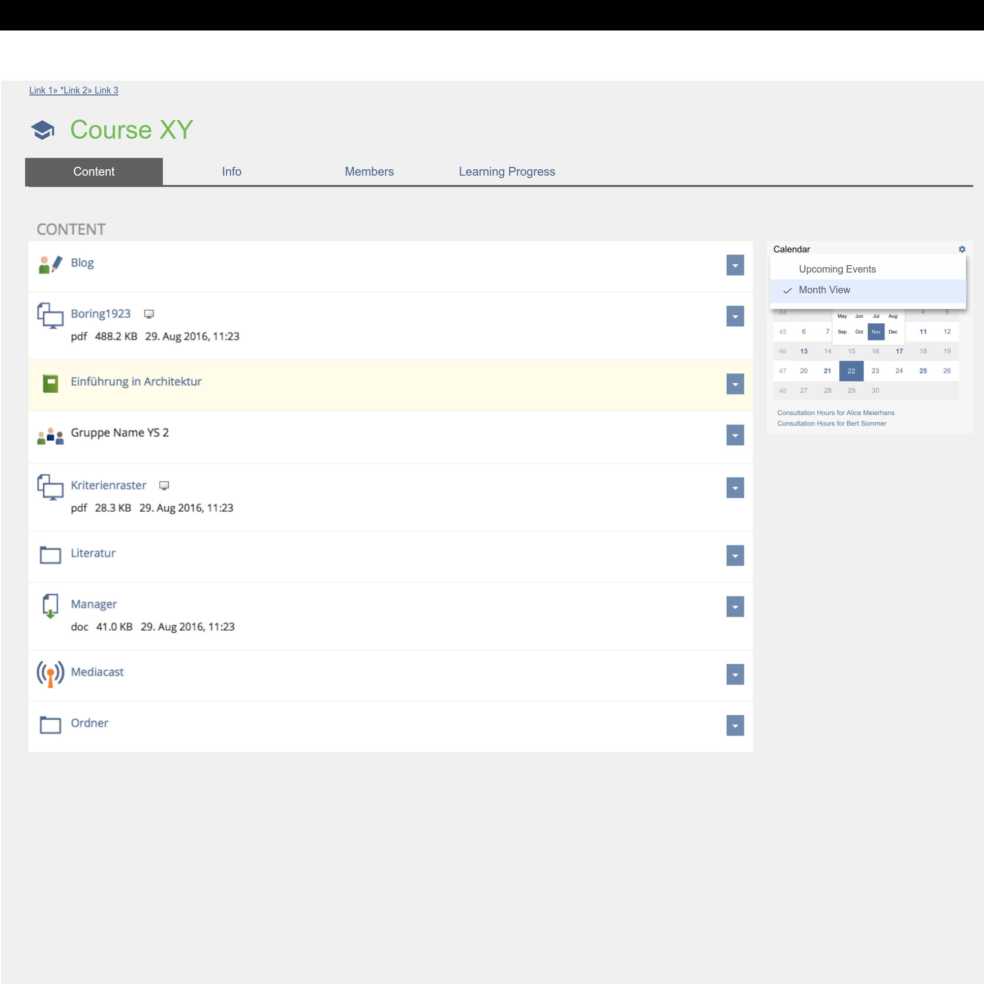
We reduce the Settings-Dropdown to this two options:
- Month View
- Upcoming Events
- Add Appointment
- Consultation Hourse for ...
Option "Consultation Hours for ..." will be removed because it's already visible beneath Marginal Grid Calendar (and in Calendar Selection Box, see Course Calendar: Separate Personal and Course Appointments View).
3 User Interface Modifications
3.1 List of Affected Views
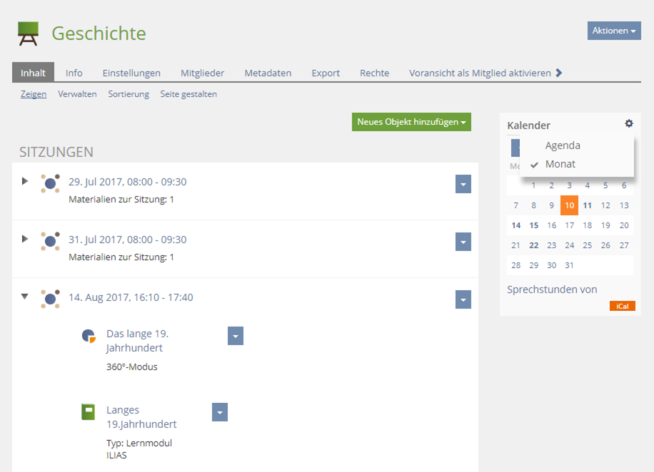
- Marginal Grid Calendar
- Marginal List Calendar
- After opening Main Column Calendar with marginal grid calendar
3.2 User Interface Details
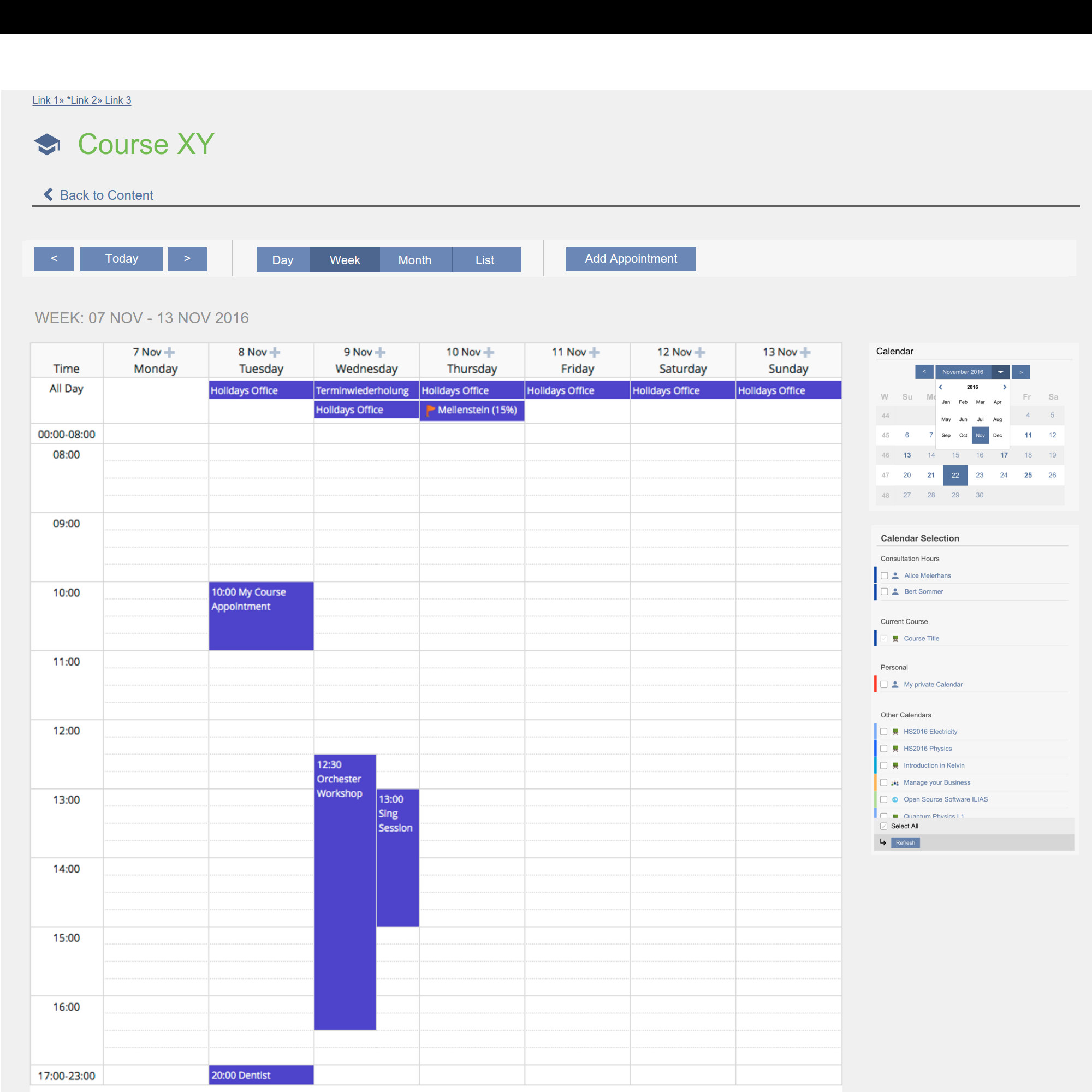
Caution: The following mockup includes implementations (like toolbar buttons "Previous / Today / Next" and button-group for View Mode) from FW Adapted View Handling of Calendar, FW Course Calendar: Separate Personal and Course Appointments View and new Marginal Grid Calendar from FW Usability Improvements Marginal Grid Calendar.

3.3 New User Interface Concepts
There are no new UI components in use.
4 Technical Information
No technical issues.
5 Contact
- Author of the Request: Seiler, Yvonne [yvseiler], Amstutz, Timon [amstutz]
- Maintainer: Meyer, Stefan [smeyer]
- Implementation of the feature is done by: {The maintainer must add the name of the implementing developer.}
6 Funding
- ...
7 Discussion
Meyer, Stefan [smeyer], 09-01-17: I support this idea.
JourFixe, ILIAS [jourfixe], Jan 09, 2017: We highly appreciate this suggestion and schedule it for 5.3. But we won't remove the 'Add Appointment' action and prefer to keep it in the list but clearly separated from the view toggle or - even better - to offer a button for it under the mini calendar (as there is not enough space in the mini navigation toolbar on top). @ Timon: could you provide a possible solution for option 2?
AT 2016-01-26: We will have a separator to visually divide the Action "Add Appointment" from the two other entries in the drop-down.
8 Implementation
Test Cases
Approval
Approved at 11. August 2017 by Amstutz, Timon [amstutz].
Last edited: 22. Aug 2017, 10:02, Seiler, Yvonne [yvseiler]


