Feature Wiki
Tabs
Usability Improvements Main Column List Calendar
Page Overview
[Hide]This feature request is a part of the Calendar Revision.
1 Initial Problem
- does not show all relevant data of an appointment.
- for further details users must open the detailed view.
- the table does not cater to mobile devices.
- only shows appointments in the future .
2 Conceptual Summary
- to show all relevant data and remove irrelevant data.
- for information on upcoming events can be grasped at the first sight.
- and gets a presentation that works on mobile devices.
- so users can view appointments from the past as well. Thus the label “Upcoming Events” should be changed to “Agenda” / “Terminübersicht”.
2.1 Appointment List Item
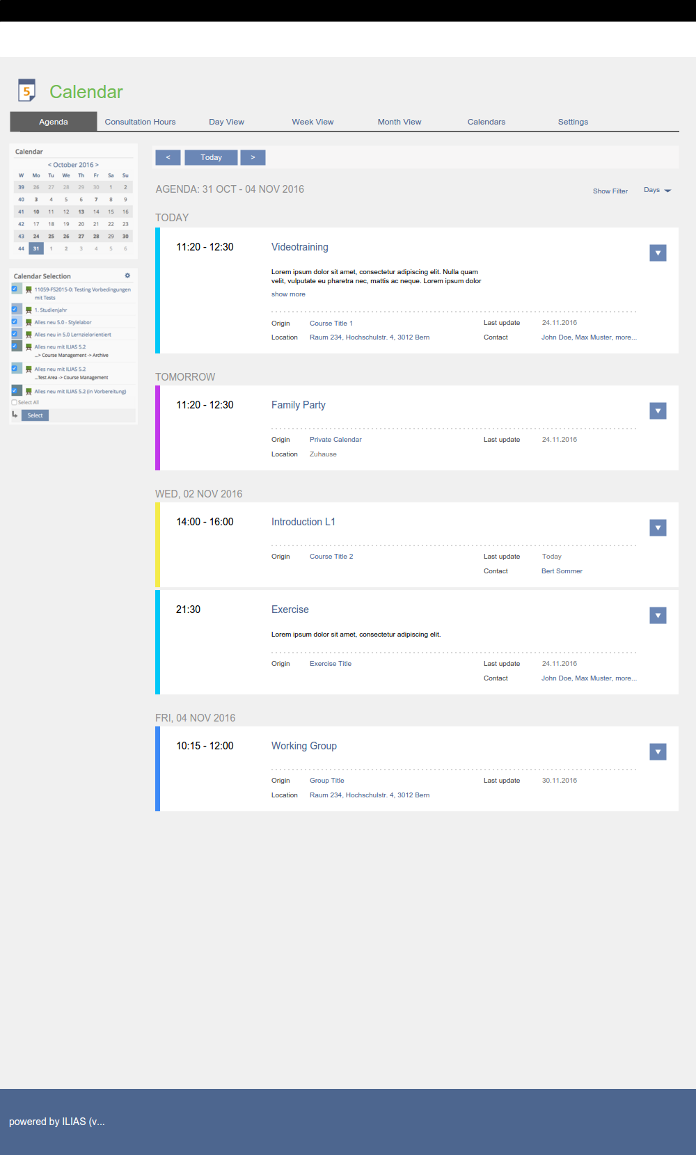
The content of “Main Column List Calendar”'s table is migrated to a new interface element "Appoinment List" comprising "Appointment List Items". Most table entries are migrated to this Appointment List Item, the only exception is "Recurrences OK" because it is not informative to users.
Content of Appointment List Item
Color | Time from ... until ... | DATE AS APPOINTMENT ITEM HEADLINE: WEEKDAY, DD. MONTH YYYY
- - - - - - -- - - - - - -- - - - - - -- - - - - - -- - - - - - -- - - - - - -- - - - - - -- - - - - - -- - - - - - -- - - - - - -- - - - - - -
|
The specific data types are outlined in the article Detailed Appointment as Round-Trip Modal.
Open issue:
2016-12-15: For some labels we aren't yet sure which one would be better. F.e. "Source" (german: Quelle or Herkunft) instead of "Origin".
- The date headline is displayed only once if several appointments are on the same day.
- Clicking on the title of an appointment it will open a Round-trip-Modal comprising the detailed view.
- Recurrent appointments are displayed as individual Appointment List Items.
- If session has no title (but calendar appointment needs one) calendar should display "Session" in Title field.
- There is required content of an Appointment Lits Item, which is displayed above the dotted line. Additionally there might be optional content organised in a key value fashion.
2.2 Working with the Appointment List
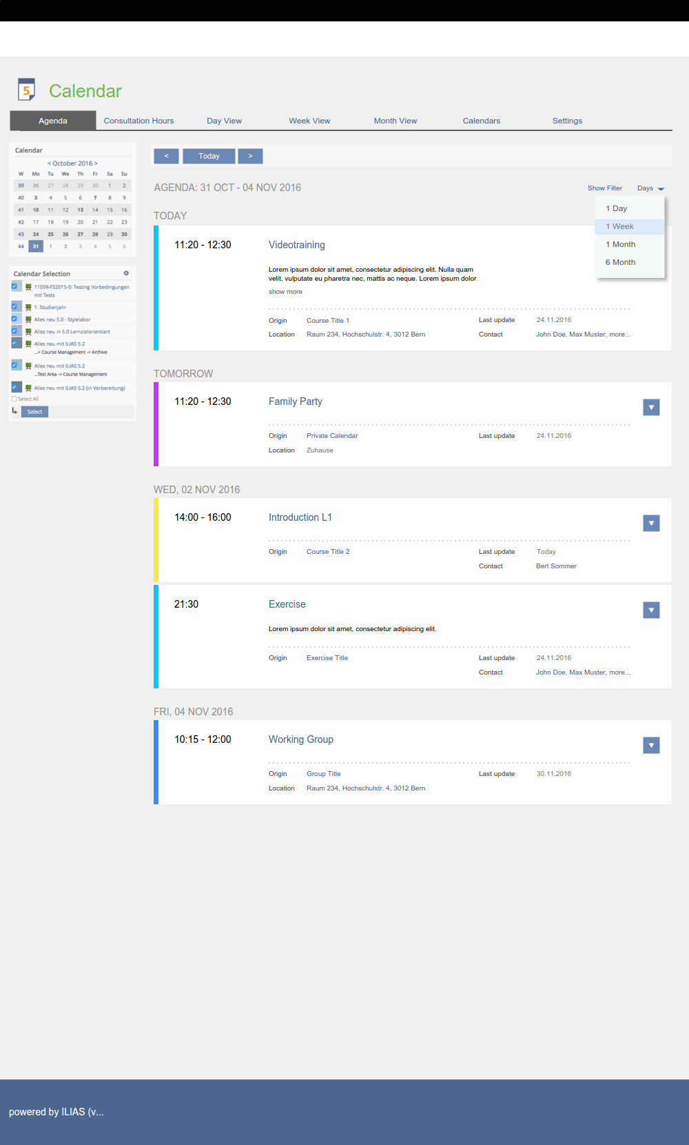
Filters are displayed on top of the Appointment List with a "Show Filter"-control above the list.
- "Title" (Text Input Field)
With selector "Days" (dropdown) user can choose how many Appoinment List Items are presented on one page:
- 1 Day
- 1 Week (default)
- 1 Month
- 6 Month
3 User Interface Modifications
3.1 List of Affected Views
- In menu Personal Desktop: After clicking on menu “Calendar” and open first tab “Upcoming Events”.
- Clicking on a calendar in "Calendar Selection" box and see appointment details.
- Clicking on tab "Calendars" (on Personal Desktop > Calendar): After clicking on Calendar Title to open Calendar Details of a calendar and see appointment details.
- If FW Adapted View Handling of Calendar is accepted
3.2 User Interface Details
- If session has no title (but calendar appointment needs one) calendar should display "Session" or "Session of Course XY" in Title field.
- Adapt design of Appointment List (see Mockups)
- Includes to add a "Day" menu to select numbers of days.
- Includes to add a "Show Filter" menu and filter options to filter for "Title" (Text Input Field) and "Origin" (Dropdown).


- Default Content in Mobile: Weekday, Time, Title, Location (if applicable), Action .
- "Show more" shows everything else

- Calendar Details needs a change too (from table to list), see FW Calendar Details.
3.3 New User Interface Concepts
Appointement Listing Panel: https://github.com/ILIAS-eLearning/ILIAS/pull/399
Killing, Alexander [alex], 30 May 2017:
Update PR Appointement Listing Panel: https://github.com/ILIAS-eLearning/ILIAS/pull/543
Extracted PR Drop Down: https://github.com/ILIAS-eLearning/ILIAS/pull/544
4 Technical Information
No technical issues.
5 Contact
- Author of the Request: Seiler, Yvonne [yvseiler], Amstutz, Timon [amstutz]
- Maintainer: Meyer, Stefan [smeyer]
- Implementation of the feature is done by: {The maintainer must add the name of the implementing developer.}
6 Funding
- ...
7 Discussion
Representation: List vs. table:
Why should "upcoming events" be displayed in table and not in list? List would be better for mobile view like repository view.
- Requirements for List View: clear view, should have filter, optionally de-/activate informations (clustering nice to have)
- Table view can't bundle appointments as a "day", every row is an appointment. List view could bundle appointments to days. "Previous" or "Next" button should navigate to the next day or week or month, not to the next appointment (f.e. if a day has several appointments).
- If Table
- Table columns can be de-/activated
- Table for mobile must have a default for minimum columns (f.e. date and title)
- If List
- How informations could be de-/activated?
- How handle with "Rows"?
- Weekdays could be displayed as block titles, evt. side-by-side like google calendar
Filter would be better than sorting (often users sort because of missing filters).
Information: Title vs. Origin
What is "Title" (can't be empty!), what is "Origin" in each appointment-created object (f.e. session)? Timon und Yvonne make a suggestion for a guideline for "Title" and "Origin".
Icons
- For "previous" and "next" buttons glyphs will be used.
- Use icon from "Administration" as icon. In the future it should be discussed to get an icon for every service in "Personal Desktop" menu. It should also be discussed, if in dropdown "Personal Desktop" all icons will be shown like in "Repository" and "Administration" tabs.
- Change "Assigned Appointments" view to new list view instead of table view?
- Remove Column "Recurrences"?
- Add Color of Calendar in Appointments?
Meyer, Stefan [smeyer], 09-01-17: I support this idea.
- to substitute 'Origin' and write 'Calendar' instead. Clicking on the title leads you to the calendar that contains this appointment.
- to open the course or group or... with the first button on the modal / top action in the action menu as this is a very important action.
- to have a button / action to save the appointment in my local calendar (in iCal format)
8 Implementation
Test Cases
Approval
Approved at Juli 28th 2017 by Amstutz, Timon [amstutz].
Last edited: 1. Aug 2017, 15:00, Tödt, Alexandra [atoedt]
