Feature Wiki
Tabs
Page turning for blog
Page Overview
[Hide]1 Initial Problem
Blog software usually offers users the option to go to the next or former page. The ILIAS blog doesn't. The only option to navigate is the list of entries in the right column. And this list is currently restricted to a defined number of blog postings, so users need to click on the shown month to navigate backwards in the blog's history. This navigation concept could easily be improved.
2 Conceptual Summary
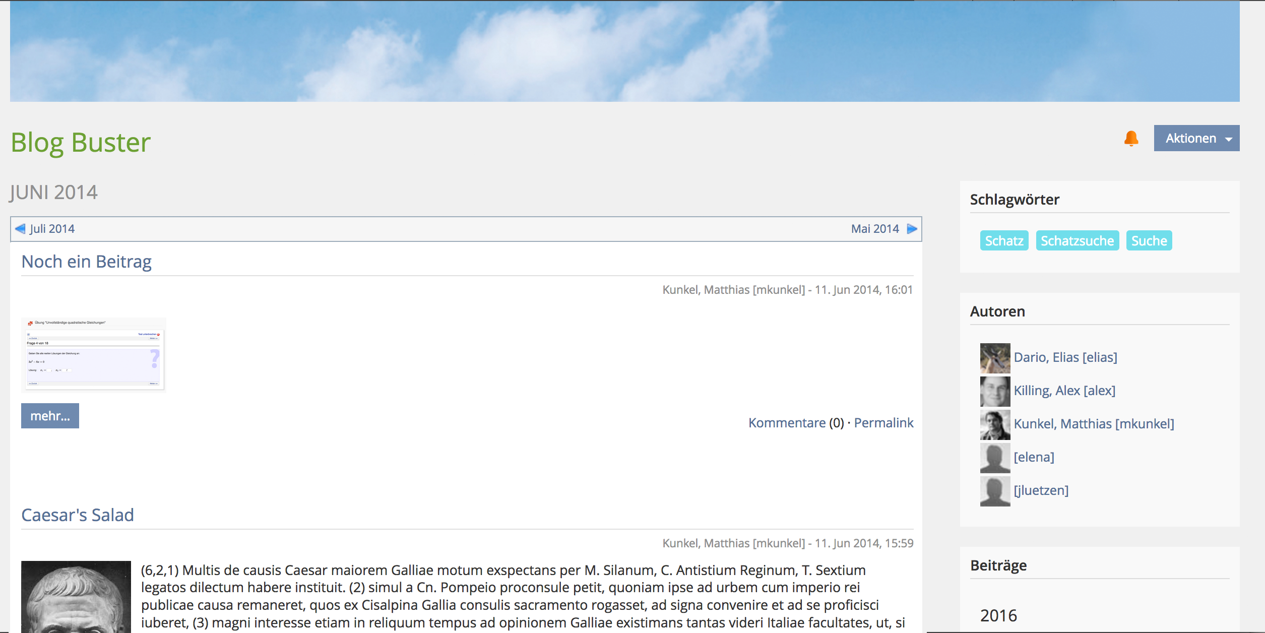
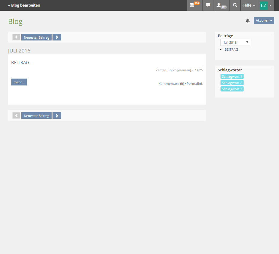
The screens for a single blog posting and for the overview of all postings of a month get both a new navigation row on top of the page content, similar to the ILIAS LM. It allows to go back and forward - either to the next or former posting in case of the single posting view or to the next or former month in case of the postings-per-month view. This navigation bar is shown on top and at the bottom of the page content.

The screenshot above comes from the first request for this feature and is not adapted to the new View Control
3 User Interface Modifications
3.1 List of Affected Views
- Presentation of a single posting in View mode
- Presentation of all postings of a month in View mode (like on screenshot above)
3.2 User Interface Details
- Single posting view: added navigation bar with UI View Control
- navigation left and right directs to former or next posting
- split button shows day of posting, drop-down shows list with up to next five and former five dates where postings have been made.
- Month view: added navigation bar with UI View Control
- navigation left and right directs to former or next month where posting has been made
- split button shows current month, drop-down shows month of the year (like known from calendar)
3.3 New User Interface Concepts
Feature request re-uses new UI element View Control, see https://github.com/ILIAS-eLearning/ILIAS/pull/378
4 Technical Information
No technical issues.
5 Contact
- Author of the Request: Kunkel, Matthias [mkunkel]
- Maintainer: Killing, Alexander [alex]
- Implementation of the feature is done by: {The maintainer must add the name of the implementing developer.}
6 Funding
7 Discussion
Killing, Alexander [alex], 2.12.2016: I support the idea. However I sometimes get the feedback, that in the learning modules presenting the titles of the previous/next chapters or pages is confusing. The users tend to think that the titles have something to do with the current page being displayed.
An alternative would be to only show the arrow icons "<" ">" or to show general terms like "< Previous Posting", "Next Posting >", "< Previous Month", "Next Month >" and also in learning modules "< Previous Page" and "Next Page >".
Kunkel, Matthias [mkunkel], Dec 02, 2016: Good suggestion - especially when the page or postings title get longer. < Previous Page|Posting|Month" and "Next Page|Posting|Month > would be my favourites.
JourFixe, ILIAS [jourfixe], Dec 05, 2016: In general we like the suggestion but we are thinking to re-use a new UI element 'month picker' (see http://www.ilias.de/docu/goto_docu_wiki_wpage_4402_1357.html) for moving forward and backwards in the blog. Therefore, we postpone the decision and deliver a new mock-up for a next upcoming Jour Fixe.
Kunkel, Matthias [mkunkel], Jan 10, 2016: I have updated the description above. The suggestion is now to re-use the new UI View Control for page turning.
JourFixe, ILIAS [jourfixe], 16 Jan 2017: We highly appreciate this suggestion and schedule it 5.3. Using the new View Control for month turning is fine. After we have implemented the UI View Control element we will check if the check button with list is the right element for the day turning, too.
8 Implementation
Test Cases
- C18777: Navigation innerhalb eines Blogs
Approval
Approved at August 24, 2017, by Kunkel, Matthias [mkunkel]
Last edited: 19. Apr 2023, 12:28, Kunkel, Matthias [mkunkel]

