Feature Wiki
Tabs
Usability Improvements Exercise
Page Overview
[Hide]1 Initial Problem
This article deals with small improvements that could make the Exercise more user-friendly.
2 Conceptual Summary
- We want to refurbish the Edit-From / Settings-tab of the Assignment.
- We want to hone labels.
- We want to better sort the order of sections in the View-tab of Assignments.
3 User Interface Modifications
3.1 List of Affected Views
- Settings-Tab of an individual Assignment
3.2 User Interface Details
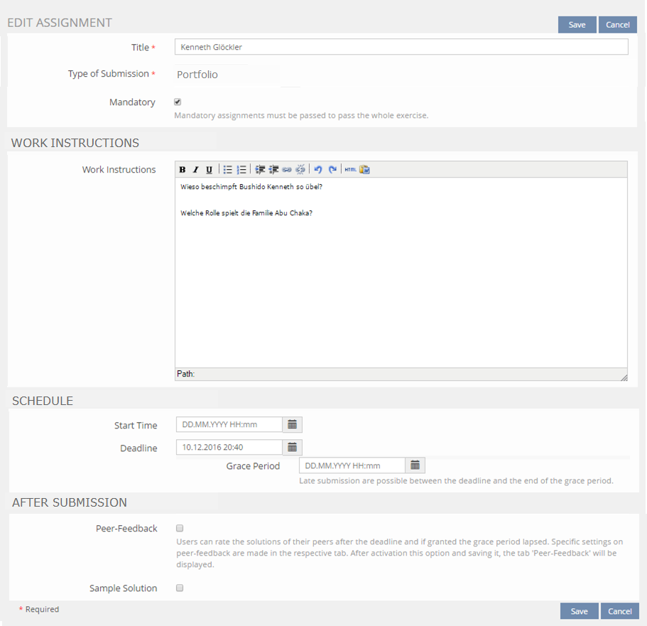
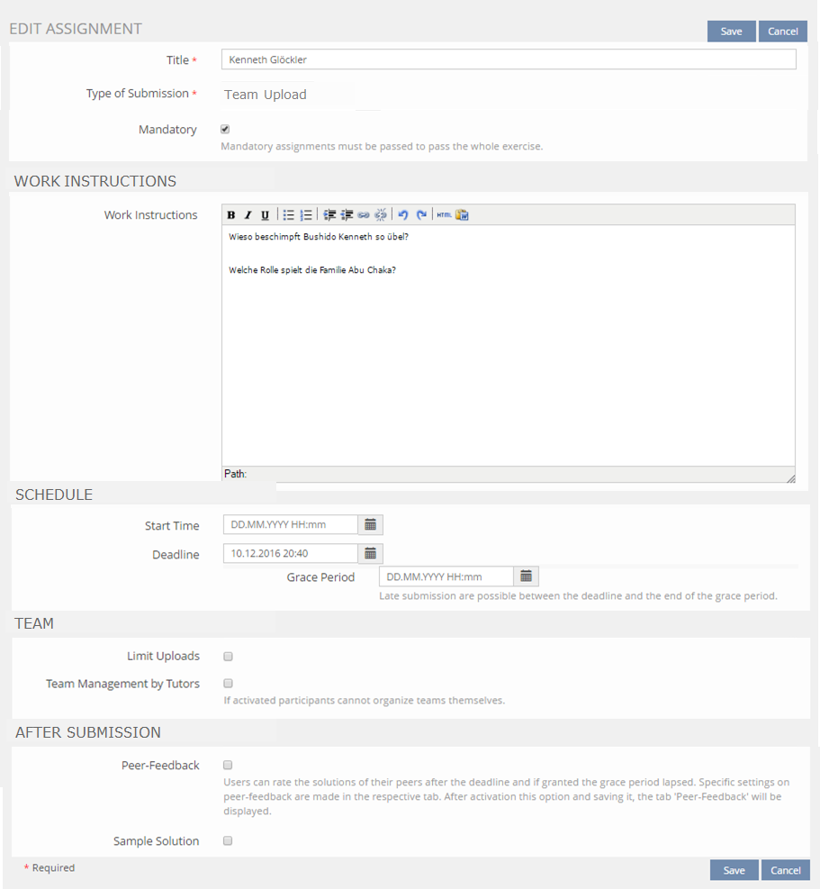
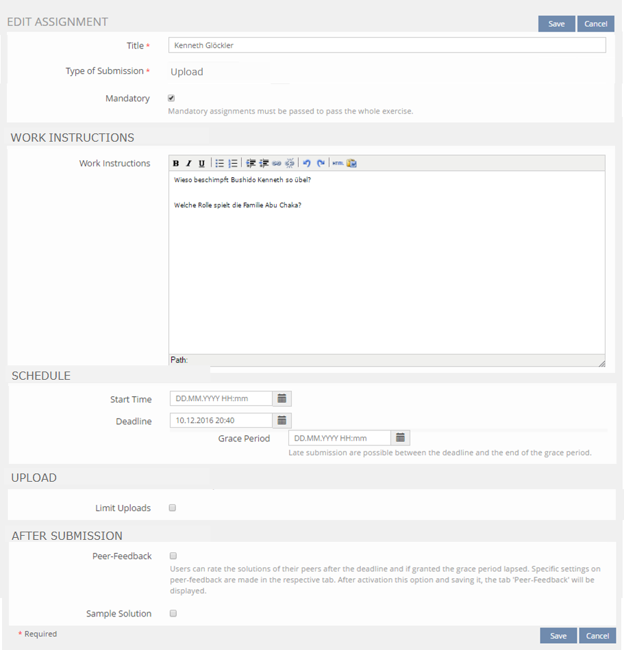
3.2.1 Refurbishing of the Settings-Tab of an individual Assignment
- H: Edit Assignment
- Title
- Type of Submission: read-only text field
- Mandatory
- H: Work Instructions
- Work Instructions text input field
- ...
- H: Schedule
- Start Time
- Deadline
- Grace Period
- H: Assignment specific
- depends on Type of Submission
- H: After Submission
- Peer-Feedback
- Sample Solution
Portfolio and Blog, Text
Team Upload
Upload
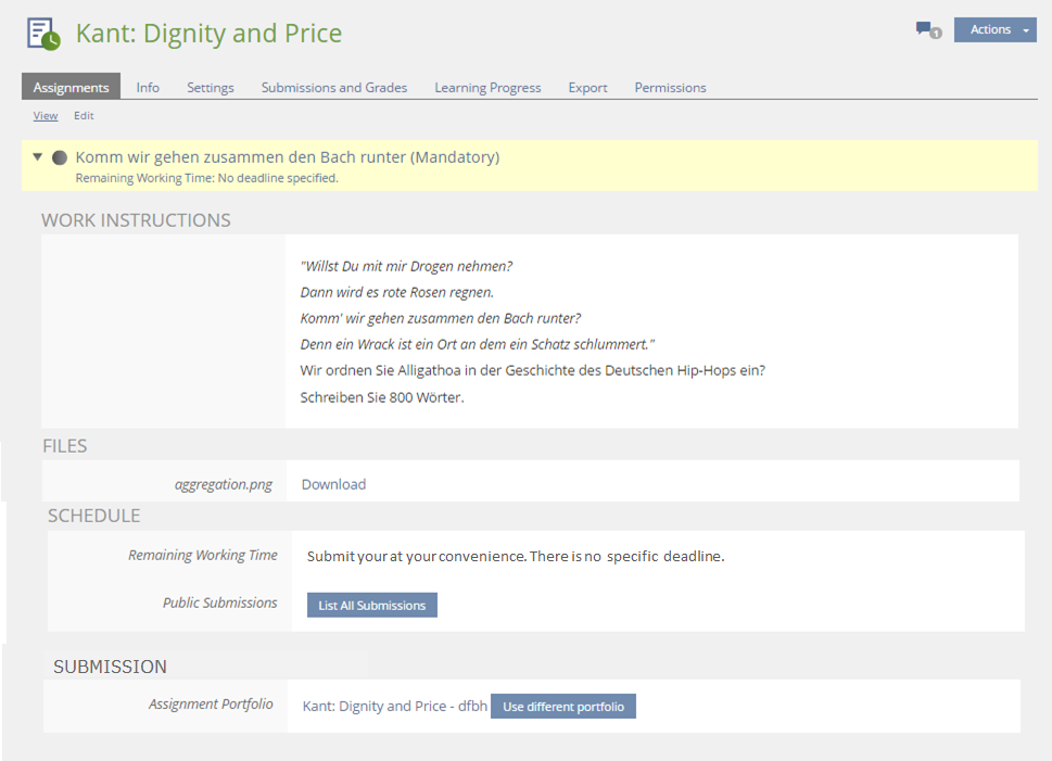
3.2.2 View-tab of Assignments
- The order of sections should be improved:
- Work Instructions
- Files (if any)
- Schedule
- Submission
- If the Assignment has no "Deadline" specified, the "Schedule"-section of the individual Assignment shows a bold Infotext "No deadline specified."
- This text should be changed to "Submit your at your convenience. There is no specific deadline."
- The part "Public Submission" of this "Schedule"- section, which is odd.
- The part "Public Submission" should be moved to the "Submission"-section, since this is it's apt place.
- The section' headline "Your Submission" is irritating, since it is shown even when no submission has been handed in or the submission is done by a team.
- The headline should be re-labled to "Submission".
- Add a button that allows to de-assign a portfolio and not just swap it for another one.
- After clicking "Remove Portfolio" ILIAS poses a question "Are you sure to remove the this portfolio form this assignment?"
German Language Issue
- In der Portfolio Übungseinheit ist der Identifier „Zugeordnetes Portfolio“. Der Bezeichner ist ungeeignet, denn trifft erst nach einer Zuordnung zu. Es sollte näher an dem englischen Bezeichner "Assigment Portfolio" sein.
- Vorschlag: "Portfolio zur Übungseinheit"
- Wählt man ein vorhandenes Portfolio aus, statt eines neu anzulegen, so lautet die Bestätigungsmeldung „Das Portfolio wurde verknüpft.“
- Vorschlag: „Das Portfolio wurde zugeordnet.“
3.3 New User Interface Concepts
No.
4 Technical Information
No technical issues.
5 Contact
- Author of the Request: Tödt, Alexandra [atoedt]
- Maintainer: Killing, Alexander [alex]
- Implementation of the feature is done by: {The maintainer must add the name of the implementing developer.}
6 Funding
- ...
7 Discussion
Kunkel, Matthias [mkunkel], NOV 01, 2016: I have devided this feature wiki request into three pages: Usability Improvements Exercise | Usability Improvements Blog | Usability Improvements Portfolio. The mentioned usability improvements have no common ground and should be treated as three separate requests.
Killing, Alexander [alex], 15.11.2016: I support this request.
JourFixe, ILIAS [jourfixe], Nov 21, 2016: We appreciate this feature request and schedule it for 5.3.
8 Implementation
Newly organised Form
Remove
Test Cases
New Cases
- 18394: 3. Übungseinheit: Portfolio entfernen und anderes Portfolio zuordnen
Approval
Approved at 2017-05-09 by Samoila, Oliver [oliver.samoila].
Last edited: 9. May 2017, 21:51, Samoila, Oliver [oliver.samoila]


