Feature Wiki
Tabs
Item Group: Expand/Collapse
Page Overview
[Hide]1 Initial Problem
Item groups can be used to group repository objects in containers. If a lot of content has to be organised accordions can be used in the page editor to "hide" some parts of the content and make it expandable. Combining these two features is quite a lot of work.
2 Conceptual Summary
It should be possible to make item groups collapsable directly without the need to use an accordion element. This should be controlled in the options of the item group.
3 User Interface Modifications
3.1 List of Affected Views
- Repository > Add or Edit an Item Group > Settings
- Repository > Any Container (Root, Category, Course, ...) > Content
3.2 User Interface Details
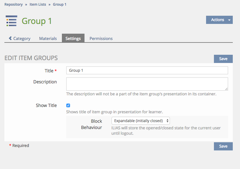
- Modify Option "Hide Title": The options should be called "Show Title" and be activated, if the title is shown to the learner. Default will be "On".
- Drop Down "Behaviour" as suboption for "Show Title": Options are "Always Expanded", "Collapsable (Default Collapsed)" and "Collapsable (Default Expanded)".
- If "Show Title" is not checked the supoption will not appear. The item group will always been presented expanded.
- If "Behaviour" is set to "Always Expanded" the item group will always been presented expanded.
- If "Behaviour" is set to "Collapsable (Default Collapsed)" the item group will be collapsable. If the user did not click the item group header in the current session, the item group will be collapsed.
- If "Behaviour" is set to "Collapsable (Default Expanded)" the item group will be collapsable. If the user did not click the item group header in the current session, the item group will be expanded.
- If an item group is "always expanded" the presentation will be like the current item group.
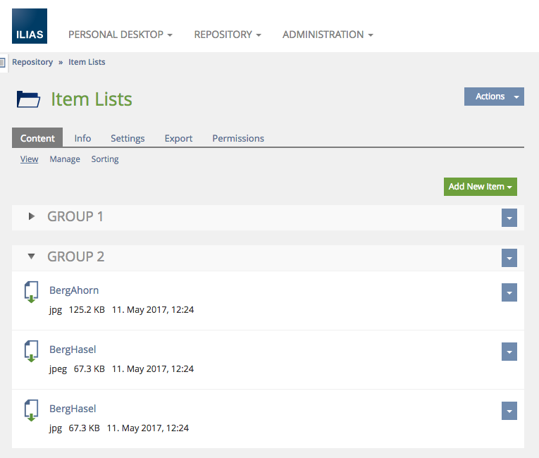
- If an item group is collapsable, the header will get a blue background like the default accordion header. On mouseover the background will slightly change to indicate a clickable area like the default accordion header. An arrow icon (same as for accordions) will indicate the collapse/expand status. Collapsing and expanding the item group will be done by using the same animation as being used for accordions.


3.3 New User Interface Concepts
It is up to disussion, which new user concepts are introduced. All the basic elements are existing in other contexts (header, header background/mouse over behaviour, arrow icon, animation behaviour).
4 Technical Information
No special technical issues.
5 Contact
- Author of the Request: René Sens, Bundesverwaltungsamt, rene.sens@bva.bund.de, 022899 358-7315
- Maintainer: Killing, Alexander [alex]
- Implementation of the feature is done by: {The maintainer must add the name of the implementing developer.}
6 Funding
- ...
7 Discussion
- If item group will be operable like accordeons, it would be important to style them like accordeons on your own via Content Styles.
- Would the "Content" item group (standard if no item group available or if not every material was assigned to a item group) be collapsable too? (would it get this settings too?)
- What is the standard value for "Behavior"? I would prefere "Always Expanded".
Killing, Alexander [alex], 13 Mar 2017: This proposal is only about item groups, not about other blocks in the repository. The page editor does not define the styles of these blocks (also not the style of item groups), since they are both independent from the container page editing. They can be used without the page editor (even if the page editor is deactivated for container pages). So, I would not like to start to make content styles modifying the appearance of item groups. Also, it should be an accordion-like behaviour, but it should not be accordions. Important is the expand/collapse behaviour. We have this at other places, too (e.g. tree branches).
JourFixe, ILIAS [jourfixe], March 13, 2017: We highly appreciate this suggestion and schedule it for 5.3. We would like to keep the discussion open if such item lists could re-use / extend the UI listing panel. This would also allow to use collapse / expand in UI appointment lists. Standard value for behaviour should be 'Always Expanded'. Styling such item groups via content styles is not supported (clear distinction between page related content and system style).
8 Implementation
Item group settings:
Item group presentation:
Test Cases
- Modified 6212 : Einstellungen des Objekteblocks ändern
Approval
Approved at 27.07.2017 by Sens, René .
Last edited: 27. Jul 2017, 12:24, Sens, Rene [Sens]


