


Feature Wiki
Tabs
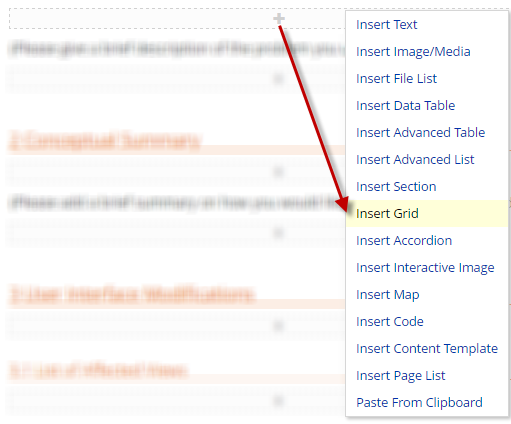
ILIAS Page Editor: Column Layout
Page Overview
[Hide]1 Initial Problem
In this feature request I will just call it grid instead of responsive column layout.
However there are two problems with these technique, which can also be seen in the blog post
- editing a page with grid layout is complicated and at times confusing
- creating the neccessary content styles for the grid layout is a complicated procedure and requires a good level of CSS knowledge
As can be seen in this screenshot a lot of these drop zones (boxes with plus sign inside) are superimposed on one another. It is very hard to tell which dropzone does what. And it is very hard to find the blocks which surround the invidiual columns.
Imagine you want to switch the order of column 3 and 4. If you don't know yet, how this can be done - I'll promise you will have at least 1-2 WTF-moments. ;-)
This is not something a content author should be confronted with to create content which is responsive.

2 Conceptual Summary
There are plans to do a major overhaul / revision of the editing GUI of the page editor. Therefore this feature request tries not to introduce new editing concepts in the page editor. The editing part in ILIAS is inspired how tables and accordeons are handled in the page editor and deliberately kept simple.
This solution is heavily based on the Bootstrap v3 grid system with 12 columns.
The basic concepts used in this feature are explained in the following introduction.
The default bootstrap v3 grid uses these values for less-to-css compilation of the predefined classes:
- @grid-columns: 12 // number of columns in the grid. Each cell can span over multiple columns
- @grid-gutter-width: 30px // padding between columns. Gets divided in half for the left and right
- xs: 0 // Extra small screen / phone -- no media query, since this is the default
- sm: 768px // Small screen / tablet
- md: 992px // Medium screen / desktop
- lg: 1200px // Large screen / wide desktop
- The next version Bootstrap v4 is going to introduce an additional breakpoint at ~544px. The current breakpoints "large, medium and small" will then be called "extra large, large and medium". The new breakpoint will then be the new small.
- It can be inserted like an advanced table or accordeon.
- any grid contains a variable number of cells.
- each cell can span over one or multiple columns of the grid.
- the cell width can have different values for each viewport range
xs / sm / md / lg. - the smallest viewport
xsrequires explicit values for cell-widths (default: 12). All larger viewports don't need explicit values and default to inheriting the cell-width from the next smaller viewport (sminherits fromxsetc.).
- all grid and cell settings are centralized in the edit screen of the grid itself
ILIAS skins will be able to change certain aspects of the bootstrap grid system, since they contain all bootstrap css:
- bootstraps
breakpointsmay be changed by ILIAS skins - the
@grid-gutter-width: 30pxmay be changed by ILIAS skins - however, the number of
@grid-columns: 12must not be changed by ILIAS skins. Note: ILIAS as it is today already has this requirement implicitly.
- This approach takes out-of-the-box experience serious and uses default styles and breakpoints according to bootstrap standards. The default breakpoints and gutter width can be modified by ILIAS skins. Future extensions of this approach are possible and sketched as follows.
- alternative names like e.g. grid layout or responsive grid instead of grid can still be sugessted and discussed. The author of this request prefers to just use grid.
- It is possible that multiple skins are in use for the same content and define different breakpoints, gutter width, etc. This may lead to inconsistent rendering - however this is not a new aspect since any skin can differ in available content width and other things like font styles etc. ILIAS admins have to keep that in mind already.
- ILIAS content styles can define their own media query ranges which are not used by the grid. This can lead to inconsistent behaviour of different elements of the page editor. To close that gap in the future the bootstrap breakpoints from the ILIAS skins could be imported into content styles automagically (see ideas for later extensions).
- a better editing mode of grids and cells is left open to the planned general revision of the page editor. Current ideas include
- explicitly selecting a media-query-range in preview and editing mode and being able to edit the grid in a simulated viewport, which matches that media query exactly (like this example in the top-right corner).
- changing cell-order via drag and drop
- changing cell-widths via some resizing-handle directly in the editor (requires explicitly selecting a media-query-range in editing mode)
- ILIAS skins could publish their breakpoint values for small, medium, etc. in their manifest file. That would allow to hardwire these skin-dependent aspects into content-styles, which could then reuse these aspects for their definitions. This would also make much sense for other key aspects like primary colors, etc.
- each grid instance could generate its css classes on-the-fly by compiling bootstrap based less files. This would allow customization of
@grid-gutter-width: 30pxand@grid-columns: 12per grid instance. However, this would also require some clever caching mechanism of the generated css, which can still be skin-dependent due to breakpoints. It will also require a less-compiler on the web-server. - each grid cell comes with these extra settings (all optional). This allows for extra customization of grid layouts - see bootstrap documentation for details.
- push/pull: 0 to 12
- offset: 0 to 12
3 User Interface Modifications
3.1 List of Affected Views
- Any place which supports the page editor (container objects, blog, wiki, portfolio, ...) > Edit Page
3.2 User Interface Details


- This grid system consists of 12 equally sized columns. Each cell can span over multiple columns (1 to 12) depending on the viewport size. This can be edited in the table below. 12 columns correspond to 100% of the grid width. Larger viewports can inherit their width from smaller viewports.

3.3 New User Interface Concepts
Only existing concepts are used (cf. page editor > table + accordeon)
4 Technical Information
Killing, Alexander [alex], 25 Oct 2016: I do not see any technical issues. Since we would like to use the "semantic" terms of the device widths, which seems to change with bootstrap 4, we may use the bootstrap 4 terminology also in the user interface now (small, medium, large, extra large as in bs4). The current alpha docs of bs4 still use px for the breakpoints, but this seems to be outdated. Other tutorials are mentioning em-sizes, see e.g. http://www.quackit.com/bootstrap/bootstrap_4/tutorial/bootstrap_grid_system.cfm.
5 Contact
- Author of the Request: Kiegel, Colin [kiegel]
- Maintainer: Killing, Alexander [alex]
- Implementation of the feature is done by: Killing, Alexander [alex]
6 Funding
7 Discussion
Killing, Alexander [alex], 21 Sep 2016: I support this request.
Kiegel, Colin [kiegel] 2016-09-21: The bootstrap grid (as proposed in the alternative) indeed strikes a good balance between expressiveness and ready-to-use styles. However it relies heavily on the fact that multiple css-classes can get applied to one cell. We would need to model that and we need to explain some 101 / basics about how they work. One cool thing about bootstrap grids is the ability to switch the order of cells depending on the breakpoint or to add spacings (via push/pull and offset-styleclasses).
However we have less flexibility to customize things like paddings, but people could still use blocks inside of cells if they really need to add more styles.
Kunkel, Matthias [mkunkel], Oct 05, 2016: I highly appreciate to introduce a generic option to create responsive column layouts. But I do not see a grid becoming a new page editor element like a text, an image or a list. For me it is an underlying and unique element of the entire area under IPE control. Tables or media object could use the grid (and in this case I would favour the BS grid). But IMHO it does not make sense to add such a grid to a page, a block or a table cell of an Advanced Table. This is totally confusing because grids of several sizes would appear on one page. A good example of a grid based layout is implemented by Contao CMS. It can easily be attributed by CSS classes and always produces a proper layouted page design.
Kiegel, Colin [kiegel] 2016-10-05: I totally agree that a grid does not make sense everywhere, especially not in tiny table cells. However it does make sense to have nested grids or no grid at all. And I could even imagine some use cases for putting grids into accordeons or blocks. That's why I see it as a page editor element (like a table).
PS: I tried the Contao CMS Online Demo http://demo.contao.org/contao/, but I could not find any way to model responsive grids. I only looked around for 5 minutes..
- There are early thoughts to do a major overhaul / revision of the page editor editing GUI. It was discussed, whether it makes sense to delay the implementation of a responsive grid until all the details of this editing GUI revision are settled. However this delay would be unpredictable and could easily take longer than the release of 5.3. We prefer to finalize the responsive grid concept first, because it is more advanced and there seems to be a big demand in the community to simplify creation of responsive content. As Alex Killing explained a later migration to a different user interface should not pose a big issue, even if this happens within the same ILIAS release. As a result this concept should try not to introduce new concepts in the editing GUI which could interfere with the revision. Instead existing concepts of the editing GUI shall be used. The following ideas are postponed to the editing GUI revision:
- switching between media queries in the editing GUI
- resizing grid cells in the editing GUI
- We prefer to reuse the bootstrap grid logic instead of utilizing manually created css styles.
- The grid should use the standard set of bootstrap breakpoints, which details can be modified by skins. As a future outlook these standard set of breakpoints could be made acessible within content styles, but that does not need to be within the scope of this feature implementation.
- We still have to clarify the naming of the feature as the name grid can lead to different associations. A grid-based layout in print design works a bit differently from the bootstrap grid system. And there is even a CSS-grid-system in the making. So let alone the name grid is at least ambiguous and it is unclear whether users will understand the right thing. This point however seemed quite controversial.
- A mockup of the edit screen should be included for the bootstrap-based variant.
Kiegel, Colin [kiegel] 2016-10-21: The proposal has been reworked according to the Jour Fixe workshop. Awaiting feedback from the maintainer and scheduling for Jour Fixe. The old proposal can still be found in the accordeon below.
Killing, Alexander [alex], 25 Oct 2016: I fully support the idea.
Kunkel, Matthias [mkunkel], Nov 03, 2016: My favourite label for this feature is 'Multi-column layout' because that is what I get as a user.
- We would like to use the future semantic terms for the breakpoints (Bootstrap 4):
- We start with small, medium, large and extra large. With the introduction of BS4, small will be split into extra small and small.
- We still keep the discussion open about the UI labels for the feature: "Grid" or "Multi-column layout"
Hilbert, Mirco [mirco.hilbert], Jan 18, 2017: From a usability point of view, I would absolutely beware introducing a new page editor element "Grid".
Instead, I would propose to add an option called for example "responsive" to the advanced table element settings. Therefore, the author can decide how a table should behave when changing the size of the browser window. Either the columns stay side by side and a user has to scroll horizontally, or the table breaks at certain columns.
If introducing a new page editor element (as proposed in this feature request) it is impossible for the author to easily change from one kind of behavior to the other. Especially concerning existing content, authors have a big workload to get all their existing tables responsive when they have to recreate them using the new grid element.
Kiegel, Colin [kiegel] 2017-01-18: I understand the concern and I agree that this is a big issue! The problem is, that a responsive grid behaves differently than a responsive table would most likely do. And we need completely different settings. Having one page element for both use cases would be a huge technical burden. However it would be very interesting to have a dedicated "convert table to responsive grid" action somewhere. I think that would help a lot of people in that situation.
Killing, Alexander [alex], 15 Feb 2017: I completely agree with Colin here. Tables are a different concept with different properties (row/column headers, diffent row concept/behaviour, border, css classes, ...). And the term "responsive table" usually refers to responsive data tables and not to grids.
Killing, Alexander [alex], 7 Mar 2017: There is a someone bigger open conceptual issue. Bootstrap grid comes with a standard float behaviour. But Colin thinks that most users might want a display:flex like grid behaviour.


Kunkel, Matthias [mkunkel], MAR 08, 2017: I assume cell 4 is placed under cell 3 because it is not very high and 3+4 are not higher than cell 2 (other than shown on graphic), right? So one problem is the behaviour of floating cells with different height. How about adding a behaviour to our cells that give them all the same height - related to the highest cell. This would also be helpful for the layout of the element as you could give a background colour to all cells, with the effect that equal surfaces are displayed. We could keep the Bootstrap grid behaviour and do not to implement an alternative solution.
Amstutz, Timon [amstutz], March 16. 2017: I would prefer to not change the bootstrap standard. It's what you would expect from a bootstrap grid. If this is a serious issue for the page layout, one could always create multiple grid layout elements and so create mulitple rows, which would get rid of this behaviour.
E.g.:Element 1:<div class="row"> <div class="col-xs-6 col-md-4">.col-xs-12 .col-md-4</div> <div class="col-xs-6 col-md-4">.col-xs-12 .col-md-4</div> <div class="col-xs-6 col-md-4">.col-xs-12 .col-md-4</div></div>Element 2:<div class="row"> <div class="col-xs-6 col-md-4">.col-xs-12 .col-md-4</div> <div class="col-xs-6 col-md-4">.col-xs-12 .col-md-4</div> <div class="col-xs-6 col-md-4">.col-xs-12 .col-md-4</div></div>
Obviously, this does break in some cases, such as:Element 1:<div class="row"> <div class="col-xs-6 col-md-4">.col-xs-6 .col-md-4</div> <div class="col-xs-6 col-md-4">.col-xs-6 .col-md-4</div> <div class="col-xs-6 col-md-4">.col-xs-6 .col-md-4</div></div>Element 2:<div class="row"> <div class="col-xs-6 col-md-4">.col-xs-6 .col-md-4</div> <div class="col-xs-6 col-md-4">.col-xs-6 .col-md-4</div> <div class="col-xs-6 col-md-4">.col-xs-6 .col-md-4</div></div>
But we can not have everything at once, right?
Killing, Alexander [alex], 17 Mar 2017: @Matthias "I assume cell 4 is placed under cell 3 because it is not very high and 3+4 are not higher than cell 2 (other than shown on graphic), right?". No, I think the picture illustrates the floating behaviour quite well. The height of 2 should not matter. What matters is that the heigt of 3 is smaller than the height of 4.
Kunkel, Matthias [mkunkel], MAR 20, 2017: Thanks for the explanation, Alex, even if it is not really comprehensible for me. But anyway... More important is to finally decide the name of the feature. I strongly recommend "Multi-column layout" or "Column layout". This feature relies on the technical concept of a grid and the existing grid implementation by Bootstrap. But grid is not a good name for labeling this feature in the UI.
JourFixe, ILIAS [jourfixe], March 27, 2017: We would like to have a behaviour like shown on the green example above (flex grid). Alexander will try to implement this and comes back to the JF in case he failes. According to the decision of the PM the feature shall be called "Column Layout" / "Spaltenlayout".
Killing, Alexander [alex], 19 Apr 2017: I failed to implement the flex grid approach. Mainly because I was not able to get nested column layouts working properly (the linked css above fails to provide this). So my current patch falls back to the bootstrap standard behaviour, which supports nesting.
Amstutz, Timon [amstutz], 19. April 2017: I am currently working at a related task of making the cards in the user gallery all the same height without using js. I think I found a working solution using flex. However, my issue is less complex, since I always have an amount of cards in row that is smaller than the max number of cards a row can hold. If you have a specific DOM snippet to look at that causes trouble, I would be happy to go over it. Maybe we can still do something. However, maybe not.
JourFixe, ILIAS [jourfixe], April 24, 2017: Alexander gave a short update about the current implementation of the flex layout. We will give a last chance to this implementation. If it does not allow nesting in a satisfying way, we go back to the pure Bootstrap implementation. According to Bootstrap web page, Bootstrap 4 (still alpha) will support flex boxes.
Hesse, Joel [Joel_Hesse], 19.06.2017: works great. Thank you all.
Hesse, Joel [Joel_Hesse] UPDATE (07.11.2017): We need the flex-grid behaviour like in the green example above.
Kiegel, Colin [kiegel] 2017-11-15: The flex-grid behaviour is essential to construct responsive layouts with cells of different height. I consider "not having this" a bug, especially since flex-grid behaviour is supported by all current browsers.
JourFixe, ILIAS [jourfixe], 20 NOV 2017: The Jour Fixe decisions made in March and April are still effective. The implementation is based on the current behaviour of Bootstrap 3. The scenario shown above in red is not considered as a bug but as the expected behaviour of Bootstrap (3). We are open to discuss this behaviour again when having switched to Bootstrap 4 where flexible grids are handled different. But this is not possible before 5.4 at the earliest.
8 Implementation
 Insert Column Layout
 Insert Column Layout II
 Edit Column Layout
Test Cases
- 18378: Grid einfügen
Approval
Approved at 19.06.2017 by Hesse, Joel [Joel_Hesse].
9 Outdated Documents
- grid element comes with these settings
- number of cells (integer)
- container style (applied to the whole grid object)
- cell style (applied to each cell within the grid)
- ILIAS offers a basic set of default container styles
- The standard container and cell styles will default to 100% width. This means that the layout is optimized for smartphones by default, according to the mobile first paradigm. Specific behaviour for larger devices can then be added with additional breakpoints
- Optional: ILIAS introduces a built-in set of breakpoints, e.g. current bootstrap defaults. The width of grid cells is then set to 50%, 33.33%, and 25% for tablet portrait, tablet landscape and desktop respectively. This will result in 1 -> 2 -> 3 -> 4 columns depending on the size of the device.
- Due to the lack of any built-in breakpoints, we can not deliver an out-of-the-box experience for responsive layouts. Adding built-in breakpoints would raise the questions, which to choose, because skins may deviate from bootstrap standards and multiple skins can be active on the same installation. In the end it may not be possible to always have the content style breakpoints match the breakpoints of all active skins.
- Alternative 1 is an open approach, where most of the basic settings have to be done in content style. While this is very flexible, it doesn't solve "problem 2" as mentioned in the introduction, i.e. it still requires a good level of css knowledge and fine tuning to get everything right when implementing a different layout.
List of Affected Views
- Any place which supports the page editor (container objects, blog, wiki, portfolio, ...) > Edit Page
- Administration > Layout and Style > Content Styles > Style X > Style Classes > Grid (new subtab)
User Interface Details
- each cell has a little anchor icon with a dropdown menu (which should be mostly self-explanatory)
- add cell before (cf. table: add column)
- add cell after (cf. table)
- move cell up (cf. table, however in the grid "up" and "down" does not literally refer to screen space but to the ordering of the cells. On a desktop "up" and "down" could result in "left" and "right", or even wrap into a new row as can be easily imagined)
- move cell down (cf. table)
- delete cell (does what it says)
- optional: grid settings (jump to the grid settings)
- optional: change cell settings (jump to a page which offers, variant 1: a selection of cell styles + save / cancel or variant 2: number of rows per breakpoint).
- optional: drag and drop cell anchors and one another could initiate a cell move and put the dragged cell in before the cell it was dropped upon. In this case it would make sense to add one trailing anchor icon to be able to drag-and-drop a column to the end.

- the style classes refer to the style classes applied to the cells and the whole grid
- number of cells

The container styles can be edited and new style classes can be added - in analogy to table styles.

Last edited: 19. Dec 2017, 12:19, Zenzen, Enrico [ezenzen]